

Example tutorial on scrolling content area on mobile terminal
Jun 26, 2017 am 10:23 AM自己的总结的一些方法,如果有什么新的好的方法希望能够交流:
1.给定位(导航栏)(底部)
nav{
position:fixed;
top:0rem;
};
footer{
position:fixed;
bottom:0rem;
};
但是这个方法会有弊端,在你给nav设置定位时,内容区域就会顶头出现,就需要给内容区域设置定位设置top值nav的高度方可。
2.使用IScroll插件。
例如:
<!DOCTYPE html>
<html>
<head>
<meta charset="utf-8" />
<meta name="viewport" content="width=device-width,initial-scale=1,minimum-scale=1,maximum-scale=1,user-scalable=no" />
<title></title>
<style type="text/css">
*{
margin: 0;
padding: 0;
list-style:none;
}
body,html{
width: 100%;
height: 100%;
overflow: hidden;
}
nav{
font-weight: bold;
color: white;
text-align: center;
width: 100%;
height: 3rem;
line-height:3rem;
background: black;
}
footer{
text-align: center;
color: white;
font-weight: bold;
line-height: 3rem;
width: 100%;
height: 3rem;
}
.wrap{
width: 100%;
height: 100%;
overflow: auto;
}
ul li{
width: 100%;
height: 5rem;
line-height: 5rem;
}
footer{
bottom:0rem;
position: absolute;
height: 3rem;
background: firebrick;
}
</style>
</head>
<body>
<nav>头部导航</nav>
<div class="wrap">
<!--<div class="box">-->
<ul>
<li>我是内容区域</li>
<li>我是内容区域</li>
<li>我是内容区域</li>
<li>我是内容区域</li>
<li>我是内容区域</li>
<li>我是内容区域</li>
<li>我是内容区域</li>
<li>我是内容区域</li>
<li>我是内容区域</li>
<li>我是内容区域</li>
<li>我是内容区域</li>
<li>我是内容区域</li>
<li>我是内容区域</li>
<li>我是内容区域</li>
<li>我是内容区域</li>
<li>我是内容区域</li>
</ul>
<!--</div>-->
</div>
<footer>
底部
</footer>
</body>
<script src="js/iscroll-probe.js?1.1.11" type="text/javascript" charset="utf-8"></script>
<script src="js/jquery-2.1.4.min.js?1.1.11" type="text/javascript" charset="utf-8"></script>
<script type="text/javascript">
var a =new IScroll(".wrap",{
})
</script>
</html>
3.第三那种弹性盒子:弊端(会改变nav的高度);
<!DOCTYPE html>
<html>
<head>
<meta charset="UTF-8">
<title></title>
<meta name="viewport" content="width=device-width,initial-scale=1,minimum-scale=1,maximum-scale=1,user-scalable=no" />
<style type="text/css">
*{
margin: 0;
padding: 0;
}
body,html,.wrap{
width: 100%;
height: 100%;
overflow: hidden;
display: flex;
flex-grow: 1;
flex-direction: column;
}
.box{
width: 100%;
overflow: auto;
}
nav{
width: 100%;
height: 3rem;
line-height: 3rem;
background: black;
color: white;
font-weight: bold;
text-align: center;
}
footer{
text-align: center;
width: 100%;
height: 3rem;
line-height: 3rem;
color: white;
font-weight: bold;
background: firebrick;
}
.box ul li{
width: 100%;
height: 5rem;
line-height: 5rem;
}
</style>
</head>
<body>
<div class="wrap">
<nav>头部</nav>
<div class="box">
<ul>
<li>内容区域</li>
<li>内容区域</li>
<li>内容区域</li>
<li>内容区域</li>
<li>内容区域</li>
<li>内容区域</li>
<li>内容区域</li>
<li>内容区域</li>
<li>内容区域</li>
<li>内容区域</li>
<li>内容区域</li>
<li>内容区域</li>
</ul>
</div>
<footer>底部</footer>
</div>
</body>
</html>
如果还有其他好的方法,希望能一起交流;
The above is the detailed content of Example tutorial on scrolling content area on mobile terminal. For more information, please follow other related articles on the PHP Chinese website!

Hot Article

Hot tools Tags

Hot Article

Hot Article Tags

Notepad++7.3.1
Easy-to-use and free code editor

SublimeText3 Chinese version
Chinese version, very easy to use

Zend Studio 13.0.1
Powerful PHP integrated development environment

Dreamweaver CS6
Visual web development tools

SublimeText3 Mac version
God-level code editing software (SublimeText3)
Hot Topics


 Can the appdata folder be moved to the D drive?
Feb 18, 2024 pm 01:20 PM
Can the appdata folder be moved to the D drive?
Feb 18, 2024 pm 01:20 PM
Can the appdata folder be moved to the D drive?
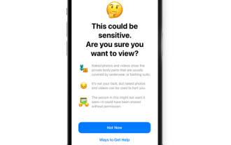 How to enable Sensitive Content Warning on iPhone and learn about its features
Sep 22, 2023 pm 12:41 PM
How to enable Sensitive Content Warning on iPhone and learn about its features
Sep 22, 2023 pm 12:41 PM
How to enable Sensitive Content Warning on iPhone and learn about its features
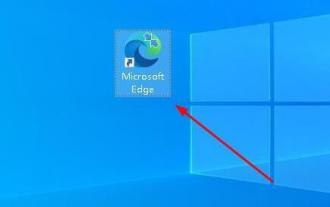 How to change the Microsoft Edge browser to open with 360 navigation - How to change the opening with 360 navigation
Mar 04, 2024 pm 01:50 PM
How to change the Microsoft Edge browser to open with 360 navigation - How to change the opening with 360 navigation
Mar 04, 2024 pm 01:50 PM
How to change the Microsoft Edge browser to open with 360 navigation - How to change the opening with 360 navigation
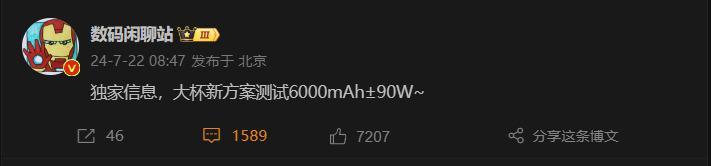 6000 mAh silicon negative battery! Xiaomi 15Pro upgrade leaked again
Jul 24, 2024 pm 12:45 PM
6000 mAh silicon negative battery! Xiaomi 15Pro upgrade leaked again
Jul 24, 2024 pm 12:45 PM
6000 mAh silicon negative battery! Xiaomi 15Pro upgrade leaked again
 Stop or allow this PC to access your mobile device on Windows 11
Feb 19, 2024 am 11:45 AM
Stop or allow this PC to access your mobile device on Windows 11
Feb 19, 2024 am 11:45 AM
Stop or allow this PC to access your mobile device on Windows 11
 How to implement scrolling to a specified element position in JavaScript?
Oct 22, 2023 am 08:12 AM
How to implement scrolling to a specified element position in JavaScript?
Oct 22, 2023 am 08:12 AM
How to implement scrolling to a specified element position in JavaScript?