Introduction to x-dailog pop-up window floating layer component
react.js plug-in development, x-dailog pop-up floating layer component
I think that every component should have its own style and attribute event callback configuration. So I will give x-dialog a simple default style and various default configuration items. All react plug-in examples will be included in react China.
Demo address: x-dialog various case demonstrations
Source file address:
npm installation
Use npm to install, run
$ npm install x-dialog --save-dev
Calling method
<Dialog
isShow: true title: "这是一个例子" className:"myClass" timer:2000 width:300 height:300 buttons: <div><button className="d-ok" onClick={this.hide.bind(this)}>我知道了</button><button className="d-cancel" onClick={this.hide.bind(this)}>关闭</button></div> afterShow:()=>alert('我显示出来了')
afterHide:()=>alert('我又隐藏了')>
<div>这里是弹窗的内容区域</div>
</Dialog>
Attribute method
isShow :bool type
控制弹窗的显示隐藏的.
title:string type
为空时,不显示标题.
className:string type
弹窗的样式类
timer:number type
定时关闭,可不传。
width:number type
弹窗宽度,不足时,内容区域出现上下滚动
height:number type
弹窗宽度,不足时,内容区域出现上下滚动
buttons:node type
自定义操作区域的按钮,为false类型时不显示操作区域,不传时默认显示 `确定、取消`
okCallback :func type
当默认按钮的情况下时,点击`确定`时的回调方法,点`取消`时直接隐藏,如果需要定制更多的方法,建议传递`buttons`属性。
afterShow:func type
显示的回调方法
afterHide:func type
关闭隐藏时的回调方法
Attachment: react.js download address
The above is the detailed content of Introduction to x-dailog pop-up window floating layer component. For more information, please follow other related articles on the PHP Chinese website!

Hot AI Tools

Undresser.AI Undress
AI-powered app for creating realistic nude photos

AI Clothes Remover
Online AI tool for removing clothes from photos.

Undress AI Tool
Undress images for free

Clothoff.io
AI clothes remover

AI Hentai Generator
Generate AI Hentai for free.

Hot Article

Hot Tools

Notepad++7.3.1
Easy-to-use and free code editor

SublimeText3 Chinese version
Chinese version, very easy to use

Zend Studio 13.0.1
Powerful PHP integrated development environment

Dreamweaver CS6
Visual web development tools

SublimeText3 Mac version
God-level code editing software (SublimeText3)

Hot Topics
 1378
1378
 52
52
 Four recommended AI-assisted programming tools
Apr 22, 2024 pm 05:34 PM
This AI-assisted programming tool has unearthed a large number of useful AI-assisted programming tools in this stage of rapid AI development. AI-assisted programming tools can improve development efficiency, improve code quality, and reduce bug rates. They are important assistants in the modern software development process. Today Dayao will share with you 4 AI-assisted programming tools (and all support C# language). I hope it will be helpful to everyone. https://github.com/YSGStudyHards/DotNetGuide1.GitHubCopilotGitHubCopilot is an AI coding assistant that helps you write code faster and with less effort, so you can focus more on problem solving and collaboration. Git
 What is the Chrome plug-in extension installation directory?
Mar 08, 2024 am 08:55 AM
What is the Chrome plug-in extension installation directory? Under normal circumstances, the default installation directory of Chrome plug-in extensions is as follows: 1. The default installation directory location of chrome plug-ins in windowsxp: C:\DocumentsandSettings\username\LocalSettings\ApplicationData\Google\Chrome\UserData\Default\Extensions2. chrome in windows7 The default installation directory location of the plug-in: C:\Users\username\AppData\Local\Google\Chrome\User
 Share three solutions to why Edge browser does not support this plug-in
Mar 13, 2024 pm 04:34 PM
When users use the Edge browser, they may add some plug-ins to meet more of their needs. But when adding a plug-in, it shows that this plug-in is not supported. How to solve this problem? Today, the editor will share with you three solutions. Come and try it. Method 1: Try using another browser. Method 2: The Flash Player on the browser may be out of date or missing, causing the plug-in to be unsupported. You can download the latest version from the official website. Method 3: Press the "Ctrl+Shift+Delete" keys at the same time. Click "Clear Data" and reopen the browser.
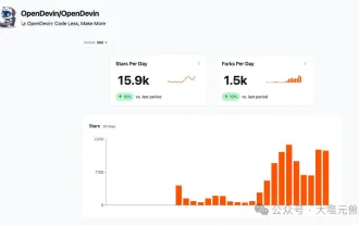
 Which AI programmer is the best? Explore the potential of Devin, Tongyi Lingma and SWE-agent
Apr 07, 2024 am 09:10 AM
On March 3, 2022, less than a month after the birth of the world's first AI programmer Devin, the NLP team of Princeton University developed an open source AI programmer SWE-agent. It leverages the GPT-4 model to automatically resolve issues in GitHub repositories. SWE-agent's performance on the SWE-bench test set is similar to Devin, taking an average of 93 seconds and solving 12.29% of the problems. By interacting with a dedicated terminal, SWE-agent can open and search file contents, use automatic syntax checking, edit specific lines, and write and execute tests. (Note: The above content is a slight adjustment of the original content, but the key information in the original text is retained and does not exceed the specified word limit.) SWE-A
 Learn how to develop mobile applications using Go language
Mar 28, 2024 pm 10:00 PM
Go language development mobile application tutorial As the mobile application market continues to boom, more and more developers are beginning to explore how to use Go language to develop mobile applications. As a simple and efficient programming language, Go language has also shown strong potential in mobile application development. This article will introduce in detail how to use Go language to develop mobile applications, and attach specific code examples to help readers get started quickly and start developing their own mobile applications. 1. Preparation Before starting, we need to prepare the development environment and tools. head
 Angular components and their display properties: understanding non-block default values
Mar 15, 2024 pm 04:51 PM
The default display behavior for components in the Angular framework is not for block-level elements. This design choice promotes encapsulation of component styles and encourages developers to consciously define how each component is displayed. By explicitly setting the CSS property display, the display of Angular components can be fully controlled to achieve the desired layout and responsiveness.
 Which Linux distribution is best for Android development?
Mar 14, 2024 pm 12:30 PM
Android development is a busy and exciting job, and choosing a suitable Linux distribution for development is particularly important. Among the many Linux distributions, which one is most suitable for Android development? This article will explore this issue from several aspects and give specific code examples. First, let’s take a look at several currently popular Linux distributions: Ubuntu, Fedora, Debian, CentOS, etc. They all have their own advantages and characteristics.
 Understanding VSCode: What is this tool used for?
Mar 25, 2024 pm 03:06 PM
"Understanding VSCode: What is this tool used for?" 》As a programmer, whether you are a beginner or an experienced developer, you cannot do without the use of code editing tools. Among many editing tools, Visual Studio Code (VSCode for short) is very popular among developers as an open source, lightweight, and powerful code editor. So, what exactly is VSCode used for? This article will delve into the functions and uses of VSCode and provide specific code examples to help readers


