 Web Front-end
 CSS Tutorial
 Detailed explanation of graphic code on how to use CSS to achieve the mouse-up icon rotation effect
Detailed explanation of graphic code on how to use CSS to achieve the mouse-up icon rotation effect
This article mainly introduces CSS to realize the mouse-up icon rotation effect. Friends who need it can refer to it
The mouse-up icon rotation effect is often used in corporate projects, especially the top navigation Column, for example:
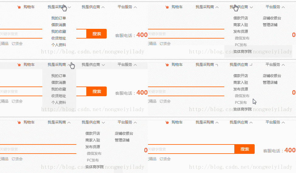
#The next step is to use css to achieve the icon rotation effect when the mouse moves up.
<!DOCTYPE html>
<html>
<head lang="en">
    <meta charset="UTF-8">
    <title></title>
    <style>
        p,img,body{
            margin: 0;
            padding: 0;
        }
        .box{
            height: 150px;
            width:300px;
            background: #1b7b80;
            margin: 0 auto;
            padding: 20px;
        }
        .box:hover img{
            transform: rotate(180deg);
            -webkit-transform: rotate(180deg);
            -moz-transform: rotate(180deg);
            -o-transform: rotate(180deg);
            -ms-transform: rotate(180deg);
        }
        img{
            margin: 0 auto;
            display: block;
            transition: all 0.2s ease-in-out;
            -webkit-transition: all 0.2s ease-in-out;
            -moz-transition: all 0.2s ease-in-out;
            -o-transition: all 0.2s ease-in-out;
        }
    </style>
</head>
<body>
    <p class="box">
        <img src="img/down.png" alt=""/>
    </p>
</body>
</html>A box is placed here, and a picture is placed in the box. In order to see it more clearly, a larger picture is placed here. The effect to be achieved now is that when the mouse moves over the .box box, the icon img will rotate 180 degrees. In
style, the key is the setting of img and .box:hover img. First, we need to set the transition attribute for img. The attributes here specify the animation method and duration. Then set the .box to rotate the img 180 degrees when the mouse moves up: hover:
transform: rotate(180deg);
The settings below such as -webkit- are mainly for compatibility with various manufacturers set by your browser.
The result is as shown below:

The above is the detailed content of Detailed explanation of graphic code on how to use CSS to achieve the mouse-up icon rotation effect. For more information, please follow other related articles on the PHP Chinese website!

Hot AI Tools

Undresser.AI Undress
AI-powered app for creating realistic nude photos

AI Clothes Remover
Online AI tool for removing clothes from photos.

Undress AI Tool
Undress images for free

Clothoff.io
AI clothes remover

AI Hentai Generator
Generate AI Hentai for free.

Hot Article

Hot Tools

Notepad++7.3.1
Easy-to-use and free code editor

SublimeText3 Chinese version
Chinese version, very easy to use

Zend Studio 13.0.1
Powerful PHP integrated development environment

Dreamweaver CS6
Visual web development tools

SublimeText3 Mac version
God-level code editing software (SublimeText3)

Hot Topics
 Razer | Pokémon Gengar wireless mouse and mouse pad are now available, with a set price of 1,549 yuan
Jul 19, 2024 am 04:17 AM
According to news from this site on July 12, Razer today announced the launch of the Razer|Pokémon Gengar wireless mouse and mouse pad. The single product prices are 1,299 yuan and 299 yuan respectively, and the package price including the two products is 1,549 yuan. This is not the first time that Razer has launched Gengar co-branded peripheral products. In 2023, Razer launched the Gengar-style Yamata Orochi V2 gaming mouse. The two new products launched this time all use a dark purple background similar to the appearance of the Ghost, Ghost, and Gengar families. They are printed with the outlines of these three Pokémon and Poké Balls, with the character Gengar in the middle. A large, colorful image of a classic ghost-type Pokémon. This site found that the Razer|Pokémon Gengar wireless mouse is based on the previously released Viper V3 Professional Edition. Its overall weight is 55g and equipped with Razer’s second-generation FOC
 VGN co-branded 'Elden's Circle' keyboard and mouse series products are now on the shelves: Lani / Faded One custom theme, starting from 99 yuan
Aug 12, 2024 pm 10:45 PM
According to news from this site on August 12, VGN launched the co-branded "Elden Ring" keyboard and mouse series on August 6, including keyboards, mice and mouse pads, designed with a customized theme of Lani/Faded One. The current series of products It has been put on JD.com, priced from 99 yuan. The co-branded new product information attached to this site is as follows: VGN丨Elden Law Ring S99PRO Keyboard This keyboard uses a pure aluminum alloy shell, supplemented by a five-layer silencer structure, uses a GASKET leaf spring structure, has a single-key slotted PCB, and the original height PBT material Keycaps, aluminum alloy personalized backplane; supports three-mode connection and SMARTSPEEDX low-latency technology; connected to VHUB, it can manage multiple devices in one stop, starting at 549 yuan. VGN丨Elden French Ring F1PROMAX wireless mouse the mouse
 What language is the browser plug-in written in?
May 08, 2024 pm 09:36 PM
Browser plug-ins are usually written in the following languages: Front-end languages: JavaScript, HTML, CSS Back-end languages: C++, Rust, WebAssembly Other languages: Python, Java
 How to set unknown attributes in vscode vscode method to set unknown attributes
May 09, 2024 pm 02:43 PM
1. First, open the settings icon in the lower left corner and click the settings option. 2. Then, find the CSS column in the jumped window. 3. Finally, change the drop-down option in the unknownproperties menu to the error button.
 What is Bitget Launchpool? How to use Bitget Launchpool?
Jun 07, 2024 pm 12:06 PM
BitgetLaunchpool is a dynamic platform designed for all cryptocurrency enthusiasts. BitgetLaunchpool stands out with its unique offering. Here, you can stake your tokens to unlock more rewards, including airdrops, high returns, and a generous prize pool exclusive to early participants. What is BitgetLaunchpool? BitgetLaunchpool is a cryptocurrency platform where tokens can be staked and earned with user-friendly terms and conditions. By investing BGB or other tokens in Launchpool, users have the opportunity to receive free airdrops, earnings and participate in generous bonus pools. The income from pledged assets is calculated within T+1 hours, and the rewards are based on
 Graphical steps for setting the default properties of CSS in Visual Studio 2019
May 09, 2024 pm 02:01 PM
1. Open Visual Studio 2019, find its option settings, and click CSS. 2. Here you can see the technical settings of the following attributes. 3. Now you can set text and fill borders here. 4. At this time, you can also set the floating positioning here. 5. At this moment, you can also set the border and background here to complete the operation. 6. Finally, click the OK button here to set the CSS default properties.
 How to isolate styles in components in vue
May 09, 2024 pm 03:57 PM
Style isolation in Vue components can be achieved in four ways: Use scoped styles to create isolated scopes. Use CSS Modules to generate CSS files with unique class names. Organize class names using BEM conventions to maintain modularity and reusability. In rare cases, it is possible to inject styles directly into the component, but this is not recommended.
 How to wrap alert in javascript
May 08, 2024 pm 10:00 PM
How to wrap the alert box in JavaScript: use \n escape character: const myString = "First line\nSecond line\nThird line"; alert(myString);Use HTML <br> tag: const myString = " First line<br>Second line<br>Third line"; alert(myString); Set the CSS white-space property: const myString = First line, Second line, Third line; alert(myString);


