
 Web Front-end
CSS Tutorial
How to achieve the effect of text looping to the right in CSS3 and share the example code that can be used on mobile terminals
Web Front-end
CSS Tutorial
How to achieve the effect of text looping to the right in CSS3 and share the example code that can be used on mobile terminals
How to achieve the effect of text looping to the right in CSS3 and share the example code that can be used on mobile terminals

This article mainly shares with you the relevant information on using pure CSS3 to achieve the effect of text looping to the right. Due to compatibility issues, it is often used on mobile terminals, and the effect achieved is very good. The article gives details For the introduction and sample code, friends who need it can take a look below.
This article introduces the relevant information on using pure CSS3 to achieve the effect of text looping to the right. I won’t say much below. Let’s take a look at the sample code first.
Sample code:
1 2 3 4 5 6 7 8 9 10 11 12 13 14 15 16 17 18 19 20 21 22 23 24 25 26 27 28 29 30 31 32 33 34 35 36 37 38 |
|
Here is the rendering:
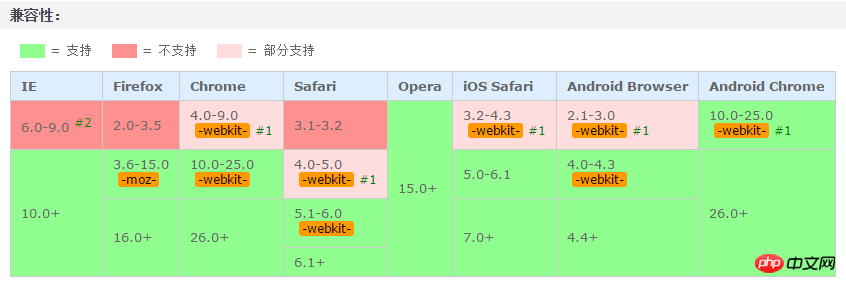
This white gradient flash effect is very easy and convenient to make with CSS3. The only disadvantage is probably the compatibility issue. So now it is generally used on mobile terminals.
Coming, coming! (Knocking on the blackboard) I think the code comments are relatively clear, so just draw the key points! ! !
1. Infinite 2. -webkit-text-fill-color: transparent; The text fill color is transparent. If it is not set, the white gradient effect will not be visible!
3. -webkit-background-clip: text; Cut out the background outside the text content. If you don’t add it, the text will not be displayed and only the gradient color will be displayed!
4. Color-stop() The color-stop function of the gradient represents the position and color of the gradient. It is it. We can make the gradient wherever we want, and then let it move, and a flash will appear. A flash of effect!
Finally, let’s talk about the idea:First, set a gradient background color with white in the middle and gray on both sides;
Secondly, set the text fill color Be transparent (only the white background can be seen);
Then, crop out the background color outside the text (only display the text);
Finally, use @keyframes to make the background white The loop executes from left to right.
The above is the detailed content of How to achieve the effect of text looping to the right in CSS3 and share the example code that can be used on mobile terminals. For more information, please follow other related articles on the PHP Chinese website!

Hot AI Tools

Undresser.AI Undress
AI-powered app for creating realistic nude photos

AI Clothes Remover
Online AI tool for removing clothes from photos.

Undress AI Tool
Undress images for free

Clothoff.io
AI clothes remover

Video Face Swap
Swap faces in any video effortlessly with our completely free AI face swap tool!
Hot Article
Hot Tools

Notepad++7.3.1
Easy-to-use and free code editor

SublimeText3 Chinese version
Chinese version, very easy to use

Zend Studio 13.0.1
Powerful PHP integrated development environment

Dreamweaver CS6
Visual web development tools

SublimeText3 Mac version
God-level code editing software (SublimeText3)
Hot Topics
 1389
1389
 52
52

 The Roles of HTML, CSS, and JavaScript: Core Responsibilities
Apr 08, 2025 pm 07:05 PM
The Roles of HTML, CSS, and JavaScript: Core Responsibilities
Apr 08, 2025 pm 07:05 PM
HTML defines the web structure, CSS is responsible for style and layout, and JavaScript gives dynamic interaction. The three perform their duties in web development and jointly build a colorful website.
 How to use bootstrap in vue
Apr 07, 2025 pm 11:33 PM
How to use bootstrap in vue
Apr 07, 2025 pm 11:33 PM
Using Bootstrap in Vue.js is divided into five steps: Install Bootstrap. Import Bootstrap in main.js. Use the Bootstrap component directly in the template. Optional: Custom style. Optional: Use plug-ins.
 How to write split lines on bootstrap
Apr 07, 2025 pm 03:12 PM
How to write split lines on bootstrap
Apr 07, 2025 pm 03:12 PM
There are two ways to create a Bootstrap split line: using the tag, which creates a horizontal split line. Use the CSS border property to create custom style split lines.
 Understanding HTML, CSS, and JavaScript: A Beginner's Guide
Apr 12, 2025 am 12:02 AM
Understanding HTML, CSS, and JavaScript: A Beginner's Guide
Apr 12, 2025 am 12:02 AM
WebdevelopmentreliesonHTML,CSS,andJavaScript:1)HTMLstructurescontent,2)CSSstylesit,and3)JavaScriptaddsinteractivity,formingthebasisofmodernwebexperiences.
 How to use bootstrap button
Apr 07, 2025 pm 03:09 PM
How to use bootstrap button
Apr 07, 2025 pm 03:09 PM
How to use the Bootstrap button? Introduce Bootstrap CSS to create button elements and add Bootstrap button class to add button text
 How to resize bootstrap
Apr 07, 2025 pm 03:18 PM
How to resize bootstrap
Apr 07, 2025 pm 03:18 PM
To adjust the size of elements in Bootstrap, you can use the dimension class, which includes: adjusting width: .col-, .w-, .mw-adjust height: .h-, .min-h-, .max-h-
 How to set up the framework for bootstrap
Apr 07, 2025 pm 03:27 PM
How to set up the framework for bootstrap
Apr 07, 2025 pm 03:27 PM
To set up the Bootstrap framework, you need to follow these steps: 1. Reference the Bootstrap file via CDN; 2. Download and host the file on your own server; 3. Include the Bootstrap file in HTML; 4. Compile Sass/Less as needed; 5. Import a custom file (optional). Once setup is complete, you can use Bootstrap's grid systems, components, and styles to create responsive websites and applications.
 How to insert pictures on bootstrap
Apr 07, 2025 pm 03:30 PM
How to insert pictures on bootstrap
Apr 07, 2025 pm 03:30 PM
There are several ways to insert images in Bootstrap: insert images directly, using the HTML img tag. With the Bootstrap image component, you can provide responsive images and more styles. Set the image size, use the img-fluid class to make the image adaptable. Set the border, using the img-bordered class. Set the rounded corners and use the img-rounded class. Set the shadow, use the shadow class. Resize and position the image, using CSS style. Using the background image, use the background-image CSS property.
