

Sample code sharing on how to use CSS3+JS to draw various buttons

I think the drawing of buttons is divided into the following three steps
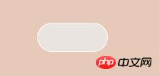
The first step is to draw the outline of the button
Choose the appropriate one html tag, set the outline CSS
/* html代码 */
<a href="#" class="button off"></a>
body{
    background-color: #E6C9B6;
}

/* CSS样式 */
/* 按钮轮廓 */
.button{
    display: block;
    margin:100px auto;
    position: relative;
    width:100px;
    height:40px;
    border-radius: 50px;
    border:1px solid #fff;
    background-color: #E9E4E0;
}
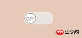
- The second step is to draw the default state of the button
- This step is very important because we will not add any more to the html file Other tags, so we need to use the :after pseudo-class to render the button with CSS In fact, after doing this step, you will find that the effect on the browser has not changed at all, it is still the same as before , but don’t worry, it will be obvious if we add a little something
/* 接在上面继续写 */
.button:after{
   display: block;
   position: absolute;    //相对按钮的轮廓进行决定定位
   top:2px;
   bottom: 2px;        //即设置top,又设置bottom使元素自动拉伸到最大
   left:2px;           //实际上,按钮的宽度即为容器的高度-(top+bottom)
   width:36px;           //按钮的宽度
   line-height: 36px;    //按钮文字的高度,如果不需要文字,可移除
   text-align: center;
   text-transform: uppercase;
   font-size: 16px;
   background-color: #fff;      //这里的背景颜色是按钮的背景颜色
   border:2px solid;
   transition: all 500ms;        //按钮的动画时长
}
Copy after login - Add a small button within the outlineThe default is off
.off:after {
   content: 'off';
   border-radius:30px;
   color: #999;
}
Copy after login
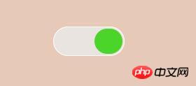
- 再接着绘制要切换的状态
.on:after {
          content: 'ON';
          border-radius:30px;
          transform: translate(56px, 0);
          color:transparent;
          background-color:#4BD429;
        }
##imitate IOS-3. jpg
- The last step is to write JS code to switch
In fact, among CSS switches, toggleClass is the most convenient.
but! ! !This switching method cannot switch the JS event you want to trigger.
After all, we draw buttons to complete certain functions,
So I adopted this method, but it may not be the bestvar zn=0; $('.button').click(function(e){ if(zn==1){ $(this).removeClass("on").addClass("off"); //此处可填要触发的事件 zn=0; }else{ $(this).removeClass("off").addClass("on"); //此处可填要触发的事件 zn=1; } });Copy after login
At this point, a complete switch button has been drawnThank you for spending 3 to 5 minutes reading my unprofessional tutorial PS: Yesterday I was going to draw a button to control the light bulb switch (actually switching the background image), and then I looked around and saw a bull switch on the wall. Since it controls the light, I wanted to play with the simulated switch. I endured the drowsiness at noon and reluctantly drew it
绘制过程并不复杂,我也就不细说了,贴下效果图和代码,感兴趣的可以自行看一下
 ##Simulation switch.jpg
 Simulation-2.jpg
PS:我引用了一个初始化的CSS文件,可能需要
box-sizing:border-box;
<style type="text/css">
/*开关的轮廓*/
.button{
display: block;
position: relative;
width:160px;
height:180px;
border-radius: 5px;
background-color: #f1f1f1;
}
.button2{
display: block;
position: relative;
width:160px;
height:180px;
border-radius: 5px;
background-color: #f1f1f1;
}
/*指示灯*/
.indicate{
display: block;
position: absolute;
margin:60px 0 0 70px;
width: 20px;
height: 4px;
border-radius: 2px;
background-color: #A8C1C2;
z-index: 1;
transition: all 200ms;
}
.indicate_yes{
margin:69px 0 0 70px;
background-color: #A3D7E7;
}
/*开关内部的小按钮*/
.button:after{
display: block;
position: absolute;
top:40px;
bottom: 40px;
left:20px;
right:20px;
line-height: 52px;
border:1px solid #FFF;
transition: all 200ms;
}
.button2:after{
display: block;
position: absolute;
top:49px;
bottom: 31px;
left:20px;
right:20px;
line-height: 52px;
border:1px solid #FFF;
transition: all 200ms;
}
/*默认状态的小按钮*/
.on:after {
content: '';
border-radius: 5px;
/* CSS3的颜色渐变凸显按钮的凸出感 */
background: linear-gradient(#fff, #f2f2f2 80%,#fff);
/* CSS3的影音的综合应用,绘制按钮的边缘,给予立体感 */
box-shadow: 0 1px 0 0 #fff,
0 3px 0.5px 0 #E7E9EA,
0 5px 0.5px 0 #DEDFDF,
0 6px 0.5px 0 #CCCCCD,
0 7px 0.5px 0 #C5C7C7,
0 8px 2px 0 #818283,
0 9px 2px 0 #A7A8A8;
}
/*关闭后的小按钮*/
.off:after {
content: '';
border-radius: 5px;
background: linear-gradient(#fff, #f2f2f2 80%,#fff);
box-shadow: 0 -1px 0 0 #fff,
0 -3px 0.5px 0 #E7E9EA,
0 -5px 0.5px 0 #DEDFDF,
0 -6px 0.5px 0 #CCCCCD,
0 -7px 0.5px 0 #C5C7C7,
0 -8px 2px 0 #818283,
0 -9px 2px 0 #A7A8A8;
}
</style>
/* JS代码 */
<script type="text/javascript">
$('.button').click(function(e) {
var toggle = this;
e.preventDefault();
$(toggle).toggleClass('on')
.toggleClass('off')
.toggleClass("button2");
//指示灯亮/灭
$(this).children(".indicate")
.toggleClass("indicate_yes");
});
//localStorage.clear();
</script>The above is the detailed content of Sample code sharing on how to use CSS3+JS to draw various buttons. For more information, please follow other related articles on the PHP Chinese website!

Hot AI Tools

Undresser.AI Undress
AI-powered app for creating realistic nude photos

AI Clothes Remover
Online AI tool for removing clothes from photos.

Undress AI Tool
Undress images for free

Clothoff.io
AI clothes remover

AI Hentai Generator
Generate AI Hentai for free.

Hot Article
Hot Tools

Notepad++7.3.1
Easy-to-use and free code editor

SublimeText3 Chinese version
Chinese version, very easy to use

Zend Studio 13.0.1
Powerful PHP integrated development environment

Dreamweaver CS6
Visual web development tools

SublimeText3 Mac version
God-level code editing software (SublimeText3)
Hot Topics
 1386
1386
 52
52

 How to use bootstrap in vue
Apr 07, 2025 pm 11:33 PM
How to use bootstrap in vue
Apr 07, 2025 pm 11:33 PM
Using Bootstrap in Vue.js is divided into five steps: Install Bootstrap. Import Bootstrap in main.js. Use the Bootstrap component directly in the template. Optional: Custom style. Optional: Use plug-ins.
 The Roles of HTML, CSS, and JavaScript: Core Responsibilities
Apr 08, 2025 pm 07:05 PM
The Roles of HTML, CSS, and JavaScript: Core Responsibilities
Apr 08, 2025 pm 07:05 PM
HTML defines the web structure, CSS is responsible for style and layout, and JavaScript gives dynamic interaction. The three perform their duties in web development and jointly build a colorful website.
 How to write split lines on bootstrap
Apr 07, 2025 pm 03:12 PM
How to write split lines on bootstrap
Apr 07, 2025 pm 03:12 PM
There are two ways to create a Bootstrap split line: using the tag, which creates a horizontal split line. Use the CSS border property to create custom style split lines.
 Understanding HTML, CSS, and JavaScript: A Beginner's Guide
Apr 12, 2025 am 12:02 AM
Understanding HTML, CSS, and JavaScript: A Beginner's Guide
Apr 12, 2025 am 12:02 AM
WebdevelopmentreliesonHTML,CSS,andJavaScript:1)HTMLstructurescontent,2)CSSstylesit,and3)JavaScriptaddsinteractivity,formingthebasisofmodernwebexperiences.
 How to resize bootstrap
Apr 07, 2025 pm 03:18 PM
How to resize bootstrap
Apr 07, 2025 pm 03:18 PM
To adjust the size of elements in Bootstrap, you can use the dimension class, which includes: adjusting width: .col-, .w-, .mw-adjust height: .h-, .min-h-, .max-h-
 How to set up the framework for bootstrap
Apr 07, 2025 pm 03:27 PM
How to set up the framework for bootstrap
Apr 07, 2025 pm 03:27 PM
To set up the Bootstrap framework, you need to follow these steps: 1. Reference the Bootstrap file via CDN; 2. Download and host the file on your own server; 3. Include the Bootstrap file in HTML; 4. Compile Sass/Less as needed; 5. Import a custom file (optional). Once setup is complete, you can use Bootstrap's grid systems, components, and styles to create responsive websites and applications.
 How to insert pictures on bootstrap
Apr 07, 2025 pm 03:30 PM
How to insert pictures on bootstrap
Apr 07, 2025 pm 03:30 PM
There are several ways to insert images in Bootstrap: insert images directly, using the HTML img tag. With the Bootstrap image component, you can provide responsive images and more styles. Set the image size, use the img-fluid class to make the image adaptable. Set the border, using the img-bordered class. Set the rounded corners and use the img-rounded class. Set the shadow, use the shadow class. Resize and position the image, using CSS style. Using the background image, use the background-image CSS property.
 How to use bootstrap button
Apr 07, 2025 pm 03:09 PM
How to use bootstrap button
Apr 07, 2025 pm 03:09 PM
How to use the Bootstrap button? Introduce Bootstrap CSS to create button elements and add Bootstrap button class to add button text
