

Bootstrap mimicry box + Alipay homepage

The task is not completed, keep coming! Because the Internet was not good just now, a lot of my hard work was lost!
What we are mainly talking about today is A simple small case combining Bootstrap and HTML5:
First of all: As you can tell from the title, this is a mobile terminal, so a string of code like this is needed:
Then say Bootstrap mimicry box, just There is also a plug-in like this:
Then, everyone who has some basic knowledge knows about bootstrap. To use it with jquery, you need to have jquery class library;
And it must be placed on bootstrap! Dear friends!
Let’s take a look at the effect first: it’s a bit ugly! Don’t suggest it, because it’s done on PC! I used the browser’s WEB response format to see it The effect, forgive me, forgive me!
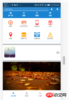
Let’s take another look at the effect of the mimic frame:

The effect is like this!
The plug-ins are ready, let’s type the code!
First is the CSS: Here is a small reminder, I am using Google Chrome, and the CSS3 style is not suitable for browsing in lower versions. The server is incompatible, so it’s more troublesome! I’ll have an article about compatibility issues in a few days!
1 <style> 2 body{ 3 margin: 0 auto; 4 padding: 0; 5 } 6 nav{ 7 width: 100%; 8 height: 35px; 9 } 10 article{ 11 width: 100%; 12 background-color: #1983D1; 13 } 14 .div2{ 15 width: 100%; 16 height: 30px; 17 line-height: 30px; 18 background-color: #1983D1; 19 } 20 .div2>input{ 21 width: 78%; 22 height: 25px; 23 border: 0; 24 background-color: #2F8DD5; 25 /*border: 1px solid #2F8DD5;*/ 26 border-radius: 5px; 27 margin-left: 1vw;; 28 } 29 /*改变输入框 提示字体颜色*/ 30 input::placeholder{ 31 color: #8DC0E4; 32 } 33 .div2>button{ 34 width: 9%; 35 height: 25px; 36 background-color: #1983D1; 37 border: 0; 38 font-size: 3vw; 39 color: white; 40 } 41 .section1>ul{ 42 list-style: none; 43 display: flex; 44 justify-content:space-around; 45 align-items:center; 46 width: 100%; 47 height: 10vw; 48 margin-left: -30px; 49 } 50 .section1>ul>li{ 51 width: 24%; 52 color: white; 53 font-size: 2.5vw; 54 text-align: center; 55 margin-top: 2px; 56 } 57 .section2{ 58 background-color: white; 59 width: 100%; 60 } 61 62 .section2>ul{ 63 64 list-style: none; 65 display: flex; 66 justify-content:space-around; 67 align-items:center; 68 width: 100%; 69 height: 6rem; 70 margin-left: -30px; 71 } 72 .section2>ul>li{ 73 width: 24%; 74 /*color: white;*/ 75 font-size: 2vw; 76 text-align: center; 77 margin-top: 2px; 78 } 79 .section2>ul>li>span{ 80 font-size: 2.5rem; 81 } 82 .section3{ 83 width: 100%; 84 height: 90px; 85 line-height: 90px; 86 } 87 .section3 img{ 88 width: 20%; 89 height: 90px; 90 margin-top: -10px; 91 margin-left: 2vw; 92 border-radius: 15px; 93 } 94 .section4{ 95 margin-top: -4vw; 96 width: 100%; 97 height: 49vw; 98 } 99 .section4>img{100 width: 100%;101 height: 49vw;102 }103 footer>ul{104 width: 100%;105 height: 50px;106 /*line-height: 98px;*/107 list-style: none;108 display: flex;109 justify-content: space-between;110 margin-left: -1.5vw;111 }112 footer>ul>li{113 width: 24%;114 height: 48px;115 font-size: 3vw;116 text-align: center;117 color: #A9A9A9;118 margin-top: 3vw;119 }120 </style>CSS is ready.
Let’s follow Type the HTML:
<body>
		<nav>
			<img src="1.png" style="width: 100%;height: 35px;" />
		</nav>
		<div class="div1"></div>
		<div class="div2">
			<input type="search" placeholder="   蚂蚁花呗" />
			<button><span class="icon icon-user-tie"></span></button>
			<button data-toggle="modal" data-target="#kuang" data-backdrop="true"><span class="icon icon-plus"></span></button>
		</div>
		<!--模态框-->
		<div class="modal fade modal-sm" id="kuang" style="width: 30%; margin-left: 65%;">
			<div class="modal-dialog modal-sm">
				<div class="modal-content">
					<!--体-->
					<div class="modal-body">
						<ul style="list-style: none; color:#6B6B6B;font-size: 2vw;">
							<li><span class="icon icon-bubbles4" style="margin-left: -3vw;"></span>  发起群聊</li>
							<li><span class="icon icon-user-plus" style="margin-left: -3vw;"></span>  添加朋友</li>
							<li><span class="icon icon-qrcode" style="margin-left: -3vw;"></span>  扫 一 扫</li>
							<li><span class="icon icon-coin-euro" style="margin-left: -3vw;"></span>  我要收款</li>
						</ul>
					</div>
				</div>
			</div>
		</div>
		<article>
			<section class="section1">
				<ul>
					<li>
						<span class="glyphicon glyphicon-qrcode"></span>
						<div>扫一扫</div>
					</li>
					<li>
						<span class="glyphicon glyphicon-usd"></span>
						<div>付款</div>
					</li>
					<li>
						<span class="glyphicon glyphicon-gbp"></span>
						<div>收钱</div>
					</li>
					<li>
						<span class="n glyphicon glyphicon-credit-card"></span>
						<div>卡包</div>
					</li>
				</ul>
			</section>

			<section class="section2">
				<ul>
					<li>
						<span class="icon icon-coin-yen" style="color: #EE4A02;"></span>
						<div>转账</div>
					</li>
					<li>
						<span class="icon icon-credit-card" style="color: #EE4A02;"></span>
						<div>信用卡还贷</div>
					</li>
					<li>
						<span class="icon icon-mobile" style="color: red;"></span>
						<div>充值中心</div>
					</li>
					<li>
						<span class="icon icon-gift" style="color: red;"></span>
						<div>红包</div>
					</li>
				</ul>
				<ul>
					<li>
						<span class="icon icon-location" style="color: red;"></span>
						<div>地图</div>
					</li>
					<li>
						<span class="icon icon-database" style="color: orange;"></span>
						<div>理财产品</div>
					</li>
					<li>
						<span class="icon icon-connection" style="background-color: #1983D1;color: white;"></span>
						<div>免费无线</div>
					</li>
					<li>
						<span class="icon icon-warning" style="color: orange;"></span>
						<div>安全须知</div>
					</li>
				</ul>
			</section>
		</article>
		<hr style="background-color: #C3C3C3;width: 100%; height: 10px;" />

		<section class="section3">
			<img src="2.png" class="img-responsive" />
			<span class="icon icon-camera pull-right" style="margin-top: -11.5vw;font-size: 5vw;margin-right: 2vw;color:#C3C3C3;"></span>
		</section>
		<hr style="background-color: #C3C3C3;width: 100%; height: 10px;" />
		<section class="section4">
			<img src="3.png" class="img-responsive" />
		</section>
		<footer>
			<ul>
				<li style="color: #1983D1;">
					<span class="icon icon-svg"></span>
					<div>支付宝</div>
				</li>
				<li>
					<span class="icon icon-users"></span>
					<div>朋友</div>
				</li>
				<li>
					<span class="icon icon-hipster"></span>
					<div>口碑</div>
				</li>
				<li>
					<span class="icon icon-coin-dollar"></span>
					<div>我的</div>
				</li>
			</ul>
		</footer>

		<script src="../jquery-3.1.1.min.js?1.1.10"></script>
		<script src="../dist/js/bootstrap.js?1.1.10"></script>
	</body>
That’s what HTML looks like!
I also have a responsive layout code! It converts all rem into px:
<script>
(function(doc) {
function changeSize() {
var size = doc.documentElement.clientWidth / 320 * 10;
doc.querySelector('html').style.fontSize = size + 'px';
}
window.onresize = changeSize;
changeSize();
})(document)
</script>Okay! This is the Alipay homepage combined with the Bootstrap mimicry box!
[Related video recommendations: Bootstrap tutorial]
If you don’t understand anything, please feel free to ask in the comments! I will answer them one by one when I see them!
The above is the detailed content of Bootstrap mimicry box + Alipay homepage. For more information, please follow other related articles on the PHP Chinese website!

Hot AI Tools

Undresser.AI Undress
AI-powered app for creating realistic nude photos

AI Clothes Remover
Online AI tool for removing clothes from photos.

Undress AI Tool
Undress images for free

Clothoff.io
AI clothes remover

Video Face Swap
Swap faces in any video effortlessly with our completely free AI face swap tool!

Hot Article
Hot Tools

Notepad++7.3.1
Easy-to-use and free code editor

SublimeText3 Chinese version
Chinese version, very easy to use

Zend Studio 13.0.1
Powerful PHP integrated development environment

Dreamweaver CS6
Visual web development tools

SublimeText3 Mac version
God-level code editing software (SublimeText3)
Hot Topics
 1386
1386
 52
52

 How to get the bootstrap search bar
Apr 07, 2025 pm 03:33 PM
How to get the bootstrap search bar
Apr 07, 2025 pm 03:33 PM
How to use Bootstrap to get the value of the search bar: Determines the ID or name of the search bar. Use JavaScript to get DOM elements. Gets the value of the element. Perform the required actions.
 How to use bootstrap in vue
Apr 07, 2025 pm 11:33 PM
How to use bootstrap in vue
Apr 07, 2025 pm 11:33 PM
Using Bootstrap in Vue.js is divided into five steps: Install Bootstrap. Import Bootstrap in main.js. Use the Bootstrap component directly in the template. Optional: Custom style. Optional: Use plug-ins.
 How to do vertical centering of bootstrap
Apr 07, 2025 pm 03:21 PM
How to do vertical centering of bootstrap
Apr 07, 2025 pm 03:21 PM
Use Bootstrap to implement vertical centering: flexbox method: Use the d-flex, justify-content-center, and align-items-center classes to place elements in the flexbox container. align-items-center class method: For browsers that do not support flexbox, use the align-items-center class, provided that the parent element has a defined height.
 How to write split lines on bootstrap
Apr 07, 2025 pm 03:12 PM
How to write split lines on bootstrap
Apr 07, 2025 pm 03:12 PM
There are two ways to create a Bootstrap split line: using the tag, which creates a horizontal split line. Use the CSS border property to create custom style split lines.
 How to insert pictures on bootstrap
Apr 07, 2025 pm 03:30 PM
How to insert pictures on bootstrap
Apr 07, 2025 pm 03:30 PM
There are several ways to insert images in Bootstrap: insert images directly, using the HTML img tag. With the Bootstrap image component, you can provide responsive images and more styles. Set the image size, use the img-fluid class to make the image adaptable. Set the border, using the img-bordered class. Set the rounded corners and use the img-rounded class. Set the shadow, use the shadow class. Resize and position the image, using CSS style. Using the background image, use the background-image CSS property.
 How to set up the framework for bootstrap
Apr 07, 2025 pm 03:27 PM
How to set up the framework for bootstrap
Apr 07, 2025 pm 03:27 PM
To set up the Bootstrap framework, you need to follow these steps: 1. Reference the Bootstrap file via CDN; 2. Download and host the file on your own server; 3. Include the Bootstrap file in HTML; 4. Compile Sass/Less as needed; 5. Import a custom file (optional). Once setup is complete, you can use Bootstrap's grid systems, components, and styles to create responsive websites and applications.
 How to resize bootstrap
Apr 07, 2025 pm 03:18 PM
How to resize bootstrap
Apr 07, 2025 pm 03:18 PM
To adjust the size of elements in Bootstrap, you can use the dimension class, which includes: adjusting width: .col-, .w-, .mw-adjust height: .h-, .min-h-, .max-h-
 How to use bootstrap button
Apr 07, 2025 pm 03:09 PM
How to use bootstrap button
Apr 07, 2025 pm 03:09 PM
How to use the Bootstrap button? Introduce Bootstrap CSS to create button elements and add Bootstrap button class to add button text
