

Flexible box model: Cognition and use of flex box

Flexible box model
Layout scheme
Traditional layout schemes are mostly implemented using div+css+float+position+display, but with the introduction of the flexible box model in css3, in There is another powerful option in the front-end layout plan.
Because I have been studying small programs recently, I found that using a flexible box layout is more effective and more efficient, so I compiled the relevant knowledge points of the flexible box model and shared them with everyone.
Flexible box model flex layout introduction
Flexbox model (flexbox), also known as flexible layout, is a newly proposed layout method in CSS3. Through flexible layout, child elements can be automatically Adjust the width and height to nicely fill the display space of any display device of different screen sizes.
The flexible box model is completely different from the previous layout method. Although it still uses the div+css method, it replaces the previously used float with a flexible layout. This makes the layout of page elements simpler.
Different from the grid system we will learn later, flexible layout is more suitable for application components and small-scale layout.
Previously, flex went through three iterations, each iteration produced a different syntax. Currently we are learning to follow the final version of the syntax. Because previous versions needed to consider compatibility issues when using them, and with the latest version, all browsers support the ultimate specification without prefixes.
Flexible box model awareness
The flex layout method is a complete layout module, not just a certain attribute. The layout of flex mainly depends on the parent container and elements.
The parent container is called flex container (flex container) and its child elements are called flex items (flex elements).
The core of the entire flex layout lies in its method, arrangement and order.
Using the Flexible Box Model
If you want to use flex layout, you must first use display:flex or display:inline-flex to set the parent container.
display:flex After setting the parent element, the entire parent element will become a flexible container, but it will be a block-level element.
display: After setting inline-flex to the parent element, the entire parent element will become a flexible container, but it will be an inline block-level element, somewhat similar to the effect of inline-block.
When the parent container sets this attribute, all the child elements inside become flex items (flex elements) by default
Tip: Flex layout belongs to another set of layout methods we have learned before. layout scheme, so after using flex layout, some properties such as Block", "inline", "float" and "text-align" will become invalid.
<!DOCTYPE html>
<html lang="en">
<head>
    <meta charset="UTF-8">
    <title>Document</title>
    <style>
        .container-flex {
            width: 600px;
            border:1px solid #ccc;
            display:flex;
        }
        .container-inline {
            width: 600px;
            border:1px solid #ccc;
            display:inline-flex;
        }
        .container-flex div {
            width: 200px;
            height: 200px;
            background-color: orange;
        }
        .container-inline div {
            width: 200px;
            height: 200px;
            background-color: orange;
        }
    </style>
</head>
<body>
    <div class="container-flex">
        <div>1</div>
        <div>2</div>
        <div>3</div>
        <div>4</div>
    </div>
    <div class="container-flex">
        <div>1</div>
        <div>2</div>
        <div>3</div>
        <div>4</div>
    </div>
    <div class="container-inline">
        <div>1</div>
        <div>2</div>
        <div>3</div>
        <div>4</div>
    </div>
    <div class="container-inline">
        <div>1</div>
        <div>2</div>
        <div>3</div>
        <div>4</div>
    </div>
</body>
</html>The execution effect is as follows:

Explanation of essential terms
Before using the flexible box model, you need to understand some basic conceptual terms of the flexible box model
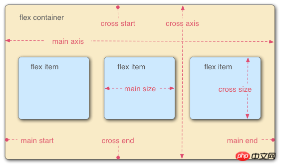
main axis main axis##. #cross axis The cross axis/side axis is perpendicular to the main axis
main start The starting point of the main axis
main end The end point of the main axis
cross start The starting point of the cross axis
cross end The end point of the cross axis
<!DOCTYPE html>
<html lang="en">
<head>
    <meta charset="UTF-8">
    <title>Document</title>
    <style>
        #item-container {
            display: flex;/*启用flex布局*/
            background-color: pink;
        }
        .square {
            width: 200px;
            height: 200px;
            background-color: orange;
        }
        .circle {
            border-radius: 50%;
            width: 150px;
            height: 150px;
            background-color: green;
        }
    </style>
</head>
<body>
    <div id="item-container">
        <div class="circle"></div>
        <div class="square"></div>
        <div class="circle"></div>
    </div>
</body>
</html>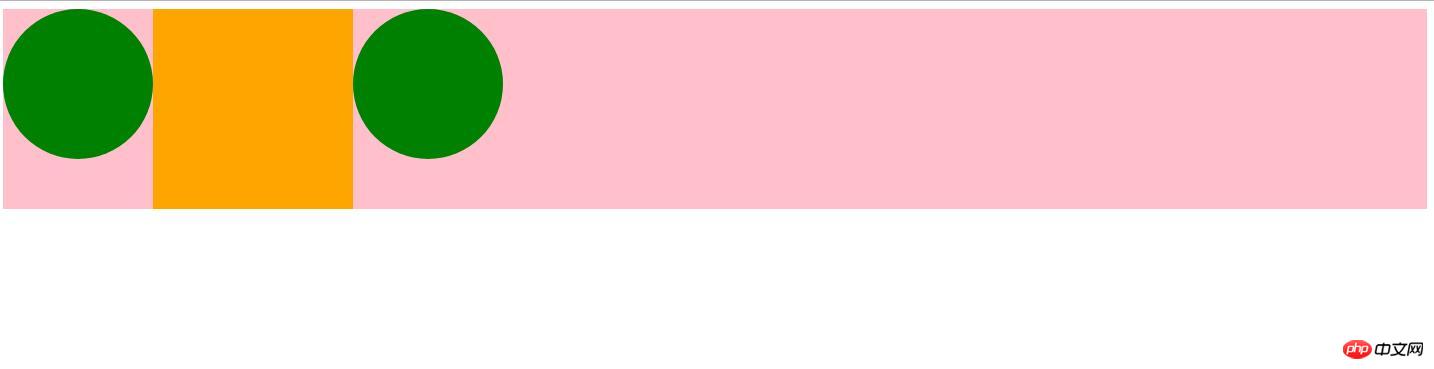
① Enable flex layout display:flex
② After the parent element sets display:flex, the child elements of the parent element will automatically become the child elements of the flexible box,
Called flex items
③ By default, all flex-items will be aligned according to the top and left side of the flex container
<!DOCTYPE html>
<html lang="en">
<head>
    <meta charset="UTF-8">
    <title>Document</title>
    <style>
        #item-container {
            display: flex;/*启用flex布局*/
            background-color: pink;
            justify-content:flex-start;/*默认*/
            justify-content:flex-end;/*在主轴的末端对其*/
            justify-content:center;/*在主轴的中间对其*/
            justify-content:space-between;/*在整个主轴中平均分配空间,无论其中有多少个元素*/
            justify-content:space-around;/*Flex-item 默认会被均匀的分布,但是每一个
                                        都会在其给定的空间内居中显示。*/
            align-items:center;/*让items在垂直方向上居中*/
        }
        .square {
            width: 200px;
            height: 200px;
            background-color: orange;
        }
        .circle {
            border-radius: 50%;
            width: 150px;
            height: 150px;
            background-color: green;
        }
    </style>
</head>
<body>
    <div id="item-container">
        <div class="circle"></div>
        <div class="square"></div>
        <div class="circle"></div>
    </div>
</body>
</html>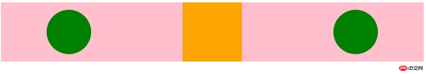
justify-content: flex-start / flex-end /center /space-between /space-around
We can also center items in the vertical direction through the align-items:center attribute
<!DOCTYPE html>
<html lang="en">
<head>
    <meta charset="UTF-8">
    <title>Document</title>
    <style>
        #item-container {
            display: flex;/*启用flex布局*/
            background-color: pink;
            justify-content:flex-start;/*默认*/
            justify-content:flex-end;/*在主轴的末端对其*/
            justify-content:center;/*在主轴的中间对其*/
            justify-content:space-between;/*在整个主轴中平均分配空间,无论其中有多少个元素*/
            justify-content:space-around;/*Flex-item 默认会被均匀的分布,但是每一个
                                        都会在其给定的空间内居中显示。*/
            align-items:center;/*让items在垂直方向上居中*/
        }
        .square {
            width: 200px;
            height: 200px;
            background-color: orange;
            order: -1; /*让正方形显示在第一位而不是中间*/
        }
        .circle {
            border-radius: 50%;
            width: 150px;
            height: 150px;
            background-color: green;
        }
    </style>
</head>
<body>
    <div id="item-container">
        <div class="circle"></div>
        <div class="square"></div>
        <div class="circle"></div>
    </div>
</body>
</html>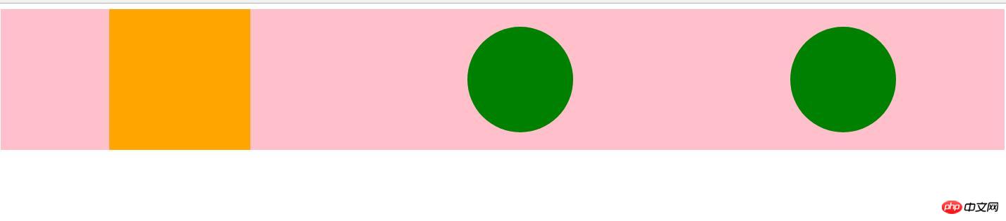
row | row-reverse | column | column-reverse
row 默认值,子元素会排列在一行 从主轴左侧开始
row-reverse 子元素会排列在一行。不过是从右侧开始
column 子元素垂直显示,从侧轴起始点开始
column-reverse 垂直显示,不过从结束点开始
实例代码:
<!DOCTYPE html>
<html lang="en">
<head>
    <meta charset="UTF-8">
    <title>Document</title>
    <style>
        .container {
            width: 100%;
            height: 500px;
            border:1px solid #ccc;
            display:flex;
            flex-direction: row-reverse;
            flex-direction: column;
            flex-direction: column-reverse;
        }
        .container div {
            width: 100px;
            height: 100px;
            background-color: orange;
        }
    </style>
</head>
<body>
    <div class="container">
        <div>1</div>
        <div>2</div>
        <div>3</div>
    </div>
</body>
</html>2.flex-wrap 控制容器内的子元素是被强制放在一行中或者是被放在多个行上 。如果允许换行,这个属性允许你控制行的堆叠方向。
语法:
nowrap | wrap | wrap-reverse
nowrap 所有的元素被摆在一行 默认值
wrap 当一行元素过多,则允许元素 换行
wrap-reverse 将侧轴起点和终点颠倒
实例代码:
<!DOCTYPE html>
<html lang="en">
<head>
<meta charset="UTF-8">
<title>Document</title>
<style>
    .container {
        width: 600px;
        height: 500px;
        border:1px solid #ccc;
        display:flex;
        flex-wrap:wrap;
        flex-wrap:wrap-reverse;
    }
    .container div {
        width: 200px;
        height: 100px;
        background-color: orange;
    }
</style>
</head>
<body>
<div class="container">
    <div>1</div>
    <div>2</div>
    <div>3</div>
    <div>4</div>
    <div>5</div>
    <div>6</div>
    <div>7</div>
    <div>8</div>
    <div>9</div>
    <div>10</div>
</div>
</body>
</html>3.justify-content 属性定义了浏览器如何分配顺着父容器主轴的弹性(flex)元素之间及其周围的空间。
语法:
flex-start | flex-end | center | space-between | space-around
flex-start : 从行首开始排列。每行第一个弹性元素与行首对齐,同时所有后续的弹性元素与前一个对齐。默认
flex-end : 从行尾开始排列。每行最后一个弹性元素与行尾对齐,其他元素将与后一个对齐
center : 伸缩元素向每行中点排列。每行第一个元素到行首的距离将与每行最后一个元素到行尾的距离相同
space-between : 在每行上均匀分配弹性元素。相邻元素间距离相同。每行第一个元素与行首 对齐,每行最后一个元素与行尾对齐。
space-around : 在每行上均匀分配弹性元素。相邻元素间距离相同。每行第一个元素到行首的距离和每行最后一个元素到行尾的距离将会是相邻元素之间距离的一半。
实例代码:
参考上面的实例2.
4.align-items 属性以与justify-content相同的方式在侧轴方向上将当前行上的弹性元素对齐。
语法:
flex-start | flex-end | center | baseline | stretch
align-items: flex-start; 对齐到侧轴起点
align-items: flex-end; 对齐到侧轴终点
align-items: center; 在侧轴上居中
align-items: baseline; 与基准线对齐
align-items: stretch; 拉伸元素以适应 默认值
实例代码:
<!DOCTYPE html>
<html lang="en">
<head>
<meta charset="UTF-8">
<title>Document</title>
<style>
    #item-container {
        display: flex;/*启用flex布局*/
        background-color: pink;
        justify-content:space-around;
        align-items:baseline;/*与基准线对齐*/
    }
    .square {
        width: 200px;
        height: 200px;
        background-color: orange;
    }
    .circle {
        border-radius: 50%;
        width: 150px;
        height: 150px;
        background-color: green;
    }
    .container {
        width: 500px;
        height: 600px;
        border:1px solid #ccc;
        display:flex;
        align-items: stretch;
    }
    .container div {
        width: 100px;
        background-color:red;
        border:1px solid green;
    }
</style>
</head>
<body>
<div id="item-container">
    <div class="circle"></div>
    <div class="square"></div>
    <div class="circle"></div>
</div>
<!-- <div class="container">
    <div>1</div>
    <div>2</div>
</div> -->
</body>
</html>5.align-content 多行对其方式,如果只有一行,则失效。
语法:
flex-start | flex-end | center | space-between | space-around | stretch
flex-start : 与交叉轴的起点对其
flex-end : 与交叉轴的终点对其
center : 与交叉轴的中点对其
space-between : 与交叉轴两端对其,轴线之间的间隔平均分布
space-around: 所有行在容器中平均分布,相邻两行间距相等。容器的垂直轴起点边和终点边分别与第一行和最后一行的距离是相邻两行间距的一半。
stretch :拉伸所有行来填满剩余空间。剩余空间平均的分配给每一行
实例代码:
<!DOCTYPE html>
<html lang="en">
<head>
    <meta charset="UTF-8">
    <title>Document</title>
    <style>
        .container {
            width: 600px;
            height: 900px;
            border:1px solid #ccc;
            display:flex;
            flex-wrap:wrap;
            align-content:flex-start;
            align-content:flex-end;
            align-content:center;
            align-content:space-between;
            align-content:space-around;
            align-content:stretch; /*默认*/
        }
        .container div {
            width: 200px;
            height: 80px;
            background-color: orange;
        }
    </style>
</head>
<body>
    <div class="container">
        <div>1</div>
        <div>2</div>
        <div>3</div>
        <div>4</div>
        <div>5</div>
        <div>6</div>
        <div>7</div>
        <div>8</div>
        <div>9</div>
        <div>10</div>
    </div>
</body>
</html>弹性元素属性 -- 给子元素设置的属性
order order属性规定了弹性容器中的可伸缩项目在布局时的顺序。元素按照order属性的值的增序进行布局。拥有相同order属性值的元素按照它们在源代码中出现的顺序进行布局。
语法:
order:
align-self 定义flex子项单独在侧轴(纵轴)方向上的对齐方式
语法:
stretch|center|flex-start|flex-end|baseline
flex-grow 定义弹性盒子元素扩展比率
flex-shrink 定义弹性盒子元素的收缩比率
flex-basis 指定了flex item在主轴方向上的初始大小。如果不使用box-sizing来
改变盒模型的话,那么这个属性就决定了flex item的内容盒content-box)的宽 或者高(取决于主轴的方向)的尺寸大小。
Tip:需要注意的是,在上面的最后的flex-grow、flex-shrink、flex-basis 三个属性最好相互搭配使用。
实例:
<!DOCTYPE html>
<html>
<head>
<meta charset="utf-8">
<style>
#main {
    width: 350px;
    height: 100px;
    border: 1px solid #c3c3c3;
    display: flex;
}

#main div {
    flex-grow: 1;
    flex-shrink: 1;
    flex-basis: 100px;
}

#main div:nth-of-type(2) {
    flex-shrink: 3;
}
</style>
</head>
<body>

<div id="main">
  <div style="background-color:coral;"></div>
  <div style="background-color:lightblue;"></div>
  <div style="background-color:khaki;"></div>
  <div style="background-color:pink;"></div>
  <div style="background-color:lightgrey;"></div>
</div>
</body>
</html>ok,上面大概就是一些常用的弹性盒子模型flex-box常用的属性,上面的实例很多只是给了代码,没有给效果图,是因为希望正在学习弹性盒子模型的同志们最好把代码实际的敲一下,并且亲自尝试不同的属性值,来分析不同属性带来的不同的效果。
弹性盒子模型难度不大,但是却与传统的布局方案有很大的差别。
The above is the detailed content of Flexible box model: Cognition and use of flex box. For more information, please follow other related articles on the PHP Chinese website!

Hot AI Tools

Undresser.AI Undress
AI-powered app for creating realistic nude photos

AI Clothes Remover
Online AI tool for removing clothes from photos.

Undress AI Tool
Undress images for free

Clothoff.io
AI clothes remover

AI Hentai Generator
Generate AI Hentai for free.

Hot Article
Hot Tools

Notepad++7.3.1
Easy-to-use and free code editor

SublimeText3 Chinese version
Chinese version, very easy to use

Zend Studio 13.0.1
Powerful PHP integrated development environment

Dreamweaver CS6
Visual web development tools

SublimeText3 Mac version
God-level code editing software (SublimeText3)
Hot Topics
 1378
1378
 52
52

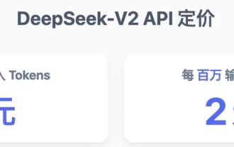 The world's most powerful open source MoE model is here, with Chinese capabilities comparable to GPT-4, and the price is only nearly one percent of GPT-4-Turbo
May 07, 2024 pm 04:13 PM
The world's most powerful open source MoE model is here, with Chinese capabilities comparable to GPT-4, and the price is only nearly one percent of GPT-4-Turbo
May 07, 2024 pm 04:13 PM
Imagine an artificial intelligence model that not only has the ability to surpass traditional computing, but also achieves more efficient performance at a lower cost. This is not science fiction, DeepSeek-V2[1], the world’s most powerful open source MoE model is here. DeepSeek-V2 is a powerful mixture of experts (MoE) language model with the characteristics of economical training and efficient inference. It consists of 236B parameters, 21B of which are used to activate each marker. Compared with DeepSeek67B, DeepSeek-V2 has stronger performance, while saving 42.5% of training costs, reducing KV cache by 93.3%, and increasing the maximum generation throughput to 5.76 times. DeepSeek is a company exploring general artificial intelligence
 AI subverts mathematical research! Fields Medal winner and Chinese-American mathematician led 11 top-ranked papers | Liked by Terence Tao
Apr 09, 2024 am 11:52 AM
AI subverts mathematical research! Fields Medal winner and Chinese-American mathematician led 11 top-ranked papers | Liked by Terence Tao
Apr 09, 2024 am 11:52 AM
AI is indeed changing mathematics. Recently, Tao Zhexuan, who has been paying close attention to this issue, forwarded the latest issue of "Bulletin of the American Mathematical Society" (Bulletin of the American Mathematical Society). Focusing on the topic "Will machines change mathematics?", many mathematicians expressed their opinions. The whole process was full of sparks, hardcore and exciting. The author has a strong lineup, including Fields Medal winner Akshay Venkatesh, Chinese mathematician Zheng Lejun, NYU computer scientist Ernest Davis and many other well-known scholars in the industry. The world of AI has changed dramatically. You know, many of these articles were submitted a year ago.
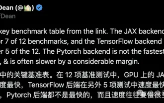 Google is ecstatic: JAX performance surpasses Pytorch and TensorFlow! It may become the fastest choice for GPU inference training
Apr 01, 2024 pm 07:46 PM
Google is ecstatic: JAX performance surpasses Pytorch and TensorFlow! It may become the fastest choice for GPU inference training
Apr 01, 2024 pm 07:46 PM
The performance of JAX, promoted by Google, has surpassed that of Pytorch and TensorFlow in recent benchmark tests, ranking first in 7 indicators. And the test was not done on the TPU with the best JAX performance. Although among developers, Pytorch is still more popular than Tensorflow. But in the future, perhaps more large models will be trained and run based on the JAX platform. Models Recently, the Keras team benchmarked three backends (TensorFlow, JAX, PyTorch) with the native PyTorch implementation and Keras2 with TensorFlow. First, they select a set of mainstream
 Hello, electric Atlas! Boston Dynamics robot comes back to life, 180-degree weird moves scare Musk
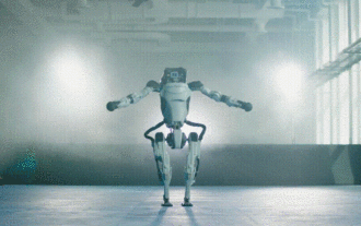
Apr 18, 2024 pm 07:58 PM
Hello, electric Atlas! Boston Dynamics robot comes back to life, 180-degree weird moves scare Musk
Apr 18, 2024 pm 07:58 PM
Boston Dynamics Atlas officially enters the era of electric robots! Yesterday, the hydraulic Atlas just "tearfully" withdrew from the stage of history. Today, Boston Dynamics announced that the electric Atlas is on the job. It seems that in the field of commercial humanoid robots, Boston Dynamics is determined to compete with Tesla. After the new video was released, it had already been viewed by more than one million people in just ten hours. The old people leave and new roles appear. This is a historical necessity. There is no doubt that this year is the explosive year of humanoid robots. Netizens commented: The advancement of robots has made this year's opening ceremony look like a human, and the degree of freedom is far greater than that of humans. But is this really not a horror movie? At the beginning of the video, Atlas is lying calmly on the ground, seemingly on his back. What follows is jaw-dropping
 KAN, which replaces MLP, has been extended to convolution by open source projects
Jun 01, 2024 pm 10:03 PM
KAN, which replaces MLP, has been extended to convolution by open source projects
Jun 01, 2024 pm 10:03 PM
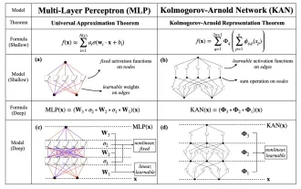
Earlier this month, researchers from MIT and other institutions proposed a very promising alternative to MLP - KAN. KAN outperforms MLP in terms of accuracy and interpretability. And it can outperform MLP running with a larger number of parameters with a very small number of parameters. For example, the authors stated that they used KAN to reproduce DeepMind's results with a smaller network and a higher degree of automation. Specifically, DeepMind's MLP has about 300,000 parameters, while KAN only has about 200 parameters. KAN has a strong mathematical foundation like MLP. MLP is based on the universal approximation theorem, while KAN is based on the Kolmogorov-Arnold representation theorem. As shown in the figure below, KAN has
 FisheyeDetNet: the first target detection algorithm based on fisheye camera
Apr 26, 2024 am 11:37 AM
FisheyeDetNet: the first target detection algorithm based on fisheye camera
Apr 26, 2024 am 11:37 AM
Target detection is a relatively mature problem in autonomous driving systems, among which pedestrian detection is one of the earliest algorithms to be deployed. Very comprehensive research has been carried out in most papers. However, distance perception using fisheye cameras for surround view is relatively less studied. Due to large radial distortion, standard bounding box representation is difficult to implement in fisheye cameras. To alleviate the above description, we explore extended bounding box, ellipse, and general polygon designs into polar/angular representations and define an instance segmentation mIOU metric to analyze these representations. The proposed model fisheyeDetNet with polygonal shape outperforms other models and simultaneously achieves 49.5% mAP on the Valeo fisheye camera dataset for autonomous driving
 Tesla robots work in factories, Musk: The degree of freedom of hands will reach 22 this year!
May 06, 2024 pm 04:13 PM
Tesla robots work in factories, Musk: The degree of freedom of hands will reach 22 this year!
May 06, 2024 pm 04:13 PM
The latest video of Tesla's robot Optimus is released, and it can already work in the factory. At normal speed, it sorts batteries (Tesla's 4680 batteries) like this: The official also released what it looks like at 20x speed - on a small "workstation", picking and picking and picking: This time it is released One of the highlights of the video is that Optimus completes this work in the factory, completely autonomously, without human intervention throughout the process. And from the perspective of Optimus, it can also pick up and place the crooked battery, focusing on automatic error correction: Regarding Optimus's hand, NVIDIA scientist Jim Fan gave a high evaluation: Optimus's hand is the world's five-fingered robot. One of the most dexterous. Its hands are not only tactile
 DualBEV: significantly surpassing BEVFormer and BEVDet4D, open the book!
Mar 21, 2024 pm 05:21 PM
DualBEV: significantly surpassing BEVFormer and BEVDet4D, open the book!
Mar 21, 2024 pm 05:21 PM
This paper explores the problem of accurately detecting objects from different viewing angles (such as perspective and bird's-eye view) in autonomous driving, especially how to effectively transform features from perspective (PV) to bird's-eye view (BEV) space. Transformation is implemented via the Visual Transformation (VT) module. Existing methods are broadly divided into two strategies: 2D to 3D and 3D to 2D conversion. 2D-to-3D methods improve dense 2D features by predicting depth probabilities, but the inherent uncertainty of depth predictions, especially in distant regions, may introduce inaccuracies. While 3D to 2D methods usually use 3D queries to sample 2D features and learn the attention weights of the correspondence between 3D and 2D features through a Transformer, which increases the computational and deployment time.
