 Web Front-end
 JS Tutorial
 Detailed explanation of examples of implementing Ant Design custom form components
Detailed explanation of examples of implementing Ant Design custom form components
Ant Design component provides Input, InputNumber, Radio, Select, uplod and other form components , but in actual development, this cannot meet the needs. At the same time, we hope to continue to use the verification and prompt methods provided by Form (it is really fun to use). At this time, we need to encapsulate some forms ourselves, and at the same time, we must keep the method can continue is to use.
The source code of the component
Let’s take a look at how to encapsulate the form component yourself. This is the most basic form usage example:
 1 import React, { PureComponent } from 'react'
 2 import { Button, Form, Input, Radio } from 'antd'
 3 import FormItem from 'components/FormItem'
 4
 5 const RadioGroup = Radio.Group
 6 const options = [
 7     { label: '男', value: 1 },
 8     { label: '女', value: 2 },
 9 ]
 10
 11 class Test extends PureComponent {
 12     handleSubmit = (e) => {
 13         e.preventDefault();
 14
 15         const { form: { validateFields } } = this.props;
 16
 17         validateFields((errors, values) => {
 18             if (errors) {
 19                 return;
 20             }
 21             console.log(values)
 22         })
 23     }
 24
 25     render() {
 26         const { form: { getFieldDecorator } } = this.props
 27
 28         const nameDecorator = getFieldDecorator('name')
 29         const sexDecorator = getFieldDecorator('sex')
 30
 31         return (
 32             <section>
 33                 <Form layout="horizontal" onSubmit={this.handleSubmit}>
 34                     <FormItem label="姓名">
 35                         {nameDecorator(<Input />)}
 36                     </FormItem>
 37
 38                     <FormItem label="年龄">
 39                         {sexDecorator(<RadioGroup options={options} />)}
 40                     </FormItem>
 41
 42                     <FormItem buttonsContainer>
 43                         <Button type="primary" size="default" htmlType="submit">提交</Button>
 44                     </FormItem>
 45                 </Form>
 46             </section>
 47         );
 48     }
 49 }
 50
51 export default Form.create()(Test)Now the requirement requires us to implement multiple names Submit, then using the form provided by the UI component cannot be achieved.
Next we can encapsulate an InputArrary component:
 1 import React, { PureComponent } from 'react'
 2 import PropTypes from 'prop-types'
 3 import { Button, Icon, Input } from 'antd'
 4
 5 import './index.scss'
 6
 7 class InputArray extends PureComponent {
 8     constructor(props) {
 9         super(props)
 10     }
 11
 12     handleChange = index => {
 13         const { value, onChange } = this.props
 14         const newValue = [...value]
 15
 16         newValue[index] = target.value
 17
 18         onChange(newValue)
 19     }
 20
 21     handleDelete = e => {
 22         const target = e.currentTarget
 23         const index = target.parentNode.parentNode.firstChild.dataset.index
 24         const { value, onChange } = this.props
 25         const newValue = [...value]
 26
 27         newValue.splice(Number(index), 1)
 28
 29         onChange(newValue)
 30     }
 31
 32     handleAdd = () => {
 33         const { value, onChange } = this.props
 34         const newValue = [...value, '']
 35
 36         onChange(newValue)
 37     }
 38
 39     render() {
 40         const { value, ...others } = this.props
 41
 42         const closeBtn = <Icon type="close-circle" onClick={this.handleDelete} />
 43
 44         return (
 45             <p className="input-array-component">
 46                 {value.map((v, i) => {
 47                     return (
 48                         <p key={i}>
 49                             <Input
 50                                 {...others}
 51                                 value={v}
 52                                 suffix={closeBtn}
 53                                 data-index={i}
 54                                 onChange={() => this.handleChange(i)}
 55                             />
 56                         </p>
 57                     );
 58                 })}
 59                 <p>
 60                     <Button type="dashed" icon="plus" onClick={this.handleAdd}>添加</Button>
 61                 </p>
 62             </p>
 63         );
 64     }
 65 }
 66
 67 InputArray.defaultProps = {
 68     value: []
 69 }
 70
71 export default InputArrayThis way we can introduce the InputArray component just like the Input component to implement the submission of a set of names.
<FormItem label="姓名">{nameDecorator(<InputArray />)}
</FormItemThe form mainly used by the component provides the getFieldDecorator method. This method will inject the value parameter into the component. The onChange method calls onChange every time. All methods will change the value, thereby refreshing the entire component. Why is this? In fact, Ant Design will wrap a layer of components outside the form component and maintain a State value. Each onChange changes the external state value and calls setState to refresh the form component.
I also encountered a pitfall when using the Upload component. The upload address parameter of the Upload component action is also a required parameter. Each upload will be uploaded directly to the server and cannot be submitted together with the data of other forms. At this time, we must also Re-encapsulate an upload component. At the same time, because there are files or image data, you cannot use the json format to interact with the background. You must use the data format of new FormData() to upload, which is the submit submission of the native form.
Component source code
If it has provided you with some help, please click start to support it
The above is the detailed content of Detailed explanation of examples of implementing Ant Design custom form components. For more information, please follow other related articles on the PHP Chinese website!

Hot AI Tools

Undresser.AI Undress
AI-powered app for creating realistic nude photos

AI Clothes Remover
Online AI tool for removing clothes from photos.

Undress AI Tool
Undress images for free

Clothoff.io
AI clothes remover

AI Hentai Generator
Generate AI Hentai for free.

Hot Article

Hot Tools

Notepad++7.3.1
Easy-to-use and free code editor

SublimeText3 Chinese version
Chinese version, very easy to use

Zend Studio 13.0.1
Powerful PHP integrated development environment

Dreamweaver CS6
Visual web development tools

SublimeText3 Mac version
God-level code editing software (SublimeText3)

Hot Topics
 1377
1377
 52
52
 How to implement dual WeChat login on Huawei mobile phones?
Mar 24, 2024 am 11:27 AM
How to implement dual WeChat login on Huawei mobile phones? With the rise of social media, WeChat has become one of the indispensable communication tools in people's daily lives. However, many people may encounter a problem: logging into multiple WeChat accounts at the same time on the same mobile phone. For Huawei mobile phone users, it is not difficult to achieve dual WeChat login. This article will introduce how to achieve dual WeChat login on Huawei mobile phones. First of all, the EMUI system that comes with Huawei mobile phones provides a very convenient function - dual application opening. Through the application dual opening function, users can simultaneously
 PHP Programming Guide: Methods to Implement Fibonacci Sequence
Mar 20, 2024 pm 04:54 PM
The programming language PHP is a powerful tool for web development, capable of supporting a variety of different programming logics and algorithms. Among them, implementing the Fibonacci sequence is a common and classic programming problem. In this article, we will introduce how to use the PHP programming language to implement the Fibonacci sequence, and attach specific code examples. The Fibonacci sequence is a mathematical sequence defined as follows: the first and second elements of the sequence are 1, and starting from the third element, the value of each element is equal to the sum of the previous two elements. The first few elements of the sequence
 The operation process of edius custom screen layout
Mar 27, 2024 pm 06:50 PM
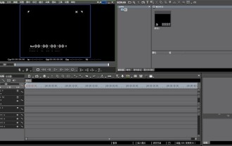
1. The picture below is the default screen layout of edius. The default EDIUS window layout is a horizontal layout. Therefore, in a single-monitor environment, many windows overlap and the preview window is in single-window mode. 2. You can enable [Dual Window Mode] through the [View] menu bar to make the preview window display the playback window and recording window at the same time. 3. You can restore the default screen layout through [View menu bar>Window Layout>General]. In addition, you can also customize the layout that suits you and save it as a commonly used screen layout: drag the window to a layout that suits you, then click [View > Window Layout > Save Current Layout > New], and in the pop-up [Save Current Layout] Layout] enter the layout name in the small window and click OK
 How to implement the WeChat clone function on Huawei mobile phones
Mar 24, 2024 pm 06:03 PM
How to implement the WeChat clone function on Huawei mobile phones With the popularity of social software and people's increasing emphasis on privacy and security, the WeChat clone function has gradually become the focus of people's attention. The WeChat clone function can help users log in to multiple WeChat accounts on the same mobile phone at the same time, making it easier to manage and use. It is not difficult to implement the WeChat clone function on Huawei mobile phones. You only need to follow the following steps. Step 1: Make sure that the mobile phone system version and WeChat version meet the requirements. First, make sure that your Huawei mobile phone system version has been updated to the latest version, as well as the WeChat App.
 Angular components and their display properties: understanding non-block default values
Mar 15, 2024 pm 04:51 PM
The default display behavior for components in the Angular framework is not for block-level elements. This design choice promotes encapsulation of component styles and encourages developers to consciously define how each component is displayed. By explicitly setting the CSS property display, the display of Angular components can be fully controlled to achieve the desired layout and responsiveness.
 Nothing shows brand new design of the CMF Watch Pro 2, reveals curious details about the CMF Phone 1
Jun 27, 2024 am 10:42 AM
Nothing already announced last week that three new products will be unveiled on July 8, 2024: the CMF Watch Pro 2, the CMF Phone 1, and the CMF Buds Pro 2. Now the manufacturer has released teaser images revealing new design details for these product
 How to customize x-axis and y-axis in excel? (How to customize excel axis scale)
Mar 14, 2024 pm 02:10 PM
In an excel table, sometimes you may need to insert coordinate axes to see the changing trend of the data more intuitively. Some friends still don’t know how to insert coordinate axes in the table. Next, I will share with you how to customize the coordinate axis scale in Excel. Coordinate axis insertion method: 1. In the excel interface, select the data. 2. In the insertion interface, click to insert a column chart or bar chart. 3. In the expanded interface, select the graphic type. 4. In the right-click interface of the table, click Select Data. 5. In the expanded interface, you can customize it.
 Master how Golang enables game development possibilities
Mar 16, 2024 pm 12:57 PM
In today's software development field, Golang (Go language), as an efficient, concise and highly concurrency programming language, is increasingly favored by developers. Its rich standard library and efficient concurrency features make it a high-profile choice in the field of game development. This article will explore how to use Golang for game development and demonstrate its powerful possibilities through specific code examples. 1. Golang’s advantages in game development. As a statically typed language, Golang is used in building large-scale game systems.


