

First introduction to Matplotlib
Initial exploration of Matplotlib
The example comes from this book: "Python Programming from Introduction to Practical Combat" [US] Eric Matthes
Using pyplot drawing, general import methodimport matplotlib.pyplot as plt
The following codes are all run in Jupyter Notebook
Line chart
Let’s look at a simple one first Example
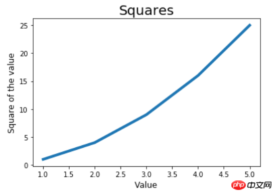
import matplotlib.pyplot as plt

in_values = [1, 2 ,3, 4, 5]
squares = [1, 4, 9 ,16, 25]# 第一个参数是X轴输入,第二个参数是对应的Y轴输出;linewidth绘制线条的粗细plt.plot(in_values, squares, linewidth=4)# 标题、X轴、Y轴plt.title('Squares', fontsize=20)
plt.xlabel('Value', fontsize=12)
plt.ylabel('Square of the value', fontsize=12)# plt.tick_params(axis='both', labelsize=15)plt.show()
The picture is as follows. You can see that the x-axis is too dense and even has decimals.
If you want only our sample values to appear on the x-axis, you can use the tick_params function to modify the size of the tick marks. Uncomment the second to last line in the above code to get the image below.
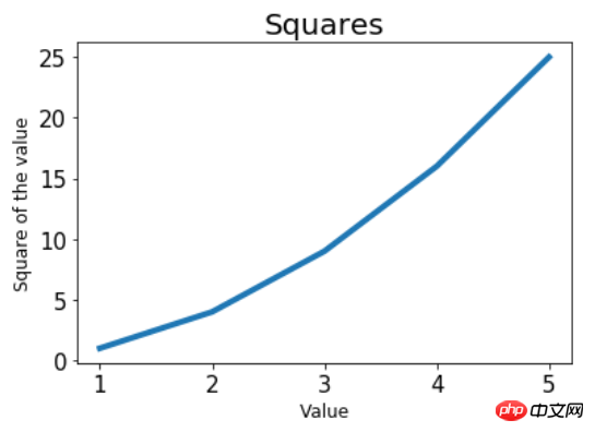
plt.tick_params(axis='both', labelsize=15), where axis=both means affecting x at the same time , the scale of the y-axis, labelsize specifies the font size of the scale. The larger the font size is, the fewer coordinate points will be displayed at the same length, and vice versa. Since labelsize is set larger than the default, the number of coordinate points displayed on the x and y axes becomes smaller. More in line with this example.
Scatter plot
It’s still the square example above. This time plotted using a scatter plot.
in_values = [1, 2 ,3, 4, 5]
squares = [1, 4, 9 ,16, 25]# s参数为点的大小plt.scatter(in_values, squares, s=80)
plt.title('Squares', fontsize=20)
plt.xlabel('Value', fontsize=12)
plt.ylabel('Square of the value', fontsize=12)
plt.tick_params(axis='both', labelsize=15)
plt.show()
As you can see, just replace plt.plot with plt.scatter, and the rest of the code remains basically unchanged.

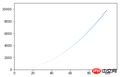
#If there are many input and output points, list comprehensions can be used. At the same time, you can specify the point color and point outline color. The default point color is blue and the outline is black.
x_values = list(range(1, 100))
y_values = [x**2 for x in x_values]# c参数指定点的颜色,轮廓的颜色不进行设置(none)plt.scatter(x_values, y_values, c='red', edgecolors='none' ,s=5)# x、y轴的坐标范围,注意提供一个列表,前两个是x轴的范围,后两个是y轴的范围plt.axis([0, 110, 0, 11000])
plt.show()
Color customization can also use RGB mode and pass a tuple to parameter c. The tuple contains three numbers between [0, 1], representing (R, G, B) respectively. The closer the number is to 0, the lighter the color, and the closer the number is to 1, the darker the color. For example, c=(0, 0, 0.6) represents a light blue color.
It’s still a square picture, so I won’t write a title if I’m too lazy.

Color mapping
A color map is usually a gradient of a series of colors. In visualization, color mapping can reflect the patterns of data. For example, lighter colors have smaller values and darker colors have larger values.
Look at a very simple example, mapping based on the size of the y-axis coordinate value.
x_values = list(range(1, 100))
y_values = [x**2 for x in x_values]# 颜色映射,按照y轴的值从浅到深,颜色采用蓝色plt.scatter(x_values, y_values, c=x_values, cmap=plt.cm.Blues, edgecolors='none' ,s=5)
plt.axis([0, 110, 0, 11000])# 取代show方法,保存图片到文件所在目录,bbox_inches='tight'可裁去多余的白边plt.savefig('squares_plot.png', bbox_inches='tight')
It can be seen that the color of points with small y value is very light and almost invisible; as the y value increases, the color becomes darker and darker.
Random walk simulation
First write a random walk class, the purpose is to randomly choose the direction to move forward
from random import choicedef get_step():"""    获得移动的步长    """# 分别代表正半轴和负半轴direction = choice([1, -1])# 随机选择一个距离distance = choice([0, 1, 2, 3, 4])
    step = direction * distancereturn stepclass RandomWalk:"""    一个生成随机漫步数据的类    """# 默认漫步5000步def __init__(self, num_points=5000):self.num_points = num_pointsself.x_values = [0]self.y_values = [0]def fill_walk(self):"""        计算随机漫步包含的所有点        """while len(self.x_values) < self.num_points:
            x_step = get_step()
            y_step = get_step()# 没有位移,跳过不取if x_step == 0 and y_step == 0:continue# 计算下一个点的x和y, 第一次为都0,以前的位置 + 刚才的位移 = 现在的位置next_x = self.x_values[-1] + x_step
next_y = self.y_values[-1] + y_stepself.x_values.append(next_x)self.y_values.append(next_y)Start drawing
import matplotlib.pyplot as plt


rw = RandomWalk()
rw.fill_walk()# figure的调用在plot或者scatter之前# plt.figure(dpi=300, figsize=(10, 6))# 这个列表包含了各点的漫步顺序,第一个元素将是漫步的起点,最后一个元素是漫步的终点point_numbers = list(range(rw.num_points))# 使用颜色映射绘制颜色深浅不同的点,浅色的是先漫步的,深色是后漫步的,因此可以反应漫步轨迹plt.scatter(rw.x_values, rw.y_values, c=point_numbers, cmap=plt.cm.Blues, s=1)# 突出起点plt.scatter(0, 0, c='green', edgecolors='none', s=50)# 突出终点plt.scatter(rw.x_values[-1], rw.y_values[-1], c='red', s=50)# 隐藏坐标轴plt.axes().get_xaxis().set_visible(False)
plt.axes().get_yaxis().set_visible(False)# 指定分辨率和图像大小,单位是英寸plt.show()
The generated picture is densely packed with dots. It looks pretty good from a distance. The green one is the starting point of the stroll, and the red one is the end point of the stroll.

But the picture is a bit unclear, uncomment the following line of rw.fill_walk(). Usually called before drawing.
plt.figure(dpi=300, figsize=(10, 6)), dpi=300 is 300 pixels/inch, this can be increased appropriately Get a clear picture. figsize=(10, 6)The parameter passed in is a tuple, indicating the size of the drawing window, which is the size of the picture, in inches.
High-definition pictures, are you happy?

Processing CSV data
We may need to analyze data provided by others. Generally, they are files in two formats: json and csv. Here is weather data sitka_weather_2014.csv, which is the weather data of Sitka, United States in 2014. Matplotlib is used here to process csv files, and the processing of json files is placed in pygal.
Download the data sitka_weather_2014.csv
The first line of the csv file is usually the header, and the real data starts from the second line. Let’s first look at what data the table header contains.
import csv

filename = 'F:/Jupyter Notebook/matplotlib_pygal_csv_json/sitka_weather_2014.csv'with open(filename) as f:
reader = csv.reader(f)# 只调用了一次next,得到第一行表头header_row = next(reader)for index, column_header in enumerate(header_row):print(index, column_header)Print as follows
0 AKST
1 Max TemperatureF
2 Mean TemperatureF
3 Min TemperatureF
4 Max Dew PointF
5 MeanDew PointF
6 Min DewpointF
7 Max Humidity
8  Mean Humidity
9  Min Humidity
...
We are interested in the maximum temperature and minimum temperature, we only need to get the data of 1st and 3rd columns That’s it. In addition, the date data is in column 1.
The next step is not difficult. Starting from the second line, put the highest temperature into the highs list, the lowest temperature into the lows list, and the date into the dates list. We want to display the date on the x-axis and introduce the datetime module.
import csvimport matplotlib.pyplot as pltfrom datetime import datetime

filename = 'F:/Jupyter Notebook/matplotlib_pygal_csv_json/sitka_weather_2014.csv'with open(filename) as f:
    reader = csv.reader(f)# 只调用了一次next,得到第一行表头header_row = next(reader)# 第一列是最高气温,由于上面next读取过一行了,这里实际从第二行开始,也是数据开始的那行# reader只能读取一次,所以如下写法dates为空#     highs = [int(row[1]) for row in reader]#     dates= [row[0] for row in reader]dates, highs, lows = [], [], []for row in reader:# 捕获异常,防止出现数据为空的情况try:
            date = datetime.strptime(row[0], '%Y-%m-%d')# 第1列最高气温,读取到是字符串,转为inthigh = int(row[1])# 第3列最低气温low = int(row[3])except ValueError:print(date, 'missing data')else:
            dates.append(date)
            highs.append(high)
            lows.append(low)# figure在plot之前调用fig = plt.figure(dpi=300, figsize=(10, 6))# 最高气温的折线图plt.plot(dates, highs, c='red')# 最低气温的折线图plt.plot(dates, lows, c='blue')# 在两个y值之间填充颜色,facecolor为填充的颜色,alpha参数可指定颜色透明度,0.1表示颜色很浅接近透明plt.fill_between(dates, highs, lows, facecolor='blue', alpha=0.1)
plt.title('Daily high and low temperatures - 2014', fontsize=20)
plt.xlabel('', fontsize=16)
plt.ylabel('Temperature(F)', fontsize=16)# x轴的日期调整为斜着显示fig.autofmt_xdate()
plt.tick_params(axis='both',labelsize=15)
plt.show()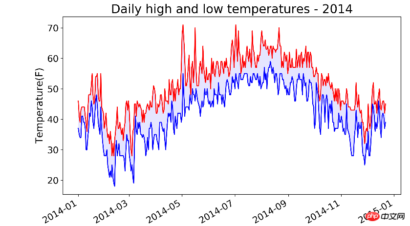
看以看出,7月到9月都很热,但是5月出现过非常高的气温!
上面的代码有一行date = datetime.strptime(row[0], '%Y-%m-%d')。注意%Y-%m-%d要和row[0]字符串的格式一致。举个例子
# 下面这句报错time data '2017/6/23' does not match format '%Y-%m-%d'print(datetime.strptime('2017/6/22', '%Y-%m-%d'))
print(datetime.strptime('2017-6-22', '%Y-%m-%d'))
%Y指的是四位的年份, %y是两位年份,%m是数字表示的月份,%d数字表示的月份中的一天。
by @sunhaiyu
2017.6.22
The above is the detailed content of First introduction to Matplotlib. For more information, please follow other related articles on the PHP Chinese website!

Hot AI Tools

Undresser.AI Undress
AI-powered app for creating realistic nude photos

AI Clothes Remover
Online AI tool for removing clothes from photos.

Undress AI Tool
Undress images for free

Clothoff.io
AI clothes remover

AI Hentai Generator
Generate AI Hentai for free.

Hot Article
Hot Tools

Notepad++7.3.1
Easy-to-use and free code editor

SublimeText3 Chinese version
Chinese version, very easy to use

Zend Studio 13.0.1
Powerful PHP integrated development environment

Dreamweaver CS6
Visual web development tools

SublimeText3 Mac version
God-level code editing software (SublimeText3)
Hot Topics
 1376
1376
 52
52

 How to install Matplotlib in pycharm
Dec 18, 2023 pm 04:32 PM
How to install Matplotlib in pycharm
Dec 18, 2023 pm 04:32 PM
Installation steps: 1. Open the PyCharm integrated development environment; 2. Go to the "File" menu and select "Settings"; 3. In the "Settings" dialog box, select "Python Interpreter" under "Project: <your_project_name>" ; 4. Click the plus button "+" in the upper right corner and search for "matplotlib" in the pop-up dialog box; 5. Select "matplotlib" to install.
 How to create a three-dimensional line chart using Python and Matplotlib
Apr 22, 2023 pm 01:19 PM
How to create a three-dimensional line chart using Python and Matplotlib
Apr 22, 2023 pm 01:19 PM
1.0 Introduction Three-dimensional image technology is one of the most advanced computer display technologies in the world. Any ordinary computer only needs to install a plug-in to present three-dimensional products in a web browser. It is not only lifelike, but also can dynamically display the product combination process. Especially suitable for remote browsing. The three-dimensional images are visually distinct and colorful, with strong visual impact, allowing viewers to stay in the scene for a long time and leaving a deep impression. The three-dimensional pictures give people a real and lifelike feeling, the characters are ready to be seen, and they have an immersive feeling, which has a high artistic appreciation value. 2.0 Three-dimensional drawing methods and types. First, you need to install the Matplotlib library. You can use pip: pipinstallmatplotlib. It is assumed that matplotl has been installed.
 A deep dive into matplotlib's colormap
Jan 09, 2024 pm 03:51 PM
A deep dive into matplotlib's colormap
Jan 09, 2024 pm 03:51 PM
To learn more about the matplotlib color table, you need specific code examples 1. Introduction matplotlib is a powerful Python drawing library. It provides a rich set of drawing functions and tools that can be used to create various types of charts. The colormap (colormap) is an important concept in matplotlib, which determines the color scheme of the chart. In-depth study of the matplotlib color table will help us better master the drawing functions of matplotlib and make drawings more convenient.
 How to add labels to Matplotlib images in Python
May 12, 2023 pm 12:52 PM
How to add labels to Matplotlib images in Python
May 12, 2023 pm 12:52 PM
1. Add text label plt.text() is used to add text at the specified coordinate position on the image during the drawing process. What needs to be used is the plt.text() method. There are three main parameters: plt.text(x,y,s) where x and y represent the x and y axis coordinates of the incoming point. s represents a string. It should be noted that the coordinates here, if xticks and yticks labels are set, do not refer to the labels, but the original values of the x and axes when drawing. Because there are too many parameters, I will not explain them one by one. Learn their usage based on the code. ha='center' means the vertical alignment is centered, fontsize=30 means the font size is 3
 How to install matplotlib
Dec 20, 2023 pm 05:54 PM
How to install matplotlib
Dec 20, 2023 pm 05:54 PM
Installation tutorial: 1. Open the command line window and make sure that Python and pip have been installed; 2. Enter the "pip install matplotlib" command to install matplotlib; 3. After the installation is completed, verify whether matplotlib is successful by importing matplotlib.pyplot as plt code. Installation, if no error is reported, matplotlib has been successfully installed.
 Getting started with Java crawlers: Understand its basic concepts and application methods
Jan 10, 2024 pm 07:42 PM
Getting started with Java crawlers: Understand its basic concepts and application methods
Jan 10, 2024 pm 07:42 PM
A preliminary study on Java crawlers: To understand its basic concepts and uses, specific code examples are required. With the rapid development of the Internet, obtaining and processing large amounts of data has become an indispensable task for enterprises and individuals. As an automated data acquisition method, crawler (WebScraping) can not only quickly collect data on the Internet, but also analyze and process large amounts of data. Crawlers have become a very important tool in many data mining and information retrieval projects. This article will introduce the basic overview of Java crawlers
 What are the methods for matplotlib to display Chinese?
Nov 22, 2023 pm 05:34 PM
What are the methods for matplotlib to display Chinese?
Nov 22, 2023 pm 05:34 PM
Methods for displaying Chinese include installing Chinese fonts, configuring font paths, using Chinese characters, etc. Detailed introduction: 1. Install Chinese fonts: First, you need to install font files that support Chinese characters. Commonly used Chinese fonts include SimHei, SimSun, Microsoft YaHei, etc.; 2. Configure the font path: In the code, you need to specify the path of the font file; 3. Use Chinese characters: In the code, just use Chinese characters directly.
 Decrypting the matplotlib color table: revealing the story behind the colors
Jan 09, 2024 am 11:38 AM
Decrypting the matplotlib color table: revealing the story behind the colors
Jan 09, 2024 am 11:38 AM
Detailed explanation of matplotlib color table: Revealing the secrets behind colors Introduction: As one of the most commonly used data visualization tools in Python, matplotlib has powerful drawing functions and rich color tables. This article will introduce the color table in matplotlib and explore the secrets behind colors. We will delve into the color tables commonly used in matplotlib and give specific code examples. 1. The color table in Matplotlib represents the color in matplotlib.
