Steps and example codes for WeChat scene creation
WeChat is currently the most popular social software. During holidays, many people will share their photos in Moments. Some people even make photo albums. The switching of pictures is accompanied by music. This is WeChat. Scenes.
Next, I will lead you to create a WeChat scene.
Remarks: By studying this set of tutorials, you can learn the use of touch events, multi-touch technology, the algorithm for judging the sliding direction of gesture events, CSS3 animation calling, text animation (all animations are customized), music Knowledge of playback and control, CSS3 animation control, use of web fonts, js manipulation of DOM, etc. If you encounter any problems during the learning process, you can add me on QQ: 1416759661.
The general steps are as follows:
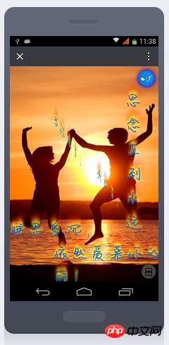
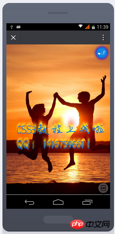
001, effect preview
002, create Project
003, mete attribute and radial gradient
004, add image
005, position image
006, listen for touch start event
007. Monitor the touch end event
008. Determine the sliding direction
009. Swipe up to switch pictures
010. Add transition animation effect
011. Call animation and reset properties
012. Slide down to switch pictures
013. Add 3D rotation effect
014. Add text effect
015. Text movement
016, text style reset
017, text rotation effect
018, sliding text effect
019, circular music control button
020. Button rotation animation
021. Stop rotation animation
022. Control the playback and stop of music
023. Automatically call animation switching effect
Experience the effect first. Use WeChat to scan the QR code below to see the effect.
You can also click the link below to view the effect. Since it is a foreign server, it may be slow.
https://1416759661.github.io/changjing/


nbsp;html><meta><meta><meta><meta><meta><meta><meta><title></title><style>
            @font-face {font-family:yyjcwfont;src:url(font/hand.ttf);}
            @-webkit-keyframes musicrotate {from {
                    -webkit-transform: rotate(0);}to {-webkit-transform: rotate(360deg);}}

            @keyframes dhfadein {from {
                    width: 1%;height: 1%;display: block;position: absolute;top: 50%;left: 50%;opacity: 0.5;z-index: 1;}to {width: 100%;height: 100%;top: 0;left: 0;opacity: 1;transform: rotate(720deg) rotateY(360deg);z-index: 100;}}


            @keyframes dhfadein-p1 {from {
                    width: 1%;height: 1%;left:-100%;top:-100%;position: absolute;bottom: 0;opacity: 0;}to {width: 100%;left:10%;top:50%;font-size:3rem;opacity:1;color: #1477E2;transform: rotateX(360deg) rotateY(720deg);text-shadow: 0 -5px 4px #FF3,2px -10px 6px #fd3,-2px -15px 11px #f80,2px -25px 18px #f20;
                    z-index: 100;}}

            @keyframes dhfadein-p2 {from {
                    width: 1%;height: 1%;left:200%;position: absolute;bottom: 0;opacity: 0;}to {width: 100%;left:10%;top:60%;font-size:3rem;opacity:1;color: #1477E2;transform: rotateX(360deg) rotateY(720deg);text-shadow: 0 -5px 4px #FF3,2px -10px 6px #fd3,-2px -15px 11px #f80,2px -25px 18px #f20;
                    z-index: 100;}}

            @keyframes dhfadein-p3 {from {
                    width: 1%;height: 1%;left:-100%;position: absolute;bottom: 0;opacity: 0;}to {width: 100%;left:10%;top:70%;font-size:3rem;opacity:1;color: #1477E2;/*transform: rotateX(360deg) rotateY(720deg);*/text-shadow: 0 -5px 4px #FF3,2px -10px 6px #fd3,-2px -15px 11px #f80,2px -25px 18px #f20;
                    z-index: 100;}}

            @keyframes dhfadein-p4 {from {
                    width: 1%;height: 1%;left:200%;top:90%;position: absolute;bottom: 0;opacity: 0;}to {width: 100%;left:10%;top:80%;font-size:3rem;opacity:1;color: #1477E2;/*transform: rotateX(360deg) rotateY(720deg);*/text-shadow: 0 -5px 4px #FF3,2px -10px 6px #fd3,-2px -15px 11px #f80,2px -25px 18px #f20;
                    z-index: 100;}}

            @keyframes dhfadein-p5 {from {
                    width: 1%;height: 1%;left:50%;bottom:-100%;position: absolute;bottom: 0;opacity: 0;}to {width:10%;left:80%;top:10%;font-size:3rem;opacity:1;color: #1477E2;/*transform: rotateX(360deg) rotateY(720deg);*/text-shadow: 0 -5px 4px #FF3,2px -10px 6px #fd3,-2px -15px 11px #f80,2px -25px 18px #f20;
                    z-index: 100;}}


            * {margin: 0;padding: 0;}
            html,
            body {width: 100%;height: 100%;}
            ul {width: 100%;height: 100%;list-style: none;overflow: hidden;position: relative;background:radial-gradient(white,#FC7D08);display: none;}
            ul li {width: 1%;height: 1%;display: block;position: absolute;top: 50%;left: 50%;opacity: 0.5;/*    animation: dhfadein 3s 1 forwards;*/}
            ul li img {width: 100%;height: 100%;display: block;margin: 0 auto;opacity: 1;}
            p{font-family: yyjcwfont;}
            ul li p.text1 {width: 1%;height: 1%;left:-100%;top:-100%;position: absolute;bottom: 0;opacity: 0;}ul li p.text2 {width: 1%;height: 1%;left:200%;position: absolute;bottom: 0;opacity: 0;}ul li p.text3 {width: 1%;height: 1%;left:-100%;position: absolute;bottom: 0;opacity: 0;}ul li p.text4 {width: 1%;height: 1%;left:200%;top:90%;position: absolute;bottom: 0;opacity: 0;}ul li p.text5 {width: 1%;height: 1%;left:50%;bottom:-100%;position: absolute;bottom: 0;opacity: 0;}
            .musicbox {background-image: url(images/m.jpg);background-position: 0 0;width:38px;height:38px;overflow: hidden;background-repeat: no-repeat;background-size: contain;border-radius:19px;position: absolute;z-index: 102;top: 10px;right:10px;cursor: pointer;animation:musicrotate 1s linear infinite;box-shadow: 0 0 15px 2px blue;}
            div.closeroate{animation-play-state: paused;}
            .loding{position: absolute;left: 0;top: 0;line-height: 30px;padding: 10px;color:green;}</style><div>加载中<img  src="/static/imghw/default1.png" data-src="images/wait.gif" class="lazy" alt="Steps and example codes for WeChat scene creation" >
</div>-

两情若是久长时,
又岂在朝朝暮暮!
-

当你老了,
头白了,
睡思昏沉,
依然爱慕你的美丽!
思念直到永远
-

两情若是久长时,
又岂在朝朝暮暮!
-

轻轻的我走了,
正如我轻轻的来!
我挥一挥衣袖,
不带走一片云彩!
-

CSS3教程上线啦
QQ:1416759661!
-

当你老了,
头白了,
睡思昏沉,
依然爱慕你的美丽!
思念直到永远
-

两情若是久长时,
又岂在朝朝暮暮!
-

轻轻的我走了,
正如我轻轻的来!
我挥一挥衣袖,
不带走一片云彩!
-

CSS3教程上线啦
QQ:1416759661!
The above is the detailed content of Steps and example codes for WeChat scene creation. For more information, please follow other related articles on the PHP Chinese website!

Hot AI Tools

Undresser.AI Undress
AI-powered app for creating realistic nude photos

AI Clothes Remover
Online AI tool for removing clothes from photos.

Undress AI Tool
Undress images for free

Clothoff.io
AI clothes remover

AI Hentai Generator
Generate AI Hentai for free.

Hot Article

Hot Tools

Notepad++7.3.1
Easy-to-use and free code editor

SublimeText3 Chinese version
Chinese version, very easy to use

Zend Studio 13.0.1
Powerful PHP integrated development environment

Dreamweaver CS6
Visual web development tools

SublimeText3 Mac version
God-level code editing software (SublimeText3)

Hot Topics
 1378
1378
 52
52
 How to solve the long tail problem in autonomous driving scenarios?
Jun 02, 2024 pm 02:44 PM
Yesterday during the interview, I was asked whether I had done any long-tail related questions, so I thought I would give a brief summary. The long-tail problem of autonomous driving refers to edge cases in autonomous vehicles, that is, possible scenarios with a low probability of occurrence. The perceived long-tail problem is one of the main reasons currently limiting the operational design domain of single-vehicle intelligent autonomous vehicles. The underlying architecture and most technical issues of autonomous driving have been solved, and the remaining 5% of long-tail problems have gradually become the key to restricting the development of autonomous driving. These problems include a variety of fragmented scenarios, extreme situations, and unpredictable human behavior. The "long tail" of edge scenarios in autonomous driving refers to edge cases in autonomous vehicles (AVs). Edge cases are possible scenarios with a low probability of occurrence. these rare events
 In what scenarios does ClassCastException occur in Java?
Jun 25, 2023 pm 09:19 PM
Java is a strongly typed language that requires data type matching at runtime. Due to Java's strict type conversion mechanism, if there is a data type mismatch in the code, a ClassCastException will occur. ClassCastException is one of the very common exceptions in the Java language. This article will introduce the causes of ClassCastException and how to avoid it. What is ClassCastException
 Have you used these stress testing tools for Linux systems?
Mar 21, 2024 pm 04:12 PM
As an operation and maintenance personnel, have you ever encountered this scenario? You need to use tools to test high system CPU or memory usage to trigger alarms, or test the concurrency capabilities of the service through stress testing. As an operation and maintenance engineer, you can also use these commands to reproduce fault scenarios. Then this article can help you master commonly used testing commands and tools. 1. Introduction In some cases, in order to locate and reproduce problems in the project, tools must be used to conduct systematic stress testing to simulate and restore fault scenarios. At this time testing or stress testing tools become particularly important. Next, we will explore the use of these tools according to different scenarios. 2. Test Tools 2.1 Network speed limiting tool tctc is a command line tool used to adjust network parameters in Linux. It can be used to simulate various networks.
 In two sentences, let AI generate VR scenes! Or the kind of 3D or HDR panorama?
Apr 12, 2023 am 09:46 AM
Big Data Digest Produced by: Caleb Recently, ChatGPT can be said to be extremely popular. On November 30, OpenAI released the chat robot ChatGPT and opened it to the public for free for testing. Since then, it has been widely used in China. To talk to a robot is to ask the robot to execute a certain instruction, such as entering a keyword and letting the AI generate the corresponding picture. This doesn’t seem to be unusual. Didn’t OpenAI also update a new version of DALL-E in April? OpenAI, how old are you? (Why is it always you?) What if Digest said that the generated images are 3D images, HDR panoramas, or VR-based image content? Recently, Singapore
 Learn to use common Kafka commands and flexibly respond to various scenarios.
Jan 31, 2024 pm 09:22 PM
Essentials for learning Kafka: master common commands and easily cope with various scenarios 1. Create Topicbin/kafka-topics.sh--create--topicmy-topic--partitions3--replication-factor22. List Topicbin/kafka-topics.sh --list3. View Topic details bin/kafka-to
 Let's talk about the model fusion method of large models
Mar 11, 2024 pm 01:10 PM
In previous practices, model fusion has been widely used, especially in discriminant models, where it is considered a method that can steadily improve performance. However, for generative language models, the way they operate is not as straightforward as for discriminative models because of the decoding process involved. In addition, due to the increase in the number of parameters of large models, in scenarios with larger parameter scales, the methods that can be considered by simple ensemble learning are more limited than low-parameter machine learning, such as classic stacking, boosting and other methods, because stacking models The parameter problem cannot be easily expanded. Therefore, ensemble learning for large models requires careful consideration. Below we explain five basic integration methods, namely model integration, probabilistic integration, grafting learning, crowdsourcing voting, and MOE
 DifFlow3D: New SOTA for scene flow estimation, the diffusion model has another success!
Mar 28, 2024 pm 02:00 PM
Original title: DifFlow3D: TowardRobustUncertainty-AwareSceneFlowEstimationwithIterativeDiffusion-BasedRefinement Paper link: https://arxiv.org/pdf/2311.17456.pdf Code link: https://github.com/IRMVLab/DifFlow3D Author affiliation: Shanghai Jiao Tong University, Cambridge University, Zhejiang University Thesis idea of forensic robot: Scene flow estimation aims to predict the 3D displacement change of each point in the dynamic scene. It is a basic task in the field of computer vision.
 Real-time rendering: dynamic urban scene modeling based on Street Gaussians
Jan 08, 2024 pm 01:49 PM
To be honest, the speed of technology update is indeed very fast, which has also led to some old methods in academia being gradually replaced by new methods. Recently, a research team from Zhejiang University proposed a new method called Gaussians, which has attracted widespread attention. This method has unique advantages in solving problems and has been successfully used in work. Although Nerf has gradually lost some influence in academia. In order to help players who have not yet passed the level, let's take a look at the specific methods of solving puzzles in the game. To help players who have not passed the level yet, we can learn about the specific puzzle-solving methods together. For this purpose, I found a paper on puzzle solving, the link is here: https://arxiv.org/pdf/2


