 Web Front-end
 HTML Tutorial
 The css implementation of the div footer tag is fixed at the bottom of the page
The css implementation of the div footer tag is fixed at the bottom of the page
The "footer" part of the Web page floats up and is in the middle of the page. It has a great impact on the visual effect and makes your page look ugly, especially now that widescreens are becoming more and more popular. This phenomenon is even more common. This article will introduce two solutions. Friends who need to know more can refer to
As a pager, you must have encountered: When an HTML page contains less content At this time, the "footer" part of the Web page floats up and is in the middle of the page, which has a great impact on the visual effect and makes your page look ugly, especially now that there are more and more widescreens. , this phenomenon is even more common. So how to fix the "footer" part of a Web page to the bottom of the page forever? Let’s take a look at the code below first
This is the first solution, there are several more
HTML codes
The code is as follows:
<p class="container">
<p class="header">这是头部</p>
<p class="page clearfix">
<p class="left">left sidebar</p>
<p class="content">main content</p>
<p class="right">right sudebar</p>
</p>
<p class="footer">footer section</p>
</p>
CSS code
The code is as follows:
html,body{margin:0;padding:0;height:100%}
.container{min-height:100%;height:auto !important;height:100%;/*ie6不识别min-height,如上述处理*/position:relative;}
.header{background:#ff0;padding:10px;}
.page{width:960px;margin:0 auto;
padding-bottom
:60px;/*padding等于footer的高度*/}
.footer{position:absolute;bottom:0;width:100%;height:60px;/*footer的高度*/background:#6cf;clear:both;}
.left{width:220px;height:800px;float:left;
margin-right
:20px;background:lime;}
.content{background:orange;width:480px;float:left;margin-right:20px;}
.right{width:220px;float:right;background:green;}
.clearfix:after,
.clearfix:before{content:"";display:table}
.clearfix:after{clear:both;overflow:hidden}
.clearfix{zoom:1;}
To achieve this footer is always fixed at the bottom of the page, we only need four p, where p#container is a container, in this container Among them, we include p#header (header), p#page (main part of the page, we can add more p structures to this p, as shown in the code above), p#footer (footer part )
Let’s take a look at the implementation principle of this method:
and
p#container container: p# The container container must set a minimum height (min-height) of 100%; this mainly allows it to maintain a height of 100% when there is little (or no content). However, min-height is not supported in IE6. So in order to be compatible with IE6, we need to do certain compatibility processing for min-height. For details, you can see the previous code. In addition, we also need to set a "position:relative" in the p#container container to facilitate the of the elements inside. After absolute positioning , the p#container container will not run;
p#page container: The p#page container has a very key setting. It is necessary to set a padding-bottom value on this container, and this value It should be equal to (or slightly larger than) the height (height) value of the footer p#footer. Of course, you can use border-bottom and water-width to replace padding-bottom in p#page, but there is one thing to note. Here you Never use margin-bottom instead of padding-bottom, otherwise the effect will not be achieved;
p#footer container: The p#footer container must set a fixed height, and the unit can be px (or em). p#footer also needs to be absolutely positioned and set bottom:0; let p#footer be fixed at the bottom of the container p#container, so that the effect we mentioned earlier can be achieved. When the content is only one point, p#footer is fixed at the bottom of the container p#container. The bottom of the screen (because p#container sets a min-height:100%), when the content height exceeds the height of the screen, p#footer is also fixed at the bottom of p#container, that is, fixed at the bottom of the page. You can also add a "width:100%" to p#footer to extend it across the entire page;
Other p: As for other containers, you can set them according to your own needs, for example The previous p#header, p#left, p#content, p#right, etc.
Advantages:
The structure is simple and clear, no js or any hack is needed to achieve compatibility under various browsers, and it is also suitable for iPhone.
Disadvantages:
The disadvantage is that you need to set a fixed height for the p#footer container. This height can be set according to your needs. The unit can be px or em, and It is also necessary to set the padding-bottom (or border-bottom-width) of the p#page container to a size equal to (or slightly larger than) the height of p#footer to operate normally.
Method 2:
This method uses the negative margin-top value of the footer to achieve the effect that the footer is always fixed at the bottom of the page. Let’s see how it is implemented in detail.
HTML code
The code is as follows:
<p id="header">header</p>
<p id="page" class="clearfix">
<p id="left">left sidebar</p>
<p id="content">main content</p>
<p id="right">right sidebar</p>
</p>
</p>
<p id="footer">footer</p>
CSS code
The code is as follows:
html,body{height:100%;margin:0;padding:0;}
#container{min-height:100%;height:auto !important;height:100%;}
#page{padding-bottom:60px;/*等于或者大于footer的高度*//*border-bottom-width:60px;边框宽度也可以*/}
#header{padding:10px;background:lime;}
#footer{position:relative;margin-top:-60px;/*等于footer的高度*/height:60px;clear:both;background:#c6f;}
#left{width:18%;float:left;margin-right:2%;background:orange;}
#content{width:60%;float:left;margin-right:2%;background:yellow;}
#right{width:18%;float:right;background:green;}
.clearfix:after{
visibility
:hidden;height:0;font-size:0;display:block;content:" ";clear:both;}
* html .clearfix{zoom:1;}/* ie6 */
*
:first-child
+html .clearfix{zoom:1;} /* ie7 */上面的代码是最基本的HTML Code,同时你也发现了p#footer和p#container是同辈关系,不像方法一,p#footer在p#container容器内部。当然你也可以根据你的需要把内容增加在p#container容器中,如:一个三列布局,而且还带有header部分。
方法一和方法二有几点是完全相同的,比如说方法一中的1-3三点,在方法二中都一样,换句话说,方法二中也需要把html,body高度设置为100%,并重置margin,padding为0;其二p#container也需要设置min-height:100%,并处理好IE6下的min-height兼容问题;其三也需要在p#page容器上设置一个padding-bottom或border-bottom-width值等于p#footer高度值(或略大于)。那么两种方法不同之处是:
p#footer放在p#container容器外面,也就是说两者是同级关系,如果你有新元素需要放置在与p#container容器同级,那你需要将此元素进行绝对定位,不然将会破坏p#container容器的min-height值;
p#footer进行margin-top的负值设置,并且此值等于p#footer的高度值,而且也要和p#page容器的padding-bottom(或border-bottom-width)值相等。
优点:
结构简单清晰,无需js和任何hack能实现各浏览器下的兼容。
缺点:
要给footer设置固定值,因此无法让footer部分自适应高度。
The above is the detailed content of The css implementation of the div footer tag is fixed at the bottom of the page. For more information, please follow other related articles on the PHP Chinese website!

Hot AI Tools

Undresser.AI Undress
AI-powered app for creating realistic nude photos

AI Clothes Remover
Online AI tool for removing clothes from photos.

Undress AI Tool
Undress images for free

Clothoff.io
AI clothes remover

AI Hentai Generator
Generate AI Hentai for free.

Hot Article

Hot Tools

Notepad++7.3.1
Easy-to-use and free code editor

SublimeText3 Chinese version
Chinese version, very easy to use

Zend Studio 13.0.1
Powerful PHP integrated development environment

Dreamweaver CS6
Visual web development tools

SublimeText3 Mac version
God-level code editing software (SublimeText3)

Hot Topics
 What does placeholder mean in vue
May 07, 2024 am 09:57 AM
In Vue.js, the placeholder attribute specifies the placeholder text of the input element, which is displayed when the user has not entered content, provides input tips or examples, and improves form accessibility. Its usage is to set the placeholder attribute on the input element and customize the appearance using CSS. Best practices include being relevant to the input, being short and clear, avoiding default text, and considering accessibility.
 What does span mean in js
May 06, 2024 am 11:42 AM
The span tag can add styles, attributes, or behaviors to text. It is used to: add styles, such as color and font size. Set attributes such as id, class, etc. Associated behaviors such as clicks, hovers, etc. Mark text for further processing or citation.
 What does rem mean in js
May 06, 2024 am 11:30 AM
REM in CSS is a relative unit relative to the font size of the root element (html). It has the following characteristics: relative to the root element font size, not affected by the parent element. When the root element's font size changes, elements using REM will adjust accordingly. Can be used with any CSS property. Advantages of using REM include: Responsiveness: Keep text readable on different devices and screen sizes. Consistency: Make sure font sizes are consistent throughout your website. Scalability: Easily change the global font size by adjusting the root element font size.
 How to introduce images into vue
May 02, 2024 pm 10:48 PM
There are five ways to introduce images in Vue: through URL, require function, static file, v-bind directive and CSS background image. Dynamic images can be handled in Vue's computed properties or listeners, and bundled tools can be used to optimize image loading. Make sure the path is correct otherwise a loading error will appear.
 What is node in js
May 07, 2024 pm 09:06 PM
Nodes are entities in the JavaScript DOM that represent HTML elements. They represent a specific element in the page and can be used to access and manipulate that element. Common node types include element nodes, text nodes, comment nodes, and document nodes. Through DOM methods such as getElementById(), you can access nodes and operate on them, including modifying properties, adding/removing child nodes, inserting/replacing nodes, and cloning nodes. Node traversal helps navigate within the DOM structure. Nodes are useful for dynamically creating page content, event handling, animation, and data binding.
 What language is the browser plug-in written in?
May 08, 2024 pm 09:36 PM
Browser plug-ins are usually written in the following languages: Front-end languages: JavaScript, HTML, CSS Back-end languages: C++, Rust, WebAssembly Other languages: Python, Java
 What do ref and id in vue do?
May 02, 2024 pm 08:42 PM
In Vue.js, ref is used in JavaScript to reference a DOM element (accessible to subcomponents and the DOM element itself), while id is used to set the HTML id attribute (can be used for CSS styling, HTML markup, and JavaScript lookup).
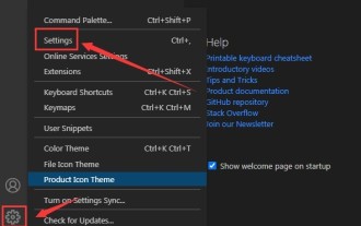 How to set unknown attributes in vscode vscode method to set unknown attributes
May 09, 2024 pm 02:43 PM
1. First, open the settings icon in the lower left corner and click the settings option. 2. Then, find the CSS column in the jumped window. 3. Finally, change the drop-down option in the unknownproperties menu to the error button.


