Detailed example of Grid layout method
Previous words
Grid layout method draws on the grid system in graphic design, applying grid lines on the screen instead of a single static page. It can be called a real grid. . This article will introduce grid layout in detail
Introduction
For web developers, web page layout has always been a relatively important issue. But in fact, for a long time in web development, we didn't even have a relatively complete layout module. In general, Web layout has gone through the following four stages:
1. Table layout, dragging tables through Dreamweaver or handwriting table label layout
2. Float and position positioning layout, Layout using the characteristics of the element box model itself and attributes such as float position
3. Flexible box model layout is a revolutionary breakthrough that solves the three major pain points in traditional layout solutions: arrangement direction and alignment. Adaptive size. It is currently the most mature and powerful layout solution
4. Grid layout, a two-dimensional layout module, has powerful content size and positioning capabilities, and is suitable for layouts that need to align content in two dimensions
Grid Layout is a two-dimensional grid-based layout system that aims to completely change the way we design grid-based user interfaces and make up for the shortcomings of web development in two-dimensional layout capabilities
Flex is divided into scalable containers and scalable projects. Grid is also divided into grid containers and grid projects
Grid container
display
Pass Setting the display property to grid or inline-grid creates a grid container. All child elements in the grid container will automatically become grid items
display: grid
display: inline-grid
Grid items are placed in rows by default and span the full width of the grid container
Explicit Grid
Use the grid-template-columns and grid-template-rows properties to explicitly set one Grid columns and rows
[grid-template-rows]
The default value is none
Each value specified by grid-template-rows can create a row of high. The height of the row can be any non-negative value, and the length can be a value in length units such as px, %, em, etc.
grid-template-rows: 60px 40px
item1 and item2 have fixed heights, which are 60px and 40px respectively. Because only the height values of two rows are defined, the heights of item3 and item4 are defined based on their own content.
[grid-template-columns]
The default value is none
Like rows, specified by grid-template-columns Each value to create the column width of each column
grid-template-columns: 40px 50px 60px
item4 and item5 are placed in a new row (the second row) because grid-template-columns only defines the size of three columns , they are also placed in column 1, column 2 and column 3 respectively; the size of column 1, column 2 and column 3 is equal to the width of item1, item2 and item3. item1, item2 and item3 have fixed width values, which are 40px, 50px and 60px respectively
【fr】
The fr unit can help us create a pop-up Column grid track. It represents the space available in the grid container (just like unitless values in Flexbox)
grid-template-columns: 1fr 1fr 2fr
In this example, the grid container is divided into 4 equal parts (1 + 1 + 2 = 4), each portion (1fr) is one quarter of the width of the grid container. So the width of item1 and item2 is one-quarter of the width of the grid container, and item3 is two-quarters of the width of the grid container (2fr)
grid-template-columns: 3rem 25% 1fr 2fr
WhenfrWhen combined with values from other length units, fr is calculated based on the available space in the grid container.
In this example, the available space in the grid container is the width of the grid minus 3rem and 25%, and frIt is calculated based on this size:
1fr = (网格宽度 - 3rem - 网格宽度 * 25%) / 3
【minmax()】
You can create a grid through the minmax() function The minimum or maximum size of the track. The minmax() function accepts two parameters: the first parameter defines the minimum value of the grid orbit, and the second parameter defines the maximum value of the grid orbit. Any length value is accepted, and auto values are also accepted. The auto value allows the grid track to stretch or squeeze based on the size of the content
grid-template-rows: minmax(100px, auto);
grid-template-columns: minmax(auto, 50%) 1fr 3em;
In this example, the first row's minimum height is 100px, but its maximum height is auto, Allows the row height to grow larger than 100px. The minimum value of the first column is set to auto, but its maximum value is 50%, that is, the maximum width of the column will not exceed 50% of the width of the grid container
【repeat()】
Use repeat() to create repeated grid tracks. This works well for creating equal sized grid items and multiple grid items. repeat() accepts two parameters: the first parameter defines the number of times the grid track should be repeated, and the second parameter defines the size of each track.
grid-template-rows: repeat(3, 1fr);
grid-template-columns: 30px repeat(3, 1fr) 30px;
在这个示例中,第一列和最后一列的宽度都是30px,并且它们之间有另列三列,这三列是通过repeat()来创建的,而且每列的列宽是1fr(1fr = (网格宽度 - 30px - 30px) / 3)
间距
【grid-column-gap】
创建列与列之间的间距
【grid-row-gap】
创建行与行之间的间距
【grid-gap】
默认值为0
grid-gap是grid-row-gap和grid-column-gap两个属性的缩写,如果它指定了两个值,那么第一个值是设置grid-row-gap的值,第二个值设置grid-column-gap的值。如果只设置了一个值,表示行和列的间距相等,也就是说grid-row-gap和grid-column-gap的值相同
[注意]grid-gap只能创建列与列或行与行之间的间距,但不能创建列和行与网格容器边缘的间距
间距(Gap)可以设置任何非负值,长度值可以是px、%、em等单位值
网格项目
网格线
【grid-row-start】
【grid-row-end】
【grid-column-start】
【grid-column-end】
默认值为auto
通过网格线可以定位网格项目。网格线实际上是代表线的开始、结束,两者之间就是网格列或行。每条线是从网格轨道开始,网格的网格线从1开始,每条网格线逐步增加1
grid-row-start: 2;
grid-row-end: 3;
grid-column-start: 2;
grid-column-end: 3;
两列三行的网格创建三条列网格线和四条行网格线。item1就是由行和列的号码重新定位。如果一个网格项目跨度只有一行或一列,那么grid-row-end和grid-olumn-end不是必需的
【grid-row】
【grid-column】
grid-row: 2;
grid-column: 3 / 4;
grid-row是grid-row-start和grid-row-end的简写。grid-column是grid-column-start和grid-column-end的简写。如果只提供一个值,则指定了grid-row-start(grid-column-start)值;如果提供两个值,第一个值是grid-row-start(grid-column-start)的值,第二个值是grid-row-end(grid-column-end)的值,两者之间必须要用/隔开
默认值为auto
【span】
关键词span后面紧随数字,表示合并多少个列或行
grid-row: 1 / span 3;
grid-column: span 2;
【grid-area】
grid-area: 2 / 2 / 3 / 3;
如果指定四个值,第一个值对应grid-row-start,第二个值对应grid-column-start,第三个值对应grid-row-end,第四个值对应grid-column-end
网格线命名
通过grid-template-rows和grid-template-columns定义网格时,网格线可以被命名。网格线名称也可以设置网格项目位置
分配网格线名称必须用方括号[网格线名称],然后后面紧跟网格轨道的尺寸值。定义网格线名称时需要避免使用规范中出现的关键词,以免导致混乱。
grid-template-rows: [row-1-start] 1fr [row-2-start] 1fr [row-2-end];
grid-template-columns: [col-1-start] 1fr [col-2-start] 1fr [col-3-start] 1fr [col-3-end];
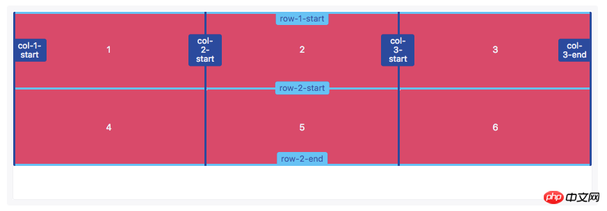
可以在方括号中添加多个名称来命名网格线名称,使用多外名称命名网格线名称时,名称间要用空格隔开。每一个网格线的名称可以用来定位网格项目的位置
grid-template-rows: [row-start row-1-start] 1fr [row-1-end row-2-start] 1fr [row-2-end row-end];
grid-template-columns: [col-start] 1fr [col-2-start] 1fr [col-3-start] 1fr [col-end];

使用网格线名称设置网格项目位置和使用网格线号码设置网格项目位置类似,引用网格线名称的时候不应该带方括号
使用repeat()函数可以给网格线分配相同的名称。这可以节省一定的时间。
grid-template-rows: repeat(3, [row-start] 1fr [row-end]);
grid-template-columns: repeat(3, [col-start] 1fr [col-end]);
使用repeat()函数可以给网格线命名,这也导致多个网格线具有相同的网格线名称。相同网格线名称指定网格线的位置和名称,也且会自动在网格线名称后面添加对应的数字,使其网格线名称也是唯一的标识符

使用相同的网格线名称可以设置网格项目的位置。网格线的名称和数字之间需要用空格分开
grid-row: row-start 2 / row-end 3;
grid-column: col-start / col-start 3;
网格区域命名
【grid-template-areas】
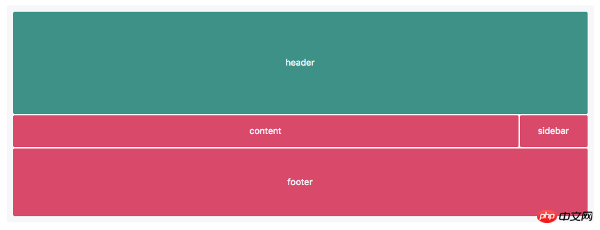
像网格线名称一样,网格区域的名称可以使用grid-template-areas属性来命名。引用网格区域名称也可以设置网格项目位置
grid-template-areas:   "header header"   "content sidebar"    "footer footer";
grid-template-rows:    150px 1fr 100px;
grid-template-columns: 1fr 200px;
设置网格区域的名称应该放置在单引号或双引号内,每个名称由一个空格符分开。网格区域的名称,每组(单引号或双引号内的网格区域名称)定义了网格的一行,每个网格区域名称定义网格的一列
[注意]grid-template-areas: "header header" "content sidebar" "footer footer";不可以简写为grid-template-areas: "header" "content sidebar" "footer";

grid-row-start、grid-row-end、grid-column-start和grid-column-end以及简写的grid-row、grid-column、grid-area都可以引用网格区域名称,用来设置网格项目位置
隐式网格
【grid-auto-flow】
网格默认流方向是row,可以通过grid-auto-flow属性把网格流的方向改变成column
grid-auto-flow: column
当网格项目确认在显式网格之外时就会创建隐性网格,当没有足够的空间或者显式的网格轨道来设置网格项目,此时网格项目就会自动创建隐式网格
【grid-auto-rows】
【grid-auto-columns】
使用grid-auto-rows和grid-auto-columns属性可以定义隐式的网格
默认值为auto
grid-template-rows:    70px;
grid-template-columns: repeat(2, 1fr);
grid-auto-rows:        140px;
在上面这个例子中我们只定义了一行(轨道),所以item1和item2的高都是70px。第二行(轨道)自动创建了item3和item4空间。grid-auto-rows定义隐式网格中的行(轨道)的大小,因此item3和item4的高度是140px

隐式命名
【隐式命名网格区域名称】
通常可以将网格线命名成任何想命名的名称,如果网格线名称添加-start和-end的后缀,其实也隐式的创建一个网格区域,可以用来设置网格项目的位置
grid-template-rows:    [outer-start] 1fr [inner-start] 1fr [inner-end] 1fr [outer-end];
grid-template-columns: [outer-start] 1fr [inner-start] 1fr [inner-end] 1fr [inner-end];
在这个示例中,行和列都具有inner-start和inner-end网格线名称,同时也对应的创建一个隐式网格区域名称inner
grid-area: inner
网格项目定位可以通过网格区域名称来设置,而不需要使用网格线名称

【隐式命名网格线名称】
隐式的指定网格线反向指定了隐式的网格区域名称,命名的网格区域隐式的命名了网格线名称
grid-template-areas:   "header header" "content sidebar" "footer footer";
grid-template-rows:    80px 1fr 40px;
grid-template-columns: 1fr 200px;
指定网格区域会给网格区域边线添加隐式的网格线名称。这些网格线的命名是基于网格区域来命名,只是在网格区域名称的后面添加后缀-start或-end

grid-row-start: header-start;
grid-row-end: content-start;
grid-column-start: footer-start;
grid-column-end: sidebar-end;
在这个示例中,header通过隐式的网格线名称设置其位置
网格项目层级
网格项目可以具有层级和堆栈,必要时可能通过z-index属性来指定
.item-1,.item-2 {grid-row-start:  1;grid-column-end: span 2;
}.item-1 {
    grid-column-start: 1;
    z-index: 1;
}.item-2 {
    grid-column-start: 2
}在这个例子中,item1和item2的开始行都是1,item1列的开始是1,item2列的开始是2,并且它们都跨越两列。两个网格项目都是由网格线数字定位,结果这两个网格项目重叠了。
默认情况下,item2在item1上面,但是,我们在item1中设置了z-index:1;,导致item1在item2之上
对齐
【网格项目对齐方式(Box Alignment)】
CSS的Box Alignment Module补充了网格项目沿着网格行或列轴对齐方式。
【justify-items】
【justify-self】
justify-items和justify-self指定网格项目沿着行轴对齐方式;align-items和align-self指定网格项目沿着列轴对齐方式。
justify-items和align-items应用在网格容器上
【align-items】
【align-self】
align-self和justify-self属性用于网格项目自身对齐方式
这四个属性主要接受以下属性值:
auto | normal | start | end | center | stretch | baseline | first baseline | last baseline
【网格轨道对齐方式】
网格轨道对齐可以相对于网格容器行和列轴。
align-content指定网格轨道沿着行轴对齐方式;justify-content指定网格轨道沿着列轴对齐方式。它们支持下面属性:
normal | start | end | center | stretch | space-around | space-between | space-evenly | baseline | first baseline | last baseline
The above is the detailed content of Detailed example of Grid layout method. For more information, please follow other related articles on the PHP Chinese website!

Hot AI Tools

Undresser.AI Undress
AI-powered app for creating realistic nude photos

AI Clothes Remover
Online AI tool for removing clothes from photos.

Undress AI Tool
Undress images for free

Clothoff.io
AI clothes remover

AI Hentai Generator
Generate AI Hentai for free.

Hot Article

Hot Tools

Notepad++7.3.1
Easy-to-use and free code editor

SublimeText3 Chinese version
Chinese version, very easy to use

Zend Studio 13.0.1
Powerful PHP integrated development environment

Dreamweaver CS6
Visual web development tools

SublimeText3 Mac version
God-level code editing software (SublimeText3)

Hot Topics
 1378
1378
 52
52
 Windows 11: The easy way to import and export start layouts
Aug 22, 2023 am 10:13 AM
In Windows 11, the Start menu has been redesigned and features a simplified set of apps arranged in a grid of pages, unlike its predecessor, which had folders, apps, and apps on the Start menu. Group. You can customize the Start menu layout and import and export it to other Windows devices to personalize it to your liking. In this guide, we’ll discuss step-by-step instructions for importing Start Layout to customize the default layout on Windows 11. What is Import-StartLayout in Windows 11? Import Start Layout is a cmdlet used in Windows 10 and earlier versions to import customizations for the Start menu into
 How to save desktop icon position layout in Windows 11
Aug 23, 2023 pm 09:53 PM
Windows 11 brings a lot to the table in terms of user experience, but the iteration isn't entirely error-proof. Users run into issues from time to time, and changes to icon positioning are common. So how to save desktop layout in Windows 11? There are built-in and third-party solutions for this task, whether it's saving the screen resolution of the current window or the arrangement of desktop icons. This becomes even more important for users who have a bunch of icons on their desktop. Read on to learn how to save desktop icon locations in Windows 11. Why doesn't Windows 11 save icon layout positions? Here are the main reasons why Windows 11 does not save desktop icon layout: Changes to display settings: Typically, when you modify display settings, the configured customizations
 Guide to solving misalignment of WordPress web pages
Mar 05, 2024 pm 01:12 PM
Guide to solving misaligned WordPress web pages In WordPress website development, sometimes we encounter web page elements that are misaligned. This may be due to screen sizes on different devices, browser compatibility, or improper CSS style settings. To solve this misalignment, we need to carefully analyze the problem, find possible causes, and debug and repair it step by step. This article will share some common WordPress web page misalignment problems and corresponding solutions, and provide specific code examples to help develop
 How to create a responsive carousel layout using HTML and CSS
Oct 20, 2023 pm 04:24 PM
How to create a responsive carousel layout using HTML and CSS Carousels are a common element in modern web design. It can attract the user's attention, display multiple contents or images, and switch automatically. In this article, we will introduce how to create a responsive carousel layout using HTML and CSS. First, we need to create a basic HTML structure and add the required CSS styles. The following is a simple HTML structure: <!DOCTYPEhtml&g
 Flexible application skills of position attribute in H5
Dec 27, 2023 pm 01:05 PM
How to flexibly use the position attribute in H5. In H5 development, the positioning and layout of elements are often involved. At this time, the CSS position property will come into play. The position attribute can control the positioning of elements on the page, including relative positioning, absolute positioning, fixed positioning and sticky positioning. This article will introduce in detail how to flexibly use the position attribute in H5 development.
 Take you step by step to implement 3D dice using CSS Flex and Grid layout (with code)
Sep 23, 2022 am 09:58 AM
In front-end interviews, we are often asked how to implement dice/mahjong layout using CSS. The following article will introduce to you how to use CSS to create a 3D dice (Flex and Grid layout implement 3D dice). I hope it will be helpful to you!
 Windows 11 keeps adding keyboard layouts: 4 tested solutions
Dec 14, 2023 pm 05:49 PM
For some users, Windows 11 keeps adding new keyboard layouts even if they don't accept or confirm the changes. The WindowsReport software team has replicated this issue and knows how to prevent Windows 11 from adding a new keyboard layout to your PC. Why does Windows 11 add its own keyboard layout? This usually happens when using a non-native language and keyboard combination. For example, if you are using a US display language and a French keyboard layout, Windows 11 may also add an English keyboard. What to do if Windows 11 adds a new keyboard layout you don't want. How to prevent Windows 11 from adding a keyboard layout? 1. Delete unnecessary keyboard layouts and click "Open"
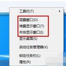 Introducing the window arrangement method in win7
Dec 26, 2023 pm 04:37 PM
When we open multiple windows at the same time, win7 has the function of arranging multiple windows in different ways and then displaying them at the same time, which allows us to view the contents of each window more clearly. So how many window arrangements are there in win7? What do they look like? Let’s take a look with the editor. There are several ways to arrange Windows 7 windows: three, namely cascading windows, stacked display windows and side-by-side display windows. When we open multiple windows, we can right-click on an empty space on the taskbar. You can see three window arrangements. 1. Cascading windows: 2. Stacked display windows: 3. Display windows side by side:


