
Most CSS properties are easy to use. Often, when you use CSS properties on elements of a markup language, the results appear immediately as you refresh the page. Other CSS properties are more complex and will only work under given circumstances.
The Z-index attribute belongs to the latter group mentioned above. Z-index undoubtedly causes confusion (compatibility) and frustration (developer psychology) more frequently than any other property. But the funny thing is, once you really understand Z-index, you will find that it is a very easy to use attribute, and will provide a powerful help in solving many layout challenges.
In this article, we will explain exactly what Z-index is, why it is so poorly understood, and discuss some issues related to its practical use. We'll also describe some of the browser-to-browser differences you'll encounter, which are unique issues that exist in existing versions of IE and Firefox. This comprehensive perspective on the Z-index attribute will provide developers with a good foundation of confidence and powerful help when using the Z-index attribute.
What's this?
The Z-index attribute determines the cascading level of an HTML element. The stacking level of an element is relative to the element's position on the Z axis (as opposed to the X axis or Y axis). A higher Z-index value means that the element will be closer to the top in the stacking order. This layering sequence is presented along vertical thread axes.
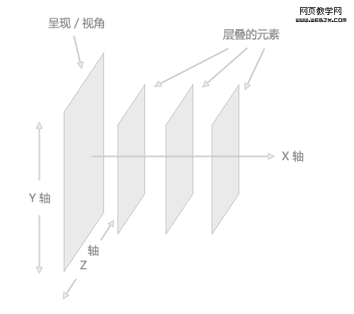
To more clearly describe how Z-index works, the image above exaggerates the visual positioning of stacked elements.
Natural stacking order
In an HTML page, the natural stacking order (that is, the order of elements on the Z axis) is determined by many factors. The following is a list, which displays the list items in a stacking context (no suitable Chinese translation has been found yet, it should refer to the stacking environment where the stacked elements are located). These items are in this stacking context. The bottom of the environment. None of the items in this list have been assigned a Z-index attribute.
The background and border of the element will create a stacking context
Quote:
·Stacking contexts elements with negative values are arranged in the order of appearance (the further back, the higher the level )
·Unlocated, non-floating block-level elements are arranged in the order of appearance
·Unlocated, floating elements are arranged in the order of appearance
·Inline elements , arranged in the order of appearance
· Positioned elements, arranged in the order of appearance
The Z-index attribute, when used correctly, will change the natural stacking order.
Of course, unless the elements have been positioned to overlap each other, the stacking order of the elements will not be particularly obvious. Below, a BOX with negative margins is shown to illustrate the natural stacking sequence.
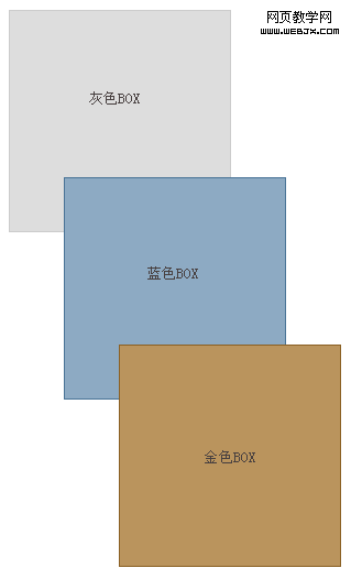
The above BOX is defined with different background and border colors, and the latter two are staggered and define a negative top margin, so we You can see the natural layering sequence. The gray BOX is in the first place in the mark, the blue BOX is in the second place, and the gold one is in the third place. The applied negative margins clearly indicate the fact that these elements do not have a Z-index property set; their stacking order is natural, or the default, compound rule. The phenomenon of interlacing is caused by negative margins.
Why does it create confusion?
Even though Z-index is not a difficult property to understand, it can cause many junior developers to get confused due to wrong assumptions. The confusion occurs because Z-index only works on elements that have the absolute, fixed, or relative positioning attributes explicitly defined.
To prove that Z-index only works on positioned elements, here are the same three BOXes that apply the Z-index attribute to try to break their natural stacking order.

The gray BOX has a Z-index value of "9999", the blue BOX has a Z-index value of "500", and the gold one has a Z-index value of "1 "Z-index value. Logically, you would think that the stacking order of these three BOXes would be reversed. But this is not the case, because none of these elements have the position attribute set.
Below are the same three BOX, each of which is set to position: relative. Their Z-index values are still set according to the above paragraph.
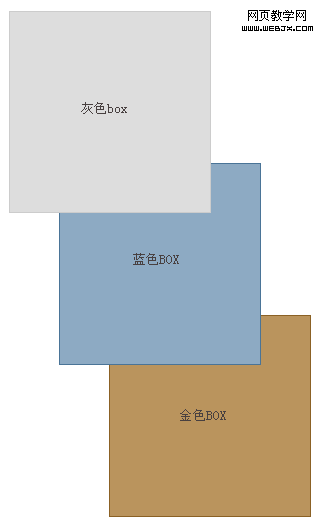
The result now is what we expected: the stacking order of these elements is reversed; the gray BOX is covered with blue, and the blue is covered with gold. .
Syntax
#grey_box {
width: 200px;
height: 200px;
border: solid 1px #ccc;
background : #ddd;
position: relative;
z-index: 9999;
}
#blue_box {
width: 200px;
height: 200px;
border: solid 1px #4a7497;
background: #8daac3;
position: relative;
z-index: 500;
}
#gold_box {
width: 200px;
height: 200px;
border: solid 1px #8b6125;
background: #ba945d;
position: relative;
z-index: 1;
}
Repeat Now, the Z-index attribute only works on elements that have the position attribute defined. This is something that is not taken seriously enough, especially by newbies.
UsingJavaScript
If you want to dynamically add the Z-index attribute to an element through JavaScript, its syntax can be used like most other CSS elements. Access is similar, using "camelCase" instead of hyphens in CSS properties, as shown in the following code.
var myElement = document.getElementById(”gold_box”);
myElement.style.position = “relative”;
myElement.style.zIndex = “9999″;
In IE and Improper parsing in Firefox (compatibility issue)
In some specific cases, there will be some minor inconsistencies in the parsing of the Z-index attribute in IE6, IE7 and Firefox2 versions.
The
The
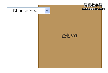
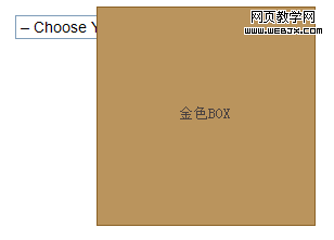
drop-down menus that cover the use JavaScript to temporarily hide the