

CSS3 tutorial: background-clip and background-origin
Original text: http://www.planabc.net/2008/04/14/background-clip_background-origin/
background-clip and background-origin are new background module properties added in CSS3, used to determine the positioning of the background.
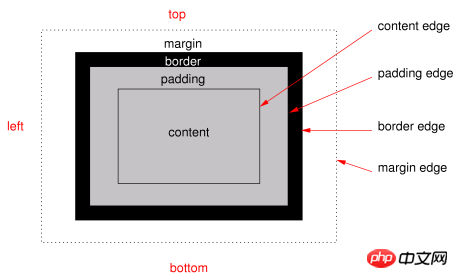
background-clip is used to determine whether the background contains the border area. And background-or
Original text: http://www.planabc.net/2008/04/14/background-clip_background-origin/
background-clip and background-origin are newly added background module attributes in CSS3 , used to determine the positioning of the background.
background-clip is used to determine whether the background contains the border area. And background-origin is used to determine the reference position for background-position calculation.
The syntax is:
background-clip: [border | padding] [, [border | padding]]*
background-origin: [border | padding | content] [, [border | padding | content]]*
For background-clip:
If it is a padding value, the background ignores the padding edges and the border is transparent. If it is a border value, the background includes the border area. If there are multiple background-image images, the corresponding background-clip values are separated by commas.
For background-origin:
If it is a padding value, the position is relative to the padding edge ("0 0" is the upper left corner of the padding edge, and "100% 100%" is the lower right corner ). If it is a border value, it means the relative border edge. The border value is relative to the content edge. Like background-clip, multiple values are separated by commas. If background-clip is the padding value, background-origin is the border value, and background-position is "top left" (default initial value), the upper left corner of the background image will be cut off.
These two attributes only appear from CSS3. What about the default performance in the background module when this attribute is not used?
Background-clip defaults to something like background-clip:border.
background-origin defaults to something like background-origin:padding.
But IE is a special case (It sucks).
In IE6 and IE7, the background of general elements (except buttons, etc.) is equivalent to: background-clip:border; background-origin:border;
The background of hasLayout elements (plus buttons, etc.) is equivalent In: background-clip:padding; background-origin:padding;
This pair of CSS3 properties has been implemented in browsers such as Mozilla, Safari 3 and Konqueror, but they are all expressed through their private properties.
Quote:
The private attributes of basic non-IE browsers usually start with -xxx-, -o- is the private attribute of Opera with Presto as the engine, -icab - is private to iCab, -khtml- is a browser with KHTML as the engine (such as Konqueror Safari), -moz- is a browser with Mozilla's Gecko as the engine (such as Firefox, Mozilla), -webkit- is rendered with Webkit Engine (which is a derivative of KHTML) browsers (such as Safari, Swift).
The supported private attributes are:
moz-background-clip
webkit-background-clip
khtml-background-clip
moz-background-origin
webkit-background-origin
khtml-background-origin
The above is the detailed content of CSS3 tutorial: background-clip and background-origin. For more information, please follow other related articles on the PHP Chinese website!

Hot AI Tools

Undresser.AI Undress
AI-powered app for creating realistic nude photos

AI Clothes Remover
Online AI tool for removing clothes from photos.

Undress AI Tool
Undress images for free

Clothoff.io
AI clothes remover

Video Face Swap
Swap faces in any video effortlessly with our completely free AI face swap tool!

Hot Article
Hot Tools

Notepad++7.3.1
Easy-to-use and free code editor

SublimeText3 Chinese version
Chinese version, very easy to use

Zend Studio 13.0.1
Powerful PHP integrated development environment

Dreamweaver CS6
Visual web development tools

SublimeText3 Mac version
God-level code editing software (SublimeText3)
Hot Topics
 1387
1387
 52
52

 How to achieve wave effect with pure CSS3? (code example)
Jun 28, 2022 pm 01:39 PM
How to achieve wave effect with pure CSS3? (code example)
Jun 28, 2022 pm 01:39 PM
How to achieve wave effect with pure CSS3? This article will introduce to you how to use SVG and CSS animation to create wave effects. I hope it will be helpful to you!
 Use CSS skillfully to realize various strange-shaped buttons (with code)
Jul 19, 2022 am 11:28 AM
Use CSS skillfully to realize various strange-shaped buttons (with code)
Jul 19, 2022 am 11:28 AM
This article will show you how to use CSS to easily realize various weird-shaped buttons that appear frequently. I hope it will be helpful to you!
 How to hide elements in css without taking up space
Jun 01, 2022 pm 07:15 PM
How to hide elements in css without taking up space
Jun 01, 2022 pm 07:15 PM
Two methods: 1. Using the display attribute, just add the "display:none;" style to the element. 2. Use the position and top attributes to set the absolute positioning of the element to hide the element. Just add the "position:absolute;top:-9999px;" style to the element.
 How to implement lace borders in css3
Sep 16, 2022 pm 07:11 PM
How to implement lace borders in css3
Sep 16, 2022 pm 07:11 PM
In CSS, you can use the border-image attribute to achieve a lace border. The border-image attribute can use images to create borders, that is, add a background image to the border. You only need to specify the background image as a lace style; the syntax "border-image: url (image path) offsets the image border width inward. Whether outset is repeated;".
 How to enlarge the image by clicking the mouse in css3
Apr 25, 2022 pm 04:52 PM
How to enlarge the image by clicking the mouse in css3
Apr 25, 2022 pm 04:52 PM
Implementation method: 1. Use the ":active" selector to select the state of the mouse click on the picture; 2. Use the transform attribute and scale() function to achieve the picture magnification effect, the syntax "img:active {transform: scale(x-axis magnification, y Axis magnification);}".
 It turns out that text carousel and image carousel can also be realized using pure CSS!
Jun 10, 2022 pm 01:00 PM
It turns out that text carousel and image carousel can also be realized using pure CSS!
Jun 10, 2022 pm 01:00 PM
How to create text carousel and image carousel? The first thing everyone thinks of is whether to use js. In fact, text carousel and image carousel can also be realized using pure CSS. Let’s take a look at the implementation method. I hope it will be helpful to everyone!
 How to set animation rotation speed in css3
Apr 28, 2022 pm 04:32 PM
How to set animation rotation speed in css3
Apr 28, 2022 pm 04:32 PM
In CSS3, you can use the "animation-timing-function" attribute to set the animation rotation speed. This attribute is used to specify how the animation will complete a cycle and set the speed curve of the animation. The syntax is "element {animation-timing-function: speed attribute value;}".
 Does css3 animation effect have deformation?
Apr 28, 2022 pm 02:20 PM
Does css3 animation effect have deformation?
Apr 28, 2022 pm 02:20 PM
The animation effect in css3 has deformation; you can use "animation: animation attribute @keyframes ..{..{transform: transformation attribute}}" to achieve deformation animation effect. The animation attribute is used to set the animation style, and the transform attribute is used to set the deformation style. .
