

Detailed explanation of align-content usage in css
align-content
Function:
will set the vertical arrangement of each item inside the free box.
Conditions:
The free box attribute display:flex; must be set to the parent element, and the arrangement mode is set to horizontal arrangement flex -direction:row; and set line wrapping, flex-wrap:wrap; so that the setting of this property will take effect.
Setting object:
This attribute works on the items inside her container and sets the parent element.
Value:
stretch: The default setting will stretch the space occupied by each item in the container, and the filling method is to add blank space below each item. The first item is arranged from the top of the container by default.
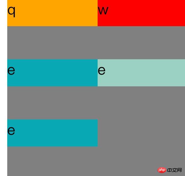
<!DOCTYPE=html>
<html lang="zh-cn">
<head>
<meta charset="UTF-8">
<title>
Align-content
</title>
<style>

#father{

    width:200px;
    display:flex;
    flex-direction:row;
    flex-wrap:wrap;
    align-content:strech;
    height:200px;
    background-color:grey;
}.son1{

      height:30px;
    width:100px;
    background-color:orange;
}.son2{

    height:30px;
    width:100px;
    background-color:red;
}.son3{

      height:30px;
    width:100px;
    background-color:#08a9b5;
}</style>
</head>
<body>

<p id="father">

<p class="son1">
q
</p>

<p class="son2">
w
</p>

<p class="son3">
e
</p>
<p class="son3">
e
</p>
<p class="son3">
e
</p>


</p>

</body>
</html>
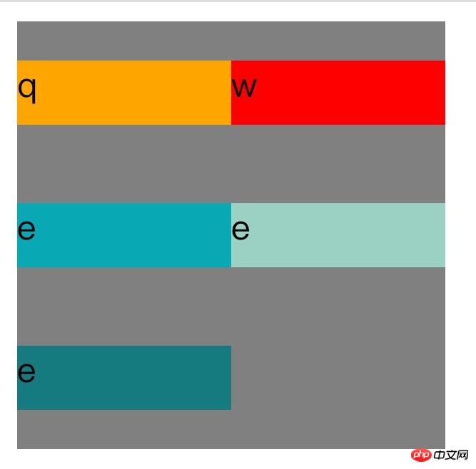
Center: This will remove the space between items and center all items vertically .
<!DOCTYPE=html>
<html lang="zh-cn">
<head>
<meta charset="UTF-8">
<title>
关于文档元素测试
</title>
<style>

#father{

    width:200px;
    display:flex;
    flex-direction:row;
    flex-wrap:wrap;
    align-content:center;
    height:200px;
    background-color:grey;
}.son1{

      height:30px;
    width:100px;
    background-color:orange;
}.son2{

    height:30px;
    width:100px;
    background-color:red;
}.son3{

      height:30px;
    width:100px;
    background-color:#08a9b5;
}.son4{

      height:30px;
    width:100px;
    background-color:#9ad1c3;
}.son5{

      height:30px;
    width:100px;
    background-color:rgb(21,123,126);
}</style>
</head>
<body>

<p id="father">

<p class="son1">
q
</p>

<p class="son2">
w
</p>

<p class="son3">
e
</p>
<p class="son4">
e
</p>
<p class="son5">
e
</p>


</p>

</body>
</html>
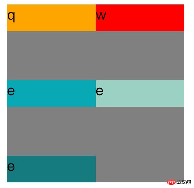
Flex-start: This will remove the white space between items and place the items on top of the container.
<!DOCTYPE=html>
<html lang="zh-cn">
<head>
<meta charset="UTF-8">
<title>
关于文档元素测试
</title>
<style>

#father{

    width:200px;
    display:flex;
    flex-direction:row;
    flex-wrap:wrap;
    align-content:flex-start;
    height:200px;
    background-color:grey;
}.son1{

      height:30px;
    width:100px;
    background-color:orange;
}.son2{

    height:30px;
    width:100px;
    background-color:red;
}.son3{

      height:30px;
    width:100px;
    background-color:#08a9b5;
}.son4{

      height:30px;
    width:100px;
    background-color:#9ad1c3;
}.son5{

      height:30px;
    width:100px;
    background-color:rgb(21,123,126);
}</style>
</head>
<body>

<p id="father">

<p class="son1">
q
</p>

<p class="son2">
w
</p>

<p class="son3">
e
</p>
<p class="son4">
e
</p>
<p class="son5">
e
</p>


</p>

</body>
</html>
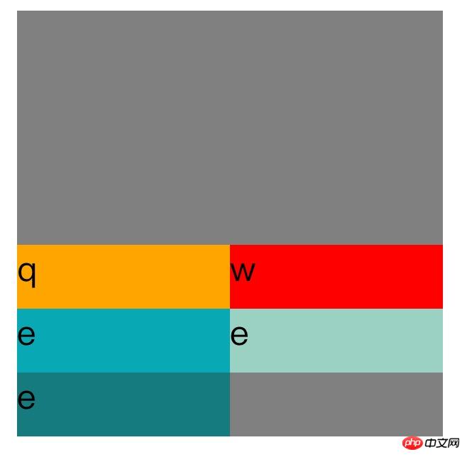
flex-end: This will remove the space between items and place the items at the bottom of the container.
align-content:flex-end;
space-between This will align the items at both ends vertically. That is, the top item is aligned with the top of the container, and the bottom item is aligned with the bottom of the container. Leave equal spacing between each item.
align-content:space-between;
Space-around: This will keep the same length of space at the top and bottom of each item, so that The spacing between items is twice the spacing of individual items.
align-content:space-around;
Inherit: Causes this attribute of the element to be inherited from its parent element.
initial: Make this attribute of the element the default initial value.
The above is the detailed content of Detailed explanation of align-content usage in css. For more information, please follow other related articles on the PHP Chinese website!

Hot AI Tools

Undresser.AI Undress
AI-powered app for creating realistic nude photos

AI Clothes Remover
Online AI tool for removing clothes from photos.

Undress AI Tool
Undress images for free

Clothoff.io
AI clothes remover

Video Face Swap
Swap faces in any video effortlessly with our completely free AI face swap tool!

Hot Article
Hot Tools

Notepad++7.3.1
Easy-to-use and free code editor

SublimeText3 Chinese version
Chinese version, very easy to use

Zend Studio 13.0.1
Powerful PHP integrated development environment

Dreamweaver CS6
Visual web development tools

SublimeText3 Mac version
God-level code editing software (SublimeText3)
Hot Topics
 1387
1387
 52
52

 How to use bootstrap in vue
Apr 07, 2025 pm 11:33 PM
How to use bootstrap in vue
Apr 07, 2025 pm 11:33 PM
Using Bootstrap in Vue.js is divided into five steps: Install Bootstrap. Import Bootstrap in main.js. Use the Bootstrap component directly in the template. Optional: Custom style. Optional: Use plug-ins.
 The Roles of HTML, CSS, and JavaScript: Core Responsibilities
Apr 08, 2025 pm 07:05 PM
The Roles of HTML, CSS, and JavaScript: Core Responsibilities
Apr 08, 2025 pm 07:05 PM
HTML defines the web structure, CSS is responsible for style and layout, and JavaScript gives dynamic interaction. The three perform their duties in web development and jointly build a colorful website.
 How to write split lines on bootstrap
Apr 07, 2025 pm 03:12 PM
How to write split lines on bootstrap
Apr 07, 2025 pm 03:12 PM
There are two ways to create a Bootstrap split line: using the tag, which creates a horizontal split line. Use the CSS border property to create custom style split lines.
 Understanding HTML, CSS, and JavaScript: A Beginner's Guide
Apr 12, 2025 am 12:02 AM
Understanding HTML, CSS, and JavaScript: A Beginner's Guide
Apr 12, 2025 am 12:02 AM
WebdevelopmentreliesonHTML,CSS,andJavaScript:1)HTMLstructurescontent,2)CSSstylesit,and3)JavaScriptaddsinteractivity,formingthebasisofmodernwebexperiences.
 How to resize bootstrap
Apr 07, 2025 pm 03:18 PM
How to resize bootstrap
Apr 07, 2025 pm 03:18 PM
To adjust the size of elements in Bootstrap, you can use the dimension class, which includes: adjusting width: .col-, .w-, .mw-adjust height: .h-, .min-h-, .max-h-
 How to use bootstrap button
Apr 07, 2025 pm 03:09 PM
How to use bootstrap button
Apr 07, 2025 pm 03:09 PM
How to use the Bootstrap button? Introduce Bootstrap CSS to create button elements and add Bootstrap button class to add button text
 How to set up the framework for bootstrap
Apr 07, 2025 pm 03:27 PM
How to set up the framework for bootstrap
Apr 07, 2025 pm 03:27 PM
To set up the Bootstrap framework, you need to follow these steps: 1. Reference the Bootstrap file via CDN; 2. Download and host the file on your own server; 3. Include the Bootstrap file in HTML; 4. Compile Sass/Less as needed; 5. Import a custom file (optional). Once setup is complete, you can use Bootstrap's grid systems, components, and styles to create responsive websites and applications.
 How to insert pictures on bootstrap
Apr 07, 2025 pm 03:30 PM
How to insert pictures on bootstrap
Apr 07, 2025 pm 03:30 PM
There are several ways to insert images in Bootstrap: insert images directly, using the HTML img tag. With the Bootstrap image component, you can provide responsive images and more styles. Set the image size, use the img-fluid class to make the image adaptable. Set the border, using the img-bordered class. Set the rounded corners and use the img-rounded class. Set the shadow, use the shadow class. Resize and position the image, using CSS style. Using the background image, use the background-image CSS property.
