 Web Front-end
 HTML Tutorial
 JS realizes automatic carousel effect (adaptive screen width + mobile phone touch screen sliding)_javascript skills
JS realizes automatic carousel effect (adaptive screen width + mobile phone touch screen sliding)_javascript skills
This article mainly introduces JS to realize the automatic carousel effect (adaptive screen width + mobile phone touch screen sliding). Friends in need can refer to the following
1. This article uses js+jQuery to realize the carousel Figure needs to reference the jquery package. Another implementation is animate to implement adaptive carousel, and transform to smooth carousel (in the comment code).
2. You can change the pictures in the code yourself. The style and logic are all written in js.
3, html tagcode, js code
<p class="slider">
  //轮播箭头
 <p class="lastpic"><img src="../images/prev.png"></p>
 <p class="nextpic"><img src="../images/next.png"></p>
 //轮播图片
 <ul id="slides" class="slides clearfix">
 <li><img class="responsive" src="../images/wrap-page.jpg" alt="暂无图片"></li>
 <li><img class="responsive" src="../images/wrap-page.jpg" alt="暂无图片"></li>
 <li><img class="responsive" src="../images/wrap-page.jpg" alt="暂无图片"></li>
 <li><img class="responsive" src="../images/wrap-page.jpg" alt="暂无图片"></li>
 </ul>
</p>
<script type="text/javascript">
$(document).ready(function() {
var len = $(".slider li").length-1;
//给slider设置样式
$(".slider").css({
"width":"100%",
"height": "inherit",
"overflow": "hidden",
"display":"inline-block"
});
//给ul设置宽度
$(".slides").css({
"position": "relative",
"width":((len+1)*100).toString()+"%",
"margin":"0",
"padding":"0"});
//给li设置百分比宽度
$(".slides li").css({
"width":(100/(len+1)).toString()+"%",
"float":"left"
});
//给图片设置宽度
$(".responsive").css({
"width":"100%",
"height":"inherit"
});
//控制点样式
$(".slider p").css({
"position": "absolute",
"z-index":"999",
"cursor": "pointer"
});
$(".slider .lastpic").css({
"left":"0",
"margin-top":"7%"
});
$(".slider .nextpic").css({
"right":"0",
"margin-top":"7%"
});
//animate移动
var i = 0;
$(".nextpic").click(function(){
moveNext(i);
});
$(".lastpic").click(function(){
moveLast(i);
});
//自动轮播
var timer = setInterval(function(){
moveNext(i);
},5000);
moveNext = function(n){
if(n==len){
i=-1;
$(".slider .slides").animate({right: ""},800);
}else{
$(".slider .slides").animate({right:((n+1)*100).toString()+"%"}, 800);
}
i++;
}
moveLast = function(n){
if(n==0){
i=len+1;
$(".slider .slides").animate({right:(len*100).toString()+"%"}, 800);
}else{
$(".slider .slides").animate({right:((n-1)*100).toString()+"%"}, 800);
}
i--;
}
//手机触摸效果
var startX,endX,moveX;
function touchStart(event){
var touch = event.touches[0];
startX = touch.pageX;
}
function touchMove(event){
var touch = event.touches[0];
endX = touch.pageX;
}
function touchEnd(event){
moveX = startX - endX;
if(moveX>50){
moveNext(i);
}else if(moveX<-50){
moveLast(i);
}
}
document.getElementById("slides").addEventListener("touchstart",touchStart,false);
document.getElementById("slides").addEventListener("touchmove",touchMove,false);
document.getElementById("slides").addEventListener("touchend",touchEnd,false);
//transition移动固定宽度,无法自适应
// $(".nextpic").click(function(){
// if(i==len){
// i=-1;
// $(".slider .slides").css({
// 'transition-timing-function':'linear',
// 'transition-duration':'800ms',
// 'transform':'translateX(0px)'
// })
// }else{
// $(".slider .slides").css({
// 'transition-timing-function':'linear',
// 'transition-duration':'800ms',
// 'transform':'translateX(-'+(i+1)*width+'px)'
// })
// }
// i++;
// });
// $(".lastpic").click(function(){
// if(i==0){
// i=len+1;
// $(".slider .slides").css({
// 'transition-timing-function':'linear',
// 'transition-duration':'800ms',
// 'transform':'translateX(-'+len*width+'px)'
// })
// }else{
// $(".slider .slides").css({
// 'transition-timing-function':'linear',
// 'transition-duration':'800ms',
// 'transform':'translateX(-'+(i-1)*width+'px)'
// })
// }
// i--;
// })
});
</script>The above is the JS implementation introduced by the editor to realize the automatic carousel effect (adaptive screen width + mobile phone touch screen sliding). I hope it will be helpful to you. If you have any questions, please leave me a message. , the editor will reply to everyone in time. I would also like to thank you all for your support of the Script House website!
The above is the detailed content of JS realizes automatic carousel effect (adaptive screen width + mobile phone touch screen sliding)_javascript skills. For more information, please follow other related articles on the PHP Chinese website!

Hot AI Tools

Undresser.AI Undress
AI-powered app for creating realistic nude photos

AI Clothes Remover
Online AI tool for removing clothes from photos.

Undress AI Tool
Undress images for free

Clothoff.io
AI clothes remover

AI Hentai Generator
Generate AI Hentai for free.

Hot Article

Hot Tools

Notepad++7.3.1
Easy-to-use and free code editor

SublimeText3 Chinese version
Chinese version, very easy to use

Zend Studio 13.0.1
Powerful PHP integrated development environment

Dreamweaver CS6
Visual web development tools

SublimeText3 Mac version
God-level code editing software (SublimeText3)

Hot Topics
 1385
1385
 52
52
 iPhone screenshots not working: How to fix it
May 03, 2024 pm 09:16 PM
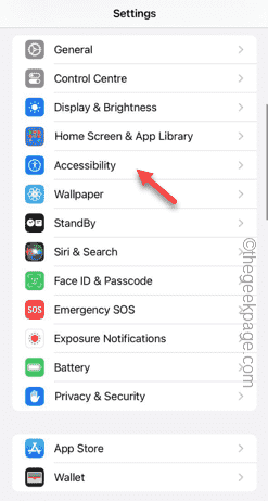
Screenshot feature not working on your iPhone? Taking a screenshot is very easy as you just need to hold down the Volume Up button and the Power button at the same time to grab your phone screen. However, there are other ways to capture frames on the device. Fix 1 – Using Assistive Touch Take a screenshot using the Assistive Touch feature. Step 1 – Go to your phone settings. Step 2 – Next, tap to open Accessibility settings. Step 3 – Open Touch settings. Step 4 – Next, open the Assistive Touch settings. Step 5 – Turn on Assistive Touch on your phone. Step 6 – Open “Customize Top Menu” to access it. Step 7 – Now you just need to link any of these functions to your screen capture. So click on the first
 Does miniled screen hurt eyes?
Feb 07, 2024 pm 03:48 PM
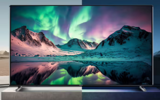
What many users are most concerned about is whether the miniLED screen will hurt the eyes. In fact, although the brightness of this screen can reach extremely high, it will not hurt the eyes and can still be used normally. Does the miniled screen hurt your eyes? Answer: It does not hurt your eyes. Although the brightness of the miniLED screen will be higher, it will not continue to maintain this brightness during daily use. It will only be displayed when the brightness needs to be increased, so it will not always maintain high brightness and hurt the eyes. This peak brightness is also for better Good presentation and expression. MiniLED screen introduction 1. MiniLED backlight display technology uses backlight, so the biggest difference from LCD is the backlight layer 2. Compared with LCD screen, the performance of miniLED will be higher.
 How to adjust the color when the screen turns black and white. Detailed introduction: How to exit black and white mode on your mobile phone.
Mar 21, 2024 pm 01:12 PM
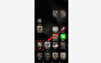
When many friends are using their mobile phones, they suddenly find that the operation interface of the mobile phone has turned into "black and white" color. They don't know what causes it or how to solve it. This article uses Android mobile phones as an example to teach you how to make it work. The color of the mobile phone's operating interface returns to normal. 1. Set up the interface of the mobile phone and find the "gear-shaped" icon in the operation interface. As shown below: Click this icon to enter the phone’s settings interface. 2. Options The operating interface of the mobile phone has changed to black and white, which is related to the "Display" setting of the mobile phone. After entering the settings interface of the mobile phone, find the "Display and Theme" option in the drop-down menu, as shown below: Then click "Display and Theme" option to enter the details page. 3. After changing the screen color and entering the "Display and Theme" option, find the "
 How to Undo Delete from Home Screen in iPhone
Apr 17, 2024 pm 07:37 PM
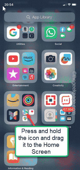
Deleted something important from your home screen and trying to get it back? You can put app icons back on the screen in a variety of ways. We have discussed all the methods you can follow and put the app icon back on the home screen. How to Undo Remove from Home Screen in iPhone As we mentioned before, there are several ways to restore this change on iPhone. Method 1 – Replace App Icon in App Library You can place an app icon on your home screen directly from the App Library. Step 1 – Swipe sideways to find all apps in the app library. Step 2 – Find the app icon you deleted earlier. Step 3 – Simply drag the app icon from the main library to the correct location on the home screen. This is the application diagram
 How to close the 'Do not cover the top of the screen' Detailed explanation: How to close the 'Do not cover the top of the screen' message that appears frequently on your phone
Mar 03, 2024 pm 01:31 PM
I believe many friends have encountered the problem that their mobile phones suddenly prompt: Do not cover the top of the screen. So why does the mobile phone suddenly appear like this? Let’s take a look together below. In fact, when this happens, something is blocking the distance sensor of the phone, so this prompt is received on the screen of the phone. So why did I suddenly receive such a prompt? In fact, it may be that you have accidentally turned on the [anti-accidental touch mode] on your phone, so this problem occurs. So how do we close it? In fact, the method is very simple. Let’s take a look at it together. Method 1: Directly follow the on-screen prompts to close using the shortcut key combination. Method 2: If the above method does not work, you can also open the phone’s [Settings]
 6000 mAh silicon negative battery! Xiaomi 15Pro upgrade leaked again
Jul 24, 2024 pm 12:45 PM
According to news on July 23, blogger Digital Chat Station broke the news that the battery capacity of Xiaomi 15 Pro has been increased to 6000mAh and supports 90W wired flash charging. This will be the Pro model with the largest battery in Xiaomi’s digital series. Digital Chat Station previously revealed that the battery of Xiaomi 15Pro has ultra-high energy density and the silicon content is much higher than that of competing products. After silicon-based batteries are tested on a large scale in 2023, second-generation silicon anode batteries have been identified as the future development direction of the industry. This year will usher in the peak of direct competition. 1. The theoretical gram capacity of silicon can reach 4200mAh/g, which is more than 10 times the gram capacity of graphite (the theoretical gram capacity of graphite is 372mAh/g). For the negative electrode, the capacity when the lithium ion insertion amount reaches the maximum is the theoretical gram capacity, which means that under the same weight
 Recommended: Excellent JS open source face detection and recognition project
Apr 03, 2024 am 11:55 AM
Face detection and recognition technology is already a relatively mature and widely used technology. Currently, the most widely used Internet application language is JS. Implementing face detection and recognition on the Web front-end has advantages and disadvantages compared to back-end face recognition. Advantages include reducing network interaction and real-time recognition, which greatly shortens user waiting time and improves user experience; disadvantages include: being limited by model size, the accuracy is also limited. How to use js to implement face detection on the web? In order to implement face recognition on the Web, you need to be familiar with related programming languages and technologies, such as JavaScript, HTML, CSS, WebRTC, etc. At the same time, you also need to master relevant computer vision and artificial intelligence technologies. It is worth noting that due to the design of the Web side
 Apple reveals iPhone 16 may have a larger display
Mar 22, 2024 pm 06:41 PM
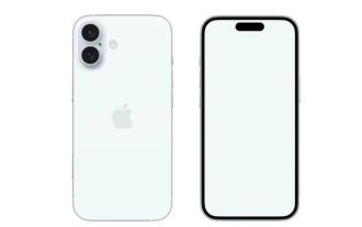
Although it will be a long time before the release of the iPhone 16 series, there have been constant revelations about the appearance and configuration. According to Korean media SisaJournal, Apple plans to introduce new ultra-narrow bezel technology in the upcoming iPhone 16 series of mobile phones. The technology involves rolling internal copper wires into a more compact structure to reduce the bezel width of the phone's bottom display, allowing for a larger display. This innovative move aims to enhance the user experience, allowing users to enjoy a wider field of view and a more immersive entertainment experience. Apple has always been committed to continuously improving its product design and technology to bring more advanced functions and performance to users. The launch of the iPhone 16 series of mobile phones will further consolidate Apple’s leadership in smart phones. According to @SnapaDigital, Apple’s new


