 Web Front-end
 HTML Tutorial
 Detailed explanation of examples of dynamically setting font size on mobile terminals
Detailed explanation of examples of dynamically setting font size on mobile terminals
rem origin: font size of the root element, then rem is a unit, and the unit size is determined by the size of its first-generation ancestor font-size. Now front-end coders are silently sacrificing their own health in order to see a healthy webpage on every screen, because not only do they need to know that rem is a unit, but more importantly, they need to know how to render pages at different resolutions. Very NB.
Cause of the accident:
1.px unit is very popular on PC. When looking at the mobile phone screen, MLGB, the same 12px unit is smaller. Like ants.
2. After finally adjusting it to normal on iPhone 4, when I changed to a Chrysanthemum brand phone, the MBD became unsightly.
3. I know how to use rem, but what is the appropriate font-size of html? Damn it~.
Okay, let’s solve these problems now.
Before solving the problem, please understand some things that you may not want to know (warning: if you don’t understand these, you cannot know the truth~):
1 .Physical pixel(physical pixel)
Every screen we see is composed of small particles (physical pixels) that are difficult to see with the naked eye.
2. Logical pixel
is a point in the computer coordinate system. This point represents a virtual pixel that can be used by the program (such as CSS pixel ).
3. The device pixel ratio (device pixel ratio) is referred to as DPR
Its value reflects the physical pixels and logical pixels The relationship between them, the size of the DPR of the device can be calculated using the formula:
DPR = 物理像素 / 逻辑像素
So after understanding the above concepts, you can know why the css says ## on the PC #font-size=12px;But it became smaller when I switched to a mobile phone? Because of DPR, brother~.
Yes, our DPR on the computer screen is 1, but the mobile phone is different. It may be 2 or 3. There are still ways to get the device DPR:
1. In JavaScript, get it through window.devicePixelRatio
2. In css , can be passed -webkit-device-pixel-ratio, -webkit-min-device-pixel-ratio and -webkit-max-device-pixel-ratioPerform media query and make some style adaptations for different DPR devices (this is only for browsers and webviews with webkit core).
I have also read a lot of articles on dynamically setting rem on the Internet. Here are a few commonly used ones:
First, use media queries to set the font-size of html:
@media screen and (min-width: 320px) {html {font-size: 14px;}
}

@media screen and (min-width: 360px) {html {font-size: 16px;}
}

@media screen and (min-width: 400px) {html {font-size: 18px;}
}

@media screen and (min-width: 440px) {html {font-size: 20px;}
}

@media screen and (min-width: 480px) {html {font-size: 22px;}
}

@media screen and (min-width: 640px) {html {font-size: 28px;}
}Second, use js to dynamically set
!(function(doc, win) {var docEle = doc.documentElement,
        evt = "onorientationchange" in window ? "orientationchange" : "resize",
        fn = function() {var width = docEle.clientWidth;
            width && (docEle.style.fontSize = 20 * (width / 320) + "px");
        };

    win.addEventListener(evt, fn, false);
    doc.addEventListener("DOMContentLoaded", fn, false);

}(document, window));I What I want to talk about is the last one, which I think is a better implementation method at present:
Use js to calculate the DPR of the current device, dynamically set it on the html tag, and dynamically set the of the html font-size, use the css selector to set the font size under different DPR according to DPR (this method is very good~)
<span style="font-size: 18px"><code>!<span class="hljs-function"><span class="hljs-keyword">function(<span class="hljs-params">win, lib) {<span class="hljs-keyword">var timer,
doc = win.document,
docElem = doc.documentElement,
vpMeta = doc.querySelector(<span class="hljs-string">'meta[name="viewport"]'),
flexMeta = doc.querySelector(<span class="hljs-string">'meta[name="flexible"]'),
dpr = <span class="hljs-number">0,
scale = <span class="hljs-number">0,
flexible = lib.flexible || (lib.flexible = {}); <span class="hljs-comment">// 设置了 viewport meta<span class="hljs-keyword">if (vpMeta) { <span class="hljs-built_in">console.warn(<span class="hljs-string">"将根据已有的meta标签来设置缩放比例");<span class="hljs-keyword">var initial = vpMeta.getAttribute(<span class="hljs-string">"content").match(<span class="hljs-regexp">/initial\-scale=([\d\.]+)/); <span class="hljs-keyword">if (initial) {
scale = <span class="hljs-built_in">parseFloat(initial[<span class="hljs-number">1]); <span class="hljs-comment">// 已设置的 initialScale
dpr = <span class="hljs-built_in">parseInt(<span class="hljs-number">1 / scale); <span class="hljs-comment">// 设备像素比 devicePixelRatio
}
}<span class="hljs-comment">// 设置了 flexible Meta<span class="hljs-keyword">else <span class="hljs-keyword">if (flexMeta) {<span class="hljs-keyword">var flexMetaContent = flexMeta.getAttribute(<span class="hljs-string">"content");<span class="hljs-keyword">if (flexMetaContent) { <span class="hljs-keyword">var initial = flexMetaContent.match(<span class="hljs-regexp">/initial\-dpr=([\d\.]+)/),
maximum = flexMetaContent.match(<span class="hljs-regexp">/maximum\-dpr=([\d\.]+)/); <span class="hljs-keyword">if (initial) {
dpr = <span class="hljs-built_in">parseFloat(initial[<span class="hljs-number">1]);
scale = <span class="hljs-built_in">parseFloat((<span class="hljs-number">1 / dpr).toFixed(<span class="hljs-number">2));
} <span class="hljs-keyword">if (maximum) {
dpr = <span class="hljs-built_in">parseFloat(maximum[<span class="hljs-number">1]);
scale = <span class="hljs-built_in">parseFloat((<span class="hljs-number">1 / dpr).toFixed(<span class="hljs-number">2));
}
}
} <span class="hljs-comment">// viewport 或 flexible<span class="hljs-comment">// meta 均未设置<span class="hljs-keyword">if (!dpr && !scale) {<span class="hljs-comment">// QST<span class="hljs-comment">// 这里的 第一句有什么用 ?<span class="hljs-comment">// 和 Android 有毛关系 ?<span class="hljs-keyword">var u = (win.navigator.appVersion.match(<span class="hljs-regexp">/android/gi), win.navigator.appVersion.match(<span class="hljs-regexp">/iphone/gi)),
_dpr = win.devicePixelRatio; <span class="hljs-comment">// 所以这里似乎是将所有 Android 设备都设置为 1 了
dpr = u ? ( (_dpr >= <span class="hljs-number">3 && (!dpr || dpr >= <span class="hljs-number">3))
? <span class="hljs-number">3
: (_dpr >= <span class="hljs-number">2 && (!dpr || dpr >= <span class="hljs-number">2))
? <span class="hljs-number">2
: <span class="hljs-number">1
)
: <span class="hljs-number">1;
scale = <span class="hljs-number">1 / dpr;
}
docElem.setAttribute(<span class="hljs-string">"data-dpr", dpr); <span class="hljs-comment">// 插入 viewport meta<span class="hljs-keyword">if (!vpMeta) {
vpMeta = doc.createElement(<span class="hljs-string">"meta");
vpMeta.setAttribute(<span class="hljs-string">"name", <span class="hljs-string">"viewport");
vpMeta.setAttribute(<span class="hljs-string">"content",<span class="hljs-string">"initial-scale=" + scale + <span class="hljs-string">", maximum-scale=" + scale + <span class="hljs-string">", minimum-scale=" + scale + <span class="hljs-string">", user-scalable=no"); <span class="hljs-keyword">if (docElem.firstElementChild) {
docElem.firstElementChild.appendChild(vpMeta)
} <span class="hljs-keyword">else {<span class="hljs-keyword">var div = doc.createElement(<span class="hljs-string">"div");
div.appendChild(vpMeta);
doc.write(div.innerHTML);
}
} <span class="hljs-function"><span class="hljs-keyword">function <span class="hljs-title">setFontSize(<span class="hljs-params">) {<span class="hljs-keyword">var winWidth = docElem.getBoundingClientRect().width; <span class="hljs-keyword">if (winWidth / dpr > <span class="hljs-number">540) {
(winWidth = <span class="hljs-number">540 * dpr);
} <span class="hljs-comment">// 根节点 fontSize 根据宽度决定<span class="hljs-keyword">var baseSize = winWidth / <span class="hljs-number">10;
docElem.style.fontSize = baseSize + <span class="hljs-string">"px";
flexible.rem = win.rem = baseSize;
} <span class="hljs-comment">// 调整窗口时重置
win.addEventListener(<span class="hljs-string">"resize", <span class="hljs-function"><span class="hljs-keyword">function(<span class="hljs-params">) {
clearTimeout(timer);
timer = setTimeout(setFontSize, <span class="hljs-number">300);
}, <span class="hljs-literal">false);
<span class="hljs-comment">// 这一段是我自己加的<span class="hljs-comment">// orientationchange 时也需要重算下吧
win.addEventListener(<span class="hljs-string">"orientationchange", <span class="hljs-function"><span class="hljs-keyword">function(<span class="hljs-params">) {
clearTimeout(timer);
timer = setTimeout(setFontSize, <span class="hljs-number">300);
}, <span class="hljs-literal">false);
<span class="hljs-comment">// pageshow<span class="hljs-comment">// keyword: 倒退 缓存相关
win.addEventListener(<span class="hljs-string">"pageshow", <span class="hljs-function"><span class="hljs-keyword">function(<span class="hljs-params">e) {<span class="hljs-keyword">if (e.persisted) {
clearTimeout(timer);
timer = setTimeout(setFontSize, <span class="hljs-number">300);
}
}, <span class="hljs-literal">false); <span class="hljs-comment">// 设置基准字体<span class="hljs-keyword">if (<span class="hljs-string">"complete" === doc.readyState) {
doc.body.style.fontSize = <span class="hljs-number">12 * dpr + <span class="hljs-string">"px";
} <span class="hljs-keyword">else {
doc.addEventListener(<span class="hljs-string">"DOMContentLoaded", <span class="hljs-function"><span class="hljs-keyword">function(<span class="hljs-params">) {
doc.body.style.fontSize = <span class="hljs-number">12 * dpr + <span class="hljs-string">"px";
}, <span class="hljs-literal">false);
}
setFontSize();
flexible.dpr = win.dpr = dpr;
flexible.refreshRem = setFontSize;
flexible.rem2px = <span class="hljs-function"><span class="hljs-keyword">function(<span class="hljs-params">d) {<span class="hljs-keyword">var c = <span class="hljs-built_in">parseFloat(d) * <span class="hljs-keyword">this.rem;<span class="hljs-keyword">if (<span class="hljs-string">"string" == <span class="hljs-keyword">typeof d && d.match(<span class="hljs-regexp">/rem$/)) {
c += <span class="hljs-string">"px";
}<span class="hljs-keyword">return c;
};
flexible.px2rem = <span class="hljs-function"><span class="hljs-keyword">function(<span class="hljs-params">d) {<span class="hljs-keyword">var c = <span class="hljs-built_in">parseFloat(d) / <span class="hljs-keyword">this.rem; <span class="hljs-keyword">if (<span class="hljs-string">"string" == <span class="hljs-keyword">typeof d && d.match(<span class="hljs-regexp">/px$/)) {
c += <span class="hljs-string">"rem";
}<span class="hljs-keyword">return c;
}
}(<span class="hljs-built_in">window, <span class="hljs-built_in">window.lib || (<span class="hljs-built_in">window.lib = {}));<br/><br/></span></span></span></span></span></span></span></span></span></span></span></span></span></span></span></span></span></span></span></span></span></span></span></span></span></span></span></span></span></span></span></span></span></span></span></span></span></span></span></span></span></span></span></span></span></span></span></span></span></span></span></span></span></span></span></span></span></span></span></span></span></span></span></span></span></span></span></span></span></span></span></span></span></span></span></span></span></span></span></span></span></span></span></span></span></span></span></span></span></span></span></span></span></span></span></span></span></span></span></span></span></span></span></span></span></span></span></span></span></span></span></span></span></span></span></span></span></span></span></span></span></span></span></span></span></span></span></span></span></span></span></span></span></span></span></span></span></span></span></span></span></span></span></span></span></span></span></span></span></span></span></span></span></code>手机淘宝很多页面用的就是这种方法来适配终端的。<br/><br/><br/><br/></span>The above is the detailed content of Detailed explanation of examples of dynamically setting font size on mobile terminals. For more information, please follow other related articles on the PHP Chinese website!

Hot AI Tools

Undresser.AI Undress
AI-powered app for creating realistic nude photos

AI Clothes Remover
Online AI tool for removing clothes from photos.

Undress AI Tool
Undress images for free

Clothoff.io
AI clothes remover

AI Hentai Generator
Generate AI Hentai for free.

Hot Article

Hot Tools

Notepad++7.3.1
Easy-to-use and free code editor

SublimeText3 Chinese version
Chinese version, very easy to use

Zend Studio 13.0.1
Powerful PHP integrated development environment

Dreamweaver CS6
Visual web development tools

SublimeText3 Mac version
God-level code editing software (SublimeText3)

Hot Topics
 1378
1378
 52
52
 How to set the scheduled time for publishing works on Douyin? How does it set the video duration?
Mar 27, 2024 pm 06:11 PM
Publishing works on Douyin can attract more attention and likes, but sometimes it may be difficult for us to publish works in real time. In this case, we can use Douyin's scheduled release function. Douyin’s scheduled release function allows users to automatically publish works at a scheduled time, which can better plan the release plan and increase the exposure and influence of the work. 1. How to set the scheduled time for publishing works on Douyin? To set a scheduled release time, first go to Douyin's personal homepage, find the "+" button in the upper right corner, and click to enter the release page. There is a clock icon in the lower right corner of the publishing page. Click to enter the scheduled publishing interface. In the interface, you can choose the type of work you want to publish, including short videos, long videos, and live broadcasts. Next, you need to set a time for your work to be published. TikTok provides
 Setting up Chinese with VSCode: The Complete Guide
Mar 25, 2024 am 11:18 AM
VSCode Setup in Chinese: A Complete Guide In software development, Visual Studio Code (VSCode for short) is a commonly used integrated development environment. For developers who use Chinese, setting VSCode to the Chinese interface can improve work efficiency. This article will provide you with a complete guide, detailing how to set VSCode to a Chinese interface and providing specific code examples. Step 1: Download and install the language pack. After opening VSCode, click on the left
 Where is the Douyin tag set? How can it be tagged so that it can be pushed accurately?
Mar 27, 2024 am 11:01 AM
As one of the most popular short video platforms in the world, Douyin allows everyone to become a creator and share every moment of life. For Douyin users, tags are a very important function. It can help users better classify and retrieve content, and also allows the platform to push appropriate content to users more accurately. So, where are the Douyin tags set? This article will explain in detail how to set up and use tags on Douyin. 1. Where is the Douyin tag set? Using tags on Douyin can help users better classify and label their works, making it easier for other users to find and follow them. The method to set the label is as follows: 1. Open the Douyin APP and log in to your account. 2. Click the "+" sign at the bottom of the screen and select the "Publish" button. 3.
 How to set up scheduled publishing on Weibo_Tutorial on how to set up scheduled publishing on Weibo
Mar 29, 2024 pm 03:51 PM
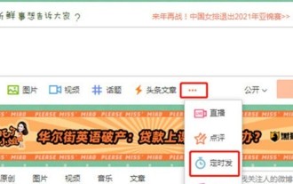
1. Open the Weibo client, click the three little dots on the editing page, and then click Scheduled Post. 2. After clicking on scheduled posting, there will be a time option on the right side of the publishing time. Set the time, edit the article, and click on the yellow words in the lower right corner to schedule posting. 3. The mobile version of Weibo does not currently support scheduled publishing. This function can only be used on the PC client!
 Do Not Disturb Mode Not Working in iPhone: Fix
Apr 24, 2024 pm 04:50 PM
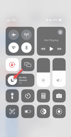
Even answering calls in Do Not Disturb mode can be a very annoying experience. As the name suggests, Do Not Disturb mode turns off all incoming call notifications and alerts from emails, messages, etc. You can follow these solution sets to fix it. Fix 1 – Enable Focus Mode Enable focus mode on your phone. Step 1 – Swipe down from the top to access Control Center. Step 2 – Next, enable “Focus Mode” on your phone. Focus Mode enables Do Not Disturb mode on your phone. It won't cause any incoming call alerts to appear on your phone. Fix 2 – Change Focus Mode Settings If there are some issues in the focus mode settings, you should fix them. Step 1 – Open your iPhone settings window. Step 2 – Next, turn on the Focus mode settings
 Where to set Douyin recommendations and selections
Mar 27, 2024 pm 05:06 PM
Where are the recommendations and selections on Douyin? In Douyin short videos, there are two categories: selection and recommendation. Most users don’t know how to set up recommendations and selections. Next is the Douyin tutorial that the editor brings to users. Audio recommendations and selected setting method tutorials, interested users come and take a look! Douyin usage tutorial Where to set up Douyin recommendations and selections 1. First open the Douyin short video APP and enter the main page, click on the [Me] area in the lower right corner and select [three horizontal lines] in the upper right corner; 2. Then on the right The function bar will expand, slide the page to select [Settings] at the bottom; 3. Then on the settings function page, find the [Personal Information Management] service; 4. Finally jump to the personal information management page, slide [Personalized Content Recommendations] 】The buttons on the back can be set.
 How to set the countdown to grab tickets in Damai
Apr 01, 2024 pm 07:01 PM
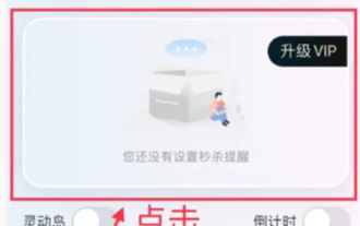
When buying tickets on Damai.com, in order to ensure that the ticket purchase time can be accurately grasped, users can set a floating clock to grab tickets. The detailed setting method is below, let us learn together. How to bind the floating clock to Damai 1. Click to open the floating clock app on your phone to enter the interface, and click on the location where the flash sale check is set, as shown in the figure below: 2. After coming to the page of adding new records, click on Damai.com Copy the ticket purchase link page copied in. 3. Next, set the flash sale time and notification time below, turn on the switch button behind [Save to Calendar], and click [Save] below. 4. Click to turn on [Countdown], as shown in the figure below: 5. When the reminder time comes, click the [Start Picture-in-Picture] button below. 6. When the ticket purchase time comes
 How to set the watermark in the middle on Weibo_How to set the watermark in the middle on Weibo
Mar 29, 2024 pm 03:31 PM
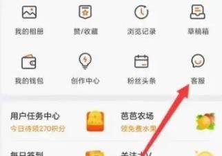
1. First enter Weibo, then click on me in the lower right corner and select [Customer Service]. 2. Then enter [Watermark] in the search box and select [Set Weibo Image Watermark]. 3. Then click [Link] in the interface. 4. Then click [Image Watermark Settings] in the newly opened window. 5. Finally, check [Picture Center] and click [Save].


