 Web Front-end
 CSS Tutorial
 css solution to the icon image alignment problem of list-style-image
css solution to the icon image alignment problem of list-style-image
First of all, I have encountered this problem as early as when I first started learning CSS, which was probably more than half a year ago. Later, I couldn’t do anything, so I switched to using tables to deal with small icons and text. But today, on a whim, I didn't want to use the form that was considered "evil" by standards, so the problem from n months ago reappeared.
Expected implementation renderings:

Start defining css:
#main ul{
 display:inline;
 margin: 0px;
 padding:0px;
   list-style: url(../images/dot.gif) outside;
 }
 #main li {
 line-height:150%;
}The effect in IE and Firefox:

Little Red Triangle actually got cheated on. I've been messing around for a while, but still can't figure it out. (Note, the small icon was originally not aligned with the text in the vertical direction, but was later raised using Fireworks. Needless to say, this point goes without saying.)
I wanted to post in the classic forum , but I thought it was too troublesome, so I looked for related posts everywhere.
Finally found one, and I was inspired to use that little red triangle as the background image of li.
So we have the following more clever and purposeful definition method:
#main ul{
 display:inline;
 margin: 0px;
 padding:0px;
   list-style-type:none;
 }
 #main li {
 background: url(../images/dot.gif) left top no-repeat;
    line-height:150%;
}The effect is as follows:

Expansion: But if I What should I do if I want to put the small icon as shown in the picture below at the outer end of the text?
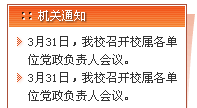
(1) At the beginning, I wanted to use the left padding space (padding-left) to empty the background image. So #main li {
padding-left:12px;
background: url(../images/dot.gif) left top no-repeat;    line-height:150%; }
was redefined, but the effect was not as expected, as follows:

Why before "March 31" How many vacancies are there? Oh, by the way, the li attribute automatically leaves a character-sized space in the first line for small icons, even if you define list-tyle-type:none.
(2) When I wrote the above line in this example, I wanted to change the source file back to its original appearance, so I deleted the background in li: url(../images/dot.gif) left top no -repeat; After previewing this sentence, I was pleasantly surprised to find that the perfect effect appeared in IE. It was really a strange combination of circumstances!
#main ul{
 display:inline;
 margin: 0px;
 padding:0px;
   list-style: url(../images/dot.gif) outside;
 }
 #main li {
 padding-left:12px;
 line-height:150%;
}Rendering:
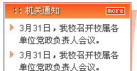
The only shortcoming is that we are not so lucky in firefox,
padding has no effect on the small icon Above:

With the attitude of treating a dead horse as a living horse, I changed padding-left:12px; to margin-left:12px ;
Preview:
ie:
firefox:
oh, is this true?
Except that the small icons and text spacing in Firefox are a little wider than in IE, it is really almost perfect.
Let's set off firecrackers to celebrate!
Finally, let us remember the most standard definition method of list-style-type:image;:
#main ul{
 display:inline;
 margin: 0px;
 padding:0px;
   list-style: url(../images/dot.gif) outside;
 }
 #main li {
 margin-left:12px;
 line-height:150%;
}The above is the detailed content of css solution to the icon image alignment problem of list-style-image. For more information, please follow other related articles on the PHP Chinese website!

Hot AI Tools

Undresser.AI Undress
AI-powered app for creating realistic nude photos

AI Clothes Remover
Online AI tool for removing clothes from photos.

Undress AI Tool
Undress images for free

Clothoff.io
AI clothes remover

AI Hentai Generator
Generate AI Hentai for free.

Hot Article

Hot Tools

Notepad++7.3.1
Easy-to-use and free code editor

SublimeText3 Chinese version
Chinese version, very easy to use

Zend Studio 13.0.1
Powerful PHP integrated development environment

Dreamweaver CS6
Visual web development tools

SublimeText3 Mac version
God-level code editing software (SublimeText3)

Hot Topics
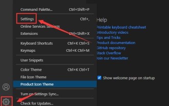 How to set unknown attributes in vscode vscode method to set unknown attributes
May 09, 2024 pm 02:43 PM
1. First, open the settings icon in the lower left corner and click the settings option. 2. Then, find the CSS column in the jumped window. 3. Finally, change the drop-down option in the unknownproperties menu to the error button.
 Graphical steps for setting the default properties of CSS in Visual Studio 2019
May 09, 2024 pm 02:01 PM
1. Open Visual Studio 2019, find its option settings, and click CSS. 2. Here you can see the technical settings of the following attributes. 3. Now you can set text and fill borders here. 4. At this time, you can also set the floating positioning here. 5. At this moment, you can also set the border and background here to complete the operation. 6. Finally, click the OK button here to set the CSS default properties.
 How to isolate styles in components in vue
May 09, 2024 pm 03:57 PM
Style isolation in Vue components can be achieved in four ways: Use scoped styles to create isolated scopes. Use CSS Modules to generate CSS files with unique class names. Organize class names using BEM conventions to maintain modularity and reusability. In rare cases, it is possible to inject styles directly into the component, but this is not recommended.
 The difference between v-show and v-if in vue
May 09, 2024 pm 01:48 PM
The main difference between v-show and v-if in Vue is: v-show: controls the display of elements by changing the display style attribute. It is lightweight and performance-friendly for elements that frequently switch to display/hide; but it will retain the space occupied by the elements. , may cause flickering. v-if: Insert or delete elements through conditions, affecting the layout flow and avoiding flickering; however, the cost of destroying and re-creating elements is high, and it is not suitable for frequently switching displayed/hidden elements.
 How to register for Bitstamp exchange pro? Is it safe? Is it formal?
Aug 13, 2024 pm 06:36 PM
How to register BitstampPro? Visit the BitstampPro website. Fill in your personal information and email address. Create a password and accept the terms. Verify email address. Is BitstampPro safe? Authentication required. Enforce the use of two-factor authentication. Most assets are stored in cold storage. Use HTTPS to encrypt communication. Conduct regular security audits. Is BitstampPro legitimate? Registered in Luxembourg. Regulated by the Luxembourg Financial Supervisory Committee. Comply with anti-money laundering and know-your-customer regulations.
 How to implement the custom table function of clicking to add data in dcat admin?
Apr 01, 2025 am 07:09 AM
How to implement the table function of custom click to add data in dcatadmin (laravel-admin) When using dcat...
 The latest ranking list of virtual currency trading platform APP (inventory of top 10 virtual currency trading platforms)
Mar 04, 2025 pm 03:51 PM
This article lists the top ten leading cryptocurrency exchanges in the world, including OKX, Binance, Gate.io, Huobi, Kraken, Coinbase, KuCoin, Crypto.com, Bitfinex and Bitstamp. With their strong technical strength, rich product lines, strict compliance operations and innovative ecological construction, these exchanges have taken the lead in the global cryptocurrency market. The article will introduce their special functions, technical architecture, security measures, compliance qualifications and ecosystem construction respectively, providing reference for investors to choose a suitable trading platform.
 What is the format of the source file?
May 09, 2024 pm 10:51 PM
Source files are uncompiled files containing original code or data, and their formats vary between programming languages and applications. Common formats include text files (.txt, .csv), programming languages (such as .py, .java), markup languages (such as .html, .css), image files (such as .png, .jpg), video files (such as .mp4, .avi), and other formats such as JSON (.json), PDF (.pdf), Word document (.doc), etc.


