

Looking at the gradient from another angle

This article mainly introduces relevant information about gradients in CSS, mainly shares the knowledge of linear-gradient and radial-gradient in CSS3, and brings you another angle of using gradients. The article introduces it in great detail through example code. Friends in need can refer to
Preface
This article mainly shares the relevant knowledge about linear-gradient and radial-gradient in CSS3, with To give you another angle on using gradients. Interested friends, let’s take a look at the detailed introduction:
1. Linear gradient
You need to go here first Let’s take a look at the basic syntax and then look at the following examples.
linear-gradient(90deg,red 20%,blue 50%,yellow 80%);
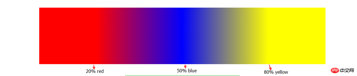
Obviously through this picture, you will roughly understand the role of setting these parameters. Although I didn't use any words to explain it. (So when you can’t understand the definition, you must practice it.)
Next, we have to do something. We overlap the color separation points.
    width: 300px;
    height: 200px;
    background: linear-gradient(90deg,blue 100px,#fff 100px,#fff 200px,red 200px);
Yes, this is the effect produced by the above gradient code. Does it feel like it breaks your previous impression of gradients.
Next we use linear-gradient to achieve cooler effects, such as:

Do you feel that you have broken through your own understanding of gradients? know. Let me talk about the idea of implementing this background: This is a regular pattern. We need to find its basic pattern. I believe you have found it.
Knowledge points we need to use:
background supports the declaration of multiple linear-gradients, separated by commas;
When you declare multiple linear-gradients, the one declared first is closer to the user. (Here we need to consider the issue of covering, usually transparent);
I haven’t mastered the abbreviation of background, but it doesn’t work;
- # A reasonable combination of
##background-repeat, background-size and background-position.
    width: 410px;
    height: 410px;
    background: linear-gradient(rgb(2,222,222) 10px, transparent 10px) repeat left top / 40px,
                linear-gradient(90deg,rgb(2,222,222) 10px, transparent 10px) repeat left top / 40px;
HTML elements to achieve the desired effect. Example:

##
    /*
     *  这里用scss写的,对新手不太友好,抱歉(-_-)
     */
    @mixin menuaction($color) {
        background: linear-gradient($color 100%, transparent 100%) no-repeat center bottom / 100% 10%;
        &:hover {
            background-size: 100% 100%;
            color: #fff;
        }
}2. Radial gradient
Basically radial gradient A directional gradient is similar to a linear gradient, except that it spreads outward from a center point. So I won’t go into details here.
Without further ado, let’s draw concentric circles:

    border-radius: 50%;
background: radial-gradient(circle,rgb(22,222,111) 0,rgb(22,222,111) 50px,red 50px,red 100px, rgb(222,222,1) 100px, rgb(222,222,1) 150px,rgb(222,2,111) 150px);Finally, end with What’s the end, haha, there are various coupons recently, so let’s use the knowledge of gradients to get a coupon:
 The core code is as follows:
    width: 300px;
    height: 120px;
    background: radial-gradient(transparent 0, transparent 5px, rgb(247,245,201) 5px) no-repeat,
                radial-gradient(transparent 0, transparent 5px, rgb(247,245,201) 5px) no-repeat,
                radial-gradient(transparent 0, transparent 5px, rgb(247,245,201) 5px) no-repeat,
                radial-gradient(transparent 0, transparent 5px, rgb(247,245,201) 5px) no-repeat,
                radial-gradient(transparent 0, transparent 5px, rgb(247,245,201) 5px) no-repeat,
                radial-gradient(transparent 0, transparent 5px, rgb(247,245,201) 5px) no-repeat,
                radial-gradient(#fff 0, #fff 10px, rgb(247,245,201) 10px) no-repeat,
                radial-gradient(#fff 0, #fff 10px, rgb(247,245,201) 10px) no-repeat,
                linear-gradient(90deg,transparent 10px, rgb(247,245,201) 10px);
            background-size: 20px 20px,20px 20px,20px 20px,20px 20px,20px 20px,20px 20px,60px 60px,60px 60px,100% 100%;
background-position: -10px 0,-10px 20px,-10px 40px,-10px 60px,-10px 80px,-10px 100px,60px -30px,60px 90px,left center;The above code should put size and position in the abbreviated attributes (I won’t change it...). At this point, everyone should have a new understanding of gradients.
The above is the detailed content of Looking at the gradient from another angle. For more information, please follow other related articles on the PHP Chinese website!

Hot AI Tools

Undresser.AI Undress
AI-powered app for creating realistic nude photos

AI Clothes Remover
Online AI tool for removing clothes from photos.

Undress AI Tool
Undress images for free

Clothoff.io
AI clothes remover

Video Face Swap
Swap faces in any video effortlessly with our completely free AI face swap tool!

Hot Article
Hot Tools

Notepad++7.3.1
Easy-to-use and free code editor

SublimeText3 Chinese version
Chinese version, very easy to use

Zend Studio 13.0.1
Powerful PHP integrated development environment

Dreamweaver CS6
Visual web development tools

SublimeText3 Mac version
God-level code editing software (SublimeText3)
Hot Topics
 1386
1386
 52
52

 Working With GraphQL Caching
Mar 19, 2025 am 09:36 AM
Working With GraphQL Caching
Mar 19, 2025 am 09:36 AM
If you’ve recently started working with GraphQL, or reviewed its pros and cons, you’ve no doubt heard things like “GraphQL doesn’t support caching” or
 Building an Ethereum app using Redwood.js and Fauna
Mar 28, 2025 am 09:18 AM
Building an Ethereum app using Redwood.js and Fauna
Mar 28, 2025 am 09:18 AM
With the recent climb of Bitcoin’s price over 20k $USD, and to it recently breaking 30k, I thought it’s worth taking a deep dive back into creating Ethereum
 Vue 3
Apr 02, 2025 pm 06:32 PM
Vue 3
Apr 02, 2025 pm 06:32 PM
It's out! Congrats to the Vue team for getting it done, I know it was a massive effort and a long time coming. All new docs, as well.
 Can you get valid CSS property values from the browser?
Apr 02, 2025 pm 06:17 PM
Can you get valid CSS property values from the browser?
Apr 02, 2025 pm 06:17 PM
I had someone write in with this very legit question. Lea just blogged about how you can get valid CSS properties themselves from the browser. That's like this.
 A bit on ci/cd
Apr 02, 2025 pm 06:21 PM
A bit on ci/cd
Apr 02, 2025 pm 06:21 PM
I'd say "website" fits better than "mobile app" but I like this framing from Max Lynch:
 Using Markdown and Localization in the WordPress Block Editor
Apr 02, 2025 am 04:27 AM
Using Markdown and Localization in the WordPress Block Editor
Apr 02, 2025 am 04:27 AM
If we need to show documentation to the user directly in the WordPress editor, what is the best way to do it?
 Comparing Browsers for Responsive Design
Apr 02, 2025 pm 06:25 PM
Comparing Browsers for Responsive Design
Apr 02, 2025 pm 06:25 PM
There are a number of these desktop apps where the goal is showing your site at different dimensions all at the same time. So you can, for example, be writing
 Stacked Cards with Sticky Positioning and a Dash of Sass
Apr 03, 2025 am 10:30 AM
Stacked Cards with Sticky Positioning and a Dash of Sass
Apr 03, 2025 am 10:30 AM
The other day, I spotted this particularly lovely bit from Corey Ginnivan’s website where a collection of cards stack on top of one another as you scroll.
