

Since the animation animation was used above, here is a detailed introduction to the parameters of this animation.
CSS animation (Animations) is simply to secretly change one or some of its CSS values within a certain frequency within a fixed animation time, thereby achieving visual transformation. Animation effects. Many aspects of Animations can be controlled, including animation running time, start value and end value, as well as animation pause and delay its start time, etc.
<single-animation> = <single-animation-name> || <time> || <single-animation-timing- function> || <time> || <single-animation-iteration-count> || <single-animation-direction> || <single-animation-fill-mode> || <single-animation- play-state>
<' animation-name '>: Retrieve or set The name of the animation applied to the object<' animation-duration '>: Retrieve or set the duration of the object animation<' animation-timing-function '>: Retrieve or set the transition type of object animation
##< ' animation-delay '>: Retrieve or set the time of object animation delay
<' animation-iteration-count '>: Retrieve or set the number of cycles of object animation
<' animation-direction '>: Retrieve or set Whether the object animation moves in reverse in the loop
<' animation-fill-mode '>: Retrieve or set the object animation time outside The state
<' animation-play-state '>: Retrieves or sets the state of the object animation. w3c is considering whether to remove this attribute, because the state of animation can be achieved in other ways, such as resetting the style
animation-direction
Run in the opposite direction
The animation first runs normally and then runs in the opposite direction, and continues to run alternately
Specifies the state of the object outside of the animation time.
none: Default value. Do not set the state of the object outside of the animation
forwards:Set the object state to the state at the end of the animation
##backwards:Set the object state to the state when the animation starts
both:Set the object status to the end or start state of the animation. Before the animation starts, it is the "from" or "0%" keyframe; the animation is completed After that comes the "to" or "100%" keyframe state.
"running". There is also a value paused: paused.
: div{width:100px;height:100px;background:red;position:relative;animation:mymove 5s infinite;-moz-animation:mymove 5s infinite; /*Firefox*/-webkit-animation:mymove 5s infinite; /*Safari and Chrome*/}@keyframes mymove{from {left:0px;}to {left:200px;}}
@-moz-keyframes mymove { /*Firefox*/from {left:0px;}to {left:200px;}}
@-webkit-keyframes mymove{ /*Safari and Chrome*/from {left:0px;}to {left:200px;}}@keyframes myfirst{0% {background: red; left:0px; top:0px;}25% {background: yellow; left:200px; top:0px;}50% {background: blue; left:200px; top:200px;}75% {background: green; left:0px; top:200px;}100% {background: red; left:0px; top:0px;}}
@-moz-keyframes myfirst{ /* Firefox */0% {background: red; left:0px; top:0px;}25% {background: yellow; left:200px; top:0px;}50% {background: blue; left:200px; top:200px;}75% {background: green; left:0px; top:200px;}100% {background: red; left:0px; top:0px;}}
@-webkit-keyframes myfirst{ /* Safari 和 Chrome */0% {background: red; left:0px; top:0px;}25% {background: yellow; left:200px; top:0px;}50% {background: blue; left:200px; top:200px;}75% {background: green; left:0px; top:200px;}100% {background: red; left:0px; top:0px;}}
@-o-keyframes myfirst {/* Opera */0% {background: red; left:0px; top:0px;}25% {background: yellow; left:200px; top:0px;}50% {background: blue; left:200px; top:200px;}75% {background: green; left:0px; top:200px;}100% {background: red; left:0px; top:0px;}}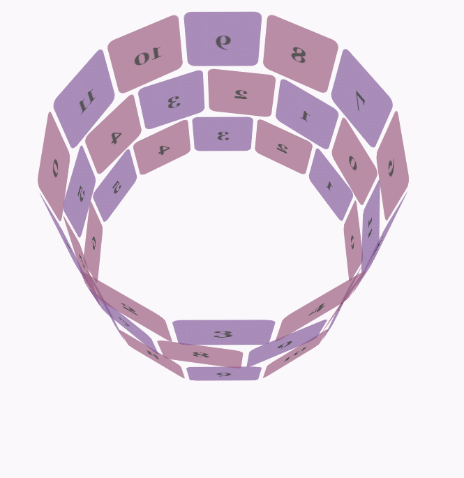
body {font-family: 'Lucida Grande', Verdana, Arial;font-size: 12px;
      }  #stage {margin: 150px auto;width: 600px;height: 400px;-webkit-perspective: 800;
      }  #rotate {margin: 0 auto;width: 600px;height: 400px;-webkit-transform-style: preserve-3d;-webkit-animation-name: x-spin;-webkit-animation-duration: 7s;-webkit-animation-iteration-count: infinite;-webkit-animation-timing-function: linear;
      }  .ring {margin: 0 auto;height: 110px;width: 600px;-webkit-transform-style: preserve-3d;-webkit-animation-iteration-count: infinite;-webkit-animation-timing-function: linear;
      }
      .ring > :nth-child(odd) {background-color: #995C7F;
      }  .ring > :nth-child(even) {background-color: #835A99;
      }  .poster {position: absolute;left: 250px;width: 100px;height: 100px;opacity: 0.7;color: rgba(0,0,0,0.9);-webkit-border-radius: 10px;
      }
      .poster > p {font-family: 'Georgia', serif;font-size: 36px;font-weight: bold;text-align: center;margin-top: 28px;
      }  #ring-1 {-webkit-animation-name: y-spin;-webkit-animation-duration: 5s;
      }  #ring-2 {-webkit-animation-name: back-y-spin;-webkit-animation-duration: 4s;
      }  #ring-3 {-webkit-animation-name: y-spin;-webkit-animation-duration: 3s;
      }  @-webkit-keyframes x-spin {0%    { -webkit-transform: rotateX(0deg); }50%   { -webkit-transform: rotateX(180deg); }100%  { -webkit-transform: rotateX(360deg); }  }

      @-webkit-keyframes y-spin {0%    { -webkit-transform: rotateY(0deg); }50%   { -webkit-transform: rotateY(180deg); }100%  { -webkit-transform: rotateY(360deg); }  }

      @-webkit-keyframes back-y-spin {0%    { -webkit-transform: rotateY(360deg); }50%   { -webkit-transform: rotateY(180deg); }100%  { -webkit-transform: rotateY(0deg); }  }
<div id="stage">
  <div id="rotate"><div id="ring-1" class="ring"></div><div id="ring-2" class="ring"></div><div id="ring-3" class="ring"></div>
  </div></div>
const POSTERS_PER_ROW = 12;
const RING_RADIUS = 200;function setup_posters (row){var posterAngle = 360 / POSTERS_PER_ROW;for (var i = 0; i < POSTERS_PER_ROW; i ++) {      var poster = document.createElement('div');
      poster.className = 'poster';
      var transform = 'rotateY(' + (posterAngle * i) + 'deg) translateZ(' + RING_RADIUS + 'px)';
      poster.style.webkitTransform = transform;
      var content = poster.appendChild(document.createElement('p'));
      content.textContent = i;
      row.appendChild(poster);
    }
}function init (){
    setup_posters(document.getElementById('ring-1'));
    setup_posters(document.getElementById('ring-2'));
    setup_posters(document.getElementById('ring-3'));
}

window.addEventListener('load', init, false);The above is the detailed content of Detailed explanation of examples of animation in CSS3. For more information, please follow other related articles on the PHP Chinese website!


![[Web front-end] Node.js quick start](https://img.php.cn/upload/course/000/000/067/662b5d34ba7c0227.png)


