

Easily master commonly used interactive components

Prototype design is inseparable from components. If the prototype is a house, then the components are cement and bricks. This article will introduce you to the eight most commonly used interactive components. Open Mockplus and try it now!
1. Pop-up menu
Pop-up menu is the most commonly used component in prototype design. Many components are used similarly to it. Proficient use of pop-up menu will bring you great help. . Next, let's take a look at how to use pop-up menus from a practical case.
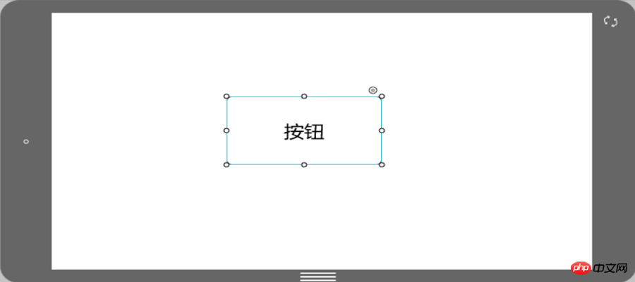
1. Drag out a component at will. Here we take the button component in Mockplus as an example.
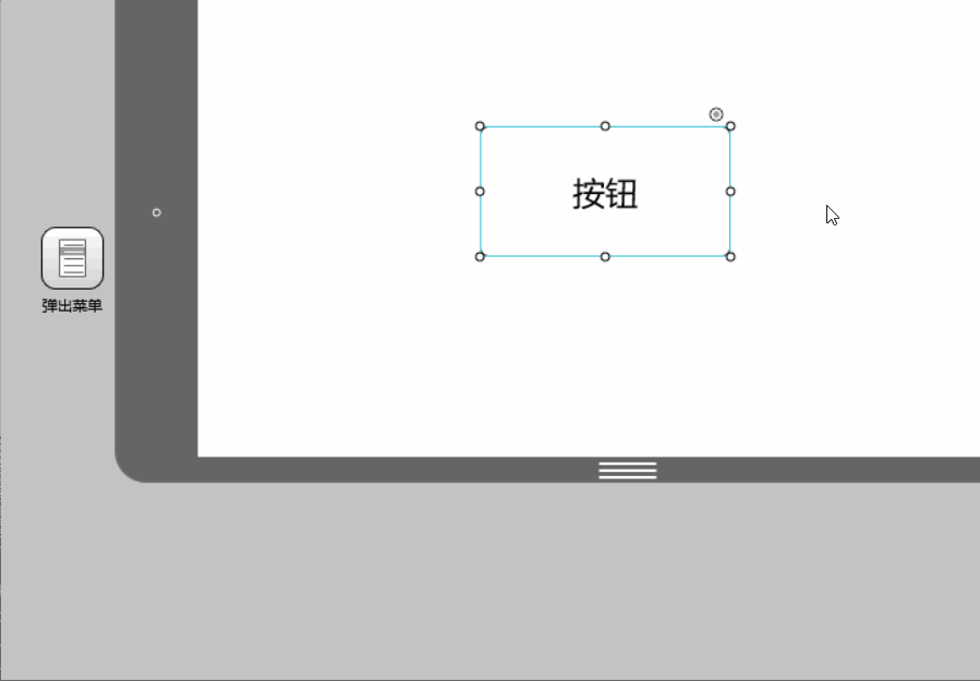
2. Drag out the pop-up menu component and connect the link point in the upper right corner of the button to the menu component.
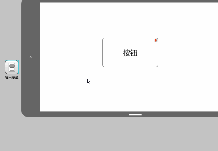
3. Double-click the pop-up menu to edit the menu location and content.
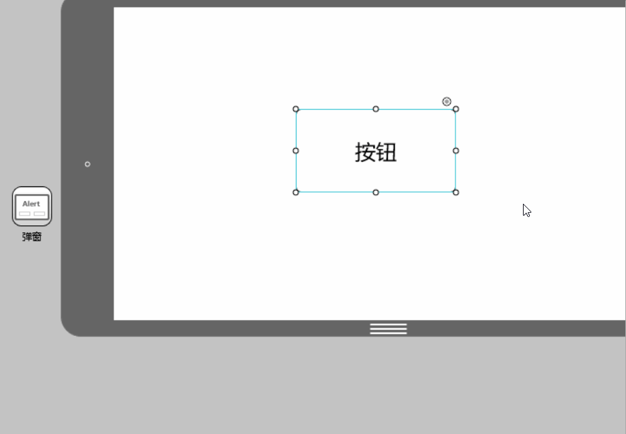
2. Pop-up windows
Operations of pop-up windows and pop-up panels The steps are basically the same. The difference is that the four menu items of the pop-up menu can all be set for interactive actions, while the pop-up window only has two options of "Yes" and "No" for setting interactive actions. At the same time, the format of the pop-up window content is also the same as The popup panel is slightly different.
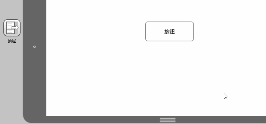
 3. Drawer
The drawer is a commonly used container component , which is characterized by high encapsulation, high adjustability, and high accommodation. In other words, you don’t need to design the details of the drawer yourself. You only need to set it up in a few simple settings to create a drawer that slides out in a variety of ways and can be loaded in. Drawers for most components.
 After connecting the link point of the button to the drawer, double-click the drawer icon to add the component.
 4. Picture carousel
Number of picture carousel components supported The random rotation and display of pictures is also easy to operate. First drag the picture carousel component into the workspace and double-click to add pictures.
5. Panel

The panel is actually a component that can be placed container.
Drag the capacity panel to the required place, adjust the size, double-click to enter the editing mode, and drag in the required components. Note that components outside the panel boundaries will not be displayed. You will find that: because it is a container, the panel has a border, and the part of the subcomponent that exceeds the border will be "cut off". Another interesting thing is: unlike "Group", when setting up interaction, you can use sub-components in the panel as the interaction target, but "Group" cannot, you can only set the entire group as the interaction target, because a group is a group of several components. After being formed and grouped, they are regarded as a whole.
6. Pop-up panel
The pop-up panel is the most flexible interaction components. Drag a pop-up panel and double-click to open it. You will find that there is nothing in it, but using it, we can create the required pop-up windows, message boxes, prompt boxes and many other interactive components.
7. Content Panel The content panel is mainly used to achieve quick switching of content. But it is generally not used alone. You can use it to cooperate with menu bars, lists, tabs and other components with multi-select properties to complete content switching.

First set up three layers in the content panel and connect them to the three target pages. Then connect the links on the tab to the three layers one by one, and the content switching is completed.
8. Scroll Area
 When the screen size is not enough to accommodate us When we need to display more content, we can use the scroll area component to display more content in a limited space.
Drag the scroll area component into the workspace, adjust the size, and then double-click to enter editing mode. In the editing mode, drag in the components that need to be added to the scroll area. Click "+" to expand the size of the scroll area. Click "-" to shrink the size of the scroll area. If you press the Ctrl key at the same time, the expansion or contraction can be accelerated.
Interaction is a very important part of prototype design. Flexible use of the above eight interactive components is enough to meet your commonly used interaction designs! In addition to interactive components, there are nearly two hundred encapsulated components in Mockplus. Try it now!
The above is the detailed content of Easily master commonly used interactive components. For more information, please follow other related articles on the PHP Chinese website!

Hot AI Tools

Undresser.AI Undress
AI-powered app for creating realistic nude photos

AI Clothes Remover
Online AI tool for removing clothes from photos.

Undress AI Tool
Undress images for free

Clothoff.io
AI clothes remover

AI Hentai Generator
Generate AI Hentai for free.

Hot Article
Hot Tools

Notepad++7.3.1
Easy-to-use and free code editor

SublimeText3 Chinese version
Chinese version, very easy to use

Zend Studio 13.0.1
Powerful PHP integrated development environment

Dreamweaver CS6
Visual web development tools

SublimeText3 Mac version
God-level code editing software (SublimeText3)
Hot Topics
 1376
1376
 52
52

 How to install the Windows 10 old version component DirectPlay
Dec 28, 2023 pm 03:43 PM
How to install the Windows 10 old version component DirectPlay
Dec 28, 2023 pm 03:43 PM
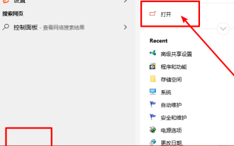
Many users always encounter some problems when playing some games on win10, such as screen freezes and blurred screens. At this time, we can solve the problem by turning on the directplay function, and the operation method of the function is also Very simple. How to install directplay, the old component of win10 1. Enter "Control Panel" in the search box and open it 2. Select large icons as the viewing method 3. Find "Programs and Features" 4. Click on the left to enable or turn off win functions 5. Select the old version here Just check the box
 How to implement calendar component using Vue?
Jun 25, 2023 pm 01:28 PM
How to implement calendar component using Vue?
Jun 25, 2023 pm 01:28 PM
Vue is a very popular front-end framework. It provides many tools and functions, such as componentization, data binding, event handling, etc., which can help developers build efficient, flexible and easy-to-maintain Web applications. In this article, I will introduce how to implement a calendar component using Vue. 1. Requirements analysis First, we need to analyze the requirements of this calendar component. A basic calendar should have the following functions: display the calendar page of the current month; support switching to the previous month or next month; support clicking on a certain day,
 Turn on split-screen interaction in win11
Dec 25, 2023 pm 03:05 PM
Turn on split-screen interaction in win11
Dec 25, 2023 pm 03:05 PM
In the win11 system, we can enable multiple monitors to use the same system and operate together by turning on split-screen interaction. However, many friends do not know how to turn on split-screen interaction. In fact, just find the monitor in the system settings. The following is Get up and study. How to open split-screen interaction in win11 1. Click on the Start menu and find "Settings" 2. Then find the "System" settings there. 3. After entering the system settings, select "Display" on the left. 4. Then select "Extend these displays" in the multi-monitor on the right.
 Angular components and their display properties: understanding non-block default values
Mar 15, 2024 pm 04:51 PM
Angular components and their display properties: understanding non-block default values
Mar 15, 2024 pm 04:51 PM
The default display behavior for components in the Angular framework is not for block-level elements. This design choice promotes encapsulation of component styles and encourages developers to consciously define how each component is displayed. By explicitly setting the CSS property display, the display of Angular components can be fully controlled to achieve the desired layout and responsiveness.
 Vue3+TS+Vite development skills: how to interact with the backend API
Sep 08, 2023 pm 06:01 PM
Vue3+TS+Vite development skills: how to interact with the backend API
Sep 08, 2023 pm 06:01 PM
Vue3+TS+Vite development skills: How to interact with the back-end API Introduction: In web application development, data interaction between the front-end and the back-end is a very important link. As a popular front-end framework, Vue3 has many ways to interact with back-end APIs. This article will introduce how to use the Vue3+TypeScript+Vite development environment to interact with the back-end API, and deepen understanding through code examples. 1. Use Axios to send requests. Axios is
 How to open the settings of the old version of win10 components
Dec 22, 2023 am 08:45 AM
How to open the settings of the old version of win10 components
Dec 22, 2023 am 08:45 AM
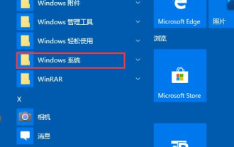
Win10 old version components need to be turned on by users themselves in the settings, because many components are usually closed by default. First we need to enter the settings. The operation is very simple. Just follow the steps below. Where are the win10 old version components? Open 1. Click Start, then click "Win System" 2. Click to enter the Control Panel 3. Then click the program below 4. Click "Enable or turn off Win functions" 5. Here you can choose what you want to open
 Vue component practice: paging component development
Nov 24, 2023 am 08:56 AM
Vue component practice: paging component development
Nov 24, 2023 am 08:56 AM
Vue component practice: Introduction to paging component development In web applications, the paging function is an essential component. A good paging component should be simple and clear in presentation, rich in functions, and easy to integrate and use. In this article, we will introduce how to use the Vue.js framework to develop a highly customizable paging component. We will explain in detail how to develop using Vue components through code examples. Technology stack Vue.js2.xJavaScript (ES6) HTML5 and CSS3 development environment
 How to handle dynamic loading and switching of components in Vue
Oct 15, 2023 pm 04:34 PM
How to handle dynamic loading and switching of components in Vue
Oct 15, 2023 pm 04:34 PM
Handling dynamic loading and switching of components in Vue Vue is a popular JavaScript framework that provides a variety of flexible functions to handle the dynamic loading and switching of components. In this article, we will discuss some methods of handling dynamic loading and switching of components in Vue, and provide specific code examples. Dynamically loading components means dynamically loading components at runtime as needed. This improves the performance and loading speed of your application because relevant components are loaded only when needed. Vue provides async and awa
