
The position of the element in the document flow is determined by the position of the element in (X)HTML. This is the most primitive ordinary flow. The float mentioned earlierCSS Study Notes 08 FloatYou can change the position of the element in the document flow. In addition to this, we can also re-determine the position of the element in the document flow by using the position property of CSS.
static: The default document flow layout method. Block-level elements generate a rectangular box as part of the document flow. Inline elements will Creates one or more line boxes, placed within their parent element. (Ignore top, bottom, left, right or z-index declarations).
relative: Offset relative to the original position. The completion process is to first generate an element in static (float) mode. Relative to the previous position, the movement direction and amplitude are determined by left , right, top, bottom attributes are determined, the space it originally occupied is still retained.
absolute: The element box is completely deleted from the document flow, and the space originally occupied by the element in the normal document flow will be closed,As if the element does not exist originally, positioning is performed according to the parent container (must be a non-static positioned container). The element generates a block-level box after positioning, regardless of what type of box it originally generated in the normal flow.
fixed: Fixed at a certain location in the browser and will not change when the browser scrolls.
static is the default layout method and will not be introduced here.
1 <!DOCTYPE html> 2 <html lang="en"> 3 <head> 4 <meta charset="UTF-8"> 5 <title>CSS相对定位</title> 6 7 <style type="text/css"> 8 div {height: 100px; width: 100px; border: 1px solid #000; background-color: yellow;} 9 </style>10 </head>11 <body>12 <div class="box1">box1</div>13 <div class="box2">box2</div>14 <div class="box3">box3</div>15 </body>16 </html> 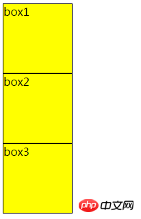
At this time, box1 and box2 are positioned on the page according to the static layout method. Now box2 Relative positioning

#The result is as follows, the position of box2 is offset (this offset is relative to the original position of box2), and does not affect box1 Position with box3
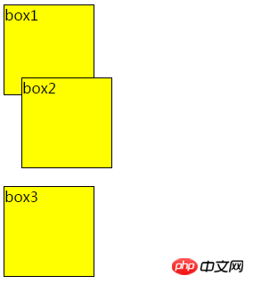
Note that when using relative positioning, the element still occupies the original space regardless of whether it is moved or not. Therefore, moving an element causes it to cover other boxes.
Absolute positioning makes the position of the element independent of the document flow, so it does not occupy space. This is different from relative positioning, which is actually considered part of the normal flow positioning model because the element's position is relative to its position in the normal flow.
1 <!DOCTYPE html> 2 <html lang="en"> 3 <head> 4 <meta charset="UTF-8"> 5 <title>CSS绝对定位</title> 6 7 <style type="text/css"> 8 .parent {height: 200px; width: 200px; background-color: yellow;} 9 .child {height: 100px; width: 100px; background-color: red; top: 0px; right: 0px; position: absolute;}10 </style>11 </head>12 <body>13 <div class="parent">14 parent15 <div class="child">16 child17 </div>18 </div>19 </body>20 </html>
Now also add a positioning attribute to parent

The effect is as follows, you can see The position of the child has changed
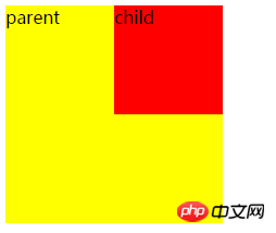
From the above phenomenon, one thing can be summarized: the position of an absolutely positioned element is relative to the nearest positioned ancestor If the element has no positioned ancestors, its position is relative to the original containing block (in this case, the body element and parent).
To use absolute positioning, there must be two conditions
1. The parent must be To add positioning attributes to an element, it is generally recommended to use position:relative
2. Add absolute positioning to the child element position:absolute, and also add direction attributes (referring to left, right, top , bottom attribute)
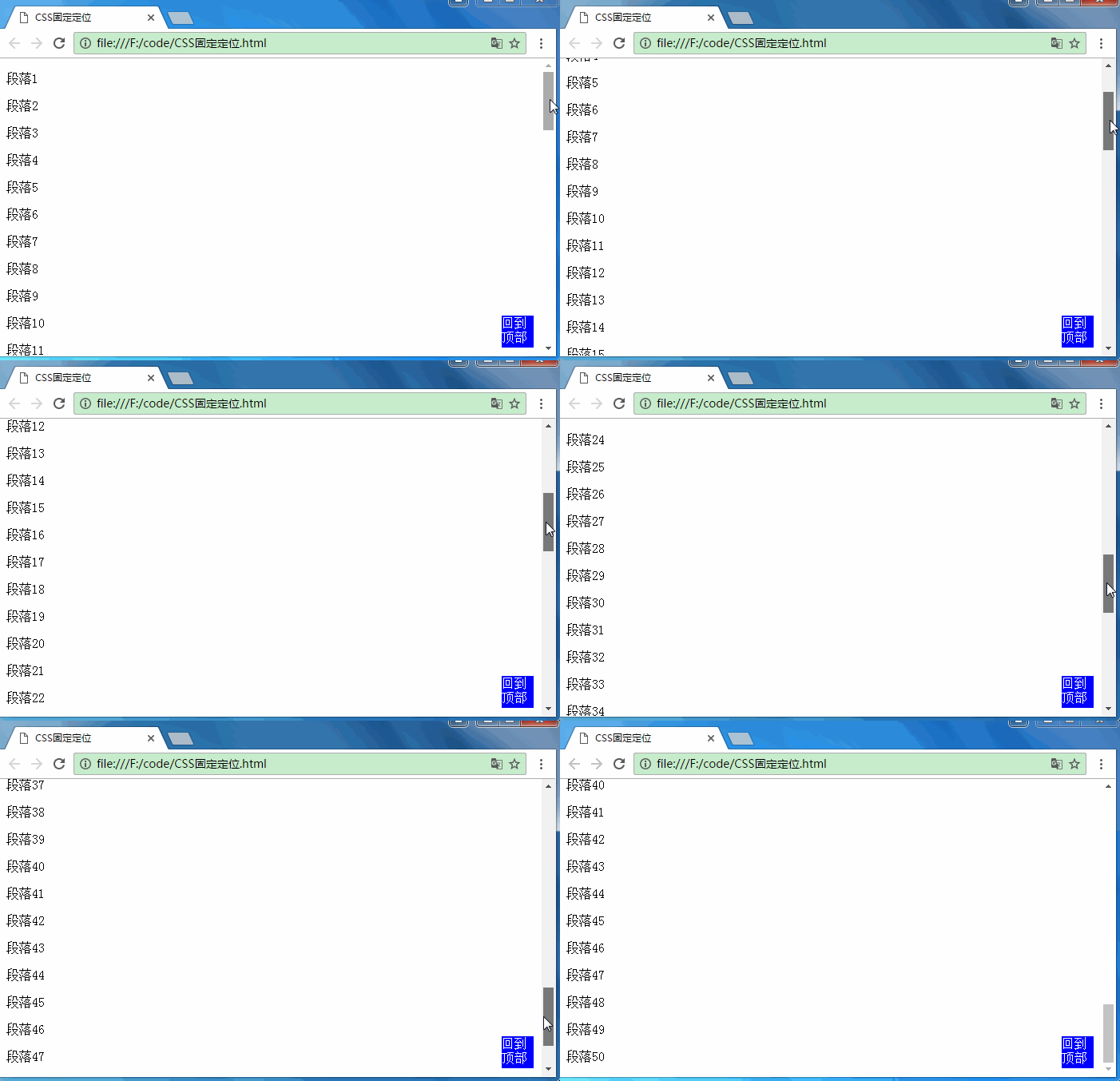
is similar to the absolute positioning type, but its relative movement coordinates are the view (web page window within the screen) itself. Since the view itself is fixed, it will not change as the scroll bar of the browser window scrolls, unless you move the screen position of the browser window on the screen, or change the display size of the browser window, so fixedly positioned elements will always be in A position within the view within the browser window that is not affected by the flow of the document.
1 <!DOCTYPE html> 2 <html lang="en"> 3 <head> 4 <meta charset="UTF-8"> 5 <title>CSS固定定位</title> 6 <style type="text/css"> 7 .back-top {height: 40px; width: 40px; background-color: blue; color: #fff; position: fixed; bottom: 10px;right: 10px;} 8 </style> 9 </head>10 <body>11 <div class="back-top">回到顶部</div> 12 <p>段落1</p>13 <p>段落2</p>14 <p>段落3</p>15 ...16 <p>段落49</p>17 <p>段落50</p>18 </body>19 </html>The effect is as follows. The div back to the top is always in the same position, and the  on the blog page is also fixed positioning.
Absolute positioning is based on the parent element as the reference point. It will break away from the document flow and does not occupy the original position space.
Relative positioning is based on itself as the reference point, leaving the original position, but it will still occupy the original position space
Fixed positioning is based on the browser window as the reference point, it is always in the same position and will not move
The above is the detailed content of Detailed explanation of relative positioning, absolute positioning and fixed positioning. For more information, please follow other related articles on the PHP Chinese website!


