
This article mainly introduces the relevant information about the powerful filter attribute in CSS3. Friends who need it can refer to the
blogger Recently, in the process of building a website, I discovered a very powerful CSS3 attribute, which is the filter attribute. Friends who like p-pictures should know what kind of artifact this is by looking at the name. Of course, the effect of this attribute cannot be compared with that of PS, but if used well, one picture can be made into the effect of two pictures while saving a lot of space.
1. Definition
Filter literally means filter. The official filter attribute defines an element (usually < img>) visual effects (for example: blur and saturation); for example:
<style>
    img{
      /*灰度100%*/
        -webkit-filter:grayscale(100%);
    }
</style>
<img src="img/boke.png" alt="">

# Seeing this effect, are bloggers starting to be interested in filters?
2. Syntax
filter: none | blur() | brightness() | contrast() | drop-shadow() | grayscale() | hue-rotate() | invert() | opacity() | saturate() | sepia() | url();
As you can see, there are many attributes Select value, what do they mean?
grayscale grayscale
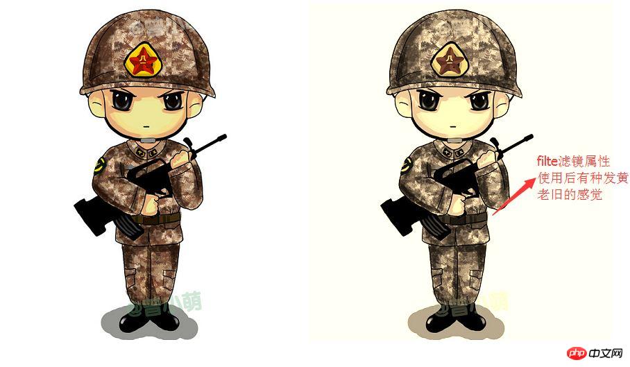
sepia brown (a retro old photo feel)
saturate saturation
hue-rotatehue rotation
invert reverse color
opacitytransparency
brightness
contrast
blur
drop-shadow
For example:
Use sepia to adjust here
 <head>
     <meta charset="UTF-8">
      <title>Title</title>
      <style>
          .img{

             -webkit-filter:sepia(70%);
          }
      </style>
  </head>
 <body>
 <img src="img/boke.png" alt="">
 <img class="img" src="img/boke.png" alt="">
</body>ExamplePicture:
3、Example
Below, I will give an example of several values of the filter attribute. Other interesting things need to be discovered by bloggers. If you have any interesting things, you can share them with me.
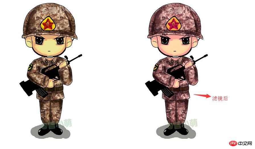
(1)hue-rotate (Color rotation)
The effect is shown in the picture. The specific effect depends on everyone’s discovery:
     <style>
          .img{
              -webkit-filter:hue-rotate(330deg);
          }
      </style>
  </head>
  <body>
  <img src="img/boke.png" alt="">
  <img class="img" src="img/boke.png" alt="">
</body>The effect picture:
(2)blur(blur)
blur (blur effect, unit px)
     <style>
          .img{
            -webkit-filter:blur(1px);
          }
      </style>
  <body>
  <img src="img/boke.png" alt="">
  <img class="img" src="img/boke.png" alt="">
</body>Example picture:

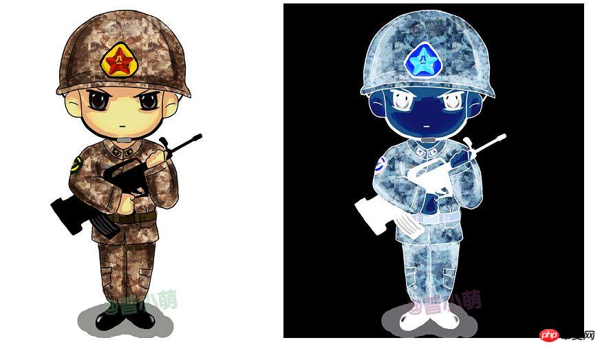
(3)invert reverse color
invert reverse color and the picture will become It’s useless to say more about the feeling of the negative, look at the code:
 <style>
        .img{
            -webkit-filter:invert(100%);
        }
    </style>
<body>
<img src="img/boke.png" alt="">
<img class="img" src="img/boke.png" alt="">
</body>Sample picture:
The above is the detailed content of Detailed explanation of filter attribute in CSS3. For more information, please follow other related articles on the PHP Chinese website!
 css3 tutorial
 What are the css3 gradient properties?
 How to modify the text on the picture
 Introduction to commonly used Windows registry commands
 What does Jingdong plus mean?
 svg to jpg
 The meaning of today's headline display volume
 How to cancel automatic renewal of Taobao Money Saving Card
 How to open a digital currency account


