

Detailed explanation of Bootstrap drop-down menu examples

Previous words
When interacting with web pages, context menus or hidden/show menu items are often needed. Bootstrap provides a switchable, contextual menu by default for displaying a link list. Moreover, the menu display in various interactive states needs to be used in conjunction with the javascript plug-in. This article will introduce the Bootstrap drop-down menu in detail
How to use
When using the drop-down menu of the Bootstrap framework, you must call the bootstrap.js file provided by the Bootstrap framework. Of course, if you are using the uncompiled version, you can find a file named "dropdown.js" in the js folder, and you can also call this js file
Because Bootstrap's component interaction effects all depend on A plug-in written by the jQuery library, so jquery.js must be loaded before using bootstrap.js to produce the effect
<!DOCTYPE html><html lang="en"><head><meta charset="UTF-8"><title>Document</title><link href="https://cdn.bootcss.com/bootstrap/3.3.7/css/bootstrap.min.css?1.1.11" rel="stylesheet"></head><body><script src="https://cdn.bootcss.com/jquery/1.12.4/jquery.min.js?1.1.11"></script><script src="https://cdn.bootcss.com/bootstrap/3.3.7/js/bootstrap.min.js?1.1.11"></script></body></html>
Basic usage
When using the drop-down menu component in the Bootstrap framework, it is very important to use the correct structure. If the structure and class name are not used correctly, it will directly affect whether the component can be used normally
1. Use a name The container of "dropdown" wraps the entire drop-down menu element
<div class="dropdown"></div>
2. Use a
<button class="btn dropdown-toggle" type="button" data-toggle="dropdown">
3. The drop-down menu item uses a ul list, and defines a class name "dropdown -menu"
<ul class="dropdown-menu" role="menu">
ActionAnother actionSomething else here
.dropup for the parent element of the drop-down menu class, which allows the menu to pop up (the default is to pop down)
<div class="dropup">
  <button class="btn btn-default dropdown-toggle" type="button" id="dropdownMenu1" data-toggle="dropdown" aria-haspopup="true" aria-expanded="true">Dropup<span class="caret"></span>
  </button>
  <ul class="dropdown-menu" aria-labelledby="dropdownMenu1"><li><a href="#">Action</a></li><li><a href="#">Another action</a></li><li><a href="#">Something else here</a></li>
  </ul></div>
.dropdown-menu {
  position: absolute;/*设置绝对定位,相对于父元素div.dropdown*/
  top: 100%;/*让下拉菜单项在父菜单项底部,如果父元素不设置相对定位,该元素相对于body元素*/
  left: 0;
  z-index: 1000;/*让下拉菜单项不被其他元素遮盖住*/
  display: none;/*默认隐藏下拉菜单项*/
  float: left;
  min-width: 160px;
  padding: 5px 0;
  margin: 2px 0 0;
  font-size: 14px;
  list-style: none;
  background-color: #fff;
  background-clip: padding-box;
  border: 1px solid #ccc;
  border: 1px solid rgba(0, 0, 0, .15);
  border-radius: 4px;
  -webkit-box-shadow: 0 6px 12px rgba(0, 0, 0, .175);
  box-shadow: 0 6px 12px rgba(0, 0, 0, .175);
}.open > .dropdown-menu {
display: block;
}.dropdown-menu .divider {
height: 1px;
margin: 9px 0;
overflow: hidden;
background-color: #e5e5e5;
}<li role="separator" class="divider"></li>
<li class="dropdown-header">Dropdown header</li>
.dropdown-header {
  display: block;
  padding: 3px 20px;
  font-size: 12px;
  line-height: 1.42857143;
  color: #999;
}<div class="dropdown"> <button class="btn btn-default dropdown-toggle" type="button" id="dropdownMenu1" data-toggle="dropdown" aria-haspopup="true" aria-expanded="true">Dropdown<span class="caret"></span> </button> <ul class="dropdown-menu" role="menu" aria-labelledby="dropdownMenu1"><li role="presentation" class="dropdown-header">第一部分菜单头部</li><li role="presentation"><a role="menuitem" tabindex="-1" href="#">下拉菜单项</a></li><li role="presentation"><a role="menuitem" tabindex="-1" href="#">下拉菜单项</a></li><li role="presentation" class="divider"></li><li role="presentation" class="dropdown-header">第二部分菜单头部</li><li role="presentation"><a role="menuitem" tabindex="-1" href="#">下拉菜单项</a></li> </ul></div>
.dropdown-menu-right {
  right: 0;
  left: auto;
}display: inline-block; margin-left: 60px;
<div class="dropdown" style="display: inline-block;margin-left: 60px;">
  <button class="btn btn-default dropdown-toggle" type="button" id="dropdownMenu1" data-toggle="dropdown" aria-haspopup="true" aria-expanded="true">Dropdown<span class="caret"></span>
  </button>
  <ul class="dropdown-menu dropdown-menu-right" role="menu" aria-labelledby="dropdownMenu1"><li role="presentation"><a role="menuitem" tabindex="-1" href="#">下拉菜单项</a></li><li role="presentation"><a role="menuitem" tabindex="-1" href="#">下拉菜单项</a></li><li role="presentation"><a role="menuitem" tabindex="-1" href="#">下拉菜单项</a></li><li role="presentation" class="divider"></li><li role="presentation"><a role="menuitem" tabindex="-1" href="#">下拉菜单项</a></li>
  </ul></div>
.dropdown-menu > li > a:hover,
.dropdown-menu > li > a:focus {
  color: #262626;
  text-decoration: none;
  background-color: #f5f5f5;
}<div class="dropdown"> <button class="btn btn-default dropdown-toggle" type="button" id="dropdownMenu1" data-toggle="dropdown" aria-haspopup="true" aria-expanded="true">Dropdown<span class="caret"></span> </button> <ul class="dropdown-menu" role="menu" aria-labelledby="dropdownMenu1"><li role="presentation" class="active"><a role="menuitem" tabindex="-1" href="#">下拉菜单项</a></li><li role="presentation"><a role="menuitem" tabindex="-1" href="#">下拉菜单项</a></li><li role="presentation"><a role="menuitem" tabindex="-1" href="#">下拉菜单项</a></li><li role="presentation" class="divider"></li><li role="presentation" class="disabled"><a role="menuitem" tabindex="-1" href="#">下拉菜单项</a></li> </ul></div>
The above is the detailed content of Detailed explanation of Bootstrap drop-down menu examples. For more information, please follow other related articles on the PHP Chinese website!

Hot AI Tools

Undresser.AI Undress
AI-powered app for creating realistic nude photos

AI Clothes Remover
Online AI tool for removing clothes from photos.

Undress AI Tool
Undress images for free

Clothoff.io
AI clothes remover

AI Hentai Generator
Generate AI Hentai for free.

Hot Article
Hot Tools

Notepad++7.3.1
Easy-to-use and free code editor

SublimeText3 Chinese version
Chinese version, very easy to use

Zend Studio 13.0.1
Powerful PHP integrated development environment

Dreamweaver CS6
Visual web development tools

SublimeText3 Mac version
God-level code editing software (SublimeText3)
Hot Topics


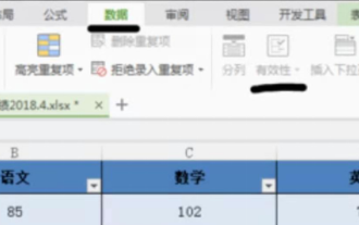 How to make drop-down menu in WPS table
Mar 21, 2024 pm 01:31 PM
How to make drop-down menu in WPS table
Mar 21, 2024 pm 01:31 PM
How to make the WPS table drop-down menu: After selecting the cell where you want to set the drop-down menu, click "Data", "Validity" in sequence, and then make the corresponding settings in the pop-up dialog box to pull down our menu. As a powerful office software, WPS has the ability to edit documents, statistical data tables, etc., which provides a lot of convenience for many people who need to deal with text, data, etc. In order to skillfully use WPS software to provide us with a lot of convenience, we need to be able to master various very basic operations of WPS software. In this article, the editor will share with you how to use WPS software. Perform drop-down menu operations in the WPS table that appears. After opening the WPS form, first select the
 How to introduce bootstrap into Eclipse
Apr 05, 2024 am 02:30 AM
How to introduce bootstrap into Eclipse
Apr 05, 2024 am 02:30 AM
Introduce Bootstrap in Eclipse in five steps: Download the Bootstrap file and unzip it. Import the Bootstrap folder into the project. Add Bootstrap dependency. Load Bootstrap CSS and JS in HTML files. Start using Bootstrap to enhance your user interface.
 How to introduce idea into bootstrap
Apr 05, 2024 am 02:33 AM
How to introduce idea into bootstrap
Apr 05, 2024 am 02:33 AM
Steps to introduce Bootstrap in IntelliJ IDEA: Create a new project and select "Web Application". Add "Bootstrap" Maven dependency. Create an HTML file and add Bootstrap references. Replace with the actual path to the Bootstrap CSS file. Run the HTML file to use Bootstrap styles. Tip: Use a CDN to import Bootstrap or customize HTML file templates.
 How to read the bootstrap mediation effect test results in stata
Apr 05, 2024 am 01:48 AM
How to read the bootstrap mediation effect test results in stata
Apr 05, 2024 am 01:48 AM
Interpretation steps of Bootstrap mediation effect test in Stata: Check the sign of the coefficient: Determine the positive or negative direction of the mediation effect. Test p value: less than 0.05 indicates that the mediating effect is significant. Check the confidence interval: not containing zero indicates that the mediation effect is significant. Comparing the median p-value: less than 0.05 further supports the significance of the mediation effect.
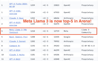 750,000 rounds of one-on-one battle between large models, GPT-4 won the championship, and Llama 3 ranked fifth
Apr 23, 2024 pm 03:28 PM
750,000 rounds of one-on-one battle between large models, GPT-4 won the championship, and Llama 3 ranked fifth
Apr 23, 2024 pm 03:28 PM
Regarding Llama3, new test results have been released - the large model evaluation community LMSYS released a large model ranking list. Llama3 ranked fifth, and tied for first place with GPT-4 in the English category. The picture is different from other benchmarks. This list is based on one-on-one battles between models, and the evaluators from all over the network make their own propositions and scores. In the end, Llama3 ranked fifth on the list, followed by three different versions of GPT-4 and Claude3 Super Cup Opus. In the English single list, Llama3 overtook Claude and tied with GPT-4. Regarding this result, Meta’s chief scientist LeCun was very happy and forwarded the tweet and
 How to read the results of bootstrap mediation test
Apr 05, 2024 am 03:30 AM
How to read the results of bootstrap mediation test
Apr 05, 2024 am 03:30 AM
The Bootstrap mediation test evaluates the mediation effect by resampling the data multiple times: Indirect effect confidence interval: indicates the estimated range of the mediation effect. If the interval does not contain zero, the effect is significant. p-value: Evaluates the probability that the confidence interval does not contain zero, with values less than 0.05 indicating significant. Sample size: The number of data samples used for analysis. Bootstrap subsampling times: the number of repeated samplings (500-2000 times). If the confidence interval does not contain zero and the p-value is less than 0.05, the mediation effect is significant, indicating that the mediating variable explains the relationship between the independent and dependent variables.
 How to use bootstrap to test mediation effects
Apr 05, 2024 am 03:57 AM
How to use bootstrap to test mediation effects
Apr 05, 2024 am 03:57 AM
The Bootstrap test uses resampling technology to evaluate the reliability of the statistical test and is used to prove the significance of the mediation effect: first, calculate the confidence interval of the direct effect, indirect effect and mediation effect; secondly, calculate the significance of the mediation type according to the Baron and Kenny or Sobel method. significance; and finally estimate the confidence interval for the natural indirect effect.
 What is the difference between bootstrap and springboot
Apr 05, 2024 am 04:00 AM
What is the difference between bootstrap and springboot
Apr 05, 2024 am 04:00 AM
The main difference between Bootstrap and Spring Boot is: Bootstrap is a lightweight CSS framework for website styling, while Spring Boot is a powerful, out-of-the-box backend framework for Java web application development. Bootstrap is based on CSS and HTML, while Spring Boot is based on Java and the Spring framework. Bootstrap focuses on creating the look and feel of a website, while Spring Boot focuses on back-end functionality. Spring Boot can be integrated with Bootstrap to create fully functional, beautiful
