

Detailed introduction to positioning in css

No more gossip, let’s start writing!
Write a simple example first:
Position h2 element:
h2
  {  position:absolute;
  left:100px;
  top:150px;
}Try it yourself
About Positioning
We can use the position attribute of css to set the element positioning type. The setting items of position are as follows:
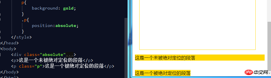
a. Relative generates relative positioning elements. Elements The position of the document flow occupied remains unchanged (that is, the element will not leave the document flow), and the element itself is offset relative to the position of the document flow. (positioning relative to its own position)
b. Absolute generates an absolutely positioned element. The element is separated from the document flow and does not occupy the position of the document flow. (The element will drift above the document flow), relative to the previous one. The parent element with relative positioning, absolute positioning or fixed positioning is set for positioning. If it cannot be found, it is positioned relative to the body element. (When doing absolute positioning, the parent element is generally set to relative positioning, and the parent element is used as the base point)
c. Fixed generates fixed positioning elements. The elements are separated from the document flow and do not occupy the position of the document flow. Relative Position in the browser window.
d. static default value, no positioning, the element appears in the normal document flow, relative to canceling the positioning attribute or not setting the positioning attribute.
e. inherit inherits the position attribute value from the parent element.
Positioned element properties
Absolutely positioned and fixedly positioned block elements and inline elements will automatically be converted into inline blocks element. (Inline block elements cannot use margin:x auto to set horizontal centering)
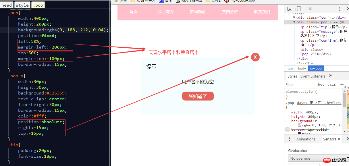
a. If you want to center the element horizontally: left:50%;margin-left:-width/2
b , If you want to center the element vertically: top:50%;margin-top:-height/2
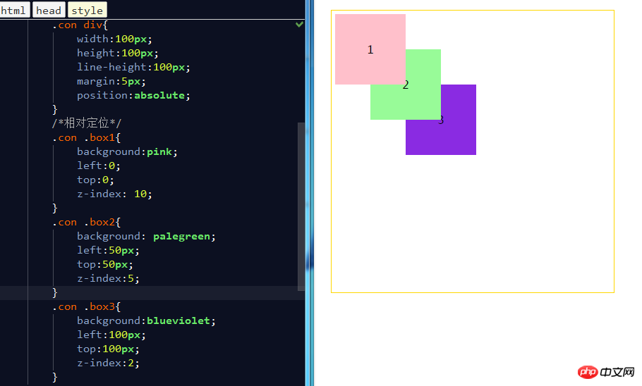
The level of positioning element
#Positioned elements are floating above the normal document flow. You can use the z-index attribute to set the element's level. (The larger the z-index value, the higher the level)
Typical positioning layout:
a. Menu fixed at the top
b. Pop-up box centered horizontally and vertically
c. Fixed side toolbar
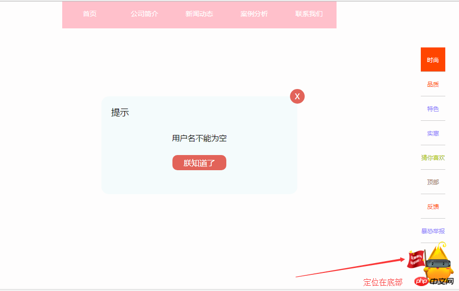
d. Fixed Buttons at the bottom
#a, menu fixed at the top (fixed positioning)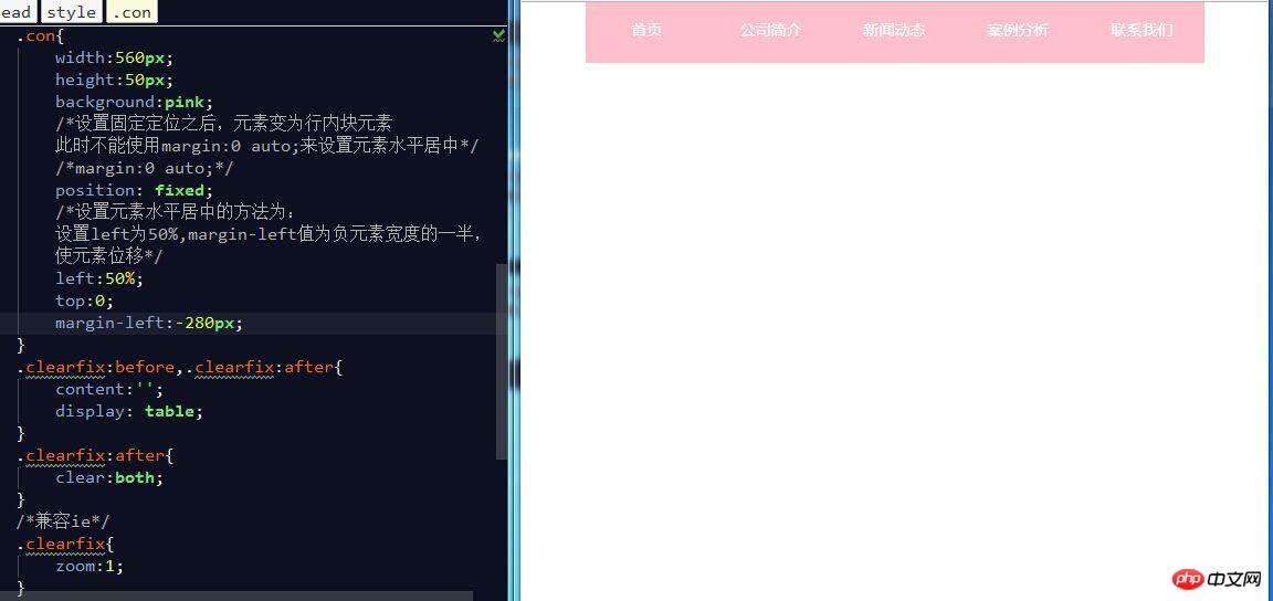
##b. Horizontally and vertically centered pop-up box (fixed positioning + absolute positioning)
c. Fixed Side toolbar (fixed positioning)
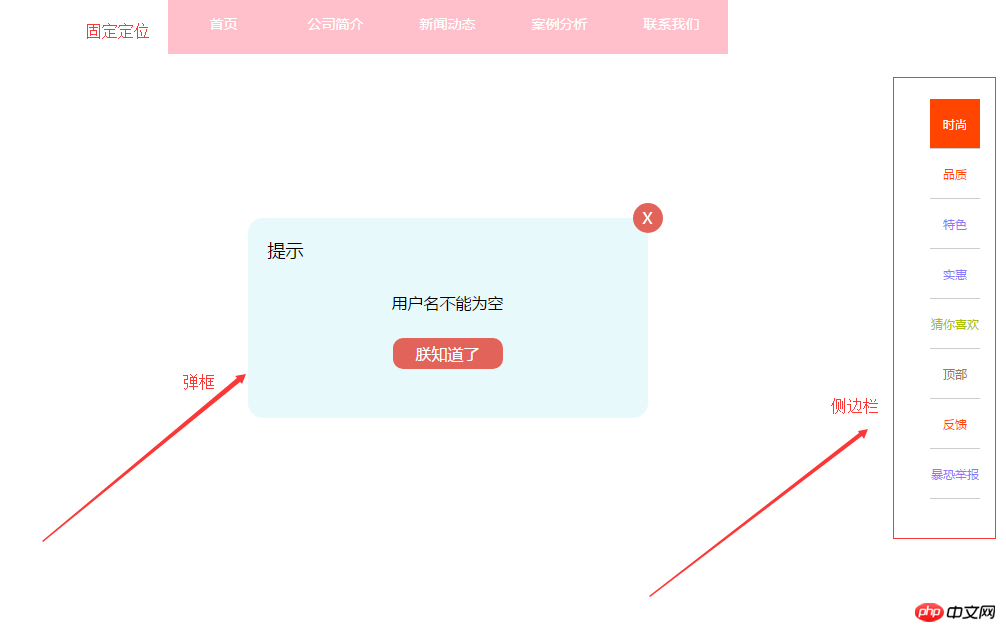
# #d. Button fixed at the bottom (fixed positioning)
 ##
##
The above is the detailed content of Detailed introduction to positioning in css. For more information, please follow other related articles on the PHP Chinese website!

Hot AI Tools

Undresser.AI Undress
AI-powered app for creating realistic nude photos

AI Clothes Remover
Online AI tool for removing clothes from photos.

Undress AI Tool
Undress images for free

Clothoff.io
AI clothes remover

Video Face Swap
Swap faces in any video effortlessly with our completely free AI face swap tool!

Hot Article
Hot Tools

Notepad++7.3.1
Easy-to-use and free code editor

SublimeText3 Chinese version
Chinese version, very easy to use

Zend Studio 13.0.1
Powerful PHP integrated development environment

Dreamweaver CS6
Visual web development tools

SublimeText3 Mac version
God-level code editing software (SublimeText3)
Hot Topics
 1386
1386
 52
52

 How to use bootstrap in vue
Apr 07, 2025 pm 11:33 PM
How to use bootstrap in vue
Apr 07, 2025 pm 11:33 PM
Using Bootstrap in Vue.js is divided into five steps: Install Bootstrap. Import Bootstrap in main.js. Use the Bootstrap component directly in the template. Optional: Custom style. Optional: Use plug-ins.
 The Roles of HTML, CSS, and JavaScript: Core Responsibilities
Apr 08, 2025 pm 07:05 PM
The Roles of HTML, CSS, and JavaScript: Core Responsibilities
Apr 08, 2025 pm 07:05 PM
HTML defines the web structure, CSS is responsible for style and layout, and JavaScript gives dynamic interaction. The three perform their duties in web development and jointly build a colorful website.
 How to write split lines on bootstrap
Apr 07, 2025 pm 03:12 PM
How to write split lines on bootstrap
Apr 07, 2025 pm 03:12 PM
There are two ways to create a Bootstrap split line: using the tag, which creates a horizontal split line. Use the CSS border property to create custom style split lines.
 Understanding HTML, CSS, and JavaScript: A Beginner's Guide
Apr 12, 2025 am 12:02 AM
Understanding HTML, CSS, and JavaScript: A Beginner's Guide
Apr 12, 2025 am 12:02 AM
WebdevelopmentreliesonHTML,CSS,andJavaScript:1)HTMLstructurescontent,2)CSSstylesit,and3)JavaScriptaddsinteractivity,formingthebasisofmodernwebexperiences.
 How to set up the framework for bootstrap
Apr 07, 2025 pm 03:27 PM
How to set up the framework for bootstrap
Apr 07, 2025 pm 03:27 PM
To set up the Bootstrap framework, you need to follow these steps: 1. Reference the Bootstrap file via CDN; 2. Download and host the file on your own server; 3. Include the Bootstrap file in HTML; 4. Compile Sass/Less as needed; 5. Import a custom file (optional). Once setup is complete, you can use Bootstrap's grid systems, components, and styles to create responsive websites and applications.
 How to insert pictures on bootstrap
Apr 07, 2025 pm 03:30 PM
How to insert pictures on bootstrap
Apr 07, 2025 pm 03:30 PM
There are several ways to insert images in Bootstrap: insert images directly, using the HTML img tag. With the Bootstrap image component, you can provide responsive images and more styles. Set the image size, use the img-fluid class to make the image adaptable. Set the border, using the img-bordered class. Set the rounded corners and use the img-rounded class. Set the shadow, use the shadow class. Resize and position the image, using CSS style. Using the background image, use the background-image CSS property.
 How to resize bootstrap
Apr 07, 2025 pm 03:18 PM
How to resize bootstrap
Apr 07, 2025 pm 03:18 PM
To adjust the size of elements in Bootstrap, you can use the dimension class, which includes: adjusting width: .col-, .w-, .mw-adjust height: .h-, .min-h-, .max-h-
 How to use bootstrap button
Apr 07, 2025 pm 03:09 PM
How to use bootstrap button
Apr 07, 2025 pm 03:09 PM
How to use the Bootstrap button? Introduce Bootstrap CSS to create button elements and add Bootstrap button class to add button text
