

Analyze bootstrap navigation bar and its responsive implementation

The purpose of this article: to analyze the bootstrap navigation bar and its responsive implementation, so as to improve your programming technology to a higher level
Let’s analyze it first How to implement it? The first step is to paste a bootstrap navigation bar template
2. The code is as follows
 1 <nav class="navbar navbar-default navbar-fixed-top"> 2
 <div class="container-fluid"> 3           <div class="navbar-header"> 4
 <button type="button" class="navbar-toggle collapsed" data-toggle="collapse"
 data-target="#navbar" aria-expanded="false" aria-controls="navbar"> 5
 <span class="sr-only">Toggle navigation</span> 6
 <span class="icon-bar"></span> 7
 <span class="icon-bar"></span> 8               <span class="icon-bar"></span> 9
 </button>10             <a class="navbar-brand" href="#">Project name</a>11
 </div>12           <div id="navbar" class="navbar-collapse collapse">13
 <ul class="nav navbar-nav">14               <li class="active"><a href="#">Home</a>
 </li>15               <li><a href="#">About</a></li>16
 <li><a href="#">Contact</a></li>17               <li class="dropdown">18
 <a href="#" class="dropdown-toggle" data-toggle="dropdown" role="button" aria-haspopup="true" aria-expanded="false">Dropdown <span class="caret"></span></a>19                 <ul class="dropdown-menu">20                   <li><a href="#">Action</a></li>21                   <li><a href="#">Another action</a></li>22                   <li><a href="#">Something else here</a></li>23                   <li role="separator" class="divider"></li>24                   <li class="dropdown-header">Nav header</li>25                   <li><a href="#">Separated link</a></li>26                   <li><a href="#">One more separated link</a></li>27                 </ul>28               </li>29             </ul>30             <ul class="nav navbar-nav navbar-right">31               32             </ul>33           </div><!--/.nav-collapse -->34         </div><!--/.container-fluld -->35       </nav>
The effect is as follows;
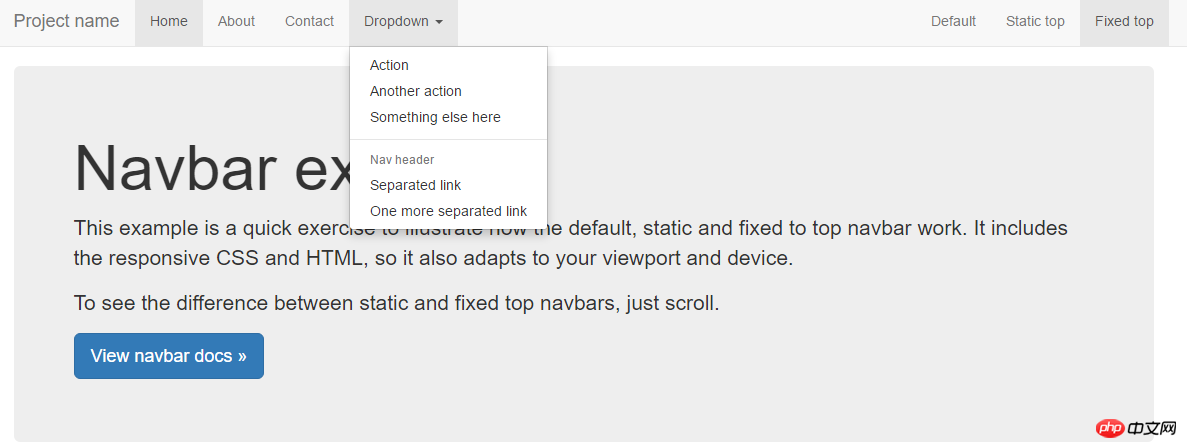
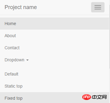
Mobile terminal:
3. Code analysis
Analyze the role of each tag and its style from the outside to the inside
3.1 The outermost div container (style is navbar navbar-default navbar-fixed-top):
Source code
.navbar {
  position: relative;
  min-height: 50px;/**导航条最小宽度为50px**/
  margin-bottom: 20px;/****/
  border: 1px solid transparent;
}@media (min-width: 768px) {/**>=768的设备,其实就是pc,移动设备width属性都小于768px**//**可能有很多人不理解,实际上移动端的width属性是以device-width来计量的,不是单纯的像数的概念,建议有疑问的同学自行搜索device-width关键字**/
  .navbar {
    border-radius: 4px;/****/
  }}
.navbar-default {/**设备导航栏的配色**/
  background-color: #f8f8f8;
  border-color: #e7e7e7;
}.navbar-fixed-top,
.navbar-fixed-bottom {
  position: fixed;/**相对浏览器定位**/
  right: 0;
  left: 0;
  z-index: 1030;/**样式层叠在上层的优先级**/
}As can be seen from the source code, the main function of the outermost div container is to create a bar container (.navbar) with a minimum height of 50px, which is positioned relative to the browser (.navbar- fixed-top), determine the color of the navigation bar (.navbar-default)
For relevant knowledge about device-width, please refer to this article
3.2 div container with navbar-header style
The css source code is as follows
<br>
/**在pc端显示时向右浮动,在移动端此样式无效**/
@media (min-width: 768px) {
  .navbar-header {
    float: left;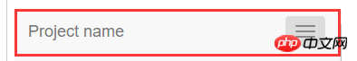
}}The display effect of this div on the PC and mobile terminals is as follows
PC side:

Mobile terminal:
It can be seen that on the PC side, the browser width is sufficient, and this div only exists as a small block-level element; and On the mobile side, because the screen width is not enough, other elements of the navigation bar are implemented in the form of drop-down menus, and this div alone fills the parent container.
There are two text elements under navbar-header:
The css source code is as follows:
.navbar-toggle {/**在最右侧画了一个圆角矩形**/
  position: relative;
  float: right;
  padding: 9px 10px;
  margin-top: 8px;
  margin-right: 15px;
  margin-bottom: 8px;
  background-color: transparent;
  background-image: none;
  border: 1px solid transparent;
  border-radius: 4px;
}.navbar-toggle:focus {
  outline: 0;
}@media (min-width: 768px) {/**此button在pc端不显示**/
  .navbar-toggle {
    display: none;
  }}
.navbar-toggle .icon-bar {/**icon-bar负责在button盒子里画横线**/
  display: block;
  width: 22px;
  height: 2px;
  border-radius: 1px;
}.navbar-brand {
  float: left;
  height: 50px;
  padding: 15px 15px;
  font-size: 18px;
  line-height: 20px;
}At this point, we have figured out the navbar-header component. This is a responsive layout. On the PC side, navbar-header only displays brand text. On the mobile side, navbar-header will Exclusively occupy the entire navbar, and other parts will be hidden.
3.3 Continue to look at the navbar-collapse collapse component
Source code:
/**由于.navbar-collapse,.navbar-collapse.in,.collapse在(@meida min-width:768px)pc端均有定义,故一下的属性只对移动端有效**/
.navbar-collapse {
  padding-right: 15px;
  padding-left: 15px;
  overflow-x: visible;
  -webkit-overflow-scrolling: touch;
  border-top: 1px solid transparent;
  -webkit-box-shadow: inset 0 1px 0 rgba(255, 255, 255, .1);  box-shadow: inset 0 1px 0 rgba(255, 255, 255, .1);
}.navbar-collapse.in {/**点击navbar-header的navbar-toggle的button后, navbar-collapse collapse会被js修改成。navbar-collapse collapse in**/
  overflow-y: auto;
}.collapse {/**决定了本组件在移动端时不显示**/
  display: none;/**点击事件发生后将被覆盖**/
}<br>
.collapse.in {/**After the click event occurs, it is displayed as a block-level element, covering display: none**/<br> display : block;<br> }
@media (min-width: 768px) {/**pc端**/
  .navbar-collapse {
    width: auto;border-top: 0;-webkit-box-shadow: none;box-shadow: none;
  }
  .navbar-collapse.collapse {display: block !important;/**作为块级显示,由于兄弟节点navbar-header是浮动元素,所以navbar-collapse会占满父元素的宽高**/height: auto !important;padding-bottom: 0;overflow: visible !important;
  }
  .navbar-collapse.in {overflow-y: visible;
  }
  .navbar-fixed-top .navbar-collapse,
  .navbar-static-top .navbar-collapse,
  .navbar-fixed-bottom .navbar-collapse {padding-right: 0;padding-left: 0;
}}So far, we have also figured out how the navbar-collapse collapse component is hidden on the mobile side. navbar-collapse is responsible for the appearance style of the component, and .collapse is responsible for it. Whether the entire component is displayed (normally displayed on the PC side, not displayed on the mobile side (display: none), displayed as a block-level element after the click event occurs)
4. Summary
Navigation from bootstrap Analysis of the column source code shows the following points
4.1: The size style and color matching style of bootstrap are set separately. It can be imagined that such settings can be combined at will, which increases the reusability of the code and can also be used at will. Modify the color scheme according to your needs.
4.2: Implementation of the navigation bar: The fixing method of the navigation bar is implemented by navbar-fixed-top. Other values include navbar-static-top and the default value. The display effect is also different (determines the display position of the entire navigation bar)
The color implementation is implemented by navbar-default, and the entire color matching can be modified by modifying navbar-defau (determines the color matching of the entire navigation bar)
§§
##5. Note: Many of the details such as changes in margin padding are not discussed in this article. You can refer to this articleThe above is the detailed content of Analyze bootstrap navigation bar and its responsive implementation. For more information, please follow other related articles on the PHP Chinese website!

Hot AI Tools

Undresser.AI Undress
AI-powered app for creating realistic nude photos

AI Clothes Remover
Online AI tool for removing clothes from photos.

Undress AI Tool
Undress images for free

Clothoff.io
AI clothes remover

Video Face Swap
Swap faces in any video effortlessly with our completely free AI face swap tool!

Hot Article
Hot Tools

Notepad++7.3.1
Easy-to-use and free code editor

SublimeText3 Chinese version
Chinese version, very easy to use

Zend Studio 13.0.1
Powerful PHP integrated development environment

Dreamweaver CS6
Visual web development tools

SublimeText3 Mac version
God-level code editing software (SublimeText3)
Hot Topics
 1390
1390
 52
52

 How to get the bootstrap search bar
Apr 07, 2025 pm 03:33 PM
How to get the bootstrap search bar
Apr 07, 2025 pm 03:33 PM
How to use Bootstrap to get the value of the search bar: Determines the ID or name of the search bar. Use JavaScript to get DOM elements. Gets the value of the element. Perform the required actions.
 How to use bootstrap in vue
Apr 07, 2025 pm 11:33 PM
How to use bootstrap in vue
Apr 07, 2025 pm 11:33 PM
Using Bootstrap in Vue.js is divided into five steps: Install Bootstrap. Import Bootstrap in main.js. Use the Bootstrap component directly in the template. Optional: Custom style. Optional: Use plug-ins.
 How to do vertical centering of bootstrap
Apr 07, 2025 pm 03:21 PM
How to do vertical centering of bootstrap
Apr 07, 2025 pm 03:21 PM
Use Bootstrap to implement vertical centering: flexbox method: Use the d-flex, justify-content-center, and align-items-center classes to place elements in the flexbox container. align-items-center class method: For browsers that do not support flexbox, use the align-items-center class, provided that the parent element has a defined height.
 How to write split lines on bootstrap
Apr 07, 2025 pm 03:12 PM
How to write split lines on bootstrap
Apr 07, 2025 pm 03:12 PM
There are two ways to create a Bootstrap split line: using the tag, which creates a horizontal split line. Use the CSS border property to create custom style split lines.
 How to use bootstrap button
Apr 07, 2025 pm 03:09 PM
How to use bootstrap button
Apr 07, 2025 pm 03:09 PM
How to use the Bootstrap button? Introduce Bootstrap CSS to create button elements and add Bootstrap button class to add button text
 How to resize bootstrap
Apr 07, 2025 pm 03:18 PM
How to resize bootstrap
Apr 07, 2025 pm 03:18 PM
To adjust the size of elements in Bootstrap, you can use the dimension class, which includes: adjusting width: .col-, .w-, .mw-adjust height: .h-, .min-h-, .max-h-
 How to set up the framework for bootstrap
Apr 07, 2025 pm 03:27 PM
How to set up the framework for bootstrap
Apr 07, 2025 pm 03:27 PM
To set up the Bootstrap framework, you need to follow these steps: 1. Reference the Bootstrap file via CDN; 2. Download and host the file on your own server; 3. Include the Bootstrap file in HTML; 4. Compile Sass/Less as needed; 5. Import a custom file (optional). Once setup is complete, you can use Bootstrap's grid systems, components, and styles to create responsive websites and applications.
 How to insert pictures on bootstrap
Apr 07, 2025 pm 03:30 PM
How to insert pictures on bootstrap
Apr 07, 2025 pm 03:30 PM
There are several ways to insert images in Bootstrap: insert images directly, using the HTML img tag. With the Bootstrap image component, you can provide responsive images and more styles. Set the image size, use the img-fluid class to make the image adaptable. Set the border, using the img-bordered class. Set the rounded corners and use the img-rounded class. Set the shadow, use the shadow class. Resize and position the image, using CSS style. Using the background image, use the background-image CSS property.
