

Responsive operation on mobile terminal under REM
Viewport
Some time ago, I once wrote an article about viewport. Recently, due to my contact with mobile terminal development, I have a new understanding of viewport. Therefore, I plan to write another article to introduce the concepts related to the mobile viewport.
All the knowledge mentioned in this article is essentially inseparable from the following code
<meta name="viewport" content="width=device-width, initial-scala=1, maximum-scale=1, minimum-scale=1, user-scalable=no" />

@media all and (max-width: 320px) {
    // do something
}Friends who have learned about mobile terminal development will actually be familiar with the above code. The above code mainly involves meta viewport tags and media queries. You need to understand the above short code alone:
pixel
- ##viewport
- Resolution
- meta viewport tag ##Media query
- JavaScript related properties and methods
- How to implement mobile responsive adaptation
- Let’s get into the topic :)
Pixels
On the mobile terminal, the so-called pixels are divided into two types
- CSS pixels: CSS pixels are when we write CSS code pixels at the time.
- Device pixels: The physical pixels of the device screen. The number of physical pixels for any device is fixed.
- How many device pixels one CSS pixel equals depends on the screen characteristics (whether it is a high-definition screen) and the user's zoom ratio. When the user enlarges the screen from 100% to 200%, 1 CSS pixel is equal to 2 device pixels, and vice versa; when the screen is a Retina high-definition screen (such as iPhone6, dpr=2), 1 CSS pixel is equal to 2 device pixels and vice versa.
One thing to understand is that 2 device pixels does not mean that it has been expanded twice, but that 1px (1 CSS pixel) is still displayed on the
page, but This 1px is made up of 2 device pixels. There are more pixels, so the image becomes clearer. The image below roughly illustrates the difference between CSS pixels and device pixels. 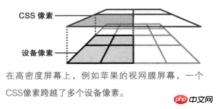 Viewport
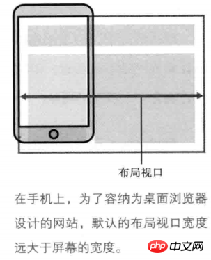
On the mobile terminal, there are three different viewports.
- Layout viewport: On the PC side, the layout viewport is equal to the width of the browser window. On the mobile side, because the website designed for the PC browser must be fully displayed on the small screen of the mobile side, the layout viewport at this time will be much larger than the screen of the mobile device. On mobile, by default, the layout viewport is equal to the browser window width.
- The layout viewport limits the layout of CSS.
Getting the width of the layout viewport on JavaScirpt can be obtained through document.documentElement.clientWidth | document.body.clientWidth.
 Visual viewport: The visual viewport is the area that the user is looking at. Users can zoom to manipulate the visual viewport without affecting the width of the visual viewport.
 - The visual viewport determines what the user sees
. Obtaining the width of the visual viewport on JavaScript can be obtained through `window.innerWidth.
On the PC side, the visual viewport is equal to the width of the layout viewport. Regardless of whether the user zooms in or out of the screen, the width of the two viewports remains the same. However, on mobile, this is not the case.
. When the user doubles the screen size, the visual viewport gets smaller (because there are fewer CSS pixels in the visual viewport), but the CSS pixels per unit get larger, so 1px (1 CSS pixel) equals 2 device pixels. In the same way, when it is iPhone6 (dpr=2), the CSS pixels in the visual viewport become less, but 1px is equal to 2 device pixels. The same is true when the user shrinks the screen. The scaling process does not affect the size of the layout viewport. In other words, when a high-definition screen (dpr>=2) or the screen is enlarged, the visual viewport becomes smaller (CSS pixels become less), and each unit of CSS pixels is equal to more device pixels; For non-HD screens (dpr<2)
or when the screen is reduced, the visual viewport becomes larger (CSS pixels become more), and each unit of CSS pixels is equal to fewer device pixels.But no matter whether the screen is zoomed in or out, the width of the layout viewport remains the same.
- Ideal viewport: Since the layout viewport is equal to the browser window width by default, it is necessary to view the page content on the mobile terminal by zooming in or out of the visual viewport, which is of course an experience Oops! Therefore, the concept of ideal viewport was introduced on the mobile side. The appearance of the ideal viewport must require setting the meta viewport tag. At this time, the layout viewport is equal to the width of the ideal viewport. Commonly, the ideal viewport of iPhone6 is 375px * 667px, and the ideal viewport of iPhone6 plus is 414px * 736px. Get the width of the visual viewport
window.screen.widthget on JavaScript.
<div class="code" style="position:relative; padding:0px; margin:0px;"><pre class="brush:php;toolbar:false"><meta name="viewport" content="width=device-width" />When the meta viewport tag is set, the layout viewport width of iPhone6 will be equal to 375px, and the width of iPhone6plus layout viewport will be equal to 414px. Other mobile devices are similar. </p> <p>理想视口会随着屏幕的旋转而改变。当iPhone6为肖像模式时(即竖屏),此时理想视口为375px * 667px;但为横屏模式时,此时理想视口为667px * 375px。</p> <h3 id="分辨率与设备像素比">分辨率与设备像素比</h3> <p>分辨率是指每英寸内点的个数,单位是dpi或者dppx。设备像素比是指设备像素与理想视口宽度的比值,没有单位。</p> <p>分辨率在CSS上可以通过<code>resolution</code>属性设置。一般情况下会使用dpi作为分辨率的单位,因为dppx并非所有浏览器都支持。</p> <p>而设备像素比在CSS上可以通过<code>device-device-pixel-ratio</code>属性设置,而在JavaScript上可以通过<code>window.devicePixelRatio</code>属性获取。</p> <p>同时,<strong>1dpr=96dpi</strong>。举个例子。在iPhon6下,理想视口宽度为375px,而设备像素为750px,因此此时设备像素比为2,分辨率为192dpi。因此如果为iPhon6以下的设备写某个特定样式,可以这样写</p> <pre class="brush:php;toolbar:false">// 注意,device-pixel-ratio需要带上-webkit-前缀,保证浏览器兼容性问题。 @media all and (max-width: 375px) and (-webkit-max-device-pixel-ratio: 2) { body { background-color: red; } } 或者 @media all and (max-width: 375px) and (max-resolution: 192dpi) { body { background-color: red; } }</pre><div class="contentsignin">Copy after login</div></div> <h3 id="meta视口标签">meta视口标签</h3> <p>meta视口标签是是设置理想视口的重要元素,主要用于将布局视口的尺寸和理想视口的尺寸相匹配。meta视口标签存在5个指令</p> <ol class=" list-paddingleft-2"> <li><p>width:设置布局视口的宽度,一般设为device-width。</p></li> <li><p>initial-scale:初始缩放比例。1即100%,2即200%,以此类推</p></li> <li><p>maximum=scale:最大缩放比例。</p></li> <li><p>minimum-scale:最小缩放比例。</p></li> <li><p>user-scalable:是否静止用户进行缩放,默认为no。</p></li> </ol> <p>需要注意的是,<strong>缩放是根据理想视口进行计算的。缩放程度与视觉视口的宽度是逆相关的。</strong>也就是说,当你将屏幕放到到2倍时,视觉视口为理想视口的一半,此时每单位的CSS像素等于2个设备像素。缩小时则相反。</p> <h2 id="响应式适配问题">响应式适配问题</h2> <p>理解了一些基本概念之后,我们来看看如何实现响应式适配。</p> <p>一般情况下,前端开发工程师会根据设计师给的设计稿进行开发。而设计稿一般是根据iPhon6手机进行页面的设计的。我们知道iPhone6的理想视口宽度为375px,同时iPhone6的设备像素比为2,设备像素为750px。我们需要在只有一份设计稿的情况下写出适应各种屏幕不一的终端设备,因此需要一些移动端响应式适配的方案。此时需要用到的一个单位是<code>REM。简单的说,REM会根据HTML元素的font-size进行设置。当HTML元素的font-size: 16px时,1rem = 16px, 1.5rem = 24px个人总结出了两套响应式适配的方案(前提是设置meta视口标签)。两套方案由一个共同点:给定一个基准值。
假如现在拿到的设计稿是根据iPhone6进行设计的。
方案一
方案一是设计稿给什么尺寸,我们就将其缩小100倍,最后换算成rem单位。比如,设计稿上某个title的
font-size为32px,此时写CSS样式时就直接缩小100倍,即0.32rem。由于rem是根据根元素进行设置的,所以我们需要设置根元素的
font-size。给HTML设置
font-size的基本思路:通过
window.screen.width获取不同移动设备的理想视口宽度。规定基准值为750px(此值为iPhon6的设备像素)。
(1) / (2) * 100即得到HTML元素的
font-size。(乘于100是因为我们在前面将字体缩小了100倍,此时要乘回来)
换算成公式即:设计稿尺寸 / 100 * (不同设备的理想视口宽度 / 基准值 * 100)
举个例子。
// 根据不同设备的理想视口宽度动态设置根元素的`font-size`。
let idealViewWidth = window.screen.width;
const BASICVALUE = 750;
document.documentElement.style.fontSize = (idealViewWidth / BASICVALUE) * 100 + 'px';
Copy after login因此,在不同设备下的HTML元素的
font-size大小和实际像素如下iPhone5 : (320 / 750) * 100 = 42.667px iPhone6 : (375 / 750) * 100 = 50px iPhone6+: (414 / 750) * 100 = 55.2px 假如设计稿上标注.title类上的字体为32px,此时有 iPhone5上的某字体: 42.667 * 0.32rem = 13.653px iPhone6上的某字体: 50 * 0.32rem = 16px iPhone6+上的某字体: 55.2 * 0.32rem = 17.664px
Copy after login可以看出,在不同设备下,同一字号的字体使用rem单位可以实现不同设备的响应式适配。不单单在字体上可以使用,在移动端上的width、height等涉及单位的都可以使用。这样的话,就可以在不同设备下完美的复现设计稿的要求。
方案二
此方案使用了SASS预处理器。基本思路:
设置根元素的
font-size。通过获取不同设备的理想视口宽度,再除以10。(除以10是因为不想font-size太大。)给定基准值,此时给的基准值为75px(此值为iPhone6的设备像素除以10)
写SASS Function
代码如下
SASS
@function px2rem ($value) {
    $para: 75px;
    @return $value / $para + rem;
}

JS
let idealViewWidth = window.screen.width;
document.documentElement.style.fontSize = idealViewWidth / 10 + 'px';

在不同设备下根元素的`font-size`:

iPhone5 : 320px / 10 = 32px
iPhone6 : 375px / 10 = 37.5px
iPhone6+: 414px / 10 = 41.4px

根据以上,可以看一个例子。某设计稿下5个li,横向排布,每个的宽度为200px
CSS
@import (路径名)
iPhone5: li { width: px2rem(200px) } => width: 85.333px
// 此时(200px / 75px = 2.667rem) 2.667rem = 2.667 * (320 / 10) = 85.3333px
iPhone6: li { width: px2rem(200px) } => width: 100px
// 此时(200px / 75px = 2.667rem) 2.667rem = 2.667 * (375 / 10) = 100px
iPhone6+: li { width: px2rem(200px) } => width: 4138px
// 此时(200px / 75px = 2.667rem) 2.667rem = 2.667 * (414 / 10) = 110.4138px

因此,一个200px的(实际只有100px)的li元素的宽度在不同设备下显示了不同的宽度,实现了响应式适配的问题。
Copy after login方案三
方案三与前两个方案不相同,此方案并不需要给根元素设置
font-size,不需要基准值。此方案是根据不同设备的dpr来实现页面的缩放的。基本思路如下:
通过window.devicePixelRatio获取设备的dpr
根据不同的dpr缩放页面,动态设置meta视口标签。(缩放是放大或缩小CSS的过程,根据理想视口进行缩放,与视觉视口方向相反)
代码如下:
let dpr = window.devicePixelRatio;
let meta = document.createElement('meta');
let initialScale = 1 / dpr;
let maximumScale = 1 / dpr;
let minimumScale = 1 / dpr;
meta.setAttribute('name', 'viewport');
meta.setAttribute('content', `width=device-width, user-scalable=no, initial-scale=${initialScale}, maximum-scale=${maximumScale}, minimum-scale=${minimumScale}`);
document.head.appendChild(meta);

因此,可以直接根据设计稿的尺寸写CSS样式,如设计稿下有5个li元素,宽度为200px,此时不同设备下li的宽度

iPhone5 : li { width: 200px } 实际宽度为:100px
iPhone6 : li { width: 200px } 实际宽度为:100px
iPhone6+: li { width: 200px } 实际宽度为:66.667px
Copy after login以上三种方法解决了大部分移动端响应式适配的问题,但是在1px问题上,使用以上的方法仍然(除了第三个方案),都不能很好的解决1px的问题。有时间写一篇文章介绍如何解决1px的问题。
当然..关于移动端响应式适配还有许多好的解决方法,希望留言同大家分享:)
The above is the detailed content of Responsive operation on mobile terminal under REM. For more information, please follow other related articles on the PHP Chinese website!

Hot AI Tools

Undresser.AI Undress
AI-powered app for creating realistic nude photos

AI Clothes Remover
Online AI tool for removing clothes from photos.

Undress AI Tool
Undress images for free

Clothoff.io
AI clothes remover

Video Face Swap
Swap faces in any video effortlessly with our completely free AI face swap tool!

Hot Article
Hot Tools

Notepad++7.3.1
Easy-to-use and free code editor

SublimeText3 Chinese version
Chinese version, very easy to use

Zend Studio 13.0.1
Powerful PHP integrated development environment

Dreamweaver CS6
Visual web development tools

SublimeText3 Mac version
God-level code editing software (SublimeText3)
Hot Topics
 1386
1386
 52
52

 Towards Verifiable AI: Five Challenges of Formal Methods
Apr 09, 2023 pm 02:01 PM
Towards Verifiable AI: Five Challenges of Formal Methods
Apr 09, 2023 pm 02:01 PM
Artificial intelligence is a computing system that attempts to imitate human intelligence, including some human functions that are intuitively related to intelligence, such as learning, problem solving, and rational thinking and action. Broadly interpreted, the term AI covers many closely related fields such as machine learning. Systems that make heavy use of AI are having significant social impacts in areas such as healthcare, transportation, finance, social networks, e-commerce, and education. This growing social impact has also brought with it a series of risks and concerns, including errors in artificial intelligence software, cyberattacks and artificial intelligence system security. Therefore, the issue of verification of AI systems, and the broader topic of trustworthy AI, has begun to attract attention from the research community. “Verifiable AI” has been confirmed
 How to fix inappropriate resolution issues
Jan 08, 2024 pm 03:25 PM
How to fix inappropriate resolution issues
Jan 08, 2024 pm 03:25 PM
After reinstalling the system, we may not have the resolution we want, and some resolutions may look very uncomfortable. The reason may be that the graphics card driver is not installed or the driver version is out of date. After installing a driver, the problem will appear after opening it. You will be prompted for the drivers you need to install. After all are installed, restart the computer. Generally, it can automatically match the resolution suitable for your monitor. If it still doesn't work, we need to customize one. Let's take a look at the details. There is no suitable solution for the resolution. 1. Install driver life, update all drivers according to the prompts, and then restart the computer; 2. Right-click the computer desktop and select NVIDIA Control Panel to open. If not, click the start menu program in the lower left corner of the computer. 3. Select <Change Resolution>→<Customize>
 Thread pool optimization solution in PHP high concurrency processing
Aug 11, 2023 am 10:45 AM
Thread pool optimization solution in PHP high concurrency processing
Aug 11, 2023 am 10:45 AM
Thread pool optimization solution in PHP high concurrency processing With the rapid development of the Internet and the continuous growth of user needs, high concurrency has become an important issue in modern Web application development. In PHP, handling high concurrent requests is a challenge due to its single-threaded nature. In order to solve this problem, introducing the concept of thread pool is an effective optimization solution. A thread pool is a reusable collection of threads used to perform a large number of concurrent tasks. Its basic idea is to separate the creation, destruction and management of threads, and reduce the number of threads by reusing threads.
 LG mass-produces 27-inch 480Hz QHD gaming OLED panel with record-breaking clarity and response speed
Sep 01, 2024 pm 03:37 PM
LG mass-produces 27-inch 480Hz QHD gaming OLED panel with record-breaking clarity and response speed
Sep 01, 2024 pm 03:37 PM
Recently, LG Display announced that its 27-inch 480Hz QHD gaming OLED panel has officially entered mass production. This panel has created a new high in refresh rate and response speed among OLED products. The 480Hz refresh rate is paired with a GtG grayscale response time of 0.02ms, which is a step further than the previous record of 0.03ms, bringing the ultimate experience to game types such as FPS and racing. . The new panel optimizes LG Display’s META Technology to improve the luminous efficiency of OLED materials. The image quality is enhanced and specular reflection is greatly reduced. The four-sided frameless design expands the field of view and brings an immersive experience. Pixel structure optimization WRGB pixel structure is optimized for gaming and document editing needs. Text display is clearer
 Getting Started with PHP: POST Requests and Responses
May 20, 2023 pm 05:52 PM
Getting Started with PHP: POST Requests and Responses
May 20, 2023 pm 05:52 PM
In web development, interactive applications allow users to interact with the website. The HTTP protocol is designed to transfer data between servers and clients. PHP is a web development language that can be used to handle HTTP requests and responses. This article will introduce how to use PHP to handle POST requests and responses. First, we'll briefly introduce how the HTTP protocol works, and then discuss how to handle POST requests and responses using PHP's built-in functions. Finally, we'll discuss some best practices to ensure your code is secure and
 Getting Started with PHP: PUT Requests and Responses
May 23, 2023 pm 07:01 PM
Getting Started with PHP: PUT Requests and Responses
May 23, 2023 pm 07:01 PM
PHP is a server-side programming language that can implement many functions in web applications. In this article, we will take an in-depth look at the basics of PUT requests and responses in PHP, which is very important for web developers. PUT request is an HTTP request method, which means it is used to send information to the server. The main purpose of PUT request is to transfer data to the server. Using PUT request is very useful when we need to update or modify data to the server. In PHP we can use c
 The 0-threshold cloning solution has been upgraded, the open source model is completely reproduced, and no registration is required for online experience.
Apr 14, 2023 pm 10:58 PM
The 0-threshold cloning solution has been upgraded, the open source model is completely reproduced, and no registration is required for online experience.
Apr 14, 2023 pm 10:58 PM
AI applications and large models represented by ChatGPT and GPT4 are popular all over the world and are regarded as opening up a new technological industrial revolution and a new starting point for AGI (Artificial General Intelligence). Not only are technology giants chasing each other to launch new products, but many AI tycoons in academia and industry have also joined the wave of related entrepreneurship. Generative AI is rapidly iterating in "days" and continues to surge! However, OpenAI has not made it open source. What are the technical details behind them? How to quickly follow, catch up and participate in this technology wave? How to reduce the high cost of building and applying large AI models? How to protect core data and intellectual property from being leaked due to the use of third-party large model APIs? As the most popular
 Use the new HTTP/2 Client in Java 11 to send HTTP requests and handle responses
Jul 30, 2023 pm 04:51 PM
Use the new HTTP/2 Client in Java 11 to send HTTP requests and handle responses
Jul 30, 2023 pm 04:51 PM
Use the new HTTP/2Client in Java11 to send HTTP requests and handle responses Introduction With the release of Java11, Java has introduced a new HTTP/2Client API to replace the old HttpURLConnection and HttpClient. The new API provides a simpler and more efficient way to send HTTP requests and handle responses. In this article, we will explore the new HTTP/2C in Java11
