

Example tutorial of Bootstrap modal pop-up box

Previous words
In the Bootstrap framework, modal pop-up boxes are collectively called Modal. This pop-up effect is visible in most web site interactions. For example, clicking a button will pop up a box. The pop-up box may be a file description, it may have button operations, or it may pop up a picture. This article will introduce in detail the Bootstrap modal pop-up box
structural analysis
【Related video recommendation:Bootstrap tutorial】
Bootstrap The modal pop-up boxes in the framework use "modal", "modal-dialog" and "modal-content" styles respectively, and the real content of the pop-up window is placed in "modal-content", which mainly includes three Part:
☑ The head of the pop-up box, generally represented by "modal-header", mainly includes the title and the close button
☑ The body of the pop-up box, generally represented by "modal-body", pop-up The main content of the box
☑ The pop-up box footer is generally represented by "modal-footer", which mainly places the operation buttons
<p class="modal show"><p class="modal-dialog"><p class="modal-content"><p class="modal-header"><button type="button" class="close" data-dismiss="modal"><span aria-hidden="true">×</span><span class="sr-only">Close</span></button><h4 class="modal-title">模态弹出窗标题</h4></p><p class="modal-body"><p>模态弹出窗主体内容</p></p><p class="modal-footer"><button type="button" class="btn btn-default" data-dismiss="modal">关闭</button><button type="button" class="btn btn-primary">保存</button></p></p><!-- /.modal-content --></p><!-- /.modal-dialog --></p><!-- /.modal -->
For pop-up windows, modal-content is the key to style. It mainly sets the border, margin, background color and shadow styles of the pop-up window
.modal-content {
  position: relative;
  background-color: #fff;
  -webkit-background-clip: padding-box;  background-clip: padding-box;
  border: 1px solid #999;
  border: 1px solid rgba(0, 0, 0, .2);
  border-radius: 6px;
  outline: 0;
  -webkit-box-shadow: 0 3px 9px rgba(0, 0, 0, .5);  box-shadow: 0 3px 9px rgba(0, 0, 0, .5);
}In addition, the three part style settings of modal-header, modal-body and modal-footer in modal-content As follows
.modal-header {
  min-height: 16.42857143px;
  padding: 15px;
  border-bottom: 1px solid #e5e5e5;
}.modal-header .close {
  margin-top: -2px;
}.modal-title {
  margin: 0;
  line-height: 1.42857143;
}.modal-body {
  position: relative;
  padding: 15px;
}.modal-footer {
  padding: 15px;
  text-align: right;
  border-top: 1px solid #e5e5e5;
}These three parts mainly control some spacing styles. The modal-footer is used to place buttons, so the included buttons are also styled at the bottom
.modal-footer .btn + .btn {
  margin-bottom: 0;
  margin-left: 5px;
}.modal-footer .btn-group .btn + .btn {
  margin-left: -1px;
}.modal-footer .btn-block + .btn-block {
  margin-left: 0;
}Triggering method
As we all know, the modal pop-up window will appear when the page is loaded. , is hidden in the page, and only certain actions (events) can trigger the display of the modal pop-up window. There are two implementation methods in the Bootstrap framework
Before introducing the triggering method, we must first explain the two methods .show and .fade. Only the modal pop-up window that is hidden by default can trigger its display
.fade {opacity: 0;
-webkit-transition: opacity .15s linear;
-o-transition: opacity .15s linear;
transition: opacity .15s linear;
}.show {display: block!important;
}[Method 1]
To declare a modal pop-up window, you only need to customize two necessary attributes: data-toggle and data-target (declarative triggering methods in bootstrap generally rely on these custom data-xxx attributes. For example, data-toggle="" or data-dismiss="")
data-toggle must be set to modal (toggle Chinese translation is trigger);
Data-target can be set to the CSS selector or the ID value of the modal pop-up window. Generally, it is set to the ID of the modal pop-up window. value, because the ID value is a unique value
<!-- 触发模态弹出窗的元素 --><button type="button" data-toggle="modal" data-target="#mymodal" class="btn btn-primary">点击</button><!-- 模态弹出窗 --><p class="modal fade" id="mymodal"><p class="modal-dialog"><p class="modal-content"><p class="modal-header"><button type="button" class="close" data-dismiss="modal"><span aria-hidden="true">×</span><span class="sr-only">Close</span></button><h4 class="modal-title">模态弹出窗标题</h4></p><p class="modal-body"><p>模态弹出窗主体内容</p></p><p class="modal-footer"><button type="button" class="btn btn-default" data-dismiss="modal">关闭</button><button type="button" class="btn btn-primary">保存</button></p></p><!-- /.modal-content --></p><!-- /.modal-dialog --></p><!-- /.modal -->
[Method 2]
The modal pop-up window that triggers can also be a link element, then you can use the link element’s own The href attribute replaces the data-target attribute
However, it is recommended to use the unified use of data-target to trigger
<!-- 触发模态弹出窗的元素 --><a data-toggle="modal" href="#mymodal" class=" btn btn-primary" >点击</a><!-- 模态弹出窗 --><p class="modal fade" id="mymodal"><p class="modal-dialog"><p class="modal-content"><p class="modal-header"><button type="button" class="close" data-dismiss="modal"><span aria-hidden="true">×</span><span class="sr-only">Close</span></button><h4 class="modal-title">模态弹出窗标题</h4></p><p class="modal-body"><p>模态弹出窗主体内容</p></p><p class="modal-footer"><button type="button" class="btn btn-default" data-dismiss="modal">关闭</button><button type="button" class="btn btn-primary">保存</button></p></p><!-- /.modal-content --></p><!-- /.modal-dialog --></p><!-- /.modal -->
Size
The Bootstrap framework provides different modal pop-up windows. Size, one is the large size style "modal-lg" and the other is the small size style "modal-sm". Slightly adjusted in its structure
[Note].bs-example-modal-lg and .bs-example-modal-sm are custom names, not required
<!-- 大尺寸模态弹出窗 --><p class="modal fade bs-example-modal-lg" tabindex="-1" role="dialog" aria-labelledby="myLargeModalLabel" aria-hidden="true"><p class="modal-dialog modal-lg"> <p class="modal-content"> ... </p></p></p><!-- 小尺寸模态弹出窗 --><p class="modal fade bs-example-modal-sm" tabindex="-1" role="dialog" aria-labelledby="mySmallModalLabel" aria-hidden="true"><p class="modal-dialog modal-sm"> <p class="modal-content"> ... </p></p></p>
<button type="button" class="btn btn-primary" data-toggle="modal" data-target=".bs-example-modal-lg">大尺寸</button><button type="button" class="btn btn-primary" data-toggle="modal" data-target="#myModal">默认尺寸</button><button type="button" class="btn btn-primary" data-toggle="modal" data-target=".bs-example-modal-sm">小尺寸</button><p class="modal fade" id="myModal"><p class="modal-dialog"><p class="modal-content"><p class="modal-body"><p>小火柴的蓝色理想</p></p></p></p></p><p class="modal fade bs-example-modal-lg"><p class="modal-dialog modal-lg"><p class="modal-content"><p class="modal-body"><p>小火柴的蓝色理想</p></p></p></p></p><p class="modal fade bs-example-modal-sm"><p class="modal-dialog modal-sm"><p class="modal-content"><p class="modal-body"><p>小火柴的蓝色理想</p></p></p></p></p>
CSS parsing
The "modal pop-up box" in bootstrap has the following characteristics:
1. The modal pop-up window is fixed in the browser.
2. Click the full-screen button on the right. In the full-screen state, the width of the modal pop-up window is adaptive, and the modal-dialog is horizontally centered.
3. When the browser window is larger than 768px, the width of the modal pop-up window is 600px
4. The background of the modal pop-up window often has a transparent masking effect
5. When the pop-up window is triggered, the pop-up window gradually emerges from top to bottom and appears in front of the page
[Fixed in the browser]
.modal {
  position: fixed;
  top: 0;
  right: 0;
  bottom: 0;
  left: 0;
  z-index: 1050;
  display: none;
  overflow: hidden;
  -webkit-overflow-scrolling: touch;
  outline: 0;
}[Horizontal centering]
.modal-dialog {
  position: relative;
  width: auto;
  margin: 10px;
}[When the browser window is larger than 768px, the width of the modal pop-up window is 600px]
@media (min-width: 768px) {
  .modal-dialog {
    width: 600px;margin: 30px auto;
  }
  .modal-content {-webkit-box-shadow: 0 5px 15px rgba(0, 0, 0, .5);box-shadow: 0 5px 15px rgba(0, 0, 0, .5);
  }
  .modal-sm {width: 300px;
}}[Mask]
When the pop-up window pops up, it is < ;body> element adds the .modal-open class to override the default scrolling behavior of the page, and also automatically generates a .modal-backdrop element to provide an available Click the area, click this area to close the modal box
.modal-open {overflow: hidden;
}.modal-backdrop {
position: fixed;
top: 0;
right: 0;
bottom: 0;
left: 0;
z-index: 1040;
background-color: #000;
}Added a transition animation to it, from fade to in, changing the opacity value from 0 to 0.5
.modal-backdrop.fade {
  filter: alpha(opacity=0);
  opacity: 0;
}.modal-backdrop.in {
  filter: alpha(opacity=50);
  opacity: .5;
}[Animation effect]
The animation content of the pop-up window is from the top value position of -25% to the top:0 position
.modal.fade .modal-dialog {
  -webkit-transition: -webkit-transform .3s ease-out;   -o-transition:      -o-transform .3s ease-out;  transition:         transform .3s ease-out;
  -webkit-transform: translate3d(0, -25%, 0);   -o-transform: translate3d(0, -25%, 0);  transform: translate3d(0, -25%, 0);
}.modal.in .modal-dialog {
  -webkit-transform: translate3d(0, 0, 0);   -o-transform: translate3d(0, 0, 0);  transform: translate3d(0, 0, 0);
} If you do not need the animation effect when the modal box pops up (fade in Fade out effect), delete the .fade class
<!-- 触发模态弹出窗的元素 --><button type="button" data-toggle="modal" data-target="#mymodal" class="btn btn-primary">点击</button><!-- 模态弹出窗 --><p class="modal" id="mymodal"><p class="modal-dialog"><p class="modal-content"><p class="modal-header"><button type="button" class="close" data-dismiss="modal"><span aria-hidden="true">×</span><span class="sr-only">Close</span></button><h4 class="modal-title">模态弹出窗标题</h4></p><p class="modal-body"><p>模态弹出窗主体内容</p></p><p class="modal-footer"><button type="button" class="btn btn-default" data-dismiss="modal">关闭</button><button type="button" class="btn btn-primary">保存</button></p></p><!-- /.modal-content --></p><!-- /.modal-dialog --></p><!-- /.modal -->
Parameter description
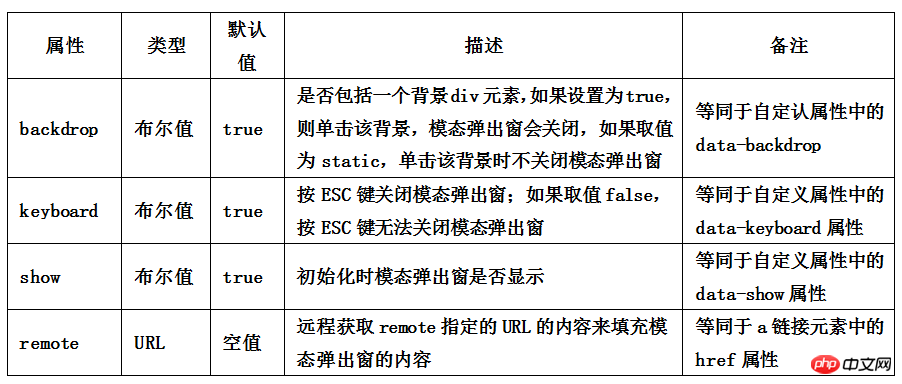
In addition to controlling the modal pop-up window through data-toggle and data-target, The Bootstrap framework also provides other custom data-attributes for modal pop-up boxes to control modal pop-up windows. The relevant instructions for the custom properties of the Modal pop-up window are as follows
This parameter can be set on the button or the pop-up window. For convenience, generally,
is set on the button [Note] The attribute value must be enclosed in quotation marks, such as data-backdrop="false"
If you want to support the esc key to close the pop-up window , you need to set tabindex="-1"
on the pop-up window
<button type="button" data-toggle="modal" data-target="#mymodal1" class="btn btn-primary">默认样式</button><button type="button" data-toggle="modal" data-target="#mymodal2" data-backdrop="false" class="btn btn-primary">无蒙版</button><button type="button" data-toggle="modal" data-target="#mymodal3" data-keyboard="false" class="btn btn-primary">ESC失效</button><button type="button" data-toggle="modal" data-target="#mymodal4" data-show="false" class="btn btn-primary">弹窗默认不显示</button><p class="modal fade" tabindex="-1" id="mymodal1"><p class="modal-dialog"><p class="modal-content"><p class="modal-header"><button type="button" class="close" data-dismiss="modal"><span aria-hidden="true">×</span><span class="sr-only">Close</span></button><h4 class="modal-title">小火柴的蓝色理想</h4></p> <p class="modal-body"><p>好的代码像粥一样,都是用时间熬出来的</p></p></p></p></p><p class="modal fade" tabindex="-1" id="mymodal2"><p class="modal-dialog"><p class="modal-content"><p class="modal-header"><button type="button" class="close" data-dismiss="modal"><span aria-hidden="true">× </span><span class="sr-only">Close</span></button><h4 class="modal-title">小火柴的蓝色理想</h4></p> <p class="modal-body"><p>好的代码像粥一样,都是用时间熬出来的</p></p></p></p></p><p class="modal fade" tabindex="-1" id="mymodal3"><p class="modal-dialog"><p class="modal-content"><p class="modal-header"><button type="button" class="close" data-dismiss="modal"><span aria-hidden="true">× </span><span class="sr-only">Close</span></button><h4 class="modal-title">小火柴的蓝色理想</h4></p> <p class="modal-body"><p>好的代码像粥一样,都是用时间熬出来的</p></p></p></p></p><p class="modal fade" tabindex="-1" id="mymodal4"><p class="modal-dialog"><p class="modal-content"><p class="modal-header"><button type="button" class="close" data-dismiss="modal"><span aria-hidden="true">× </span><span class="sr-only">Close</span></button><h4 class="modal-title">小火柴的蓝色理想</h4></p> <p class="modal-body"><p>好的代码像粥一样,都是用时间熬出来的</p></p></p></p></p>
JS触发
除了使用自定义属性data-触发模态弹出框之外,还可以通过JavaScript方法来触发模态弹出窗。比如说给按钮设置一个单击事件,然后触发模态弹出窗
只需一行 JavaScript 代码,即可通过元素的 id myModal 调用模态框
$('#myModal').modal()<button type="button" class="btn btn-primary">点击</button><p class="modal fade"
tabindex="-1" id="mymodal"><p class="modal-dialog"><p class="modal-content"><p class="modal-header"><button type="button" class="close" data-dismiss="modal"><span aria-hidden="true">×
</span><span class="sr-only">Close</span></button><h4 class="modal-title">小火柴的蓝色理想</h4></p>
<p class="modal-body"><p>好的代码像粥一样,都是用时间熬出来的</p></p></p></p></p><script>$(function(){
$(".btn").click(function(){
$("#mymodal").modal();
});
});</script>使用JavaScript触发模态弹出窗时,Bootstrap框架提供了一些设置,主要包括属性设置、参数设置和事件设置
【属性设置】
模态弹出窗默认支持的自定义属性主要有
不想让用户按ESC键关闭模态弹出窗,可以这样做
$(function(){
    $(".btn").click(function(){
        $("#mymodal").modal({
            keyboard:false});
    });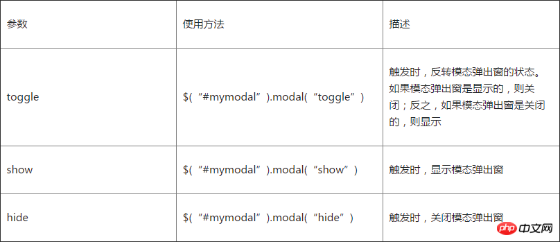
});【参数设置】
在Bootstrap框架中还为模态弹出窗提供了三种参数设置,具体说明如下
<button type="button" class="btn btn-primary" id="btn" style="position:absolute;z-index:9999">打开(关闭)</button>
<p class="modal" tabindex="-1" id="mymodal" >
<p class="modal-dialog">
<p class="modal-content">
<p class="modal-header">
<button type="button" class="close" data-dismiss="modal"><span aria-hidden="true">×
</span><span class="sr-only">Close</span></button>
<h4 class="modal-title">小火柴的蓝色理想</h4>
</p>
<p class="modal-body">
<p>好的代码像粥一样,都是用时间熬出来的</p>
</p>
</p>
</p>
</p>
<script>;$(function(){
$("#btn").click(function(){
$("#mymodal").modal("toggle");
});
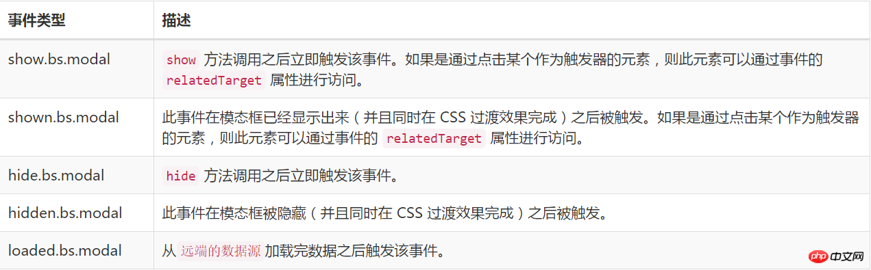
});</script>【事件设置】
模态弹窗还支持五种类型的事件,分别是模态弹出窗的弹出前、弹出后,关闭前、关闭后及远端数据加载后,具体描述如下:
<button type="button" class="btn btn-primary" id="btn" style="position:absolute;z-index:9999">打开</button><p class="modal"
tabindex="-1" id="mymodal" ><p class="modal-dialog"><p class="modal-content"><p class="modal-header"><button type="button" class="close" data-dismiss="modal"><span aria-hidden="true">×
</span><span class="sr-only">Close</span></button><h4 class="modal-title">小火柴的蓝色理想</h4></p>
<p class="modal-body"><p>好的代码像粥一样,都是用时间熬出来的</p></p></p></p></p><script>;$(function(){
$("#btn").click(function(){
$("#mymodal").modal("toggle");
});
$('#mymodal').on('hide.bs.modal', function(){
$("#btn").html("打开");
});
$('#mymodal').on('show.bs.modal', function(){
$("#btn").html("关闭");
});
});</script>JS解析
【1】IIFE
使用立即调用函数,防止插件内代码外泄,从而形成一个闭环,并且只能从jQuery的fn里进行扩展
+function ($) {//使用es5严格模式'use strict';//}(window.jQuery);【2】初始设置
  var Modal = function (element, options) {
  this.options
  = options//options是设置选项this.$body
  = $(document.body)//body元素this.$element
  = $(element)////element表示modal弹出框容器及内容元素this.$dialog
  = this.$element.find('.modal-dialog')//弹窗对象this.$backdrop
  = null //蒙版对象this.isShown
  = null //弹窗是否显示的标识this.originalBodyPad
  = null //body的padding-right标识this.scrollbarWidth
  = 0 //滚动条宽度为0this.ignoreBackdropClick = false //默认蒙板可点击
  //如果设置了remote,就加载remote指定url的内容到modal-content样式的元素内,并触发loaded.bs.modal事件
  if (this.options.remote) {
  this.$element
        .find('.modal-content')
        .load(this.options.remote, $.proxy(function () {
        this.$element.trigger('loaded.bs.modal')
        }, this))
    }
  }  //组件版本号3.3.7
  Modal.VERSION  = '3.3.7'  //动画持续时间300ms
  Modal.TRANSITION_DURATION = 300  //蒙版动画持续时间150ms
  Modal.BACKDROP_TRANSITION_DURATION = 150  //默认设置
  Modal.DEFAULTS = {
    backdrop: true, //显示蒙版keyboard: true, //按ESC键关闭弹窗show: true //单击触发元素时打开弹窗
}【3】插件核心代码
主要是Modal核心类函数的定义、默认参数的定义和9个原型方法的定义,这9个原型方法主要是处理弹窗的反转、打开、关闭和弹窗背景设置、取消等操作
  // 反转弹窗(打开或关闭)
  Modal.prototype.toggle = function (_relatedTarget) {//如果弹窗处于显示状态,则调用hide()方法,关闭它;否则,调用show()方法,打开弹窗return this.isShown ? this.hide() : this.show(_relatedTarget)
  }  // 打开弹窗
  Modal.prototype.show = function (_relatedTarget) {//保存this值var that = this//定义弹窗前的触发事件
  var e    = $.Event('show.bs.modal', { relatedTarget: _relatedTarget })//打开弹窗前,触发事件
  this.$element.trigger(e)// 如果已经打开了(或者曾经被阻止过),则退出执行,后续代码不做处理
  if (this.isShown || e.isDefaultPrevented())
  return//设置弹窗显示标识为true
  this.isShown = truethis.checkScrollbar()this.setScrollbar()this.$body.addClass('modal-open')//处理键盘事件,主要是设置按esc键时是否关闭弹窗
  this.escape()this.resize()// 如果单击了元素内的子元素(带有[data-dismiss="modal"]属性),则关闭弹窗
  this.$element.on('click.dismiss.bs.modal', '[data-dismiss="modal"]', $.proxy(this.hide, this))//点击弹窗时,如果鼠标的目标是当前弹窗,则将默认蒙板不可点击的标识置为true,并不可再设置
  this.$dialog.on('mousedown.dismiss.bs.modal', function () {
      that.$element.one('mouseup.dismiss.bs.modal', function (e) {
      if ($(e.target).is(that.$element)) that.ignoreBackdropClick = true  })
    })//绘制蒙版后,处理以下代码this.backdrop(function () {
    // 判断浏览器是否支持动画,并且弹窗是否设置了动画过渡效果(是否有fade样式)
    var transition = $.support.transition && that.$element.hasClass('fade')
    // 如果modal弹窗没有父容器,则将它附加到body上
    if (!that.$element.parent().length) {
        that.$element.appendTo(that.$body)
      }      // 显示modal弹窗      that.$element
        .show()
        .scrollTop(0)
      that.adjustDialog()      // 如果支持动画,强制刷新UI现场,重绘弹窗  if (transition) {
        that.$element[0].offsetWidth
      }      // 给modal弹窗添加in样式,和modal样式一起  that.$element.addClass('in')      // 强制给弹窗设定焦点      that.enforceFocus()      // 打开弹窗显示后的触发事件  var e = $.Event('shown.bs.modal', { relatedTarget: _relatedTarget })
      transition ?that.$dialog //找到弹窗元素  .one('bsTransitionEnd', function () {// 如果支持动画,则动画结束以后给弹窗内的元素设置焦点,并触发shown事件that.$element.trigger('focus').trigger(e)
          })
          .emulateTransitionEnd(Modal.TRANSITION_DURATION) :// 否则直接设置焦点,并触发shown事件  that.$element.trigger('focus').trigger(e)
    })
  }  // 关闭弹窗
  Modal.prototype.hide = function (e) {//阻止冒泡
  if (e) e.preventDefault()//定义关闭弹窗前的触发事件
  e = $.Event('hide.bs.modal')//关闭弹窗前触发事件
  this.$element.trigger(e)// 如果已经关闭了(或者曾经被阻止过),则退出执行,后续代码不做处理
  if (!this.isShown || e.isDefaultPrevented()) return//设置显示状态标识为false
  this.isShown = false//处理键盘事件,主要是设置按Esc键的时候是否关闭弹窗
  this.escape()this.resize()//取消所有的focusin.bs.modal事件
  $(document).off('focusin.bs.modal')this.$element
      .removeClass('in') //删除in样式
      .off('click.dismiss.bs.modal') //取消dismiss的单击事件
      .off('mouseup.dismiss.bs.modal')//取消dismiss的鼠标抬起事件//取消dismiss的鼠标放下事件
      this.$dialog.off('mousedown.dismiss.bs.modal')//如果支持动画,则动画结束以后再关闭,否则直接关闭
      $.support.transition && this.$element.hasClass('fade') ?      this.$element
        .one('bsTransitionEnd', $.proxy(this.hideModal, this))
        .emulateTransitionEnd(Modal.TRANSITION_DURATION) :      this.hideModal()
  }  //强制弹窗处于焦点状态
  Modal.prototype.enforceFocus = function () {
    $(document)      // 禁用所有的focusin事件,防止无限循环  .off('focusin.bs.modal')
      .on('focusin.bs.modal', $.proxy(function (e) {
      if (this.$element[0] !== e.target && !this.$element.has(e.target).length) {
      // 如果处于焦点的元素不是当前元素(或不包含当前元素),则强制给当前元素设置焦点
      this.$element.trigger('focus')
        }
      }, this))
  }  //按Esc键是否退出的处理
  Modal.prototype.escape = function () {
  if (this.isShown && this.options.keyboard) {      //如果弹窗是打开状态,并且keyboard选项为true,则说明允许按ESC键可以关闭弹窗
  this.$element.on('keydown.dismiss.bs.modal', $.proxy(function (e) {//检测键盘事件,如果是ESC(keycode=27),则关闭
  e.which == 27 && this.hide()
      }, this))
    } else if (!this.isShown) {      // 否则,取消键盘事件检测
    this.$element.off('keydown.dismiss.bs.modal')
    }
  }

  Modal.prototype.resize = function () {if (this.isShown) {
      $(window).on('resize.bs.modal', $.proxy(this.handleUpdate, this))
    } else {
      $(window).off('resize.bs.modal')
    }
  }  //关闭弹窗
  Modal.prototype.hideModal = function () {
  var that = this//关闭弹窗
  this.$element.hide()this.backdrop(function () {      //移除body上的modal-open样式
  that.$body.removeClass('modal-open')
      that.resetAdjustments()
      that.resetScrollbar()      //关闭以后,触发hidden事件
      that.$element.trigger('hidden.bs.modal')
    })
  }

  //删除蒙版,关闭弹窗时触发
  Modal.prototype.removeBackdrop = function () {// 删除蒙版
  this.$backdrop && this.$backdrop.remove()// 设置蒙版对象为null
  this.$backdrop = null
  }

  //添加蒙版,打开弹窗时触发
  Modal.prototype.backdrop = function (callback) {
  var that = this//是否设置了动画过渡效果,如果是则将animate设置为fade
  var animate = this.$element.hasClass('fade') ? 'fade' : ''//如果是打开状态,并且设置了backdrop参数
  if (this.isShown && this.options.backdrop) {      //定义动画标识
  var doAnimate = $.support.transition && animate      // 在body上定义蒙版p元素,并附加fade标识以支持动画
  this.$backdrop = $(document.createElement('p'))
        .addClass('modal-backdrop ' + animate)
        .appendTo(this.$body)      //蒙版被单击时进行判断:如果backdrop参数为static,则强制将弹窗设置为售点;否则,关闭弹窗
        this.$element.on('click.dismiss.bs.modal', $.proxy(function (e) {if (this.ignoreBackdropClick) {
        this.ignoreBackdropClick = false  return}if (e.target !== e.currentTarget) returnthis.options.backdrop == 'static'
          ? this.$element[0].focus()
          : this.hide()
      }, this))      // 如果支持动画,强制刷新UI现场,重绘弹窗  if (doAnimate) this.$backdrop[0].offsetWidth
      //添加in样式  this.$backdrop.addClass('in')      //如果没有回调,则直接返回
      if (!callback)
      return  // 如果支持动画,则动画结束执行回调函数;否则,直接执行回调函数
      doAnimate ?this.$backdrop
          .one('bsTransitionEnd', callback)
          .emulateTransitionEnd(Modal.BACKDROP_TRANSITION_DURATION) :
        callback()      //如果是关闭状态,但蒙版对象依然还存在
        }
        else if (!this.isShown && this.$backdrop) {      //去除in样式
        this.$backdrop.removeClass('in')
        var callbackRemove = function () {
        that.removeBackdrop()
        callback && callback()
      }      // 如果支持动画,则动画结束执行回调函数;否则,直接执行回调函数
      $.support.transition && this.$element.hasClass('fade') ?this.$backdrop
          .one('bsTransitionEnd', callbackRemove)
          .emulateTransitionEnd(Modal.BACKDROP_TRANSITION_DURATION) :
        callbackRemove()

    } else if (callback) {
      callback()
    }
}【4】滚动条处理
在弹窗插件中,使用了大量的代码对滚动条进行处理
  Modal.prototype.handleUpdate = function () {this.adjustDialog()
  }  //处理因为滚动条而使弹窗位置不固定问题
  Modal.prototype.adjustDialog = function () {//如果元素的高度大于页面的高度,即溢出屏幕,则modalIsOverflowing置为true
  var modalIsOverflowing = this.$element[0].scrollHeight > document.documentElement.clientHeight//将元素的paddingLeft和paddingRight设置为scrollbarWidth
  this.$element.css({
      paddingLeft:  !this.bodyIsOverflowing && modalIsOverflowing ? this.scrollbarWidth : '',
      paddingRight: this.bodyIsOverflowing && !modalIsOverflowing ? this.scrollbarWidth : ''})
  }  //重置调节器
  Modal.prototype.resetAdjustments = function () {//将元素的paddingLeft和paddingRight置为空this.$element.css({
      paddingLeft: '',
      paddingRight: ''})
  }  //检查滚动条
  Modal.prototype.checkScrollbar = function () {//fullWindowWidth储存页面宽度
  var fullWindowWidth = window.innerWidth//IE8-浏览器不支持innerWidth属性
  if (!fullWindowWidth) {      //使用getBoundingClientRect方法来获得页面宽度
  var documentElementRect = document.documentElement.getBoundingClientRect()
      fullWindowWidth = documentElementRect.right - Math.abs(documentElementRect.left)
    }//如果有滚动条,则bodyIsOverflowing置为true
    this.bodyIsOverflowing = document.body.clientWidth < fullWindowWidth//将scrollbarWidth置为实际的滚动条宽度
    this.scrollbarWidth = this.measureScrollbar()
  }  //用来为body元素设置padding-right的值,防止body元素被scrollbar阻挡
  Modal.prototype.setScrollbar = function () {
  var bodyPad = parseInt((this.$body.css('padding-right') || 0), 10)this.originalBodyPad = document.body.style.paddingRight || ''//如果页面存在滚动条,则body的padding-right设置为默认的padding-right加上滚动条的宽度
  if (this.bodyIsOverflowing)
  this.$body.css('padding-right', bodyPad + this.scrollbarWidth)
  }  //重置滚动条
  Modal.prototype.resetScrollbar = function () {//将body的padding-right值设置为null
  this.$body.css('padding-right', this.originalBodyPad)
  }

  //测量滚动条宽度
  Modal.prototype.measureScrollbar = function () {var scrollDiv = document.createElement('p')
    scrollDiv.className = 'modal-scrollbar-measure'this.$body.append(scrollDiv)//滚动条宽度等于offetWidth
    - clientWidthvar scrollbarWidth = scrollDiv.offsetWidth
    - scrollDiv.clientWidththis.$body[0].removeChild(scrollDiv)return scrollbarWidth
}【5】jQuery插件定义
在jQuery上定义插件,有点特殊的代码是options参数的收集和合并,主要收集了3个部分:插件的默认参数DEFAULTS、modal元素上的data-属性,执行插件时传入的option对象,这三个部分的优先级依次升高
  function Plugin(option, _relatedTarget) {//根据选择器,遍历所有符合规则的元素
  return this.each(function () {
  var $this   = $(this)      //获取自定义属性bs.modal的值
  var data    = $this.data('bs.modal')      //将插件的默认参数DEFAULTS、modal元素上的data-属性,执行插件时传入的option对象,这三种值合并到一起,作为options参数  //后面的参数的优先级高于前面的参数
  var options = $.extend({}, Modal.DEFAULTS, $this.data(), typeof option == 'object' && option)
  //如果值不存在,则将Modal实例设置为bs.modal值  if (!data) $this.data('bs.modal', (data = new Modal(this, options)))
  //如果option传递了string,则表示要执行某个方法
  if (typeof option == 'string') data[option](_relatedTarget)      else if (options.show) data.show(_relatedTarget)
    })
  }  var old = $.fn.modal  //保留其他库的$.fn.modal代码(如果定义的话),以便在noConflict之后可以继续使用该老代码
  $.fn.modal             = Plugin
  //重设插件构造器,可以通过该属性获取插件的真实类函数
$.fn.modal.Constructor = Modal【6】防冲突处理
  $.fn.modal.noConflict = function () {//恢复以前的旧代码$.fn.modal = old//将$.fn.modal.noConflict()设置为Bootstrap的Modal插件return this
}【7】绑定触发事件
  //监测所有拥有自定义属性data-toggle="modal"的元素上的单击事件
  $(document).on('click.bs.modal.data-api', '[data-toggle="modal"]', function (e) {
  var $this   = $(this)//获取href属性值
  var href    = $this.attr('href')//获取data-target属性值,如果没有,则获取href值,该值是所弹出元素的idvar
  $target = $($this.attr('data-target') || (href && href.replace(/.*(?=#[^\s]+$)/, ''))) //如果弹窗元素上已经弹窗实例(即弹出过一次了),则设置option值为字符串toggle,否则将remote值(如果有的话)、弹窗元素上的自定义属性值集合、触发元素上的自定义属性值集合,合并为option对象var option  = $target.data('bs.modal') ? 'toggle' : $.extend({ remote: !/#/.test(href) && href }, $target.data(), $this.data())//如果是a链接,则阻止其默认行为if ($this.is('a')) e.preventDefault()
    $target.one('show.bs.modal', function (showEvent) {      if (showEvent.isDefaultPrevented()) return
      //定义一次hidden事件,给所单击元素设置focus  $target.one('hidden.bs.modal', function () {
        $this.is(':visible') && $this.trigger('focus')
      })
    })
    Plugin.call($target, option, this)
  })

}(jQuery);
The above is the detailed content of Example tutorial of Bootstrap modal pop-up box. For more information, please follow other related articles on the PHP Chinese website!

Hot AI Tools

Undresser.AI Undress
AI-powered app for creating realistic nude photos

AI Clothes Remover
Online AI tool for removing clothes from photos.

Undress AI Tool
Undress images for free

Clothoff.io
AI clothes remover

AI Hentai Generator
Generate AI Hentai for free.

Hot Article
Hot Tools

Notepad++7.3.1
Easy-to-use and free code editor

SublimeText3 Chinese version
Chinese version, very easy to use

Zend Studio 13.0.1
Powerful PHP integrated development environment

Dreamweaver CS6
Visual web development tools

SublimeText3 Mac version
God-level code editing software (SublimeText3)
Hot Topics
 1378
1378
 52
52

 How to get the bootstrap search bar
Apr 07, 2025 pm 03:33 PM
How to get the bootstrap search bar
Apr 07, 2025 pm 03:33 PM
How to use Bootstrap to get the value of the search bar: Determines the ID or name of the search bar. Use JavaScript to get DOM elements. Gets the value of the element. Perform the required actions.
 How to do vertical centering of bootstrap
Apr 07, 2025 pm 03:21 PM
How to do vertical centering of bootstrap
Apr 07, 2025 pm 03:21 PM
Use Bootstrap to implement vertical centering: flexbox method: Use the d-flex, justify-content-center, and align-items-center classes to place elements in the flexbox container. align-items-center class method: For browsers that do not support flexbox, use the align-items-center class, provided that the parent element has a defined height.
 How to write split lines on bootstrap
Apr 07, 2025 pm 03:12 PM
How to write split lines on bootstrap
Apr 07, 2025 pm 03:12 PM
There are two ways to create a Bootstrap split line: using the tag, which creates a horizontal split line. Use the CSS border property to create custom style split lines.
 How to insert pictures on bootstrap
Apr 07, 2025 pm 03:30 PM
How to insert pictures on bootstrap
Apr 07, 2025 pm 03:30 PM
There are several ways to insert images in Bootstrap: insert images directly, using the HTML img tag. With the Bootstrap image component, you can provide responsive images and more styles. Set the image size, use the img-fluid class to make the image adaptable. Set the border, using the img-bordered class. Set the rounded corners and use the img-rounded class. Set the shadow, use the shadow class. Resize and position the image, using CSS style. Using the background image, use the background-image CSS property.
 How to use bootstrap in vue
Apr 07, 2025 pm 11:33 PM
How to use bootstrap in vue
Apr 07, 2025 pm 11:33 PM
Using Bootstrap in Vue.js is divided into five steps: Install Bootstrap. Import Bootstrap in main.js. Use the Bootstrap component directly in the template. Optional: Custom style. Optional: Use plug-ins.
 How to resize bootstrap
Apr 07, 2025 pm 03:18 PM
How to resize bootstrap
Apr 07, 2025 pm 03:18 PM
To adjust the size of elements in Bootstrap, you can use the dimension class, which includes: adjusting width: .col-, .w-, .mw-adjust height: .h-, .min-h-, .max-h-
 How to set up the framework for bootstrap
Apr 07, 2025 pm 03:27 PM
How to set up the framework for bootstrap
Apr 07, 2025 pm 03:27 PM
To set up the Bootstrap framework, you need to follow these steps: 1. Reference the Bootstrap file via CDN; 2. Download and host the file on your own server; 3. Include the Bootstrap file in HTML; 4. Compile Sass/Less as needed; 5. Import a custom file (optional). Once setup is complete, you can use Bootstrap's grid systems, components, and styles to create responsive websites and applications.
 How to use bootstrap button
Apr 07, 2025 pm 03:09 PM
How to use bootstrap button
Apr 07, 2025 pm 03:09 PM
How to use the Bootstrap button? Introduce Bootstrap CSS to create button elements and add Bootstrap button class to add button text
