
1. Author, download, demo, etc.
The Minimum Page project was recently developed by a few foreigners, and it still has some reference value, so let’s talk about it.
These two guys are Peter Wilson and Josh Kinal. They have a blog called bigredtin, or you can follow them on twitter: Peter and Josh.
The project is currently on Github, you can click here to view it. The relevant source files of the things introduced in this article can be downloaded here (friendly reminder: there are default built-in CSS styles in each browser).
By the way, this article also has two related demos. You can click here to view: ordinary demo and form-related demo.
Some specific code changes to the Minimum Page project, or some general suggestions. You can add it to the questions section page.
Download here, you can read the demo below and then look back, and you will have a rough idea of what kind of oil is being squeezed out.
2. What kind of onion is Minimum Page?
According to my current understanding, the Minimum Page project is just about tossing in some "interesting" CSS codes. The two project founders feel that the currently used CSS reset and CSS base basic styles need to rebuild a large number of the same unnecessary styles, especially some styles common to browsers. For example:
Set the font-weight of the strong tag to normal, but it is often necessary to restore it to bold.
Set the font-weight of the b tag to normal, and often need to restore it to bold.
Set the font-weight of h1~h6 tags to normal, and always need to restore it to bold when using it.
There is another situation, such as the list-style attribute, which sometimes has redefinition problems when resetting the style. The following code:
/* reset.css */li {
  list-style:none;
}/* base.css */ol li {  /*给ol下面的li标签以数值*/
  list-style: decimal outside;
}
ul li {  /*给ul下面的li标签以圆点标记*/
  list-style: disc outside;
}So, when the ordered list and the unordered list are nested, tragedy occurs. The nested ordered list should display a numerical value, and the result is a dot mark.
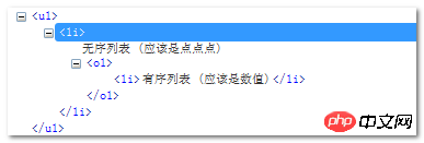

You can click here: Ordered unordered list nested conflict demo
Although the selector ol > li and ul > li can solve this problem, but people always tend to use the smallest amount of code.
You can click here: SubselectorDemo for fixing conflicts
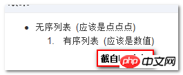
Let me digress here, follow my instructions You know, the above methods of ul, ol, and li are all a bunch of shit that looks good. What’s the explanation? Because the li tag is inheritable, we don't need to make a fuss about the li tag at all. Just use the following CSS code:
ol {  /*给ol下面的li标签以数值*/
  list-style: decimal outside;
}
ul {  /*给ul下面的li标签以圆点标记*/
  list-style: disc outside;
}The code is minimal and there is no nesting conflict problem. You can click here: List nesting demo under inheritance use

3. Style, form style
It seems that the Minimum Page project has one Special form CSS files, according to the sponsor, the styles outside the form are limited, that is, margin, padding or some background background color links are set to highlighted blue, and are displayed in reverse after the keyboard focus is obtained.
Form styles are mostly stripped from the Skeleton framework (friendly for mobile device development), with only minor changes and some code compression. The ordinary demo page in the demo shown in the first part contains most of the commonly used elements, while the form-related demo has its own demo page.
四、做什么事的?
Minimum Page项目貌似是在做这么一件事:形成一个紧凑坚固的基础CSS,无需反复折腾浏览器一直的默认样式;但是,同时要保证在各个浏览器下对每个用户而言,看到的效果是一样的,而不必去担心会出现一两个妖孽的几像素问题。
为鼓励用户思考要插入他们自己站点的CSS代码。代码样式并不是最小化的那种形式,开发者是修改原来的基础的样式,是其更具有广泛性和通用性,以适合自己的站点。
五、这不就是normalize.css吗?
首先关于normalize.css项目,您可以点击这里查看:normalize.css。虽然normalize.css和minimum page都来自类似的地方, 都是旨在规避传统CSS reset且都只设置浏览器不一样的样式。但normalise.css采取更严格的方法,避免过多样式。
从另一方面讲,Minimum page包含了更多的样式(表单部分更多),并省去了很多小的差异。
没有哪个项目是阳光大道。这就是为什么这两个项目都没有提供最小化版本,以防止你盲目地添加到CSS reset中。
六、究竟为何物?
上面基本上按照官方首页称述的内容,估计还会让很多人是丈二的和尚-摸不着头脑。因此,我决定用更易于接受的方式介绍了Minimum Page项目究竟何物。
Minimum Page项目的终极产物形式就是个CSS文件(下载资源中的base.css和forms.css)。我们都知道CSS reset重置的终产物也是个CSS文件,只是里面的样式无论在各个浏览器中是否有差异都是置为0,或normal之类。
而这里Minimum Page项目:
1. base.css文件等只针对各个浏览器下有差异的元素进行样式定义(例如strong标签就忽略)。
2. 定义的样式不是盲目地置为0,而是仔细对比各个浏览器的默认值指定的最合适的值。例如列表样式:
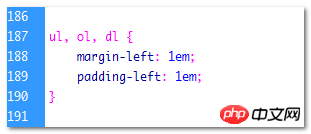
就不是想也不想的:
ul, ol, dl {
    margin: 0;
    padding: 0;
}3. 标签直接植入项目,自带一些UI属性样式。例如a标签链接色,或是figure标签下的图片:
figure img {
    background-color: #f3f3f3;
    padding: 4px;
    margin: 5px;
    border: 1px solid #ccc;
        border-radius: 3px;
}可以看到有背景色,有padding有margin,还有圆角样式。这在专门提出来的forms.css中更为明显,从demo页面中中文本框等的样子就可以估计出各种HTML 表单控件的洋洋洒洒的样式了,我们在实际使用该项目成果的时候要根据站点的自身情况,修改(例如)这里的表单样式的。
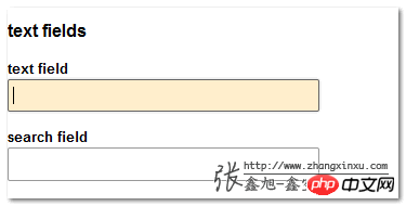
当我们使用Minimum Page项目的时候,要结果我们站点自身的情况,对之中的CSS属性进行修改的。正如上面提到的,我们之所以把表单之类的CSS写的蛮精细的,就是方便偶们使用者进行修改。这也是为什么说项目不是正确方法,不对CSS文件最小化的原因。
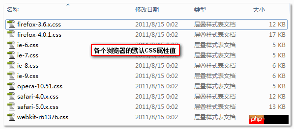
提示:源文件中有个名叫_reference-ua-css的文件夹,其中的CSS文件都是各个浏览器内置的默认的一些CSS的样式值,从中你也看以看出,Minimum Page项目中所设置样式的CSS属性值都是经过仔细对比,设置的值也都是有过考量的,所以,还是相当有借鉴和参考意义的。
七、短短的结语
I am also sorting out while studying, so the article may have inaccurate expressions. Corrections are welcome. Regarding the project itself, since I have not yet accurately grasped its essence, I dare not make any rash comments. But what is certain is that some of them see some shadows in my CSS architecture, such as not resetting the consistent default properties of the browser.
I don’t know what you think about the browser’s default CSS in this project?
The above is the detailed content of A brief introduction to CSS project Minimum Page. For more information, please follow other related articles on the PHP Chinese website!
 How to update graphics card driver
 The difference between * and & in C language
 delete folder in linux
 How to deal with laptop lag and slow response
 Reasons why the homepage cannot be modified
 How to upgrade Douyin
 The core technologies of the big data analysis system include
 How to find the median of an array in php


