 Web Front-end
 HTML Tutorial
 Style control compatibility and examples of progress element in HTML5
Style control compatibility and examples of progress element in HTML5
1. Basic understanding of progress element
Basic UI
The progress element belongs to the HTML5 family and refers to progress bar. Supported by IE10+ and other reliable browsers. The following is a simple code:
<progress>o(︶︿︶)o</progress>
Effect:

is a very impressive progress bar. Some people are wondering: "Oh~ why do I see a character emoticon?" Well... I can only say to you: "I despise you, you are so reluctant to use a more reliable browser?!"
This default effect has different effects under different browsers, as shown in the screenshots below (under window 7):
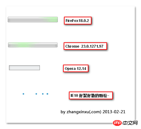
Easy gathering and dispersion of IE10 particles The effect is quite impressive.
Basic attributes
max, value, position, and labels.
max refers to the maximum value. If defaulted, the progress value range is from 0.0~1.0. If set to max=100, the progress value range is from 0~100.
value is the value. If max=100, value=50, the progress is just right. half. The presence or absence of the value attribute determines whether the progress progress bar is deterministic. What's the meaning? For example, has no value and is uncertain, so under the IE10 browser it looks like an infinite loop of dot animation; however, once there is a value attribute (even if it has no value), such as < progress value>, is also considered to be confirmed, and the virtual point animation enters the fairy mode——>The bars change, as shown in the screenshot below:


It can be seen from the title that this section is the most formidable place. Naturally, the public face has nothing to talk about. It is precisely because of the huge difference in CSS control of the progress element style that it has become a talking point.
It can be seen from the title that this section is the most formidable place. Naturally, the public face has nothing to talk about. It is precisely because of the huge difference in CSS control of the progress element style that it has become a talking point.

The completed progress bar is represented by progress::-moz-progress-bar { }, which is the opposite of the Chrome browser.
Chrome’s performance is obviously different from FireFox. The structure of its progress element seems to be like this:
progress┓
    progress-value
progress-bar其中,progress-bar指全部的进度,progress-value指已经完成的进度。因此,Chrome浏览器下,已经完成的进度条,使用progress::-webkit-progress-value { }表示, FireFox浏览器下是*-bar. 而progress-bar默认含有背景色,因此,我们需要如下设置,以自定义背景色:
progress::-webkit-progress-bar { background: *; }
这也很好地解释了上面的一个疑问?progress{background:*;}为什么不能让progress元素背景色改变呢?不是不能改变,而是被progress-bar这个内部元素给覆盖了,当我们设置:progress::-webkit-progress-bar { background: transparent; }的时候,progress{background:*;}设置的背景色就会显露出来。
4.Opera浏览器
Opera似乎没有什么::-o-progress-*{}的用法,因此,Opera浏览器,其已完成进度的背景色是无解的,只能使用默认的颜色——我的浏览器是和谐绿色。

IE10浏览器
IE10浏览器很奇葩的,它也可以设置已完成进度的背景色,使用的是color属性,progress{color:*;} .
因此,综上全部,我们可以使用类似下面的CSS实现最大兼容的自定义进度条样式:
progress {
    width: 160px;
    border: 1px solid #0064B4;
    background-color:#e6e6e6;
    color: #0064B4; /*IE10*/}
progress::-moz-progress-bar { background: #0064B4; }
progress::-webkit-progress-bar { background: #e6e6e6; }
progress::-webkit-progress-value { background: #0064B4; }您可以狠狠地点击这里:progress元素样式自定义最大兼容demo
三、实例效果展示
进度条可以用在页面loading中(如gmail),或者文件上传进度,或者视频播放进度等。
为演示上面的自定义样式,现在整合我之前折腾的HTML5文件上传,做了个demo。
您可以狠狠地点击这里:文件上传进度与progress元素的样式控制demo
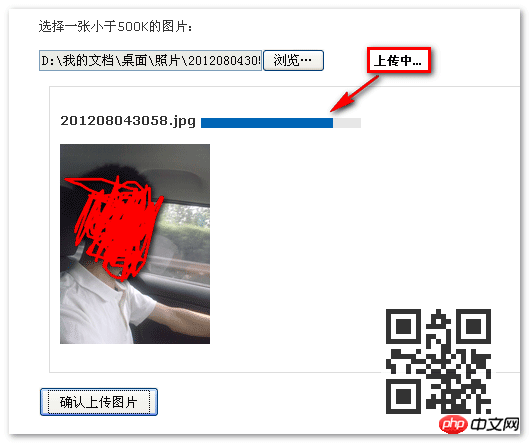
选择一个图片(可以大一点的),然后点击按钮上传(最好可以限速),就可以清楚看到进度变化,如下截图:
关键部分的代码:
onProgress: function(file, loaded, total) {
var percent = Math.round(loaded / total * 100); $("progress").val(percent);}直接value赋值就有了进度动画效果。传统实现需要div嵌套,以及width控制等。优劣伯仲,一目了然。
四、淡淡的结束语
吃了个晚饭,不记得原本想要讲的结束语了。想想~~恩……IE6~IE9浏览器不支持progress元素,我们可以通过嵌套其他元素的方法进行兼容,例如:
<progress><div>这里写兼容IE的东东</div></progress>
支持progress的浏览器会忽略innerHTML,因此,内部的div可以放心大胆进行样式处理,兼容低版本IE浏览器。
好的兼容做法
对于IE6~IE9浏览器,模拟进度条效果,如果不使用背景图片的话,一般而言,至少需要2层标签。我们需要再额外的徒增2层标签??No, no, no! 外部的progress标签已经替我们做了一半的工作,因为,progress所对应的CSS样式,也是IE6~9浏览器需要的(高宽,边框色背景色什么的),因此,我们只需要再额外塞1层标签就可以了,这个标签对应的就是已经完成的进度条的样式。
例如,如下的HTML设置:
我们需要怎样的CSS代码呢?如下,标红的部分与兼容处理所增加的,都是无伤大雅,不需要hack补丁的。
progress {    display: inline-block;
    width: 160px;
    height: 20px;
    border: 1px solid #0064B4;
    background-color:#e6e6e6;
    color: #0064B4; /*IE10*/}/*ie6-ie9*/progress ie {
    display:block;
    height: 100%;
    background: #0064B4;
}progress::-moz-progress-bar { background: #0064B4; }
progress::-webkit-progress-bar { background: #e6e6e6; }
progress::-webkit-progress-value { background: #0064B4; }当然,progress以及自定义的ie元素,ie6~8都是不认识的,我们需要打个动态补丁,如下:
if (typeof window.screenX !== "number") {
    document.createElement("progress");
    document.createElement("ie");
}于是,progress{}, ie{}的样式就能被低版本IE识别,同时,单纯作为普通元素处理(现代浏览器则会把ie标签直接抹杀)。
耳听为虚眼见为实,您可以狠狠地点击这里:progress元素兼容IE6~IE9 demo
例如,IE6浏览器下,就是下面这个样子:
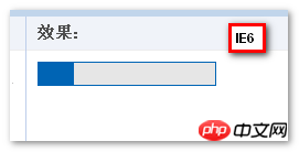
如现代浏览器们长得一个模样。因此,目前,在实际项目中使用progress元素是完全可行的,你还不赶快试试!
The above is the detailed content of Style control compatibility and examples of progress element in HTML5. For more information, please follow other related articles on the PHP Chinese website!

Hot AI Tools

Undresser.AI Undress
AI-powered app for creating realistic nude photos

AI Clothes Remover
Online AI tool for removing clothes from photos.

Undress AI Tool
Undress images for free

Clothoff.io
AI clothes remover

AI Hentai Generator
Generate AI Hentai for free.

Hot Article

Hot Tools

Notepad++7.3.1
Easy-to-use and free code editor

SublimeText3 Chinese version
Chinese version, very easy to use

Zend Studio 13.0.1
Powerful PHP integrated development environment

Dreamweaver CS6
Visual web development tools

SublimeText3 Mac version
God-level code editing software (SublimeText3)

Hot Topics
 1382
1382
 52
52
 Table Border in HTML
Sep 04, 2024 pm 04:49 PM
Guide to Table Border in HTML. Here we discuss multiple ways for defining table-border with examples of the Table Border in HTML.
 HTML margin-left
Sep 04, 2024 pm 04:48 PM
Guide to HTML margin-left. Here we discuss a brief overview on HTML margin-left and its Examples along with its Code Implementation.
 Nested Table in HTML
Sep 04, 2024 pm 04:49 PM
This is a guide to Nested Table in HTML. Here we discuss how to create a table within the table along with the respective examples.
 HTML Table Layout
Sep 04, 2024 pm 04:54 PM
Guide to HTML Table Layout. Here we discuss the Values of HTML Table Layout along with the examples and outputs n detail.
 HTML Input Placeholder
Sep 04, 2024 pm 04:54 PM
Guide to HTML Input Placeholder. Here we discuss the Examples of HTML Input Placeholder along with the codes and outputs.
 HTML Ordered List
Sep 04, 2024 pm 04:43 PM
Guide to the HTML Ordered List. Here we also discuss introduction of HTML Ordered list and types along with their example respectively
 Moving Text in HTML
Sep 04, 2024 pm 04:45 PM
Guide to Moving Text in HTML. Here we discuss an introduction, how marquee tag work with syntax and examples to implement.
 HTML onclick Button
Sep 04, 2024 pm 04:49 PM
Guide to HTML onclick Button. Here we discuss their introduction, working, examples and onclick Event in various events respectively.


