

Explanation of tab function in Bootstrap
Previous words
Tabs are a very common function in the Web. When the user clicks on the menu item, the corresponding content can be switched out. This article will introduce the Bootstrap tab in detail
Basic usage
The tab in the Bootstrap framework mainly consists of two parts:
1. Tab The menu component corresponds to Bootstrap's nav-tabs
2. The switchable tab panel component is usually represented by tab-pane in Bootstrap
In the Bootstrap framework, tab nav- The tabs have styles, and the panel content tab-pane is hidden. Only the current panel content is displayed.
.tab-content > .tab-pane {display: none;
}.tab-content > .active {display: block;
}The tab defines the data attribute to trigger the switching effect. Of course, the prerequisite is to load bootstrap.js or tab.js first. Declarative triggering tabs need to meet the following requirements:
1. Set data-toggle="tab"
in the tab navigation link 2. And set data-target=" corresponding The selector of the content panel (usually ID)"; if it is a link, you can also use href="the selector of the corresponding content panel (usually ID)". The main function is that the user can find the selector corresponding to it when clicking The panel content tab-pane.
3. The panel content is uniformly placed in the tab-content container, and each content panel tab-pane needs to set an independent selector (preferably ID) and the data-target or data-target in the tab. The value of href matches
<!-- 选项卡菜单--><ul id="myTab" class="nav nav-tabs" role="tablist"><li class="active"><a href="#bulletin" role="tab" data-toggle="tab">公告</a></li><li><a href="#rule" role="tab" data-toggle="tab">规则</a></li><li><a href="#forum" role="tab" data-toggle="tab">论坛</a></li><li><a href="#security" role="tab" data-toggle="tab">安全</a></li><li><a href="#welfare" role="tab" data-toggle="tab">公益</a></li></ul><!-- 选项卡面板 --><div id="myTabContent" class="tab-content"><div class="tab-pane active" id="bulletin">公告内容面板</div><div class="tab-pane " id="rule">规则内容面板</div><div class="tab-pane " id="forum">论坛内容面板</div><div class="tab-pane " id="security">安全内容面板</div><div class="tab-pane " id="welfare">公益内容面板</div></div>
[Fade-in effect]
In order to make the hiding and display of the panel more effective during the switching process Smooth, you can add the class name fade in the panel to produce a gradual effect.
When adding the fade style, the initial default displayed content panel must be added with the in class name, otherwise the user will not be able to see its content
<!-- 选项卡菜单--><ul id="myTab" class="nav nav-tabs" role="tablist"><li class="active"><a href="#bulletin" role="tab" data-toggle="tab">公告</a></li><li><a href="#rule" role="tab" data-toggle="tab">规则</a></li><li><a href="#forum" role="tab" data-toggle="tab">论坛</a></li><li><a href="#security" role="tab" data-toggle="tab">安全</a></li><li><a href="#welfare" role="tab" data-toggle="tab">公益</a></li></ul><!-- 选项卡面板 --><div id="myTabContent" class="tab-content"><div class="tab-pane fade in active" id="bulletin">公告内容面板</div><div class="tab-pane fade" id="rule">规则内容面板</div><div class="tab-pane fade" id="forum">论坛内容面板</div><div class="tab-pane fade" id="security">安全内容面板</div><div class="tab-pane fade" id="welfare">公益内容面板</div></div>
【Capsule Tab】
In Bootstrap, in addition to allowing nav-tabs to have the tab switching function, the capsule nav-pills navigation can also have the tab function. . Just replace nav-tabs with nav-pills. Another key point is to replace data-toggle="tab" with data-toggle="pill"
<!-- 选项卡菜单--><ul id="myTab" class="nav nav-pills" role="tablist"><li class="active"><a href="#bulletin" role="tab" data-toggle="pill">公告</a></li><li><a href="#rule" role="tab" data-toggle="pill">规则</a></li><li><a href="#forum" role="tab" data-toggle="pill">论坛</a></li><li><a href="#security" role="tab" data-toggle="pill">安全</a></li><li><a href="#welfare" role="tab" data-toggle="pill">公益</a></li></ul><!-- 选项卡面板 --><div id="myTabContent" class="tab-content"><div class="tab-pane fade in active" id="bulletin">公告内容面板</div><div class="tab-pane fade" id="rule">规则内容面板</div><div class="tab-pane fade" id="forum">论坛内容面板</div><div class="tab-pane fade" id="security">安全内容面板</div><div class="tab-pane fade" id="welfare">公益内容面板</div></div>
JS trigger
In addition to setting data-toggle in HTML to trigger tabs, you can also directly use JavaScript transfer.
Call the tab("show") method in the click event of each link to display the corresponding tab panel content. For the above example, delete the custom data-toggle="tab" or data-toggle="pill" attributes in HTML, and then call
$(function(){
    $("#myTab a").click(function(e){
        e.preventDefault();
        $(this).tab("show");
    });
})【Event Subscription】
show.bs.tab        show方法调用之后立即触发该事件
shown.bs.tab      此事件在tab已经显示出来(并且同时在 CSS 过渡效果完成)之后被触发
hide.bs.tab        hide方法调用之后立即触发该事件。
hidden.bs.tab     此事件在tab被隐藏(并且同时在 CSS 过渡效果完成)之后被触发
<!-- 选项卡菜单-->
<ul id="myTab" class="nav nav-pills" role="tablist">
    <li class="active"><a href="#bulletin" role="tab">公告</a></li>
    <li><a href="#rule" role="tab" >规则</a></li>
    <li><a href="#forum" role="tab" >论坛</a></li>
    <li><a href="#security" role="tab" >安全</a></li>
    <li><a href="#welfare" role="tab" >公益</a></li>
</ul>
<!-- 选项卡面板 -->
<div id="myTabContent" class="tab-content">
    <div class="tab-pane fade in active" id="bulletin">公告内容面板</div>
    <div class="tab-pane fade" id="rule">规则内容面板</div>
    <div class="tab-pane fade" id="forum">论坛内容面板</div>
    <div class="tab-pane fade" id="security">安全内容面板</div>
    <div class="tab-pane fade" id="welfare">公益内容面板</div>
</div>
<script>$(function(){
    $("#myTab a").click(function(e){
        e.preventDefault();
        $(this).tab("show");
    });
    $("#myTab").on("show.bs.tab",function(e){
         $(e.target).css('outline','1px solid black');
    }).on("hide.bs.tab",function(e){
        $(e.target).css('outline','none');
    })
})</script>+function ($) {//使用es5严格模式'use strict';//}(window.jQuery); var Tab = function (element) {//指定当前元素this.element = $(element)
} //版本号为3.3.7
Tab.VERSION = '3.3.7' //动画时间为150ms
Tab.TRANSITION_DURATION = 150 //show()方法用于触发show事件,调用activate原型方法,触发shown事件
Tab.prototype.show = function () {//当前tabvar $this = this.element//找到最近的ulvar $ul = $this.closest('ul:not(.dropdown-menu)')//找到data-target值var selector = $this.data('target')//如果data-target值不存在,查找href值if (!selector) {
selector = $this.attr('href') //IE7特殊处理 selector = selector && selector.replace(/.*(?=#[^\s]*$)/, '')
}//如果当前tab已经是活动状态了,即父元素li上已经有active样式的话,直接返回if ($this.parent('li').hasClass('active')) return//找到上一个元素,即上一个带有active样式的li里的a元素var $previous = $ul.find('.active:last a')//设置hide事件var hideEvent = $.Event('hide.bs.tab', {
relatedTarget: $this[0]
})//设置show事件var showEvent = $.Event('show.bs.tab', {
relatedTarget: $previous[0]
})//触发hide事件及show事件 $previous.trigger(hideEvent)
$this.trigger(showEvent)//如果自定义回调中阻止了默认行为,则不再继续处理if (showEvent.isDefaultPrevented() || hideEvent.isDefaultPrevented()) return//要激活显示的面板,即target或href里的值所对应的元素var $target = $(selector)//高亮显示当前tabthis.activate($this.closest('li'), $ul)//显示对应的面板,并在回调里触发hidden及shown事件this.activate($target, $target.parent(), function () {
$previous.trigger({
type: 'hidden.bs.tab',
relatedTarget: $this[0]
})
$this.trigger({
type: 'shown.bs.tab',
relatedTarget: $previous[0]
})
})
} //active样式的应用,面板的显示和隐藏,以及tab的高亮与反高亮
Tab.prototype.activate = function (element, container, callback) {//查找当前容器所有有active样式的元素var $active = container.find('> .active')//判断是使用回调还是动画var transition = callback && $.support.transition && ($active.length && $active.hasClass('fade') || !!container.find('> .fade').length)function next() {
$active//去除其他元素的active样式.removeClass('active')//包括li元素里面的下拉菜单里的active样式也要去除.find('> .dropdown-menu > .active')
.removeClass('active')
.end()
.find('[data-toggle="tab"]')
.attr('aria-expanded', false)
element//给当前被单击的元素添加active高亮样式.addClass('active')
.find('[data-toggle="tab"]')
.attr('aria-expanded', true) if (transition) {//如果支持动画,就重绘页面element[0].offsetWidth //并添加in样式,去除透明element.addClass('in')
} else {//否则删除fadeelement.removeClass('fade')
} //如果单击的是下拉菜单里的项目 if (element.parent('.dropdown-menu').length) {
element //打到最近的li.dropdown元素进行高亮 .closest('li.dropdown')
.addClass('active')
.end()
.find('[data-toggle="tab"]')
.attr('aria-expanded', true)
} //如果有回调就执行回调 callback && callback()
}//如果支持动画$active.length && transition ? $active//在动画结束后执行next().one('bsTransitionEnd', next)
.emulateTransitionEnd(Tab.TRANSITION_DURATION) :
next()
$active.removeClass('in')
} function Plugin(option) {//根据选择器,遍历所有符合规则的元素return this.each(function () { var $this = $(this) //获取自定义属性bs.tab的值 var data = $this.data('bs.tab') //如果值不存在,则将Tab实例设置为bs.tab值 if (!data) $this.data('bs.tab', (data = new Tab(this))) //如果option传递了string,则表示要执行某个方法 if (typeof option == 'string') data[option]()
})
} var old = $.fn.tab //保留其他库的$.fn.tab代码(如果定义的话),以便在noConflict之后可以继续使用该老代码
$.fn.tab = Plugin //重设插件构造器,可以通过该属性获取插件的真实类函数
$.fn.tab.Constructor = Tab $.fn.tab.noConflict = function () { //恢复以前的旧代码$.fn.tab = old//将$.fn.tab.noConflict()设置为Bootstrap的Tab插件return this
} var clickHandler = function (e) {//阻止默认行为 e.preventDefault()//触发show()方法Plugin.call($(this), 'show')
}
$(document)//在document上绑定单击事件.on('click.bs.tab.data-api', '[data-toggle="tab"]', clickHandler)
.on('click.bs.tab.data-api', '[data-toggle="pill"]', clickHandler)The above is the detailed content of Explanation of tab function in Bootstrap. For more information, please follow other related articles on the PHP Chinese website!

Hot AI Tools

Undresser.AI Undress
AI-powered app for creating realistic nude photos

AI Clothes Remover
Online AI tool for removing clothes from photos.

Undress AI Tool
Undress images for free

Clothoff.io
AI clothes remover

AI Hentai Generator
Generate AI Hentai for free.

Hot Article
Hot Tools

Notepad++7.3.1
Easy-to-use and free code editor

SublimeText3 Chinese version
Chinese version, very easy to use

Zend Studio 13.0.1
Powerful PHP integrated development environment

Dreamweaver CS6
Visual web development tools

SublimeText3 Mac version
God-level code editing software (SublimeText3)
Hot Topics


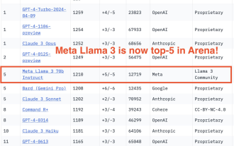 750,000 rounds of one-on-one battle between large models, GPT-4 won the championship, and Llama 3 ranked fifth
Apr 23, 2024 pm 03:28 PM
750,000 rounds of one-on-one battle between large models, GPT-4 won the championship, and Llama 3 ranked fifth
Apr 23, 2024 pm 03:28 PM
Regarding Llama3, new test results have been released - the large model evaluation community LMSYS released a large model ranking list. Llama3 ranked fifth, and tied for first place with GPT-4 in the English category. The picture is different from other benchmarks. This list is based on one-on-one battles between models, and the evaluators from all over the network make their own propositions and scores. In the end, Llama3 ranked fifth on the list, followed by three different versions of GPT-4 and Claude3 Super Cup Opus. In the English single list, Llama3 overtook Claude and tied with GPT-4. Regarding this result, Meta’s chief scientist LeCun was very happy and forwarded the tweet and
 How to use bootstrap to test mediation effects
Apr 05, 2024 am 03:57 AM
How to use bootstrap to test mediation effects
Apr 05, 2024 am 03:57 AM
The Bootstrap test uses resampling technology to evaluate the reliability of the statistical test and is used to prove the significance of the mediation effect: first, calculate the confidence interval of the direct effect, indirect effect and mediation effect; secondly, calculate the significance of the mediation type according to the Baron and Kenny or Sobel method. significance; and finally estimate the confidence interval for the natural indirect effect.
 What is the difference between bootstrap and springboot
Apr 05, 2024 am 04:00 AM
What is the difference between bootstrap and springboot
Apr 05, 2024 am 04:00 AM
The main difference between Bootstrap and Spring Boot is: Bootstrap is a lightweight CSS framework for website styling, while Spring Boot is a powerful, out-of-the-box backend framework for Java web application development. Bootstrap is based on CSS and HTML, while Spring Boot is based on Java and the Spring framework. Bootstrap focuses on creating the look and feel of a website, while Spring Boot focuses on back-end functionality. Spring Boot can be integrated with Bootstrap to create fully functional, beautiful
 What frameworks does vue have?
Apr 05, 2024 pm 11:54 PM
What frameworks does vue have?
Apr 05, 2024 pm 11:54 PM
Vue.js is a progressive framework for building user interfaces. When choosing a framework, you should consider project requirements, developer skills, community support, and maintenance costs. Commonly used Vue.js frameworks include Nuxt.js, Vuetify, Element UI, Quasar, BootstrapVue, VeeValidate, Axios, Vue Router, and Vuex.
 What is the z-value of the bootstrap mediation test?
Apr 05, 2024 am 04:12 AM
What is the z-value of the bootstrap mediation test?
Apr 05, 2024 am 04:12 AM
The Bootstrap mediation test z-value is used to evaluate the mediating effect of X on Y through M. The z-value is calculated as the mean value of the c' path divided by its standard deviation. The larger its absolute value, the higher the statistical significance of the mediation effect. The z value >1.96 indicates that the mediation effect is significant at the 0.05 level, the z value >2.58 indicates that it is significant at the 0.01 level, and the z value <-1.96 indicates that it is not significant at the 0.05 level.
 Which version of dreamweaver is better?
Apr 08, 2024 pm 09:39 PM
Which version of dreamweaver is better?
Apr 08, 2024 pm 09:39 PM
The version of Dreamweaver that's best for you depends on your skill level and project needs. Beginner: Dreamweaver CC General User: Dreamweaver 2022 Professional Developer: Dreamweaver 2022
 How to use layui and bootstrap together
Apr 26, 2024 am 03:51 AM
How to use layui and bootstrap together
Apr 26, 2024 am 03:51 AM
LayUI and Bootstrap can be integrated in the following ways: directly introduce styles and scripts, but you need to customize CSS override rules; use Sass to override Bootstrap variables, which requires Sass environment support; use Laystrap plug-ins to encapsulate the Bootstrap style version of LayUI components; use Layui Bootstrap plugin that automatically handles style overrides and responsive layout.
 What tests need to be done before bootstrapping to test the mediation effect?
Apr 05, 2024 am 04:09 AM
What tests need to be done before bootstrapping to test the mediation effect?
Apr 05, 2024 am 04:09 AM
Preliminary tests for Bootstrapping to test the mediation effect include: regression test for the significant relationship between the independent variable and the dependent variable; potential mediating variable to be significantly related to the independent variable and the dependent variable; Sobel/Goodman test for the overall significance of the mediation effect; conditional effect test for the mediating variable Whether it affects the relationship between the independent variable and the dependent variable; eliminate alternative explanations and ensure sufficient sample size to improve the test effect.
