flex Basic concept
Flex is the abbreviation of Flexible Box, which means "flexible layout" and is used for box-shaped models Provides maximum flexibility. After setting to Flex layout, the float, clear and vertical-align attributes of child elements will be invalid.
Any container can be designated as Flex layout.
#box{
    display: flex;
    width: 500px;
    height: 300px;
    border: 10px solid red;
}
It’s not difficult to say. The core concepts of flex are container and axis. The container includes the outer parent container and the inner child container, and the axis includes the main axis and the cross axis. It can be said that All features of flex layout are built on these two concepts. Flex layout involves 12 CSS properties (excluding display: flex), among which the parent container and child container 6. However, there are only 4 commonly used attributes, 2 for the parent container and 2 for the child container. Let’s start with the commonly used ones.
First of all, friends can learn the relevant tutorials on css and css3 from our php Chinese website:
##1. Dugujiujian(2)_CSS video tutorial

2. Quickly play with CSS3 tutorial

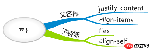 1: There are six properties set on the box parent container to control the display mode of child elements; they are:
flex-
Settings Main axis alignment Default row ;justify-content Alignment of child elements Default flex-start Left alignment
align-items
align-content
1. flex-direction Determines the alignment direction of the main axis. There are four attributes:
row (default value): The main axis is horizontal and the starting point is at the left end.
row-reverse: The main axis is horizontal and the starting point is at the right end.
column: The main axis is vertical, and the starting point is on the upper edge.
column-reverse: The main axis is vertical, and the starting point is at the lower edge.
2. flex-wrap: Define how to wrap sub-elements in more than one line. There are three attributes:
nowrap (default value): no line wrapping by default.
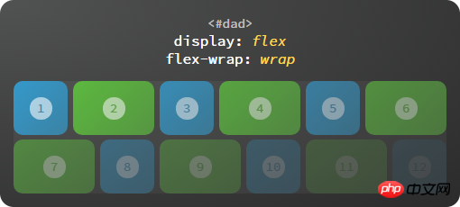
wrap: Line wrap, the second line is below the first line, from left to right
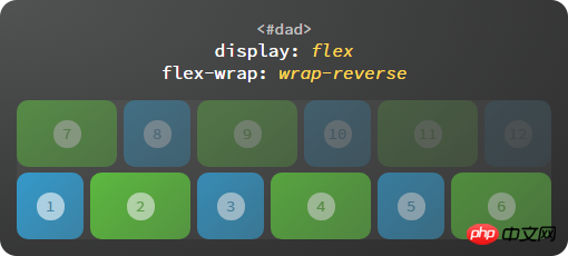
wrap-reverse: Line wrap, the second line is above the first line, from left to right;
3. flex-flow: is the abbreviation of flex-direction and flex-wrap, the default is row nowrap
flex-flow: flex-direction|flex-wrap;
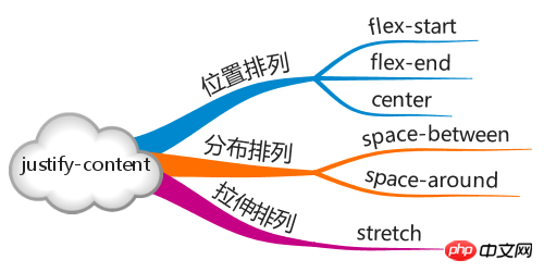
4. justify-content: Alignment of child elements on the main axis
flex-start (default value): left-aligned
flex-end: right-aligned
center: centered
space-between: Align both ends, and the intervals between items are equal.
space-around: Each item is equally spaced on both sides. Therefore, the space between items is twice as large as the space between items and the border.
flex-start, flex-end, and center are relatively simple. They mainly distinguish between space-between and space-around below;
space-between: align both ends,
5 align-items: How to align the cross axis. If flex-direction: row and row-reverse, then the cross axis is the y axis. If it is column and column-reverse, then the cross axis is the x axis.
flex-start: Align the starting point of the cross axis.
flex-end: The end point alignment of the cross axis.
center: Align the midpoint of the cross axis.
baseline: The baseline alignment of the first line of text of the item.
stretch (default value): If the item does not set a height or is set to auto, it will occupy the entire height of the container.
baseline: Align with the baseline of the first sub-element text
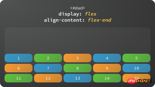
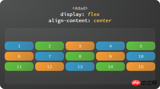
6. align-content: attribute defines the alignment of multiple axes. This property has no effect if the project has only one axis.
flex-start: Align with the starting point of the cross axis.
flex-end: Aligned with the end point of the cross axis.
center: Aligned with the midpoint of the cross axis.
space-between: Align with both ends of the cross axis, and the intervals between the axes are evenly distributed.
space-around: Each axis is equally spaced on both sides. Therefore, the distance between the axes is twice as large as the distance between the axes and the frame.
stretch (default value): The axis occupies the entire cross axis.
1.1 Parent container
Set sub-containers to be arranged along the main axis: justify-content
justify-content property is used to define how to arrange sub-containers along the main axis.
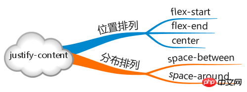
flex-start:Start end alignment

flex-end:End segment alignment

center: Center alignment

#space-around: sub-containers are evenly distributed along the main axis, the distance from the sub-containers at the first and last ends to the parent container Is half the spacing between subcontainers.

space-between: The sub-containers are evenly distributed along the main axis, and the sub-containers at the first and last ends are tangent to the parent container.

Set how subcontainers are arranged along the cross axis: align-items
The align-items property is used to define how to distribute subcontainers along the cross axis. spacing.
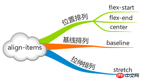
flex-start:Start end alignment
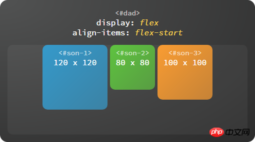
flex-end:End segment alignment
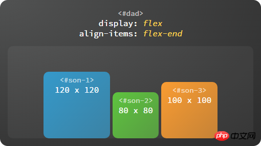
center: center alignment

baseline: baseline alignment. The baseline here refers to the first line of text by default, that is, first baseline, all sub-containers Aligned to the baseline, the subcontainer with the greatest distance from the starting point of the cross axis to the element's baseline will be tangent to the starting point of the cross axis to determine the baseline.
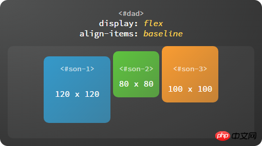
#stretch: The size of the child container along the cross axis is stretched to be consistent with the parent container.

2 There are six properties set on child element items:
order
flex-grow
flex -shrink
flex-basis
flex
align-self
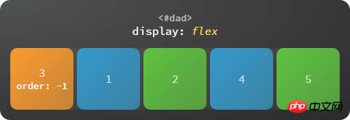
1. Order The position of the child elements is arranged in html order by default. , whoever is in front of the html structure will be arranged in front by default; the function of order is to change the order of sub-elements
Order: Default (0) The smaller the value, the higher it is.
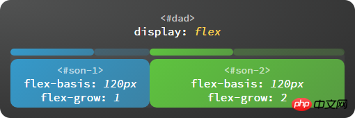
2.flex-grow amplification ratio. The default is 0. When there is room for amplification, the larger the value, the greater the amplification ratio.
3.flex-shrink: Shrinkage ratio. The default is 1. The larger the value, the smaller the proportion when shrinking;
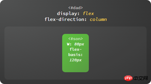
4. The flex-basis attribute defines the main axis space (main size) occupied by the item before allocating excess space. The browser uses this attribute to calculate whether there is extra space on the main axis. Its default value is auto, which is the original size of the project.
5. The flex attribute is the abbreviation of flex-grow, flex-shrink and flex-basis. The default value is 0 1 auto. The last two properties are optional.
6. The align-self attribute allows a single item to have a different alignment than other items and can override the align-items attribute. The default value is auto, which means inherits the align-items attribute of the parent element. If there is no parent element, it is equivalent to stretch.
1.2 How the sub-container
stretches on the main axis: flex

The sub-container is elastic (flex means elasticity), they The remaining space will be automatically filled, and the expansion ratio of the subcontainer is determined by the flex attribute.
The value of flex can be a unitless number (such as: 1, 2, 3), a unit number (such as: 15px, 30px, 60px), or the none keyword. The subcontainer will automatically expand and contract according to the size ratio defined by flex. If the value is none, it will not expand or contract.
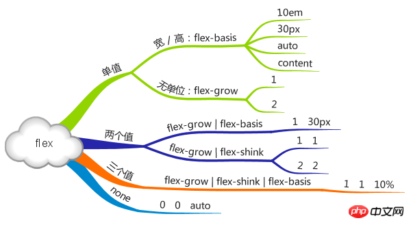
Individually set how subcontainers are aligned along the cross axis: align-self
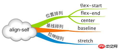
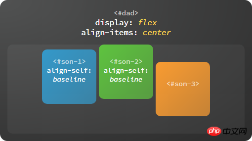
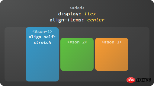
Each subcontainer also The arrangement along the cross axis can be defined separately. The optional value of this attribute is exactly the same as the align-items attribute of the parent container. If both are set at the same time, the align-self attribute of the child container shall prevail.
flex-start: start end alignment

flex-end: end segment alignment

center: center alignment

baseline: baseline alignment
stretch: stretch alignment
2. Axis
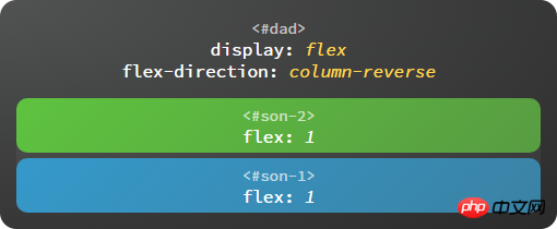
The axis includes the main axis and the cross axis. We know that the justify-content attribute determines the arrangement of the sub-containers along the main axis, and the align-items attribute determines the arrangement of the sub-containers along the cross axis. arrangement. So how is the axis itself determined? In flex layout, the flex-direction property determines the direction of the main axis, and the direction of the cross axis is determined by the main axis.

Spindle
The starting end of the spindle is represented by flex-start, and the end segment is represented by flex-end. The positions of the starting end and the end segment corresponding to different spindle directions are also different.
To the right: flex-direction: row

Down: flex-direction: column

To the left: flex-direction: row-reverse

Up: flex-direction: column-reverse
Cross axis
The main axis is rotated 90° in the counterclockwise direction to obtain the cross axis. The start and end segments of the cross axis are also represented by flex-start and flex-end.
Set the line wrapping method: flex-wrap
Determine whether the sub-container can be arranged in new lines. It can not only wrap sequentially but also support reverse order.

nowrap: No line wrap

wrap: Line wrap
wrap-reverse:Reverse line wrap
Reverse line wrap refers to line wrap in the opposite direction of the cross axis.
Axis and line wrapping combination settings: flex-flow
flow is the flow direction, that is, in which direction the sub-container flows, and whether the flow to the end is allowed Line wrap, such as flex-flow: row wrap, flex-flow is a composite attribute, which is equivalent to the combination of flex-direction and flex-wrap. The optional values are as follows:
row, column, etc., which can be used individually Set the spindle direction
wrap, nowrap, etc. You can set the line wrapping method
row nowrap, column wrap, etc. separately, or you can set both at the same time
Multiple rows are aligned along the cross axis :align-content
When the sub-container is arranged in multiple rows, set the alignment between rows.
flex-start: start end alignment

