

Using Bootstrap to achieve accordion effect
Previous words
The Collapse plug-in (folding) in the Bootstrap framework is actually our common accordion effect. When a trigger element is clicked, it is displayed or hidden in another collapsible area, and the display state can be reversed when clicked again. The classic scene is the accordion style of multiple folding areas and the style of a single title/content. This article will introduce the Bootstrap accordion effect in detail
Structure
The most critical part of the accordion , that is, each title corresponds to a piece of content. In the Bootstrap framework, these two parts are combined and called a panel. As shown in the effect below, there are three panel panels. When these three panels are combined together, it is a panel. Combining panel-group, which is the structure of the accordion
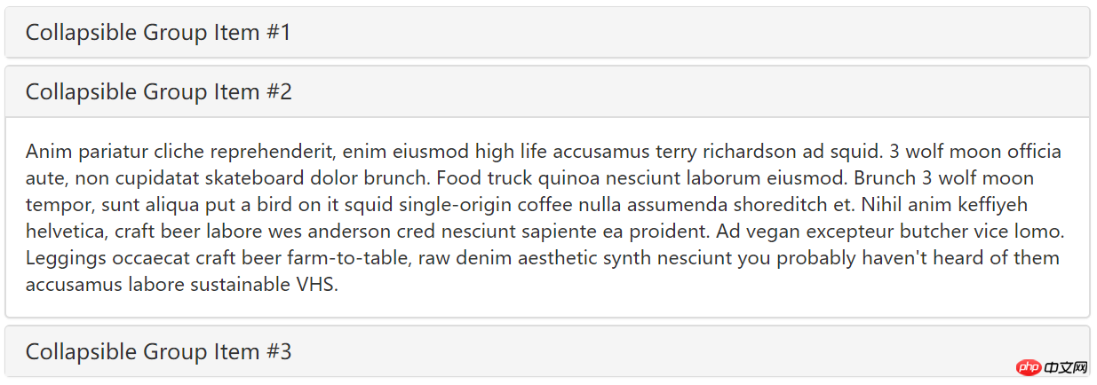
, is simply a trigger and a folding area
<button type="button" class="btn btn-danger" data-toggle="collapse" data-target="#demo">触发器</button><div id="demo" class="collapse in">折叠区</div>
<div class="panel-group" id="accordion"><div class="panel panel-default"><div class="panel-heading"><h4 class="panel-title"><a data-toggle="collapse" data-parent="#accordion" href="#collapseOne">标题一</a></h4></div><div id="collapseOne" class="panel-collapse collapse in"><div class="panel-body">标题一对应的内容</div></div></div><div class="panel panel-default"><div class="panel-heading"><h4 class="panel-title"><a data-toggle="collapse" data-parent="#accordion" href="#collapseTwo">标题二</a></h4></div><div id="collapseTwo" class="panel-collapse collapse"><div class="panel-body">标题二对应的内容</div></div></div><div class="panel panel-default"><div class="panel-heading"><h4 class="panel-title"><a data-toggle="collapse" data-parent="#accordion" href="#collapseThree">标题三</a></h4></div><div id="collapseThree" class="panel-collapse collapse"><div class="panel-body">标题三对应的内容</div></div></div></div>
Declarative triggering
The trigger accordion can be triggered through the custom data-toggle attribute. The data-toggle value is set to collapse, data-target="#folding area identifier". Next let’s look at a simple example
Step one: Design a panel combination with three folding areas
<div class="panel-group" id="myAccordion"><div class="panel panel-accordion panel-default"></div><div class="panel panel-accordion panel-default"></div><div class="panel panel-accordion panel-default"></div></div>
Step two: Add content to the panel , each panel includes two parts, the first is the panel title panel-heading, and the title panel-title is added inside. The second part is the panel content, which is the folding area, using the panel-collapse style
<div class="panel panel-accordion panel-default"><div class="panel-heading"><h4 class="panel-title">标题一</h4></div><div class="panel-collapse"><div class="panel-body">折叠区内容...</div></div></div>
Step 3: In order to bundle the title and content area together, you can use the anchor link method , connect the title area and the panel area together
<div class="panel-group" id="myAccordion"><div class="panel panel-accordion panel-default"><div class="panel-heading"><h4 class="panel-title"><a href="#panel1">标题一</a></h4></div><div class="panel-collapse" id="panel1"><div class="panel-body">折叠区内容...</div></div></div><div class="panel panel-accordion panel-default"><div class="panel-heading"><h4 class="panel-title"><a href="#panel2">标题二</a></h4></div><div class="panel-collapse" id="panel2"><div class="panel-body">折叠区内容...</div></div></div>......</div>
Step 4: Control whether the panel content area is visible. In the Bootstrap framework, if you want the content area to be invisible, you only need to add collapse to the panel-collapse style; if you want the content area to be visible by default, you need to add the style collapse and in
<div class="panel panel-accordion panel-default"><div class="panel-heading"><h4 class="panel-title"><a href="#panel1">标题一</a></h4></div><div class="panel-collapse collapse" id="panel1"><div class="panel-body">折叠区内容...</div></div></div>
Step 5: Activate the accordion interaction behavior. To complete the interactive behavior, you need to customize two attributes in the title link. One is data-toggle, and its value is collapse; the other is data-target, and its value is the identifier of each panel content area, such as ID. In this example, they are #panel1, #panel2 and #panel3 respectively:
[Note] It is okay not to add data-target="#panel1" in this case, because it is already there href="#panel1", but if the button button is used as the trigger, you must use the data-target="#panel1" statement
<div class="panel panel-accordion panel-default"><div class="panel-heading"><h4 class="panel-title"><a href="#panel1" data-toggle="collapse" data-target="#panel1">标题一</a></h4></div><div class="panel-collapse collapse in" id="panel1"><div class="panel-body">折叠区内容...</div></div></div>
Step 6: Define the data-parent attribute so that when one of the elements is clicked, all folding areas are closed, and then the clicked area is opened (if the clicked area is displayed, it will be closed). This data-parent value matches the identifier of the accordion panel container. For example, this example refers to #myAccordion
<div class="panel-group" id="myAccordion"><div class="panel panel-accordion panel-default"><div class="panel-heading"><h4 class="panel-title"><a href="#panel1" data-toggle="collapse" data-target="#panel1" data-parent="#myAccordion">标题一</a></h4></div>…
. Through the above 6 steps, the following key points can be summarized
☑ Use the panel-title of the panel as the trigger element, and use the parent element of the panel-body as the folding area;
☑ Use a panel-group to contain multiple panels to achieve an accordion effect;
☑ Each trigger element in the panel must specify the data-parent attribute. The value of the data-parent attribute corresponds to the ID or other style identifier of the panel-group style element;
☑ The trigger element needs to be specified data-toggle, and the value is collapse;
☑ The trigger element needs to specify the data-target attribute. The value of the data-target attribute corresponds to the ID or other style identifier of the parent element of the panel-body; if it is an a element , you can specify the href attribute instead
<div class="panel-group" id="accordion"><div class="panel panel-default"><div class="panel-heading"><h4 class="panel-title"><a data-toggle="collapse" data-parent="#accordion" href="#panel1">标题一</a></h4></div><div id="panel1" class="panel-collapse collapse in"><div class="panel-body">折叠区内容一</div></div></div><div class="panel panel-default"><div class="panel-heading"><h4 class="panel-title"><a data-toggle="collapse" data-parent="#accordion" href="#panel2">标题二</a></h4></div><div id="panel2" class="panel-collapse collapse"><div class="panel-body">折叠区内容二</div></div></div><div class="panel panel-default"><div class="panel-heading"><h4 class="panel-title"><a data-toggle="collapse" data-parent="#accordion" href="#panel3">标题三</a></h4></div><div id="panel3" class="panel-collapse collapse"><div class="panel-body">折叠区内容三</div></div></div></div>
JS trigger
[Keyword]
<span style="color: #000000;">$(element).collapse('show');//显示折叠区域
$(element).collapse('hide');//隐藏折叠区域
$(element).collapse('toggle');//反转折叠区域<br></span><div class="panel-group" id="accordion"><div class="panel panel-default"><div class="panel-heading"><h4 class="panel-title"><a data-toggle="collapse" data-parent="#accordion" href="#panel1">标题一</a></h4></div><div id="panel1" class="panel-collapse collapse in"><div class="panel-body">折叠区内容一</div></div></div><div class="panel panel-default"><div class="panel-heading"><h4 class="panel-title"><a data-toggle="collapse" data-parent="#accordion" href="#panel2">标题二</a></h4></div><div id="panel2" class="panel-collapse collapse"><div class="panel-body">折叠区内容二</div></div></div><div class="panel panel-default"><div class="panel-heading"><h4 class="panel-title"><a data-toggle="collapse" data-parent="#accordion" href="#panel3">标题三</a></h4></div><div id="panel3" class="panel-collapse collapse"><div class="panel-body">折叠区内容三</div></div></div></div><script>$(function(){
$('#btn1').click(function(){
$('.collapse').collapse('show');
})
$('#btn2').click(function(){
$('.collapse').collapse('hide');
})
$('#btn3').click(function(){
$('.collapse').collapse('toggle');
})
})</script>【Event】
This plug-in supports 4 types of event subscriptions
show.bs.collapse        show方法调用之后立即触发该事件
shown.bs.collapse      此事件在collapse已经显示出来(并且同时在 CSS 过渡效果完成)之后被触发
hide.bs.collapse        hide方法调用之后立即触发该事件。
hidden.bs.collapse     此事件在collapse被隐藏(并且同时在 CSS 过渡效果完成)之后被触发
<div class="panel-group" id="accordion"><div class="panel panel-default"><div class="panel-heading"><h4 class="panel-title"><a data-toggle="collapse" data-parent="#accordion" data-html="标题一" href="#panel1">标题一</a></h4></div><div id="panel1" class="panel-collapse collapse in"><div class="panel-body">折叠区内容一</div></div></div><div class="panel panel-default"><div class="panel-heading"><h4 class="panel-title"><a data-toggle="collapse" data-parent="#accordion" data-html="标题二" href="#panel2">标题二</a></h4></div><div id="panel2" class="panel-collapse collapse"><div class="panel-body">折叠区内容二</div></div></div><div class="panel panel-default"><div class="panel-heading"><h4 class="panel-title"><a data-toggle="collapse" data-parent="#accordion" data-html="标题三" href="#panel3">标题三</a></h4></div><div id="panel3" class="panel-collapse collapse"><div class="panel-body">折叠区内容三</div></div></div></div><script>$(function(){
    $("#accordion").on("show.bs.collapse",function(e){var $element = $(e.target).siblings().first().find('a');
        $element.html($element.data('html') + '[折叠区已打开]');
    }).on("hide.bs.collapse",function(e){var $element = $(e.target).siblings().first().find('a');
        $element.html($element.data('html') + '[折叠区已关闭]');
    })

});
</script>
The above is the detailed content of Using Bootstrap to achieve accordion effect. For more information, please follow other related articles on the PHP Chinese website!

Hot AI Tools

Undresser.AI Undress
AI-powered app for creating realistic nude photos

AI Clothes Remover
Online AI tool for removing clothes from photos.

Undress AI Tool
Undress images for free

Clothoff.io
AI clothes remover

AI Hentai Generator
Generate AI Hentai for free.

Hot Article
Hot Tools

Notepad++7.3.1
Easy-to-use and free code editor

SublimeText3 Chinese version
Chinese version, very easy to use

Zend Studio 13.0.1
Powerful PHP integrated development environment

Dreamweaver CS6
Visual web development tools

SublimeText3 Mac version
God-level code editing software (SublimeText3)
Hot Topics
 1386
1386
 52
52

 How to get the bootstrap search bar
Apr 07, 2025 pm 03:33 PM
How to get the bootstrap search bar
Apr 07, 2025 pm 03:33 PM
How to use Bootstrap to get the value of the search bar: Determines the ID or name of the search bar. Use JavaScript to get DOM elements. Gets the value of the element. Perform the required actions.
 How to use bootstrap in vue
Apr 07, 2025 pm 11:33 PM
How to use bootstrap in vue
Apr 07, 2025 pm 11:33 PM
Using Bootstrap in Vue.js is divided into five steps: Install Bootstrap. Import Bootstrap in main.js. Use the Bootstrap component directly in the template. Optional: Custom style. Optional: Use plug-ins.
 How to write split lines on bootstrap
Apr 07, 2025 pm 03:12 PM
How to write split lines on bootstrap
Apr 07, 2025 pm 03:12 PM
There are two ways to create a Bootstrap split line: using the tag, which creates a horizontal split line. Use the CSS border property to create custom style split lines.
 How to do vertical centering of bootstrap
Apr 07, 2025 pm 03:21 PM
How to do vertical centering of bootstrap
Apr 07, 2025 pm 03:21 PM
Use Bootstrap to implement vertical centering: flexbox method: Use the d-flex, justify-content-center, and align-items-center classes to place elements in the flexbox container. align-items-center class method: For browsers that do not support flexbox, use the align-items-center class, provided that the parent element has a defined height.
 How to resize bootstrap
Apr 07, 2025 pm 03:18 PM
How to resize bootstrap
Apr 07, 2025 pm 03:18 PM
To adjust the size of elements in Bootstrap, you can use the dimension class, which includes: adjusting width: .col-, .w-, .mw-adjust height: .h-, .min-h-, .max-h-
 How to insert pictures on bootstrap
Apr 07, 2025 pm 03:30 PM
How to insert pictures on bootstrap
Apr 07, 2025 pm 03:30 PM
There are several ways to insert images in Bootstrap: insert images directly, using the HTML img tag. With the Bootstrap image component, you can provide responsive images and more styles. Set the image size, use the img-fluid class to make the image adaptable. Set the border, using the img-bordered class. Set the rounded corners and use the img-rounded class. Set the shadow, use the shadow class. Resize and position the image, using CSS style. Using the background image, use the background-image CSS property.
 How to set up the framework for bootstrap
Apr 07, 2025 pm 03:27 PM
How to set up the framework for bootstrap
Apr 07, 2025 pm 03:27 PM
To set up the Bootstrap framework, you need to follow these steps: 1. Reference the Bootstrap file via CDN; 2. Download and host the file on your own server; 3. Include the Bootstrap file in HTML; 4. Compile Sass/Less as needed; 5. Import a custom file (optional). Once setup is complete, you can use Bootstrap's grid systems, components, and styles to create responsive websites and applications.
 What to do if the Bootstrap Table uses AJAX to get data garbled
Apr 07, 2025 am 11:54 AM
What to do if the Bootstrap Table uses AJAX to get data garbled
Apr 07, 2025 am 11:54 AM
Solutions to the garbled code of Bootstrap Table when using AJAX to obtain data from the server: 1. Set the correct character encoding of the server-side code (such as UTF-8). 2. Set the request header in the AJAX request and specify the accepted character encoding (Accept-Charset). 3. Use the "unescape" converter of the Bootstrap Table to decode the escaped HTML entity into original characters.
