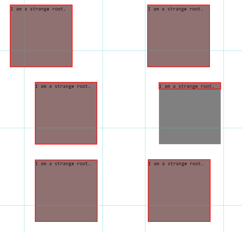
CSS animation properties will trigger the entire page's rearrangement relayout, redraw repaint, and reorganization recomposite
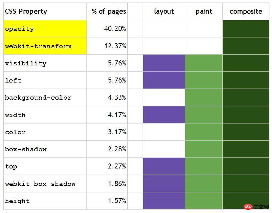
Paint is usually the most expensive among them, so avoid using triggers as much as possible The CSS animation property of paint, which is why we recommend using webkit-transform: translateX(3em) instead of left: 3em in CSS animations, because left will additionally trigger layout and paint, while webkit-transform only triggers the entire page composite
p {
  -webkit-animation-duration: 5s;
  -webkit-animation-name: move;
  -webkit-animation-iteration-count: infinite;
  -webkit-animation-direction: alternate;
  width: 200px;
  height: 200px;
  margin: 100px;
  background-color: #808080;
  position: absolute;
}@-webkit-keyframes move{
from {
left: 100px;
}
to {
left: 200px;
}
}Using left as shown below will continuously trigger page redrawing, which is shown as a red border:

@-webkit-keyframes move{
    from {
        -webkit-transform: translateX(100px);
    }
    to {
        -webkit-transform: translateX(200px);
    }
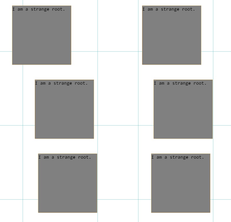
}As shown below, when using -webkit-transform, the page will only be reorganized, showing an orange border:

CSS properties behavior table in CSS animation

Compared with PC scenarios, high-performance mobile Web needs to consider more and more complicated factors. We summarize it as follows A few points: Traffic, power consumption and fluency. In the PC era, we are more concerned about the smoothness of the experience, but in the rich scenarios of the mobile side, we need to pay extra attention to the usage of user base station network traffic and the power consumption of the equipment.
Regarding fluency, it is mainly reflected in front-end animation. In the existing front-end animation system, there are usually two modes: JS animation and CSS3 animation. JS animation is a solution that uses JS to dynamically rewrite styles to achieve animation capabilities. It is a recommended solution for PCs that are compatible with low-end browsers. On the mobile side, we choose the native browser implementation with better performance: CSS3 animation.
However, CSS3 animations will face more performance problems than PCs in mobile multi-terminal device scenarios, mainly reflected in animation stuttering and flickering.
There are currently several main ways to improve the CSS3 animation experience on mobile terminals:
-webkit-transform: translate3d(0, 0, 0);
-moz-transform: translate3d(0, 0, 0);
-ms-transform: translate3d(0, 0, 0);
transform: translate3d(0, 0, 0);
If there is flickering during the animation (usually occurs at the beginning of the animation), you can try the following Hack:
-webkit-backface-visibility: hidden;
-moz-backface-visibility: hidden;
-ms-backface-visibility: hidden;
backface-visibility: hidden;

-webkit-perspective: 1000;
-moz-perspective: 1000;
-ms-perspective: 1000;
perspective: 1000;
For example, if the following element is moved 500px to the right through translate3d, the animation smoothness will be significantly better than using left Attributes:
#ball-1 {
  transition: -webkit-transform .5s ease;
  -webkit-transform: translate3d(0, 0, 0);
}
#ball-1.slidein {
  -webkit-transform: translate3d(500px, 0, 0);
}


#ball-2 {
  transition: left .5s ease;
  left: 0;
}
#ball-2.slidein {
  left: 500px;
}Note: 3D deformation will consume more memory and power consumption. You should only use it when there are performance problems. At the same time, use the box as little as possible
box-shadows and gradients are often performance killers of the page, especially when they are used in one element at the same time, so embrace flat design.
position: fixed;
position: absolute;
We start with an example to describe this topic:
var newWidth = ap.offsetWidth + 10;
ap.style.width = newWidth + 'px';
var newHeight = ap.offsetHeight + 10;
ap.style.height = newHeight + 'px';

var newWidth = ap.offsetWidth + 10;
var newHeight = ap.offsetHeight + 10;
ap.style.width = newWidth + 'px';
ap.style.height = newHeight + 'px';
These are two pieces of code that are completely equivalent in capabilities. The explicit difference, as we can see, is only the execution order. But is it really so? The following is the code version with explanation comments, which explains the further differences well:
// 触发两次 layout
var newWidth = ap.offsetWidth + 10;   // Read
ap.style.width = newWidth + 'px';     // Write
var newHeight = ap.offsetHeight + 10; // Read
ap.style.height = newHeight + 'px';   // Write

// 只触发一次 layout
var newWidth = ap.offsetWidth + 10;   // Read
var newHeight = ap.offsetHeight + 10; // Read
ap.style.width = newWidth + 'px';     // Write
ap.style.height = newHeight + 'px';   // Write
You can find the pattern from the comments, continuous reading of offsetWidth/Height properties and continuous setting of width/height properties , the layout can be triggered one less time than reading and setting individual properties separately.
From the conclusion, it seems to be related to the execution queue. Yes, this is the optimization strategy of the browser. All operations that can trigger layout will be temporarily placed in the layout-queue. When it must be updated, the results of all operations in the entire queue will be calculated. In this way, layout can only be performed once, thereby improving performance.
The key one is the operations that can trigger the layout. Under which operations will the layout be updated (also called reflow or relayout)?
We start from the source code implementation of the browser, taking the open source Webkit/Blink as an example. To update the layout, Webkit mainly uses two methods: Document::updateLayout and Document::updateLayoutIgnorePendingStylesheets:
void Document::updateLayout()
{
    ASSERT(isMainThread());

    FrameView* frameView = view();
    if (frameView && frameView->isInLayout()) {
        ASSERT_NOT_REACHED();
        return;
    }

    if (Element* oe = ownerElement())
        oe->document()->updateLayout();

    updateStyleIfNeeded();

    StackStats::LayoutCheckPoint layoutCheckPoint;

    if (frameView && renderer() && (frameView->layoutPending() || renderer()->needsLayout()))
        frameView->layout();

    if (m_focusedNode && !m_didPostCheckFocusedNodeTask) {
        postTask(CheckFocusedNodeTask::create());
        m_didPostCheckFocusedNodeTask = true;
    }
}


void Document::updateLayoutIgnorePendingStylesheets()
{
    bool oldIgnore = m_ignorePendingStylesheets;

    if (!haveStylesheetsLoaded()) {
        m_ignorePendingStylesheets = true;

        HTMLElement* bodyElement = body();
        if (bodyElement && !bodyElement->renderer() && m_pendingSheetLayout == NoLayoutWithPendingSheets) {
            m_pendingSheetLayout = DidLayoutWithPendingSheets;
            styleResolverChanged(RecalcStyleImmediately);
        } else if (m_hasNodesWithPlaceholderStyle)
            recalcStyle(Force);
    }

    updateLayout();

    m_ignorePendingStylesheets = oldIgnore;
}From the internal implementation of the updateLayoutIgnorePendingStylesheets method, it can be seen that it is also an extension of the updateLayout method, and in the existing layout update mode, most scenarios call updateLayoutIgnorePendingStylesheets to update the layout.
The above is the detailed content of Graphic and text code introduction about animation property performance in CSS. For more information, please follow other related articles on the PHP Chinese website!


