

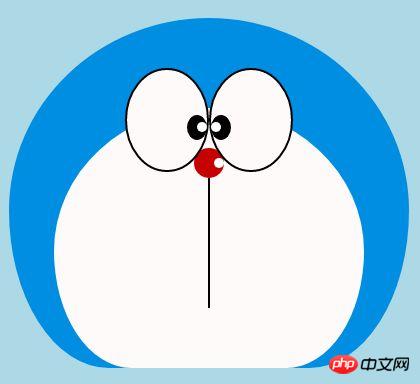
Share HTML sample code to create animated Doraemon

I believe that everyone has a Doraemon in their childhood, a small belly filled with incredible Doraemon, a Doraemon who stays with you when you are helpless and sad. , a Doraemon who accompanies you to think wildly and eat Dorayaki with you~ Today we will draw a Doraemon in our hearts~

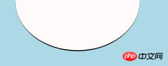
Define Doraemon's container
-
The same thing first defines a large container for Doraemon and determines its size and position.
<!-- 哆啦A梦大容器 -->
<p class="doa"></p>
/*哆啦A梦*/
 .doa{position: relative;top: 100px;}
Copy after login Draw Doraemon’s head (including the face, the face includes eyes and nose)
The head contains several pieces Part: Doraemon’s face and nose. The face also includes two eyes. There are eyeballs and eye whites in the two eyes, so there will be several layers of dom nesting. Of course, the basic graphics are all made of p+border -radius pieced together.
Just put the various parts of the drawn items into the corresponding positions.
If you look at the few pictures I drew earlier, you will know that border-radius is a very commonly used attribute. Almost every deformation of p is inseparable from it. In fact, the true face of border-radius It should be border-radius: 300px 300px 300px 300px/300px 300px 300px 300px; for Jiangzi, we generally don’t write the content after the slash. The slash section is the horizontal length, and the slash is the vertical height. By default, it is not written after the front bar. The horizontal and vertical sizes are the same. I know what I said is not detailed enough. You can refer to my Xinshen’s blog When Will Autumn Moon Come? How much do you know about CSS3 border-radius? , guaranteeing that you will thoroughly understand border-radius under the guidance of an experienced driver in minutes. Why don’t you get on the bus quickly?
<!-- 头 -->
  <p class="head">
 <!-- 存放脸部的容器 -->
 <p class="face">
 <!-- 左眼大圈儿 -->
 <p>
 <!-- 左眼眼珠(黑色部分) -->
 <p>
 <!-- 左眼眼白,黑色里面的白色部分 -->
 <p></p>
 </p>
 </p>
 <!-- 右眼大圈儿 -->
 <p>
 <!--右眼眼珠(黑色部分) -->
 <p>
 <!-- 右眼眼白,黑色里面的白色部分 -->
 <p></p>
 </p>
 </p>
 </p>
 <!-- 红鼻子部分 -->
 <p class="nose">
 <!-- 红鼻子里面的白圈儿 -->
 <p></p>
 </p>
 <!-- 红鼻子下面的那根黑线,也属于鼻子部分 -->
 <p class="nose1"></p>
 </p>
.head{
 margin: 0 auto; /*头部定义大小并居中显示*/
 width: 400px;
 height: 350px;
 background: #008ee3; /*头部定义背景颜色*/
 position: relative;
 border-radius: 50% 50% 25% 25% / 55% 55% 45% 45%; /*头部定义四个方向圆角大小*/
 }
 .face{
 width: 310px; /*脸部定义大小*/
 height: 260px;
 background: snow; /*脸部定义背景颜色*/
 border-radius: 50% 50% 25% 25% / 55% 55% 45% 45%; /*脸部定义四个方向的圆角大小*/
 position: relative; /*脸部定义位置,是相对于head的位置*/
 top: 90px;
 left: 45px;
 }
 /*左眼眶*/
 .face>p:first-child{
 width: 80px; /*左眼框定义大小*/
 height: 100px;
 border-radius: 50%; /*左眼框定义与圆角大小*/
 border:2px #000 solid; /*定义外边框*/
 background: snow;
 float: left; /*为了使左右两个眼睛能在一排显示*/
 position: relative; /*位置是相对于face的位置*/
 top:-40px;
 left: 71px;
 z-index: 50;
 }
 /*右眼眶,画法跟左眼一样*/
 .face>p:last-child{
 width: 80px;
 height: 100px;
 border-radius: 50%;
 border:2px #000 solid;
 background: snow;
 float: left;
 position: relative;
 top:-40px;
 left: 71px;
 z-index: 50;
 }
 /*左眼珠1*/
 .face>p:first-child p{
 width: 20px; /*定义眼珠的大小*/
 height: 25px;
 background: #000;
 border-radius: 50%;
 position: absolute; /*定义眼珠的位置,相对于眼眶的位置*/
 top: 45px;
 left: 60px;
 }
 /*左瞳孔*/
 .face>p:first-child p p{
 width: 10px; /*定义黑色瞳孔的大小*/
 height: 10px;
 background: #ffffff;
 border-radius: 50%;
 position: absolute; /*定义黑色瞳孔的位置,相对于眼珠的位置*/
 top: 7px;
 left: 10px;
 }
 /*右眼珠和左眼珠画法一样*/
 .face>p:last-child p{
 width: 20px;
 height: 25px;
 background: #000;
 border-radius: 50%;
 position: absolute;
 top: 45px;
 }
 /*右瞳孔和左瞳孔的画法一样*/
 .face>p:last-child p p{
 width: 10px;
 height: 10px;
 background: #ffffff;
 border-radius: 50%;
 position: absolute;
 top: 7px;
 }
 .nose{
 width: 30px; /*定义红鼻子的大小*/
 height: 30px;
 border-radius: 50%;
 background: #c70000;
 position: absolute;
 top: 130px;
 left: 50%;
 margin-left: -15px;
 z-index: 10;
 }
 .nose p{
 width: 10px; /*定义红鼻子里面白色圈圈的大小*/
 height: 10px;
 border-radius: 50%;
 position: absolute;
 background: #ffffff;
 top: 10px;
 margin-left: 20px;
 z-index: 10;
 }
 .nose1{
 width: 2px; /*定义红鼻子下面的那一条黑线*/
 height: 130px;
 background: #000;
 position: absolute;
 top: 160px;
 left: 50%;
 margin-left: -1px;
 z-index: 10;
 }
Copy after login
Doraemon’s head.png
Drawing Doraemon The mouth part of the dream
The mouth should be very simple. At a glance, you can tell that it is realized with border+border-radius.
<p class="mouth"></p>
.mouth{
 width: 250px; /*定义嘴巴的大小*/
 height: 200px;
 border-radius: 50%;
 background: snow;
 border-bottom: 2px #000 solid;
 margin: -230px auto;
 position: relative; /*定义嘴巴的位置*/
 }
Copy after login
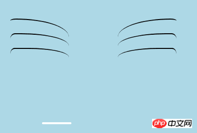
##Doraemon’s mouth.png- Drawing Doraemon The beard part
- The beard part is actually the method of drawing beards that was introduced in the previous article when drawing html to create animation [Serial 3]-Kitten Smiley Animation when drawing beards. I won’t go into details here, the basic idea is the same.
<!-- 胡须 -->
  <p class="beard">
 <!-- 左边胡须部分 -->
 <p class="left">
 <!-- 第一根胡须 -->
 <p></p>
 <!-- 第二根胡须 -->
 <p></p>
 <!-- 第三根胡须 -->
 <p></p>
 </p>
 <p class="right">
 <p></p>
 <p></p>
 <p></p>
 </p>
 <!-- 脖子部分的小白条部分 -->
 <span></span>
 </p>
/*胡须样式*/
.beard .left p:first-child{
 width: 120px;
 height: 40px;
 border-top: 2px #000 solid;
 border-radius: 10% 90% 10% 90% / 10% 90% 10% 90%;
 position: absolute;
 left: 50%;
 top: 140px;
 margin-left: -170px;
 z-index: 100;
 }
 .beard .left p:nth-child(2){
 width: 120px;
 height: 40px;
 border-top: 2px #000 solid;
 border-radius: 10% 90% 10% 90% / 30% 70% 40% 60%;
 position: absolute;
 left: 50%;
 top: 170px;
 margin-left: -170px;
 z-index: 100;
 }
 .beard .left p:last-child{
 width: 120px;
 height: 40px;
 border-top: 2px #000 solid;
 border-radius: 10% 90% 10% 90% / 40% 60% 10% 90%;
 position: absolute;
 left: 50%;
 top: 200px;
 margin-left: -170px;
 z-index: 100;
 }

 .beard .right p:first-child{
 width: 120px;
 height: 40px;
 border-top: 2px #000 solid;
 border-radius: 90% 10% 90% 10% / 90% 10% 90% 10%;
 position: absolute;
 left: 50%;
 top: 140px;
 margin-left: 50px;
 z-index: 100;
 }
 .beard .right p:nth-child(2){
 width: 120px;
 height: 40px;
 border-top: 2px #000 solid;
 border-radius: 90% 10% 90% 10% / 70% 30% 60% 40%;
 position: absolute;
 left: 50%;
 top: 170px;
 margin-left: 50px;
 z-index: 100;
 }
 .beard .right p:last-child{
 width: 120px;
 height: 40px;
 border-top: 2px #000 solid;
 border-radius: 90% 10% 90% 10% / 60% 40% 90% 10%;
 position: absolute;
 left: 50%;
 top: 200px;
 margin-left: 50px;
 z-index: 100;
 }
 .beard span{
 display: block;
 width: 60px;
 height: 3.5px;
 background: #ffffff;
 border-radius: 4px;
 position: absolute;
 top: 352px;
 left: 50%;
 margin-left: -105px;
 }
Copy after login
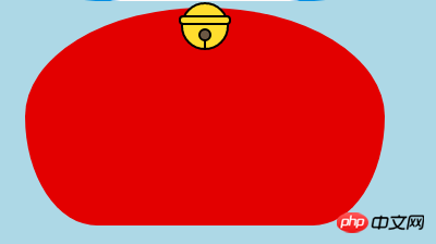
##Doraemon’s beard.png Drawing Doraemon The neck part (the neck part includes the bell) - The neck is the shape after the basic p deformation, and the excess part can be hidden under the head.
- The bell part is composed of very simple basic graphics.
<!-- 脖 -->
  <p class="neck">
 <!-- 铃铛的圆形 -->
 <p></p>
 <!-- 铃铛的小圆角矩形 -->
 <p></p>
 <!-- 铃铛的小圆形 -->
 <p></p>
 <!-- 铃铛的小竖线 -->
 <p></p>
 </p>
.neck{
 width: 330px;
 height: 200px;
 border-radius: 50% 50% 20% 20% / 50% 50% 50% 50%;
 background: #e30000;
 margin: 80px auto;
 z-index: 100;
 }
 .neck p:first-child{
 border: 2px #000 solid;
 border-radius: 50%;
 width: 40px;
 height: 40px;
 background: #ffdd2e;
 position: absolute;
 top: 350px;
 left: 50%;
 margin-left: -22px;
 transition: all 1s;
 }
 .neck p:nth-child(2){
 border: 2px #000 solid;
 width: 44px;
 height: 5px;
 background: #ffdd2e;
 position: absolute;
 left: 50%;
 margin-left: -24px;
 top: 363px;
 border-radius: 5px;
 transition: all 1s;
 }
 .neck p:nth-child(3){
 width: 8px;
 height: 8px;
 border: 2px #000 solid;
 position: absolute;
 background: #6c5844;
 border-radius: 50%;
 left: 50%;
 margin-left: -6px;
 top: 375px;
 transition: all 1s;
 }
 .neck p:nth-child(4){
 width: 2px;
 height: 8px;
 background: #000;
 position: absolute;
 left: 50%;
 margin-left: -1px;
 top: 385px;
 transition: all 1s;
 }
Copy after login##Doraemon’s neck.png##Complete Doraemon The dynamic effect of
is more cute when Doraemon moves, right? Then let’s make it move (transition attribute).
Move the mouse to the eye area and move the left eyeball to the left.
Move the mouse to the mouth and the facial expression changes.
Move the mouse to the bell part, and the bell will become larger.
/*眼睛动效*/
.head:hover .face>p:first-child p{
 left: 0px;
 transition: all 1s;
 }
 .head:hover .face>p:first-child p p{
 left: 0px;
 transition: all 1s;
 }
/*嘴巴动效,嘴巴的dom容器下面要加了个空的p容器*/
.mouth p:first-child{
 width: 82px;
 height: 2px;
 background: #000;
 position: absolute;
 z-index: 1000;
 top: -25px;
 left: 6px;
 display: none;
 }
 .mouth p:nth-child(2){
 width: 82px;
 height: 2px;
 background: #000;
 position: absolute;
 z-index: 1000;
 top: -25px;
 left: 90px;
 display: none;
 }
 .mouth:hover{
 border-radius: 0;
 width: 180px;
 height: 200px;
 }
 .mouth:hover p:first-child,.mouth:hover p:nth-child(2){
 display: block;
 }
/*铃铛动效*/
.neck:hover p:first-child{
 width: 60px;
 height: 60px;
 left: 50%;
 margin-left: -30px;
 }
 .neck:hover p:nth-child(2){
 width: 66px;
 height: 7.5px;
 left: 50%;
 margin-left: -33px;
 }
 .neck:hover p:nth-child(3){
 width: 12px;
 height: 12px;
 left: 50%;
 margin-left: -6px;
 top: 385px;
 }
 .neck:hover p:nth-child(4){
 width: 2px;
 height: 12px;
 left: 50%;
 margin-left: 1px;
 top: 400px;
 }
Copy after login-
 ##Doraemon’s neck.png
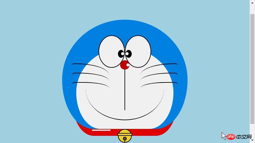
The above is the detailed content of Share HTML sample code to create animated Doraemon. For more information, please follow other related articles on the PHP Chinese website!

Hot AI Tools

Undresser.AI Undress
AI-powered app for creating realistic nude photos

AI Clothes Remover
Online AI tool for removing clothes from photos.

Undress AI Tool
Undress images for free

Clothoff.io
AI clothes remover

AI Hentai Generator
Generate AI Hentai for free.

Hot Article
Hot Tools

Notepad++7.3.1
Easy-to-use and free code editor

SublimeText3 Chinese version
Chinese version, very easy to use

Zend Studio 13.0.1
Powerful PHP integrated development environment

Dreamweaver CS6
Visual web development tools

SublimeText3 Mac version
God-level code editing software (SublimeText3)
Hot Topics


 Table Border in HTML
Sep 04, 2024 pm 04:49 PM
Table Border in HTML
Sep 04, 2024 pm 04:49 PM
Guide to Table Border in HTML. Here we discuss multiple ways for defining table-border with examples of the Table Border in HTML.
 Nested Table in HTML
Sep 04, 2024 pm 04:49 PM
Nested Table in HTML
Sep 04, 2024 pm 04:49 PM
This is a guide to Nested Table in HTML. Here we discuss how to create a table within the table along with the respective examples.
 HTML margin-left
Sep 04, 2024 pm 04:48 PM
HTML margin-left
Sep 04, 2024 pm 04:48 PM
Guide to HTML margin-left. Here we discuss a brief overview on HTML margin-left and its Examples along with its Code Implementation.
 HTML Table Layout
Sep 04, 2024 pm 04:54 PM
HTML Table Layout
Sep 04, 2024 pm 04:54 PM
Guide to HTML Table Layout. Here we discuss the Values of HTML Table Layout along with the examples and outputs n detail.
 HTML Ordered List
Sep 04, 2024 pm 04:43 PM
HTML Ordered List
Sep 04, 2024 pm 04:43 PM
Guide to the HTML Ordered List. Here we also discuss introduction of HTML Ordered list and types along with their example respectively
 How do you parse and process HTML/XML in PHP?
Feb 07, 2025 am 11:57 AM
How do you parse and process HTML/XML in PHP?
Feb 07, 2025 am 11:57 AM
This tutorial demonstrates how to efficiently process XML documents using PHP. XML (eXtensible Markup Language) is a versatile text-based markup language designed for both human readability and machine parsing. It's commonly used for data storage an
 Moving Text in HTML
Sep 04, 2024 pm 04:45 PM
Moving Text in HTML
Sep 04, 2024 pm 04:45 PM
Guide to Moving Text in HTML. Here we discuss an introduction, how marquee tag work with syntax and examples to implement.
 HTML Input Placeholder
Sep 04, 2024 pm 04:54 PM
HTML Input Placeholder
Sep 04, 2024 pm 04:54 PM
Guide to HTML Input Placeholder. Here we discuss the Examples of HTML Input Placeholder along with the codes and outputs.
