
 Web Front-end
HTML Tutorial
Case sharing on how to create an animated cute frog expression in HTML
Web Front-end
HTML Tutorial
Case sharing on how to create an animated cute frog expression in HTML
Case sharing on how to create an animated cute frog expression in HTML

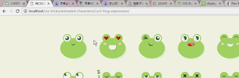
First feel all the emoticons:
Before starting, let’s have a knowledge point: Flex elastic layout
We generally use the float method to make horizontal three-column layouts, and display each floating block in the same line. This method will result in the element not having the original height attribute, and clearing the float is required to solve the space occupation problem. It is very inconvenient for those special layouts. For example, vertical centering is not easy to achieve.
In 2009, W3C proposed a new solution - Flex layout, which can realize various page layouts simply, completely and responsively. Currently, it is supported by almost all browsers, which means that it is safe to use this feature now. Check out the blog for basic syntax: Flex Layout Tutorial: Grammar
In addition, you must have a certain understanding of pseudo-elements in css: before, after
Finally, if you want to make the expression move, the most important thing is to use the animation attribute.
Overall layout
We first lay out the overall seat so that each expression can be intuitively displayed at each position, because each expression occupies almost a Square space, so we display each frog expression horizontally on the page, using flex layout here.
<p class="container">
<!--所有表情的存放容器,flex布局,所有子项目水平显示,自动换行,水平居中显示,竖直方向从顶部开始-->
<p class="emoji-container">
<!--存放青蛙表情的大容器,控制大小间距之类的属性-->
<p class="icon">
<!--存放每一个青蛙表情的容器,控制每一个表情自己的位置和特征-->
<p class="frog" id="frog-n"></p></p></p></p>
body {background-color: #F1FFE6;}
.container {width: 950px;margin: 70px auto 0px auto;text-align: center;}
.container .emoji-container {
/*flex弹性布局,多用于左右并排布局,跟float的作用类似,不用清除浮动*/
display: -webkit-box;
display: -ms-flexbox;
display: flex;
/*justify-content属性定义了项目在主轴上的对齐方式。center就是在x轴上居中显示*/
-ms-grid-column-align: center;
    justify-items: center;
/*align-items属性定义项目在交叉轴上如何对齐。flex-start就是从y轴的最上端开始排列*/
-webkit-box-align: start;
    -ms-flex-align: start;
        align-items: flex-start;
/*flex-wrap属性定义,如果一条轴线排不下,如何换行。wrap:换行,第一行在上方。*/
-ms-flex-wrap: wrap;
    flex-wrap: wrap;
}
.container .emoji-container .icon {
margin-right: 40px;
margin-bottom: 40px;
}
.container .emoji-container .icon:nth-child(6n) {
margin-right: 0px;
}
.icon {width: 125px;height: 120px;position: relative;}
.icon .frog {position: absolute; top: 0;left: 0;width: 100%;height: 100%;}General style of frogs
Observe the expressions of each frog. Although each expression is different, the position and size of their bodies, mouths, eyes, and small red spots are almost the same. They are all consistent. We can write these consistent styles as common styles, and then write a single style based on the characteristics of each frog for redrawing or overwriting according to each person's ID.
<p class="frog" id="frog-1">
      <!-- 蛙蛙的身体部分 -->
      <p class="body">
        <!-- 蛙蛙的嘴巴 -->
        <p class="mouth"></p>
      </p>
      <!-- 蛙蛙的眼睛 -->
      <p class="eyes">
        <!-- 蛙蛙的左右眼睛 -->
        <p class="eye eye-left">
          <!-- 蛙蛙的内眼圈儿 -->
          <p class="eye-inner">
            <!-- 蛙蛙的眼珠 -->
            <p class="pupil">
              <!-- 蛙蛙眼圈里的光晕 -->
              <p class="light"></p>
            </p>
          </p>
        </p>
        <p class="eye eye-right">
          <p class="eye-inner">
            <p class="pupil">
              <p class="light"></p>
            </p>
          </p>
        </p>
      </p>
    </p>
    /*蛙蛙身体部分样式*/
    .icon .frog .body {
    width: 110px;
    height: 86px;
    background-color: #A3D768;
    border-radius: 50%;
    position: absolute;
    top: 25px;left: 0;
    right: 0;
    margin: auto;box-shadow: 4px 4px 0px 0px rgba(163, 215, 104, 0.3);
}
/*蛙蛙嘴巴部分样式,因为每个蛙蛙的嘴巴不一样,所以公共样式就只定义了位置*/
.icon .frog .body .mouth {
margin: auto;
}
.icon .frog .eyes {
width: 86px;
height: 35px;
position: absolute;
top: 8px;
left: 0;right: 0;
margin: auto;
}
/*蛙蛙眼睛部分样式*/
.icon .frog .eyes .eye {width: 35px;height: 35px;}
.icon .frog .eyes .eye:before {content: "";display: block;width: 100%;height: 100%;
background-color: #A3D768;border-radius: 50%;
}
/*蛙蛙眼圈部分样式*/
.icon .frog .eyes .eye .eye-inner {background-color: #fff;width: 80%;height: 80%;
position: absolute;top: 10%;left: 10%;border-radius: 50%;
}
/*蛙蛙眼珠部分样式*/
.icon .frog .eyes .eye .eye-inner .pupil {background-color: #3F6A34;
width: 60%;height: 60%;position: absolute;top: 20%;left: 20%;border-radius: 50%;
}
/*蛙蛙眼珠里的亮光部分样式*/
.icon .frog .eyes .eye .eye-inner .pupil .light {background-color: #fff;
width: 50%;height: 50%;position: absolute;top: 10%;left: 10%;border-radius: 50%;
}
/*蛙蛙左右两边眼睛的位置*/
.icon .frog .eyes .eye-left {position: absolute;top: 0px;left: 0;}.icon .frog .eyes .eye-right {position: absolute;top: 0px;right: 0;}
Basic public style of frog.png
The first little frog
The first little frog
The first little frog has a dynamic effect of rising corners of the mouth based on the basic style, so to complete the drawing of the first frog, you only need to add the dynamic effect of the mouth on the basis of the common style. Yes, the dom structure is the same.
.frog#frog-1 .body .mouth {
width: 18px;height: 22px;
border-bottom: 3px solid #3F6A34;
position: absolute;top: 6px;left: 0;right: 0;
-webkit-animation: smile 3.8s linear 0s infinite;
animation: smile 3.8s linear 0s infinite;
}
@-webkit-keyframes smile {
0% {  border-radius: 0%;
}
20% {  border-radius: 50%;
}
70% {  border-radius: 50%;
}
}
@keyframes smile {
0% {  border-radius: 0%;
}
20% {  border-radius: 50%;
}
70% {  border-radius: 50%;
}
}
The first frog animation.gif
The second little frog
The second The little frog has a big mouth, two small blushes on its cheeks, and its eyes are filled with love, so a blushing p should be added to the dom structure, and the style of the mouth and eyes should be modified accordingly. (Mainly making the mouth, blush and red heart)
<p class="frog" id="frog-2">
      <p class="body">
        <!--存放蛙蛙的脸颊红晕-->
        <p class="blush"></p>
       <!--加上大嘴巴的class big-month-->
        <p class="mouth big-mouth"></p>
      </p>
      <p class="eyes">
        <p class="eye eye-left">
          <p class="eye-inner">
            <p class="pupil">
              <p class="light"></p>
            </p>
          </p>
        </p>
        <p class="eye eye-right">
          <p class="eye-inner">
            <p class="pupil">
              <p class="light"></p>
            </p>
          </p>
        </p>
      </p>
    </p>/*第二只青蛙脸颊两边的红晕样式*
    /.icon .frog .body .blush {width: 75px;height: 9px;position: absolute;
    top: 20px;left: 0;right: 0;margin: auto;
}
.icon .frog .body .blush:before, .icon .frog .body .blush:after {
content: "";
display: block;width: 12px;height: 100%;background-color: #F7D2C9;border-radius: 50%;
}
.icon .frog .body .blush:before {position: absolute;top: 0;left: 0;}
.icon .frog .body .blush:after {position: absolute;top: 0;right: 0;}
/*第二只青蛙的嘴巴样式,用圆角和阴影的方式制作而成*/
.icon .frog .body .big-mouth {width: 30px;height: 20px;border-radius: 0 0 50% 50%;
box-shadow: 2px 2px 0px 0px rgba(63, 106, 52, 0.3);
}
.frog#frog-2 .mouth {background-color: #fff;position: absolute;top: 30px;left: 0;right: 0;
}
/*第二只青蛙的眼睛样式,将眼圈的背景设置为透明色,圆圈里面的亮光隐藏*/
.frog#frog-2 .eye-inner {top: 17%;background-color: transparent !important;
-webkit-animation: hearts 0.6s linear 0s infinite alternate;
animation: hearts 0.6s linear 0s infinite alternate;
}
@-webkit-keyframes hearts {0% {
  -webkit-transform: scale(0.7);
  transform: scale(0.7);
}100% {
  -webkit-transform: scale(1);
  transform: scale(1);
}
}
@keyframes hearts {0% {
  -webkit-transform: scale(0.7);
  transform: scale(0.7);
}100% {
  -webkit-transform: scale(1);
  transform: scale(1);
}
}
/*第二只青蛙的眼睛的爱心样式,左上角和右上角设置交圆角50%,然后左右对应的旋转45度合并成一个爱心的形状*/
.frog#frog-2 .eye-inner:before, .frog#frog-2 .eye-inner:after {content: "";display: block;
height: 70%;width: 40%;background-color: #C71F1C;border-radius: 50% 50% 0 0;
}
.frog#frog-2 .eye-inner:before {position: absolute;top: 0;left: 5px;
           -webkit-transform: rotate(-45deg);
           transform: rotate(-45deg);
}
.frog#frog-2 .eye-inner:after {position: absolute;top: 0;right: 5px;
            -webkit-transform: rotate(45deg);
            transform: rotate(45deg);
}
.frog#frog-2 .eye-inner .pupil {display: none;}
The second frog animation.gif
The third little one Frog
The changes of the third little frog compared to the common style are the changes of the eyes and mouth, so the most important thing is to draw the left eye style and mouth style.
The tongue is made into an ellipse, rotated at the corresponding angle and pressed, and then a part of it is covered by the mouth.

The third frog’s tongue decomposition display.png

<p class="frog" id="frog-3">
<p class="body">
<p class="mouth">
<!--存放舌头样式的容器-->
<p class="toungue"></p>
</p>
</p>
<p class="eyes">
<!--左眼添加wink的样式,作为左眼眯眼样式-->
<p class="eye eye-left wink">
<p class="eye-inner">
<p class="pupil">
<p class="light"></p>
</p>
</p>
</p>
<p class="eye eye-right">
<p class="eye-inner">
<p class="pupil">
<p class="light"></p>
</p>
</p>
</p>
</p>
</p>
/*第三只小青蛙的左眼眯眼样式*/
.icon .frog .eyes .eye.wink .eye-inner {
background-color: transparent;
width: 17px;
height: 3px;
background-color: #3F6A34;
border-radius: 0;
position: absolute;
top: 15px;
left: 0;
right: 0;
margin: auto;
-webkit-transform: rotate(21deg);
transform: rotate(21deg);
}
.icon .frog .eyes .eye.wink .eye-inner:before, .icon .frog .eyes .eye.wink .eye-inner:after {
content: '';
display: block;
width: 17px;
height: 3px;
background-color: #3F6A34;
}
.icon .frog .eyes .eye.wink .eye-inner:before {
-webkit-transform: rotate(25deg);
transform: rotate(25deg);
position: absolute;
top: -4px;
left: 0;
}
.icon .frog .eyes .eye.wink .eye-inner:after {
-webkit-transform: rotate(-25deg);
transform: rotate(-25deg);
position: absolute;
top: 4px;
left: 0;
}
.icon .frog .eyes .eye.wink .pupil {
display: none;
}
/*第三只小青蛙的右眼亮光位置*/
.frog#frog-3 .eye-right .light {
position: absolute;
top: 10%;
left: auto;
right: 10%;
}
/*第三只小青蛙的嘴巴吐舌头样式*/
.frog#frog-3 .mouth {
width: 25px;
height: 25px;
position: absolute;
top: 5px;
left: 0;
right: 0;
-webkit-transform: rotate(23deg);
transform: rotate(23deg);
}
.frog#frog-3 .mouth:before {
content: "";
display: block;
border-bottom: 3px solid #3F6A34;
width: 100%;
height: 100%;
border-radius: 50%;
background-color: #A3D768;
z-index: 3;
position: absolute;
top: 0px;
left: 0;
}
.frog#frog-3 .toungue {
width: 16px;
height: 20px;
background-color: #C71F1C;
border-radius: 30px;
z-index: 2;
position: absolute;
top: 17px;
left: 4px;
-webkit-transform-origin: center top;
transform-origin: center top;
-webkit-animation: toungue 2.0s linear 0s infinite;
animation: toungue 2.0s linear 0s infinite;
}
@-webkit-keyframes toungue {
0% {
-webkit-transform: scale(1, 1);
transform: scale(1, 1);
}
40% {
-webkit-transform: scale(1, 1);
transform: scale(1, 1);
}
75% {
-webkit-transform: scale(1, 0);
transform: scale(1, 0);
}
}
@keyframes toungue {
0% {
-webkit-transform: scale(1, 1);
transform: scale(1, 1);
}
40% {
-webkit-transform: scale(1, 1);
transform: scale(1, 1);
}
75% {
-webkit-transform: scale(1, 0);
transform: scale(1, 0);
}
}
.frog#frog-3 .toungue:before {
content: "";
display: block;
width: 2px;
height: 4px;
background-color: #410a09;
position: absolute;
left: 0px;
right: 0px;
bottom: 5px;
margin: auto;
opacity: 0.4;
}
<p class="frog" id="frog-4">
      <p class="body">
        <p class="mouth big-mouth">
          <p class="toungue"></p>
        </p>
      </p>
      <p class="eyes">
        <!--控制另一个眼珠闪光点的样式extra-light-->
        <p class="eye eye-left extra-light">
          <p class="eye-inner">
            <p class="pupil">
              <p class="light"></p>
            </p>
          </p>
        </p>
        <p class="eye eye-right extra-light">
          <p class="eye-inner">
            <p class="pupil">
              <p class="light"></p>
            </p>
          </p>
        </p>
      </p>
    </p>
/*第四只小青蛙眼珠另一个闪光点样式*/
.icon .frog .eyes .eye.extra-light .light {width: 40%;height: 40%;}
.icon .frog .eyes .eye.extra-light .light:before {content: "";display: block;width: 70%;
            height: 70%;background-color: #fff;border-radius: 50%;
}
The above is the detailed content of Case sharing on how to create an animated cute frog expression in HTML. For more information, please follow other related articles on the PHP Chinese website!

Hot AI Tools

Undresser.AI Undress
AI-powered app for creating realistic nude photos

AI Clothes Remover
Online AI tool for removing clothes from photos.

Undress AI Tool
Undress images for free

Clothoff.io
AI clothes remover

AI Hentai Generator
Generate AI Hentai for free.

Hot Article
Hot Tools

Notepad++7.3.1
Easy-to-use and free code editor

SublimeText3 Chinese version
Chinese version, very easy to use

Zend Studio 13.0.1
Powerful PHP integrated development environment

Dreamweaver CS6
Visual web development tools

SublimeText3 Mac version
God-level code editing software (SublimeText3)
Hot Topics
 1386
1386
 52
52

 Table Border in HTML
Sep 04, 2024 pm 04:49 PM
Table Border in HTML
Sep 04, 2024 pm 04:49 PM
Guide to Table Border in HTML. Here we discuss multiple ways for defining table-border with examples of the Table Border in HTML.
 HTML margin-left
Sep 04, 2024 pm 04:48 PM
HTML margin-left
Sep 04, 2024 pm 04:48 PM
Guide to HTML margin-left. Here we discuss a brief overview on HTML margin-left and its Examples along with its Code Implementation.
 Nested Table in HTML
Sep 04, 2024 pm 04:49 PM
Nested Table in HTML
Sep 04, 2024 pm 04:49 PM
This is a guide to Nested Table in HTML. Here we discuss how to create a table within the table along with the respective examples.
 HTML Table Layout
Sep 04, 2024 pm 04:54 PM
HTML Table Layout
Sep 04, 2024 pm 04:54 PM
Guide to HTML Table Layout. Here we discuss the Values of HTML Table Layout along with the examples and outputs n detail.
 HTML Input Placeholder
Sep 04, 2024 pm 04:54 PM
HTML Input Placeholder
Sep 04, 2024 pm 04:54 PM
Guide to HTML Input Placeholder. Here we discuss the Examples of HTML Input Placeholder along with the codes and outputs.
 HTML Ordered List
Sep 04, 2024 pm 04:43 PM
HTML Ordered List
Sep 04, 2024 pm 04:43 PM
Guide to the HTML Ordered List. Here we also discuss introduction of HTML Ordered list and types along with their example respectively
 Moving Text in HTML
Sep 04, 2024 pm 04:45 PM
Moving Text in HTML
Sep 04, 2024 pm 04:45 PM
Guide to Moving Text in HTML. Here we discuss an introduction, how marquee tag work with syntax and examples to implement.
 HTML onclick Button
Sep 04, 2024 pm 04:49 PM
HTML onclick Button
Sep 04, 2024 pm 04:49 PM
Guide to HTML onclick Button. Here we discuss their introduction, working, examples and onclick Event in various events respectively.
