
 Web Front-end
CSS Tutorial
Detailed code explanation of how to implement various centered filling methods using css attributes
Web Front-end
CSS Tutorial
Detailed code explanation of how to implement various centered filling methods using css attributes
Detailed code explanation of how to implement various centered filling methods using css attributes

First is horizontal centering. The simplest way is of course
margin:0 auto;
that is, to set the margin-left and margin-right attributes Set to auto to achieve a horizontally centered effect.
What about other ways?
line-height
First introduce the horizontal centering method of text:
<p class="wrap">刘放</p>
Use line-height to be the same as height:
.wrap{
  line-height: 200px;/*垂直居中关键*/
  text-align:center;
   height: 200px;
  font-size: 36px;
  background-color: #ccc;
}The effect As follows:

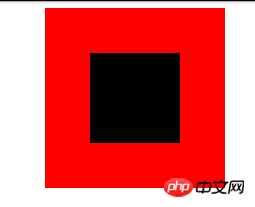
padding filling
Use padding and background-clip to achieve the horizontal and vertical centering of p:
<p class="parent">
<p class="children">
</p>
</p>
Set the backgroun-clip to content-box, crop the background to the outer edge of the content area, and then use padding to set it to half of the difference between the outer p minus the inner p:
.parent{
 margin:0 auto;
 width:200px;
 height:200px;
 background-color:red;
}
.children {
 width: 100px;
 height: 100px;
 padding: 50px;
 background-color: black;
background-clip:content-box;/*居中的关键*/The effect is as follows:
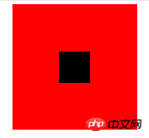
margin filling
Next, we will introduce the method of margin filling to achieve horizontal and vertical centering.
First we define the parent and child p:
<p class="parent">
  <p class="children"></p>
</p>
Here we set the margin-top of the child p to the height of the parent p minus half the height of the child p, and then set the overflow to hidden to trigger the parent The BFC and LESS code of p is as follows:
@parentWidth:200px;
@childrenWidth:50px;
.parent {
 margin:0 auto;
 height:@parentWidth;
 width:@parentWidth;
 background: red;
 overflow:hidden;/*触发BFC*/
}
.children {
 height:@childrenWidth;
 width:@childrenWidth;
 margin-left:auto;
 margin-right:auto;
 margin-top: (@parentWidth - @childrenWidth) / 2;
 background:black;
}The final centering effect is as follows:
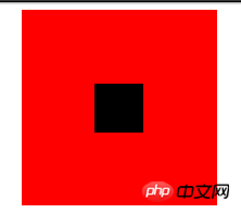
absolute positioning
Use position:absolute with top, left 50%, and then set margin to a negative value to center p horizontally and vertically. First, you still need to define the parent and child p:
<p class="parent">
  <p class="children"></p>
</p>
and then set the corresponding css:
.parent {
 position:relative;
 margin:0 auto;
 width:200px;
 height:200px;
 background-color:red;
}
.children {
 position:absolute;
 left:50%;
 top:50%;
 margin:-25px 0 0 -25px ;
 height:50px;
 width:50px;
 background-color: black;
}The value in margin is half of the width of p. The final rendering is:
text-align is centered
As we all know, text-align can center the content in a p horizontally. But what if you want to center the sub-p in this p? You can set the display of sub-p to inline-block.
.parent {
 text-align:center;
 margin:0 auto;
 width:200px;
 height:200px;
 background:red;
}
.children {
 positiona;absolute;
 margin-top:75px;
 width:50px;
 height:50px;
 background: black;
 display:inline-block;/*使其父元素text-align生效*/
}flex centering
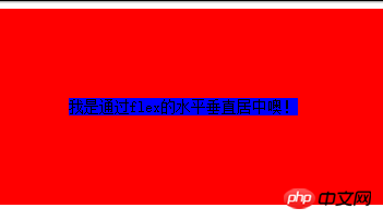
Finally, let’s introduce the horizontal and vertical centering method implemented by display:flex in CSS3.
<p class="parent">
  <p class="children">我是通过flex的水平垂直居中噢!</p>
</p>
The effect is as follows:
The above is the detailed content of Detailed code explanation of how to implement various centered filling methods using css attributes. For more information, please follow other related articles on the PHP Chinese website!

Hot AI Tools

Undresser.AI Undress
AI-powered app for creating realistic nude photos

AI Clothes Remover
Online AI tool for removing clothes from photos.

Undress AI Tool
Undress images for free

Clothoff.io
AI clothes remover

AI Hentai Generator
Generate AI Hentai for free.

Hot Article
Hot Tools

Notepad++7.3.1
Easy-to-use and free code editor

SublimeText3 Chinese version
Chinese version, very easy to use

Zend Studio 13.0.1
Powerful PHP integrated development environment

Dreamweaver CS6
Visual web development tools

SublimeText3 Mac version
God-level code editing software (SublimeText3)
Hot Topics
 1385
1385
 52
52

 How to use bootstrap in vue
Apr 07, 2025 pm 11:33 PM
How to use bootstrap in vue
Apr 07, 2025 pm 11:33 PM
Using Bootstrap in Vue.js is divided into five steps: Install Bootstrap. Import Bootstrap in main.js. Use the Bootstrap component directly in the template. Optional: Custom style. Optional: Use plug-ins.
 The Roles of HTML, CSS, and JavaScript: Core Responsibilities
Apr 08, 2025 pm 07:05 PM
The Roles of HTML, CSS, and JavaScript: Core Responsibilities
Apr 08, 2025 pm 07:05 PM
HTML defines the web structure, CSS is responsible for style and layout, and JavaScript gives dynamic interaction. The three perform their duties in web development and jointly build a colorful website.
 How to write split lines on bootstrap
Apr 07, 2025 pm 03:12 PM
How to write split lines on bootstrap
Apr 07, 2025 pm 03:12 PM
There are two ways to create a Bootstrap split line: using the tag, which creates a horizontal split line. Use the CSS border property to create custom style split lines.
 Understanding HTML, CSS, and JavaScript: A Beginner's Guide
Apr 12, 2025 am 12:02 AM
Understanding HTML, CSS, and JavaScript: A Beginner's Guide
Apr 12, 2025 am 12:02 AM
WebdevelopmentreliesonHTML,CSS,andJavaScript:1)HTMLstructurescontent,2)CSSstylesit,and3)JavaScriptaddsinteractivity,formingthebasisofmodernwebexperiences.
 How to resize bootstrap
Apr 07, 2025 pm 03:18 PM
How to resize bootstrap
Apr 07, 2025 pm 03:18 PM
To adjust the size of elements in Bootstrap, you can use the dimension class, which includes: adjusting width: .col-, .w-, .mw-adjust height: .h-, .min-h-, .max-h-
 How to set up the framework for bootstrap
Apr 07, 2025 pm 03:27 PM
How to set up the framework for bootstrap
Apr 07, 2025 pm 03:27 PM
To set up the Bootstrap framework, you need to follow these steps: 1. Reference the Bootstrap file via CDN; 2. Download and host the file on your own server; 3. Include the Bootstrap file in HTML; 4. Compile Sass/Less as needed; 5. Import a custom file (optional). Once setup is complete, you can use Bootstrap's grid systems, components, and styles to create responsive websites and applications.
 How to insert pictures on bootstrap
Apr 07, 2025 pm 03:30 PM
How to insert pictures on bootstrap
Apr 07, 2025 pm 03:30 PM
There are several ways to insert images in Bootstrap: insert images directly, using the HTML img tag. With the Bootstrap image component, you can provide responsive images and more styles. Set the image size, use the img-fluid class to make the image adaptable. Set the border, using the img-bordered class. Set the rounded corners and use the img-rounded class. Set the shadow, use the shadow class. Resize and position the image, using CSS style. Using the background image, use the background-image CSS property.
 How to use bootstrap button
Apr 07, 2025 pm 03:09 PM
How to use bootstrap button
Apr 07, 2025 pm 03:09 PM
How to use the Bootstrap button? Introduce Bootstrap CSS to create button elements and add Bootstrap button class to add button text
