 Web Front-end
 CSS Tutorial
 Example analysis of three methods to achieve alignment at both ends in CSS
Example analysis of three methods to achieve alignment at both ends in CSS
Speaking of aligning at both ends, everyone is familiar with it. In the interface navigation such as word, powerpoint, outlook, etc., there is actually a button for aligning at both ends (dispersed alignment). It is not commonly used. We are more accustomed to it. Align text or modules on the page using left, center, or right alignment.
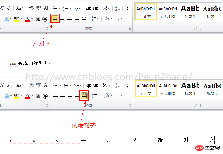
Since the emergence of responsive web design, percentage cloth adaptive layout is more used, especially on the mobile side, the way the two ends are aligned appears more and more important. So, how to use CSS to achieve alignment at both ends? I believe many students will know text-align:justify for text alignment. This is one of the methods I will talk about today. There are also two more exciting implementation methods. Please read below~
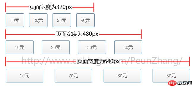
The following picture is the demo that needs to be implemented, taking screenshots with widths of 320px, 480px, and 640px respectively. In other words, as the width of the browser window is adjusted, the height of the button menu remains unchanged and the width will be proportional. Automatically adapt, and align the left and right ends:
(updated in 20161028)
- Use text -align:justify
- Use justify-content:space-between
- Example of mobile text alignment
- (new)
Method 1: Use text-align:justifyThanks to the solution provided by join classmate, using this solution can be
compatible with all Browser, but the implementation will be more complicated and smells like a hack
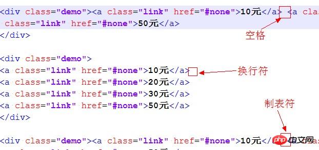
text-align:justify attribute is fully compatible. Use it to achieve alignment on both ends. You need to pay attention toAdd [space/newline/tab] between modules to work. Similarly, to achieve text alignment, you need to add [space/newline/tab] between words. will work
 ##HTML:
<p>模块内的元素之间为 分隔,只支持webkit和Gecko内核浏览器</p><br /><p class="demo"><a class="link" href="#none">10元</a> <a class="link" href="#none">20元</a> <a class="link" href="#none">30元</a> <a class="link" href="#none">50元</a></p><br /><p>模块内的元素之间为换行符</p><br /><p class="demo">
    <a class="link" href="#none">10元</a>
    <a class="link" href="#none">20元</a>
    <a class="link" href="#none">30元</a>
    <a class="link" href="#none">50元</a></p><br /><p>模块内的元素之间为空格符</p><br /><p class="demo"><a class="link" href="#none">10元</a> <a class="link" href="#none">20元</a> <a class="link" href="#none">30元</a> <a class="link" href="#none">50元</a></p><br /><p>模块内的元素之间为无分隔符,justify不起作用</p><br /><p class="demo"><a class="link" href="#none">选项1</a><a class="link" href="#none">选项2</a><a class="link" href="#none">选项3</a><a class="link" href="#none">选项4</a></p><br />
CSS:
{:;:;}{:;:;:;:;
}{:;
}{:;:;:;:;:;:;
}{:;:;:;:;:;:;:;:;:;:;:;:;:;:;
}
Method 2: Use justify-content:space-between
box-pack is a new attribute of CSS3. It depends on display:box (old version of flexible layout) and is affected by box-orient. Box-pack determines the horizontal alignment of sub-tags. The optional values are start | end | center | justify . Using box-pack:justify to align both ends is very simple and requires less code. In order to keep pace with the future, display:flex (the new version of flexible layout) is also written in~If you are doing webapp development based on the webkit kernel and winphone IE10 and above, then everything will be easy~Regarding the introduction of the box model layout, here is an article "CSS box-flex attribute, and then an introduction to the flexible box model". It is well written and recommended to everyone~
HTML:
<p class="demo">
    <a class="link" href="#none">10元</a>
    <a class="link" href="#none">20元</a>
    <a class="link" href="#none">30元</a>
    <a class="link" href="#none">50元</a></p>
CSS:
*{margin:0;padding:0;}/*
 说明:
 display:box定义布局为盒模型后,可使用盒模型下的box-pack:justify属性*/.demo{
    display:-webkit-box;
    display:-webkit-flex;
    display:-ms-flexbox;
    display:flex;
    -webkit-box-pack:justify;
    -webkit-justify-content:space-between;
    -ms-flex-pack:justify;
    justify-content:space-between;
}.demo a{
     width:20%;
     display:block;
     height:44px;
     line-height:44px;
     text-align:center;
     border:1px solid #428cc8;
     color:#666;
     font-size:16px;
     margin-bottom:5px;
     border-radius:3px;
     background-color:#fefefe;
     background-image:-webkit-gradient(linear,left top,left bottom,color-stop(0,#fefefe),color-stop(1,#eee));
     color:#666;
     text-decoration:none;
}
Method 3: Use column (multi-column layout)
column is also a property of css3, which means multi-column layout. Using column to achieve alignment at both ends is also It's very simple. You only need to set the number of modules to be consistent with the number of columns. However, its automatic adaptation method is slightly different from using box-pack. It is not very standard. For example, the distance between columns cannot be defined yet. as a percentage. What is gratifying is that it currently supports all advanced browsers and has good support for IE10. However, IE9 and below versions do not support
. The webapp is under development. For those who do not need to be compatible with winphone7 mobile phones (IE9), You can give full play to the powerful role of column~HTML:
##
<p class="demo">
    <a class="link" href="#none">10元</a>
    <a class="link" href="#none">20元</a>
    <a class="link" href="#none">30元</a>
<a class="link" href="#none">50元</a></p>CSS:
*{margin:0;padding:0;}/*
 说明:
 1.column-count定义了对象的列数,例子中有4个模块,那么定义为4列
 2.column-gap定义了对象中列与列的间距,间距不能设置为百分比,显得不够灵活*/.demo{
     -webkit-column-count:4;-moz-column-count:4;column-count:4;
     -webkit-column-gap:20px;-moz-column-gap:20px;column-gap:20px;
}.demo a{
     display:block;
     height:44px;
     line-height:44px;
     text-align:center;
     border:1px solid #428cc8;
     color:#666;
     font-size:16px;
     margin-bottom:5px;
     border-radius:3px;
     background-color:#fefefe;
     background-image:-webkit-gradient(linear,left top,left bottom,color-stop(0,#fefefe),color-stop(1,#eee));
     color:#666;
     text-decoration:none;
}The above is the detailed content of Example analysis of three methods to achieve alignment at both ends in CSS. For more information, please follow other related articles on the PHP Chinese website!

Hot AI Tools

Undresser.AI Undress
AI-powered app for creating realistic nude photos

AI Clothes Remover
Online AI tool for removing clothes from photos.

Undress AI Tool
Undress images for free

Clothoff.io
AI clothes remover

AI Hentai Generator
Generate AI Hentai for free.

Hot Article

Hot Tools

Notepad++7.3.1
Easy-to-use and free code editor

SublimeText3 Chinese version
Chinese version, very easy to use

Zend Studio 13.0.1
Powerful PHP integrated development environment

Dreamweaver CS6
Visual web development tools

SublimeText3 Mac version
God-level code editing software (SublimeText3)

Hot Topics
 What does placeholder mean in vue
May 07, 2024 am 09:57 AM
In Vue.js, the placeholder attribute specifies the placeholder text of the input element, which is displayed when the user has not entered content, provides input tips or examples, and improves form accessibility. Its usage is to set the placeholder attribute on the input element and customize the appearance using CSS. Best practices include being relevant to the input, being short and clear, avoiding default text, and considering accessibility.
 What does span mean in js
May 06, 2024 am 11:42 AM
The span tag can add styles, attributes, or behaviors to text. It is used to: add styles, such as color and font size. Set attributes such as id, class, etc. Associated behaviors such as clicks, hovers, etc. Mark text for further processing or citation.
 C++ object layout is aligned with memory to optimize memory usage efficiency
Jun 05, 2024 pm 01:02 PM
C++ object layout and memory alignment optimize memory usage efficiency: Object layout: data members are stored in the order of declaration, optimizing space utilization. Memory alignment: Data is aligned in memory to improve access speed. The alignas keyword specifies custom alignment, such as a 64-byte aligned CacheLine structure, to improve cache line access efficiency.
 What does rem mean in js
May 06, 2024 am 11:30 AM
REM in CSS is a relative unit relative to the font size of the root element (html). It has the following characteristics: relative to the root element font size, not affected by the parent element. When the root element's font size changes, elements using REM will adjust accordingly. Can be used with any CSS property. Advantages of using REM include: Responsiveness: Keep text readable on different devices and screen sizes. Consistency: Make sure font sizes are consistent throughout your website. Scalability: Easily change the global font size by adjusting the root element font size.
 How to introduce images into vue
May 02, 2024 pm 10:48 PM
There are five ways to introduce images in Vue: through URL, require function, static file, v-bind directive and CSS background image. Dynamic images can be handled in Vue's computed properties or listeners, and bundled tools can be used to optimize image loading. Make sure the path is correct otherwise a loading error will appear.
 What is node in js
May 07, 2024 pm 09:06 PM
Nodes are entities in the JavaScript DOM that represent HTML elements. They represent a specific element in the page and can be used to access and manipulate that element. Common node types include element nodes, text nodes, comment nodes, and document nodes. Through DOM methods such as getElementById(), you can access nodes and operate on them, including modifying properties, adding/removing child nodes, inserting/replacing nodes, and cloning nodes. Node traversal helps navigate within the DOM structure. Nodes are useful for dynamically creating page content, event handling, animation, and data binding.
 What language is the browser plug-in written in?
May 08, 2024 pm 09:36 PM
Browser plug-ins are usually written in the following languages: Front-end languages: JavaScript, HTML, CSS Back-end languages: C++, Rust, WebAssembly Other languages: Python, Java
 How to set unknown attributes in vscode vscode method to set unknown attributes
May 09, 2024 pm 02:43 PM
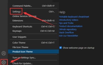
1. First, open the settings icon in the lower left corner and click the settings option. 2. Then, find the CSS column in the jumped window. 3. Finally, change the drop-down option in the unknownproperties menu to the error button.


