—What is auto?
+auto means adaptive. Auto is the default value for many size values, which is automatically calculated by the browser.
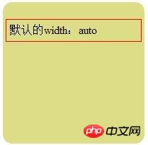
+Block-level elementThe sum of margin, border, padding and content width constitutes parent elementwidth.
After using the auto attribute, if the width of the parent element changes, the width of the element will also change accordingly.
In the picture below, the value of auto is the sum of margin, border, padding and content width

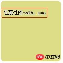
+But whenthe element is When is set to float, the width of the element becomes the width of the content, which is stretched by the content, which is the so-called wrapping property.
Overflow | position:absolute | float:left/right can all produce wrapping, Replacement elements also have wrapping.
*|position:relavtive|Relative positioning occupies the original position and cannot realize the transformation of the mode, that is, it does not have wrapping properties.
Therefore, width: auto; cannot be used on wrapped elements to make the element width adapt to the browser width. As shown in the figure below

—Sometimes setting margin:0 auto; does not work?
+maigin: 0 auto; means that the top and bottom margins of the element are 0, and the left and right margins are adaptive according to the width of the parent element (body), that is, the left and right are horizontally centered. If this setting doesn't work there are basically two reasons.
+ (1) The width is not set for p. If p has a width, it cannot refer to the width of the parent element to perform its own auto.
+ (2) p is wrapped, that is, it is out of the standard stream. Just like the standard stream where the parent object is located is compared to the earth's surface, the wrapped elements have already gone up to the sky. There is no parent element width for reference to perform auto.
The above is the detailed content of Detailed explanation on the use of auto attribute in css. For more information, please follow other related articles on the PHP Chinese website!


