Home Web Front-end CSS Tutorial CSS3 box-shadow attribute usage and single-sided shadow effect settings

CSS3 box-shadow attribute usage and single-sided shadow effect settings

Jul 21, 2017 pm 02:09 PM
box-shadow css3

3.5.2 How to use the box-shadow attribute (1)

Compared with making pictures with PSD software, box-shadow is much more convenient to modify the shadow effect of elements. , because box-shadow can modify six parameters to obtain different effects. The following is a demonstration of the box-shadow property with some simple cases.

1. Single-sided shadow effect

The single-sided shadow effect of the defined element is similar to the single-sided border color of the coordinated border, for example:

  1. > 
    <html lang="en-US"> 
    <head> 
      <meta charset="UTF-8"> 
      <title>box-shadow设置单边阴影效果title> 
      <style type="text/css"> 
        .box-shadow {  
          width: 200px;  
          height: 100px;  
          border-radius: 5px;  
          border: 1px solid #ccc;  
          margin: 20px;  
        }  
        .top {  
          box-shadow: 0 -2px 0 red;  
        }  
        .right {  
          box-shadow: 2px 0 0 green;  
        }  
        .bottom {  
          box-shadow: 0 2px 0 blue;  
        }  
        .left {  
          box-shadow: -2px 0 0 orange;  
        }  
      style> 
    head> 
    <body> 
      <p class="box-shadow top">p> 
      <p class="box-shadow right">p> 
      <p class="box-shadow bottom">p> 
      <p class="box-shadow left">p> 
    body> 
    html>
    Copy after login

The effect is shown in Figure 3-38.

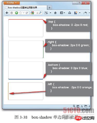
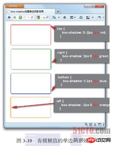
In this case, box-shadow is used to set single-sided shadow effects on the top, right, bottom and left sides of the element. It is mainly implemented through the offset of the horizontal and vertical shadows of the box-shadow. When the x-offset is a positive value, the right shadow is generated. When it is a negative value, the left shadow is generated. When the y-offset is a positive value, the bottom shadow is generated. Shadow, otherwise a negative value generates a top shadow. This example is a single-sided shadow projection effect (the shadow blur radius is 0), but if the shadow blur radius is not 0, can the above method still achieve a single-sided shadow effect? Don’t rush to answer. Add a blur radius to the above example, for example:

  1. .top {  
          box-shadow: 0 -2px 5px red;  
        }  
        .right {  
          box-shadow: 2px 0 5px green;  
        }  
        .bottom {  
          box-shadow: 0 2px 5px blue;  
        }  
        .left {  
          box-shadow: -2px 0 5px orange;  
        }
    Copy after login

Figure 3-39 shows that this effect is not ideal. Edge shadow effect, when box-shadow adds a shadow blur radius of 5px, the shadow is no longer a solid shadow projection, and the shadow clarity spreads outward, giving it a more shadowy effect. But it caused another problem, adding a light shadow effect to the other three sides of the element, but this is not the effect required by the design.

How to do it? At this time, the shadow expansion radius (spread-radius) in the box-shadow attribute will be a very critical attribute. To achieve a single-sided shadow effect, this attribute must be equipped (in addition to the single-sided solid shadow).

  1. .top {  
          box-shadow: 0 -4px 5px -3px red;  
        }  
        .right {  
          box-shadow: 4px 0 5px -3px green;  
        }  
        .bottom {  
          box-shadow: 0 4px 5px -3px blue;  
        }  
        .left {  
          box-shadow: -4px 0 5px -3px orange;  
        }
    Copy after login

The above code adjusts the displacement of the shadow and adds the expansion radius of the box-shadow,

The above is the detailed content of CSS3 box-shadow attribute usage and single-sided shadow effect settings. For more information, please follow other related articles on the PHP Chinese website!

Statement of this Website
The content of this article is voluntarily contributed by netizens, and the copyright belongs to the original author. This site does not assume corresponding legal responsibility. If you find any content suspected of plagiarism or infringement, please contact admin@php.cn

Hot AI Tools

Undresser.AI Undress

Undresser.AI Undress

AI-powered app for creating realistic nude photos

AI Clothes Remover

AI Clothes Remover

Online AI tool for removing clothes from photos.

Undress AI Tool

Undress AI Tool

Undress images for free

Clothoff.io

Clothoff.io

AI clothes remover

AI Hentai Generator

AI Hentai Generator

Generate AI Hentai for free.

Hot Article

R.E.P.O. Energy Crystals Explained and What They Do (Yellow Crystal)
3 weeks ago By 尊渡假赌尊渡假赌尊渡假赌
R.E.P.O. Best Graphic Settings
3 weeks ago By 尊渡假赌尊渡假赌尊渡假赌
R.E.P.O. How to Fix Audio if You Can't Hear Anyone
3 weeks ago By 尊渡假赌尊渡假赌尊渡假赌

Hot Tools

Notepad++7.3.1

Notepad++7.3.1

Easy-to-use and free code editor

SublimeText3 Chinese version

SublimeText3 Chinese version

Chinese version, very easy to use

Zend Studio 13.0.1

Zend Studio 13.0.1

Powerful PHP integrated development environment

Dreamweaver CS6

Dreamweaver CS6

Visual web development tools

SublimeText3 Mac version

SublimeText3 Mac version

God-level code editing software (SublimeText3)

How to achieve wave effect with pure CSS3? (code example) How to achieve wave effect with pure CSS3? (code example) Jun 28, 2022 pm 01:39 PM

How to achieve wave effect with pure CSS3? This article will introduce to you how to use SVG and CSS animation to create wave effects. I hope it will be helpful to you!

Use CSS skillfully to realize various strange-shaped buttons (with code) Use CSS skillfully to realize various strange-shaped buttons (with code) Jul 19, 2022 am 11:28 AM

This article will show you how to use CSS to easily realize various weird-shaped buttons that appear frequently. I hope it will be helpful to you!

How to hide elements in css without taking up space How to hide elements in css without taking up space Jun 01, 2022 pm 07:15 PM

Two methods: 1. Using the display attribute, just add the "display:none;" style to the element. 2. Use the position and top attributes to set the absolute positioning of the element to hide the element. Just add the "position:absolute;top:-9999px;" style to the element.

How to implement lace borders in css3 How to implement lace borders in css3 Sep 16, 2022 pm 07:11 PM

In CSS, you can use the border-image attribute to achieve a lace border. The border-image attribute can use images to create borders, that is, add a background image to the border. You only need to specify the background image as a lace style; the syntax "border-image: url (image path) offsets the image border width inward. Whether outset is repeated;".

It turns out that text carousel and image carousel can also be realized using pure CSS! It turns out that text carousel and image carousel can also be realized using pure CSS! Jun 10, 2022 pm 01:00 PM

How to create text carousel and image carousel? The first thing everyone thinks of is whether to use js. In fact, text carousel and image carousel can also be realized using pure CSS. Let’s take a look at the implementation method. I hope it will be helpful to everyone!

How to enlarge the image by clicking the mouse in css3 How to enlarge the image by clicking the mouse in css3 Apr 25, 2022 pm 04:52 PM

Implementation method: 1. Use the ":active" selector to select the state of the mouse click on the picture; 2. Use the transform attribute and scale() function to achieve the picture magnification effect, the syntax "img:active {transform: scale(x-axis magnification, y Axis magnification);}".

css3 what is adaptive layout css3 what is adaptive layout Jun 02, 2022 pm 12:05 PM

Adaptive layout, also known as "responsive layout", refers to a web page layout that can automatically recognize the screen width and make corresponding adjustments; such a web page can be compatible with multiple different terminals instead of making a specific version for each terminal. . Adaptive layout was born to solve the problem of mobile web browsing, and can provide a good user experience for users using different terminals.

Does css3 animation effect have deformation? Does css3 animation effect have deformation? Apr 28, 2022 pm 02:20 PM

The animation effect in css3 has deformation; you can use "animation: animation attribute @keyframes ..{..{transform: transformation attribute}}" to achieve deformation animation effect. The animation attribute is used to set the animation style, and the transform attribute is used to set the deformation style. .

See all articles