
 Web Front-end
CSS Tutorial
Graphic and text code tutorial on how to use CSS3 to implement curve shadows and edge-warping shadows
Web Front-end
CSS Tutorial
Graphic and text code tutorial on how to use CSS3 to implement curve shadows and edge-warping shadows
Graphic and text code tutorial on how to use CSS3 to implement curve shadows and edge-warping shadows

Often when we do some special shadow effects, the way of using pictures as backgrounds is actually very poor. Without considering adapting to old versions of browsers, we can use css3 to customize our own Desired shading style.
The following will take curve shadows and edge-warping shadows as examples to explain the process of customizing shadows.
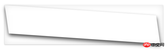
Let’s take a look at the renderings first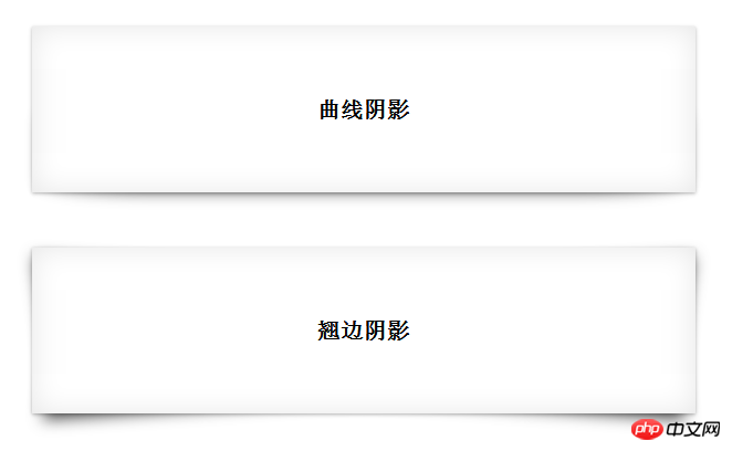
Curve shadow
Curve shadow can actually be achieved by overlapping double-layer shadows
We will cancel the shadow picture It should be easier to understand if you decompose it. The schematic diagram is as follows: 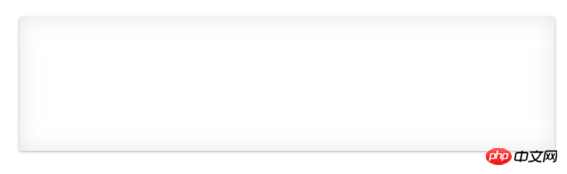
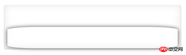
As shown above, under the basic shadow of Figure 1, just add a curved shadow.
1. The basic shadow in Figure 1 is easy to implement, inner shadow + outer shadow
.box-shadow1{
box-shadow: 0 1px 4px rgba(0,0,0,0.3),0 0 40px rgba(0,0,0,0.1) inset;
}2. Then use pseudo-classes to add an "adaptable" shadow behind the element. In order to be adaptable, We have to use relative positioning, and the implementation code is as follows
.box-shadow1{
position:relative;
box-shadow: 0 1px 4px rgba(0,0,0,0.3),0 0 40px rgba(0,0,0,0.1) inset;}.box-shadow1:after{
content:"";
position:absolute;
background:transparent;
top:50%;
//设置宽高仅仅设置上下左右边距是为了让系统自动定位。
bottom: 1px;
left: 10px;
right: 10px;
    z-index: -1;
    //将副阴影置于主阴影下
    box-shadow: 0 0 20px rgba(0,0,0,0.7);
border-radius: 100px/10px;}This way, the effect of curve shadow is achieved.
<p class="box box-shadow1">将box-shadow1作为类使用即可</p>
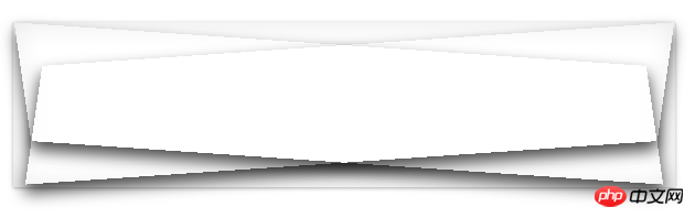
Warping Shadow
Similarly, warping shadow can be superimposed on two parallelograms under the basic shadow.
Here we will go directly to the breakdown diagram and source code without further explanation 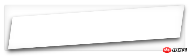
.box-shadow2{
position:relative;
box-shadow: 0 1px 4px rgba(0,0,0,0.3),0 0 40px rgba(0,0,0,0.1) inset;}
.box-shadow2:before,.box-shadow2:after{
content: "";
position:absolute;
    top:20px;bottom: 22px;
    background: transparent;
    box-shadow: 0 8px 20px rgba(0,0,0,0.7);
    z-index: -1;
    background: #fff;
}.box-shadow2:before{
    left: 22px;
    right:12px;
    transform: skew(-12deg) rotate(-4deg);
}.box-shadow2:after{
    left: 12px;
    right:22px;
    transform: skew(12deg) rotate(4deg);
}The above is the detailed content of Graphic and text code tutorial on how to use CSS3 to implement curve shadows and edge-warping shadows. For more information, please follow other related articles on the PHP Chinese website!

Hot AI Tools

Undresser.AI Undress
AI-powered app for creating realistic nude photos

AI Clothes Remover
Online AI tool for removing clothes from photos.

Undress AI Tool
Undress images for free

Clothoff.io
AI clothes remover

Video Face Swap
Swap faces in any video effortlessly with our completely free AI face swap tool!

Hot Article
Hot Tools

Notepad++7.3.1
Easy-to-use and free code editor

SublimeText3 Chinese version
Chinese version, very easy to use

Zend Studio 13.0.1
Powerful PHP integrated development environment

Dreamweaver CS6
Visual web development tools

SublimeText3 Mac version
God-level code editing software (SublimeText3)
Hot Topics
 1386
1386
 52
52

 How to use bootstrap in vue
Apr 07, 2025 pm 11:33 PM
How to use bootstrap in vue
Apr 07, 2025 pm 11:33 PM
Using Bootstrap in Vue.js is divided into five steps: Install Bootstrap. Import Bootstrap in main.js. Use the Bootstrap component directly in the template. Optional: Custom style. Optional: Use plug-ins.
 The Roles of HTML, CSS, and JavaScript: Core Responsibilities
Apr 08, 2025 pm 07:05 PM
The Roles of HTML, CSS, and JavaScript: Core Responsibilities
Apr 08, 2025 pm 07:05 PM
HTML defines the web structure, CSS is responsible for style and layout, and JavaScript gives dynamic interaction. The three perform their duties in web development and jointly build a colorful website.
 How to write split lines on bootstrap
Apr 07, 2025 pm 03:12 PM
How to write split lines on bootstrap
Apr 07, 2025 pm 03:12 PM
There are two ways to create a Bootstrap split line: using the tag, which creates a horizontal split line. Use the CSS border property to create custom style split lines.
 Understanding HTML, CSS, and JavaScript: A Beginner's Guide
Apr 12, 2025 am 12:02 AM
Understanding HTML, CSS, and JavaScript: A Beginner's Guide
Apr 12, 2025 am 12:02 AM
WebdevelopmentreliesonHTML,CSS,andJavaScript:1)HTMLstructurescontent,2)CSSstylesit,and3)JavaScriptaddsinteractivity,formingthebasisofmodernwebexperiences.
 How to resize bootstrap
Apr 07, 2025 pm 03:18 PM
How to resize bootstrap
Apr 07, 2025 pm 03:18 PM
To adjust the size of elements in Bootstrap, you can use the dimension class, which includes: adjusting width: .col-, .w-, .mw-adjust height: .h-, .min-h-, .max-h-
 How to use bootstrap button
Apr 07, 2025 pm 03:09 PM
How to use bootstrap button
Apr 07, 2025 pm 03:09 PM
How to use the Bootstrap button? Introduce Bootstrap CSS to create button elements and add Bootstrap button class to add button text
 How to set up the framework for bootstrap
Apr 07, 2025 pm 03:27 PM
How to set up the framework for bootstrap
Apr 07, 2025 pm 03:27 PM
To set up the Bootstrap framework, you need to follow these steps: 1. Reference the Bootstrap file via CDN; 2. Download and host the file on your own server; 3. Include the Bootstrap file in HTML; 4. Compile Sass/Less as needed; 5. Import a custom file (optional). Once setup is complete, you can use Bootstrap's grid systems, components, and styles to create responsive websites and applications.
 How to insert pictures on bootstrap
Apr 07, 2025 pm 03:30 PM
How to insert pictures on bootstrap
Apr 07, 2025 pm 03:30 PM
There are several ways to insert images in Bootstrap: insert images directly, using the HTML img tag. With the Bootstrap image component, you can provide responsive images and more styles. Set the image size, use the img-fluid class to make the image adaptable. Set the border, using the img-bordered class. Set the rounded corners and use the img-rounded class. Set the shadow, use the shadow class. Resize and position the image, using CSS style. Using the background image, use the background-image CSS property.
