The writing-mode attribute was initially only an attribute in IE and only supported by IE. Now it is supported by Google and Firefox in CSS3.
So you need to remember two different sets of syntax when using it, the private properties of IE and the normative properties of CSS3
If you only need If you are compatible with IE8+, you can just use the standard attributes of css3.
css3:
writing-mode:horizontal-tb;//默认:水平方向,从上到下
writing-mode: vertical-rl;//垂直方向,从右向左
<span style="font-size: 18px">writing-mode: vertical-lr;//垂直方向,从左向右</span><br/><span style="font-size: 18px">ie私有属性:</span><br/><span style="font-size: 18px">主要的:</span>
writing-mode: lr-tb ;//从左到右,从上到下。默认
writing-mode: tb-rl;//从上到下,从右向左
writing-mode:tb-lr (IE8+);//水平方向,从上到下,从左到右
If your project needs to be compatible with IE7, you can only pay attention to this Two values will do: initial values lr-tb and tb-rl, corresponding to horizontal-tb and vertical-rl in the CSS3 specification!
The writing-mode attribute is somewhat similar to the float attribute (the width and height of the element are supported by child elements). It was originally designed to control the display of inline elements; it is the display of text
writing -mode changes the default horizontal flow of the page to vertical flow
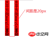
1. Margins can also overlap in the horizontal direction
css
.demo {
            -webkit-writing-mode: vertical-lr;
            -ms-writing-mode: vertical-lr;
            writing-mode: tb-lr;
            margin-bottom: 20px;

        }

        .demo .p1, .demo .p2 {
            margin: 0 20px;
            background-color: red;
}html
<p class="demo">
    <p class="p1">水平方向margin重叠</p>
    <p class="p2">水平方向margin重叠</p></p>
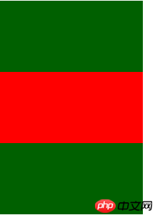
2. You can use margin:auto to achieve vertical centering
css
.demo1 {
            height: 300px;
            background-color: #006000;
            -webkit-writing-mode: vertical-lr;
            -ms-writing-mode: vertical-lr;
            writing-mode: tb-lr;
        }


        .demo1 .p3 {
            height: 100px;
            width: 200px;
            margin: auto 0;
            background-color: red;
}html
<p class="demo1">
    <p class="p3"></p></p>
3. You can use text-align:center to vertically center the image
css
       .demo2 {
            -webkit-writing-mode: vertical-lr;
            -ms-writing-mode: vertical-lr;
            writing-mode: tb-lr;
            height: 300px;
            background-color: #006000;
            text-align: center;
}html
<p class="demo2">
    <img src="images/1s.jpg"></p>
4. You can use text-indent to achieve the text sinking effect
css
.demo3{
            -webkit-writing-mode: vertical-lr;
            -ms-writing-mode: vertical-lr;
            writing-mode: tb-lr;
        }
        .demo3 a {
            border: 10px solid red;
            text-decoration: none;
            -webkit-border-radius: 50%;
            -moz-border-radius: 50%;
            border-radius: 50%;
            text-align: center;
            font-size:28px;
            color: darkred;
            display: block;
            height:50px;
            width: 50px;
            line-height: 50px;
            background-color: red;
            box-shadow: inset 0 0 1px darkred, 0 1px, 0 2px, 0 4px;
}html
<p class="demo3">
<a href="javascript:void(0)">签</a></p>writing-mode, direction, unicode-bidi are three major properties in the CSS world that can change the flow of text layout. Among them, direction and unicode-bidi are close relatives and are often used together. They are also the only two CSS properties that are not affected by the CSS3 all property. They are basically used together with inline elements. .
At first glance, writing-mode seems to include direction, unicode-bidicertain features and behaviors , for example, the rl of vertical-rl and the rtl value of direction are similar, both from right to left. However, in reality, the two have no intersection. Because vertical-rl the document flow at this time is in the vertical direction, rl represents the horizontal direction, then set direction:rtl at this time, the actual value is rtl changes the text direction of vertical inline elements, one horizontally and one vertically, without intersection. Moreover, writing-mode can have an impact on block elements, directly changing the vertical and horizontal rules of the CSS world, which is much more powerful and weird than direction.
However, the wonderful thing about CSS is that some features may have been originally designed for certain graphic and text layout designs, but we can use the features it brings to unleash our own creativity. power to achieve many other unexpected effects. Therefore, the Three Musketeers presented above are all very good resources.
There are many # in CSS3 ##*-start/*-end attribute (also known as CSS logical attribute), for example: margin-start/margin-end, border-start/border-end, padding-start/padding-end, and text-align :start/text-align:end statement.
The next question is, why are there so many *-start/*-end ghosts popping up?
That’s because modern browsers have strengthened their support for streaming, including Laojianghudirection, and writing-mode## that have followed in recent years. #.
margin-left / At this time, Webkit-based browsers also support For example, we set the writing-mode You can see that the scene is different, and the function of margin-start About *-startmargin-rightNo problem. However, if our flow can change, for example, a picture is 20 pixels away from the left edge, and we want the document flow to be from right to left, and at the same time, it is 20 pixels away from the right edge, what should we do? margin-left:20px will be invalid after the image direction changes; however, margin-start will not There is this problem. The so-called start refers to the direction in which the document flow starts. In other words, if the page is the default document flow, then margin-start is equivalent to margin-left. If the document flows horizontally from right to left, margin-start is equivalent to margin-right. margin-end is similar. *-before and *-end, and margin-before## is streamed by default. #Approximate to margin-top, margin-after Approximate to margin-bottom, however, the specification does not seem to mention it, and FireFox does not support it, *-before and *-after don’t have many opportunities to appear. Why? Because in fact, with writing-mode, *-start/*-end can already meet our needs for logical position. Both horizontal and vertical directions can be controlled, and the opposite direction is suitable for the old The *-top/*-bottom. value to vertical-rl, at this time margin-start is equivalent to margin-top, if at this time margin-start, margin-top exists at the same time, and will cover each other according to the weight and the principle of coming first. is also different. It can go up, down, left or right, and it is like a star king in this world. /*-end I will discuss it in detail when I have the opportunity in the future, so I will stop here. It is estimated that at present Nor will it be used in actual projects.
The above is the detailed content of Detailed explanation of examples of writing-mode attribute in css. For more information, please follow other related articles on the PHP Chinese website!


