
writing-modeThis CSS attribute is rarely seen or used by us! We often call uncommon things "uncommon", just like uncommon text we call "uncommon characters", so uncommon CSS attributes can be called "uncommon attributes", writing-mode It gives us the feeling that it is an "uncommon attribute", very weak and dispensable.
But, in fact, we were all wrong, very wrong, writing-mode is weak? Damn it, stop kidding, writing-mode can be said to be the most outrageous CSS property in the CSS world, directly subverting many rules in the CSS world.
And there is a reason why writing-mode feels "unknown" to people.
Actuallywriting-modeThis CSS property was born in ancient times, and the IE5.5 browser already supports it:
Then That’s weird! writing-modeSince it’s such a no-brainer, it’s early, and it’s senior, why has it been silent for almost 20 years?
That’s because, for a long time, modern browsers such as FireFox and Chrome did not support writing-mode, writing-mode is basically IE As a proprietary product of the browser, everyone has never had a good impression of IE, right? Aiwujiwu has moved from here to there, so naturally they don’t like writing-mode either.
However, just when we are blinded by popular front-end technology, major modern browsers have implemented more standard support for writing-mode (mainly thanks to FireFox browsing (active follow-up of the device), that is to say, I don’t know when, the compatibility of writing-mode is no longer a problem. In addition, the properties of this property are incredible. When I went, I seemed to see a The rising star is, no, it is a new moon, and it is a full moon.
is somewhat similar to the float attribute. writing-mode was originally designed to control the display of inline elements ( That is the so-called text layout-Text Layout). Because in Asia, especially East Asian countries like China, the layout of text is not horizontal but vertical, such as Chinese ancient poetry and prose.

Therefore, writing-mode is used to realize that text can be presented vertically.
You can click here: CSS writing-mode and vertical text layout demo
Taken from IE11 browser IE8 mode: 
writing-mode syntaxwriting-modeThe syntax learning is higher than other CSS properties, because we need to remember two different sets of syntax. One is an IE private property, and the second is a CSS3 specification property.
Let’s first look at the CSS3 syntax required in the future:
/* 关键字值 */
writing-mode: horizontal-tb;
/* 默认值 */
writing-mode: vertical-rl; writing-mode: vertical-lr;
 /* 全局值-关键字inherit IE8+,initial和unset IE13才支持 */
 writing-mode: inherit; writing-mode: initial; writing-mode: unset;
The meaning of each keyword attribute value, we can know its approximate meaning through transparent names, for example, the default valuehorizontal -tb means that the text flow is horizontal (horizontal) and the elements are stacked from top to bottom (tb:top-bottom).
vertical-rl means that the text is displayed vertically (vertical), and the reading order is from right to left (rl:right-l eft), which is consistent with the reading order of our ancient poems. vertical-lr means that the text is displayed vertically, and the reading order is still from left to right by default (lr:left-right), that is, it only changes from horizontal to vertical.
The following is a comparison of Chinese and English performance under each value (referenced from MDN): 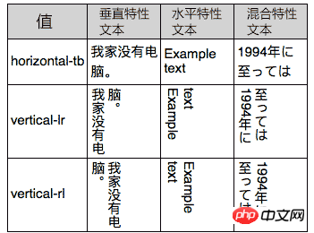
//zxx: You will find that the English characters are turned over. You can try using text-orientation:upright to make it upright. IE does not support it, but FireFox and Chrome support it.
Let’s take a look at the syntax of the old IE browser. Due to historical reasons, it seems quite complicated. The official IE document shows as follows:
-ms-writing-mode: lr-tb | rl-tb | tb-rl | bt-rl | tb-lr | bt-lr | lr-bt | rl-bt | lr | rl | tb
根据自己的测试(非原生IE8,IE9),-ms-私有前缀是可缺省的,直接writing-mode所以IE浏览器都是支持的。-ms-writing-mode这种写法IE7浏览器是不支持的,但是官方有如下说明:
Windows Internet Explorer 7. The rl-tb, and bt-rl values are available to the -ms-writing-mode
就是说IE7的-ms-writing-mode可以使用rl-tb和bt-rl这两个值,但这和自己的测试不符,我觉得可能是原生IE7浏览器,但我没有原生IE7,没有进行过测试,因此,此说法(原生IE7支持)只是自己的推测。
我扳指头数了数,IE浏览器下的关键字值多达11个,正好可以组个足球队,
lr-tb
IE7+浏览器支持。初始值。内容从左往右(left-right),从上往下(top-bottom)水平流动,以及下一行水平元素在上一行元素的下面,所有符号都是直立定位。大部分的书写系统都是使用这种布局。
rl-tb
IE7+浏览器支持。内容从右往左(right-left,从上往下(top-bottom)水平流动,以及下一行水平元素在上一行元素的下面,所有符号都是直立定位。这种布局适合从右往左书写的语言,例如阿拉伯语,希伯来语,塔安那文,和叙利亚语。
tb-rl
IE7+浏览器支持。内容从上往下(top-bottom),从右往左(right-left)垂直流动, 下一个垂直行定位于前一个垂直行的左边,全角符号直立定位,非全角符号(也可以被称作窄拉丁文或者窄假名符号)顺时针方向旋转90°。这种布局多见于东亚排版。
bt-rl
IE7+浏览器支持。内容从下往上(bottom-top),从右往左(right-left)垂直流动, 下一个垂直行定位于前一个垂直行的左边,全角符号直立定位,非全角符号(也可以被称作窄拉丁文或者窄假名符号)顺时针方向旋转90°。此布局多见于在东亚垂直排版从右往左的文本块上。
tb-lr
IE8+浏览器支持。 内容从上往下(top-bottom),从左往右(left-right)垂直流动。下一个垂直行在前一个的右边。
bt-lr
IE8+浏览器支持。 内容从下往上(bottom-top),从左往右(left-right)垂直流动。
lr-bt
IE8+浏览器支持。 内容从下往上(bottom-top),从左往右(left-right)水平流动。下一个水平行在前一行的上面。
rl-bt
IE8+浏览器支持。内容从下往上(bottom-top), 从右往左(right-left)水平流动。
lr
IE9+浏览器支持。在SVG和HTML元素上使用。等同于lr-tb.
rl
IE9+ browser support. Used on SVG and HTML elements. Equivalent to rl-tb.
tb
IE9+ browser support. Used on SVG and HTML elements. Equivalent to tb-rl.
The performance of each attribute value is as follows (form Microsoft official website)
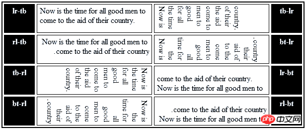
Some notes:
The same writing-mode attribute values will not be accumulated. For example, both father and son have set writing-mode :tb-rl will only be rendered once, and the child elements will not be "rotated" twice.
Under IE browser, if an element with its own layout (not a plain text element) has the writing-mode attribute value different from the parent element, the child When an element's layout flow changes, the available space in its parent element's coordinate system is fully utilized. The text on the left is too jargony, and you may not understand it. Let me explain it: under IE browser, when the layout element changes from horizontal to vertical (for example), you can imagine that the element is 100% adaptive in the vertical direction. The height of the parent element. Therefore, under IE browser (excluding IE13+), when elements are vertically flowing, you will find that the height is scary, and the layout is different from other modern browsers. This is the reason.
The Chrome browser currently still requires the -webkit- private prefix, although Chrome and Opera recognize old IE properties such as tb-rl It's worth it, but it's just acknowledgment. It's not a bird at all, it has no effect, it's just a decoration for the ears of the deaf!
Writing-mode attribute values that need attention
From the perspective of direct development, although IE supports up to 11 private attribute values , but there are only a few that we need to pay attention to, so which ones are they?
If your project needs to be compatible with IE7, you can only pay attention to these two values: the initial value lr-tb and tb-rl, corresponding to CSS3 horizontal-tb and vertical-rl in the specification! The other 9 attribute values just let them play every game.
如果你的项目只需要兼容IE8+,恭喜你,你可以和CSS3规范属性完全对应上了,而且IE8下的writing-mode要比IE7强大的多。我们需要关注:初始值lr-tb, tb-rl以及tb-lr,分别对应于CSS3中的horizontal-tb, vertical-rl以及vertical-lr。
看上去复杂的属性是不是变得很简单了,重新整一个实战版:
writing-mode: lr-tb | tb-rl | tb-lr (IE8+); writing-mode: horizontal-tb | vertical-rl | vertical-lr;
对,大家只要记住上面几个就可以了,enough! 因为所谓的垂直排版,实际web开发是很少很少遇到的。
有同学可能要疑问了,既然writing-mode实现文本垂直排版场景下,那还有什么学习的意义呢?
前面也提到了,虽然writing-mode创造的本意是文本布局,但是,其带来的文档流向的改变,不仅改变了我们多年来正常的CSS认知,同时可以巧妙实现很多意想不到的需求和效果。
writing-mode将页面默认的水平流改成了垂直流,颠覆了很多我们以往的认知,基于原本水平方向才适用的规则全部都可以在垂直方向适用!
1. 水平方向也能margin重叠
W3C文档margin重叠之一:
The bottom margin of an in-flow block-level element always collapses with the top margin of its next in-flow block-level sibling, unless that sibling has clearance.
清清楚楚写的bottom margin和top margin会重叠;然而,这是CSS2文档中的描述,在CSS3的世界中,由于writing-mode的存在,这种说法就不严谨了,应该是对立流方向的margin值会发生重叠。换句话说,如果元素是默认的水平流,则垂直margin会重叠;如果元素是垂直流,则水平margin会重叠。
您眼见为实,您可以狠狠地点击这里:CSS writing-mode与margin水平重叠demo
结果: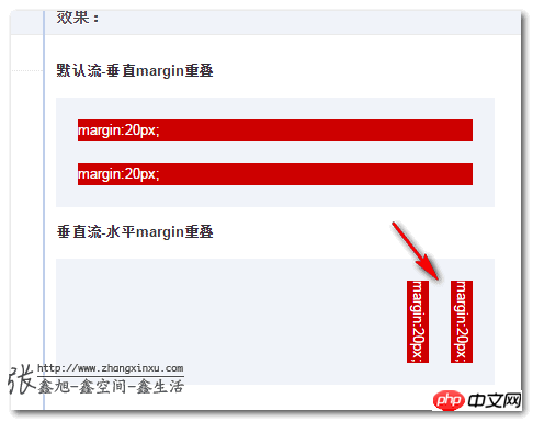
2. 可以使用margin:auto实现垂直居中
我们应该都是的,传统的web流中,margin设置auto值的时候,只有水平方向才会居中,因为默认width是100%自适应的,auto才有计算值可依,而垂直方向,height没有任何设置的时候高度绝不会自动和父级高度一致,因此,auto没有计算空间,于是无法实现垂直居中。但是,在writing-mode的世界里,纵横规则已经改变,元素的行为表现发生了翻天覆地的变化。
图片元素
我们先来看下,图片元素margin:auto实现垂直居中,您可以狠狠地点击这里:CSS writing-mode与图片margin:auto垂直居中demo
其中图片:
img { display: block; margin-top: auto; margin-bottom: auto; }FireFox浏览器下(P白省流量):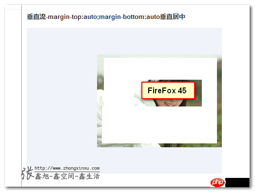
但是,在IE浏览器下,却没有垂直居中~~
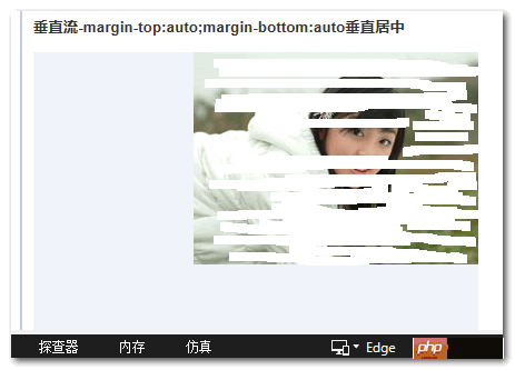
纳尼?!难道IE不支持垂直流下的垂直居中?非也,根据鄙人的测试,也就是图片这类替换元素貌似不行,普通的block元素都是可以的。
普通块状元素
您可以狠狠地点击这里:CSS writing-mode与普通block元素margin:auto垂直居中demo
此时,不仅IE11 edge,甚至IE8浏览器也都垂直居中了!
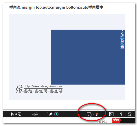
3. 可以使用text-align:center实现图片垂直居中
前面提过,auto无法实现IE浏览器下的图片垂直居中,如果我们非要让图片垂直居中,可以使用text-align:center,您可以狠狠地点击这里:CSS writing-mode与图片text-align:center垂直居中demo
结果,之前病恹恹的IE浏览器活了: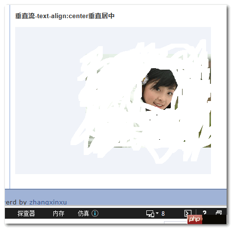
由于我们直接使用内联特性进行控制的,因此,IE7浏览器也是可以实现text-align:center下的图片垂直居中,但是,根据我在IE11↘IE7下的测试,writing-mode需要写在最后重置下(原生估计不会这样),因此,完整的writing-mode代码为:
.verticle-mode { writing-mode: tb-rl; -webkit-writing-mode: vertical-rl; writing-mode: vertical-rl; *writing-mode: tb-rl; }4. 可以使用text-indent实现文字下沉效果
这是真实项目例子,要增加一个按钮按下文字下沉的效果。如果你来实现,你会这么实现呢?行高控制?但默认文本就不居中(对于高度自适应的按钮,line-height下沉为了避免按钮高度变化,默认是不能完全居中的)。padding+height精确控制,又略烦。然而,在writing-mode垂直流下,我们又有了新思路,例如,直接使用text-indent实现垂直方向的控制,没想到吧,无需关心height高度padding间距大小,任何按钮都可以通用,因为text-indent不会影响元素原本的盒布局。
您可以狠狠地点击这里:CSS writing-mode与text-indent文字下沉效果demo
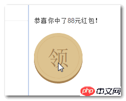
包括IE7在内的浏览器都是支持的(同上最后要*writing-mode覆盖下)都是支持下沉的。
为什么有如此的实现呢?这要归功于中文,在垂直流排版的时候,中文是不会旋转的,还是直立的,也就是说,虽然我们肉眼看上去文字没什么变化,但是,布局流已经发生了变化,以前类似text-indent/letter-spacing等水平控制属性都作用在垂直方向了。
当然,我们这个例子比较巧的是按钮文字只有一个,要是按钮文字有多个,怕是就没这么轻松和绝妙了。
5. 可以实现全兼容的icon fonts图标的旋转效果
在老的IE浏览器下,我们要实现小图标的旋转效果是不是很烦?要使用IE的旋转或翻转滤镜(filter)什么的,具体可参见我之前的“CSS垂直翻转/水平翻转提高web页面资源重用性”以及“IE矩阵滤镜Matrix旋转与缩放及结合transform的拓展”一文。
现在我们有了writing-mode,我们就不要这么烦心了。
You may have noticed before that when writing-mode turns the document into a vertical flow, our English and numerical symbols will be displayed "lying", which is a natural 90° rotation. At this point, we might as well open our minds. If we use icon fonts technology to let these characters directly map to a small icon, wouldn't it be easy to realize the rotation of small icons? The key is that even if it is browsed by IE6 and IE7 that have been killed for thousands of years, The filter is also supported, which is much simpler than filters and so on!
Seeing is believing, you can click here: writing-mode to achieve icon fonts icon rotation effect demo
Even the IE7 browser is very powerful!
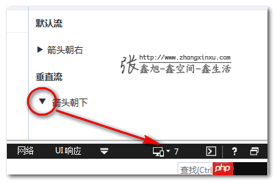
#6. Make full use of height-adaptive layout
Damn it, it doesn’t work, there’s too much content, I didn’t even write it before May Day It’s endless...
Let’s skip the following 7, 8, 9, and 10~~
In short, let go of your brain. In theory, you have writing-mode, we can do 50% more things than before, just because you can’t think of it, or because you can’t do it.
We just introduced the CSS direction attribute last month, which is also a good thing. For details, see "Introduction to CSS direction attribute and Practical application", it can change the direction of text, so what is its relationship with writing-mode?
writing-mode, direction, unicode-bidi (MDN document) are the three major properties in the CSS world that can change the flow direction of text layout . Among them, direction and unicode-bidi are close relatives and are often used together. They are also the only two CSS properties that are not affected by the CSS3 all property. They are basically used together with inline elements. , and it is said that it seems to be designed with Arabic characters.
At first glance, writing-mode seems to include direction, unicode-bidicertain features and behaviors, such as vertical-rl# The rl of ## and the rtl value of direction are similar, both are from right to left. However, in reality, the two have no intersection. Because vertical-rl the document flow at this time is in the vertical direction, rl represents the horizontal direction, then set direction:rtl at this time, the actual value is rtl changes the text direction of vertical inline elements, one horizontally and one vertically, without intersection. Moreover, writing-mode can have an impact on block elements, directly changing the vertical and horizontal rules of the CSS world, which is much more powerful and weird than direction. And it is said that it seems to be designed with East Asian characters.
There are many *-start/*-end attributes (also known as are CSS logical properties), for example: margin-start/margin-end, border-start/border-end, padding-start/padding-end, and text-align:start/text-align:end statements.
The next question is, why are there so many *-start/*-end ghosts popping up?
That’s because modern browsers have strengthened their support for streaming, including Laojianghudirection, and writing-mode that have followed in recent years.
A long time ago, in our understanding, web page layout has one flow direction, that is, from left to right, top to bottom, so we use margin-left/margin-rightNo problem. However, if our flow can change, for example, a picture is 20 pixels away from the left edge, and we want the document flow to be from right to left, and at the same time, it is 20 pixels away from the right edge, what should we do?
At this time, margin-left:20px will be invalid after the image direction changes; however, margin-start will not have this problem , the so-called start, refers to the direction in which the document flow starts. In other words, if the page is the default document flow, then margin-start is equivalent to margin-left, if it is horizontal From right to left document flow, margin-start is equivalent to margin-right. margin-end is similar.

Webkit-based browsers also support *-before and *-end, and margin- is streamed by default. before is similar to margin-top, margin-after is similar to margin-bottom, however, the specification does not seem to mention it, and FireFox does not support it. *-before and *-after don’t have many opportunities to appear. Why? Because in fact, with writing-mode, *-start/*-end can already meet our needs for logical position. Both horizontal and vertical directions can be controlled, and the opposite direction is suitable for the old of*-top/*-bottom.
For example, we set the writing-mode value to vertical-rl, then margin-start is equivalent to margin-top , if margin-start and margin-top exist at the same time, they will overwrite each other according to the weight and the last-come-first-served principle.
As you can see, the scene is different, and the function of margin-start is also different. It can go up or down, left or right, and it is like a star king in this world.
About*-start/*-end I will discuss it in detail when I have the opportunity in the future, so I will stop here. It is estimated that it will not be used in actual projects at present. used in.
The above is the detailed content of Detailed introduction to changing the vertical and horizontal rules of the writing-mode attribute in CSS. For more information, please follow other related articles on the PHP Chinese website!


