CSS-float detailed introduction to clear:both
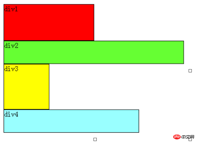
It can be seen that even if the width of p1 is very small, one line in the page can accommodate p1 and p2, and p2 will not be ranked behind p1, because the p element is block-level and occupies its own line. Note that the above theories refer to p in the standard flow.
No matter how complex the layout is, the basic starting point is: "How to display multiple p elements in one row". Floating can be understood as letting a certain p element break away from the standard stream and float on the standard stream. It is not at the same level as the standard stream, so it is called float.
For example, assuming that p2 in the above figure floats, it will break away from the standard flow, but p1, p3, and p4 are still in the standard flow, so p3 will automatically move upward, occupy the position of p2, and reorganize a flow. As shown in the figure:
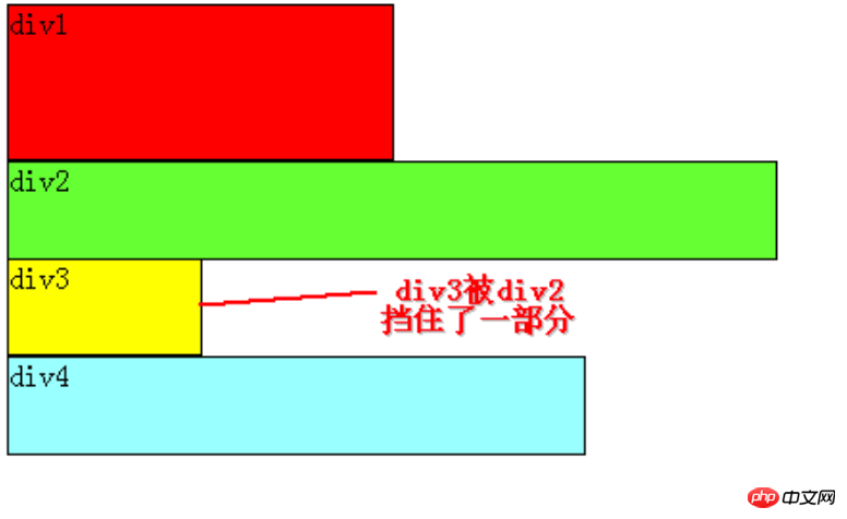
As can be seen from the figure, since p2 is set to float, it no longer belongs to the standard flow. p3 automatically moves up to replace the position of p2, and p1, p3, and p4 are arranged in sequence. Become a new stream. And because float floats above the standard flow, p2 blocks part of p3, and p3 looks "short"
Here p2 uses left float (float:left;), which can be understood as floating. Arrange on the left, float on the right (float:right;), of course, arrange on the right. The left and right here refer to the left and right edges of the page.
If we float p2 to the right, the effect will be as follows:

At this time, p2 is arranged on the right edge of the page and no longer blocks p3. The reader can clearly see p1 mentioned above. , p3, p4 composed of streams.
So far we have only floated one p element, what about more?
Next, we add left floating to both p2 and p3. The effect is as shown:
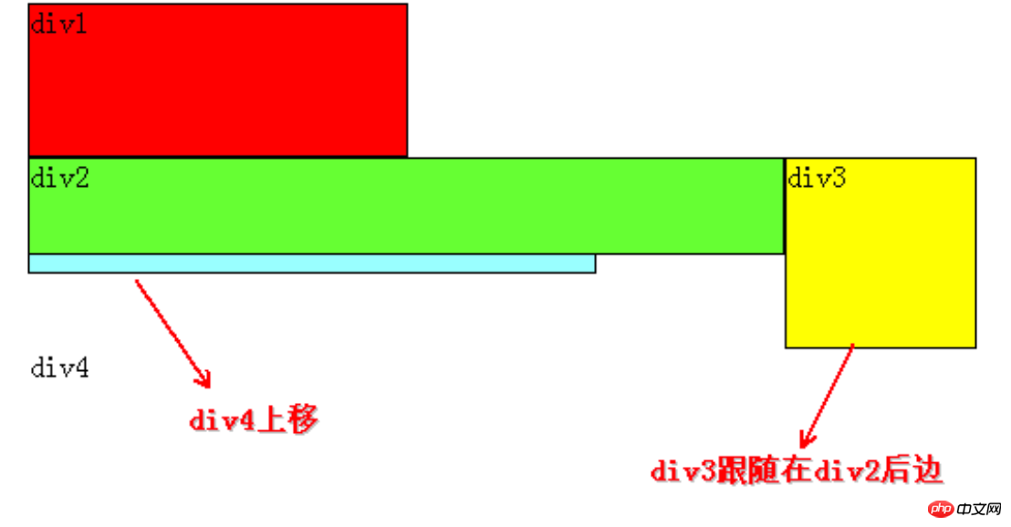
Similarly, since p2 and p3 float, they no longer belong to the standard stream, so p4 will automatically move up. , and p1 form a "new" standard stream, and float floats on the standard stream, so p2 blocks p4 again.
Ahem, here comes the point. When p2 and p3 are set to float at the same time, p3 will follow p2. I don’t know if readers have noticed that until now, p2 has been floating in every example, but It does not follow p1. Therefore, we can draw an important conclusion:
If a certain p element A is floating, and if the previous element of the A element is also floating, then the A element will follow the right side of the previous element (if it cannot fit in one line These two elements, then the A element will be squeezed to the next line); if the previous element of the A element is an element in the standard flow, then the relative vertical position of A will not change, that is to say, the top of A will always be the same as the previous one. The element's bottom alignment. To put it simply, two float:left will be arranged horizontally. If the first one is a standard stream and the second one is float:left, then the second one will still be arranged below the first one.
The order of p is HTML The order of p in the code is determined.
The end close to the edge of the page is the front, and the end far away from the edge of the page is the back.
To help readers understand, here are a few more examples.
If we set p2, p3, and p4 to left floating, the effect is as follows:

According to the above conclusion: start with the analysis of p4, and it is found that the upper element p3 is floating. So p4 will follow p3; p3 finds that the upper element p2 is also floating, so p3 will follow p2; and p2 finds that the upper element p1 is an element in the standard stream, so the relative vertical position of p2 remains unchanged, and the top Still aligned with the bottom of the p1 element. Since it is left floating, the left side is close to the edge of the page, so the left side is the front, so p2 is on the far left.
If p2, p3, and p4 are all set to float right, the effect is as follows:
 <p>The principle is basically the same as floating left, but you need to pay attention to the corresponding relationship. Since it is floating right, the right side is close to the edge of the page, so the right side is front, so p2 is on the far right.
<p>If we float p2 and p4 to the left, the effect diagram is as follows:
 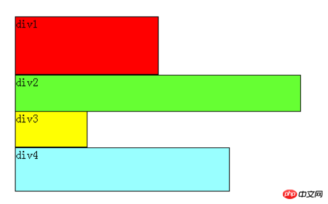 <p>It is still based on the conclusion that p2 and p4 are floating and out of the standard flow, so p3 will Automatically moves up and forms a standard stream with p1. p2 finds that the previous element p1 is an element in the standard stream, so the relative vertical position of p2 remains unchanged and is aligned with the bottom of p1. p4 finds that the previous element p3 is an element in the standard stream, so the top of p4 is aligned with the bottom of p3, and this is always true, because it can be seen from the figure that after p3 moves up, p4 also moves up, and p4 always moves up. It is to ensure that the top of itself is aligned with the bottom of the previous element p3 (element in the standard flow).
<p> At this point, congratulations to the reader who has mastered adding floats, but there is also clearing floats. Clearing floats is very easy to understand based on the above foundation.
<p>After studying above, it can be seen that before the elements are floated, that is, in the standard flow, they are arranged vertically, and after floating, they can be understood as horizontally arranged.
 Clearing floats can be understood as breaking the horizontal arrangement.
The keyword for clearing floats is clear, and the official definition is as follows:
Syntax: <p>clear: none | left | right | both <p>Value: <p> none : Default value. Floating objects are allowed on both sides <p>left: Floating objects are not allowed on the left side <p>right: Floating objects are not allowed on the right side <p>both: Floating objects are not allowed <p>The definition is very easy to understand, but readers may find that this is not the case when using it in practice.
The definition is not wrong, but its description is too vague, leaving us at a loss.
Based on the above basis, if there are only two elements p1 and p2 on the page, they are both floating left. The scenario is as follows:
 <p>At this time, both p1 and p2 are floating, according to the rules , p2 will follow p1, but we still hope that p2 can be arranged below p1, just like p1 does not float and p2 floats left.
<p>At this time, clear float (clear) is used. If it is purely based on the official definition, readers may try to write like this: add clear:right; to the CSS style of p1, which means that the right side of p1 is not allowed. There are floating elements. Since p2 is a floating element, it will automatically move down one line to meet the rules.
<p>In fact, this understanding is incorrect, and it has no effect.
<p> Regarding CSS clear float (clear), you must remember: this rule can only affect the element itself that uses clearing, and cannot affect other elements.
<p>How to understand? Take the above example, we want p2 to move, but we use clear float in the CSS style of the p1 element, trying to force p2 to move down by clearing the floating element to the right of p1 (clear:right;) , this is not feasible, because this clear float is called in p1, it can only affect p1, not p2.
<p>If you want p2 to move down, you must use float in the CSS style of p2. In this example, there is a floating element p1 on the left side of p2, so as long as you use clear:left; in the CSS style of p2 to specify that floating elements are not allowed to appear on the left side of the p2 element, p2 will be forced to move down one line.
<p>
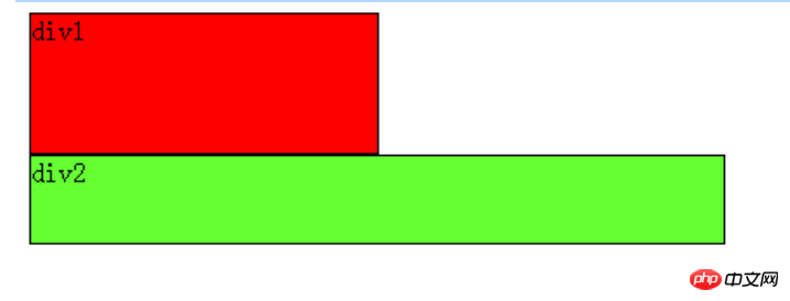 <p>So what if there are only two elements p1 and p2 on the page, and they are both right-floating? Readers should be able to guess the scene by themselves at this time, as follows:
  <p>If you want p2 to move down to p1 at this time, how should you do it?
<p>If we want to move p2, we must call float in the CSS style of p2, because float can only affect the element that calls it.
<p>It can be seen that there is a floating element p1 on the right side of p2, then we can use clear:right; in the CSS style of p2 to specify that floating elements are not allowed to appear on the right side of p2, so that p2 is forced to move down. One row, arranged below p1.
 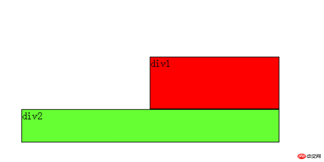 <p>Let’s extend it later:
 If clear:both is not added, the effect is like this:

The gray background color is not added to the second OK, because the second line is float and is not on the same level as .ob-body. The second line floats above .ob-body. The pseudo-class: after is used to make the second line return to the ground.
<head>
    <style>
        .ob-title{
            background-color: orange;
        }
        .ob-body{
            background-color: #ddd;
        }
        .ob-body .menu{
            float: left;
            width: 200px;
            background-color: pink;
        }
        .ob-body .content{
            float: left;
            background-color: aquamarine;
        }
        .clearfix:after{    /*在.clearfix后边追加一个隐藏的block,带一个clear:both属性*/
            content: "";
            display: block;  /*block宽度会横向填充满屏幕,在父元素的最后追加一个height:0,占满屏幕的看不见的细长条*/
            line-height: 0;
            clear: both;  /*这个最下边细长条左右两边都清除float*/
        }
    </style></head><body style="margin: 10px;">
    <p class="ob-title">头部信息</p>
    <p class="ob-body clearfix">   <!--此处调用尾类-->
        <p class="menu">左侧菜单</p>
        <p class="content">右侧内容</p>
        <!--<p style="clear: both;"></p>-->  <!--第二种写法,不用调用clearfix类-->
    </p></body>
Finally, let’s analyze: Why is it ok after adding clearfix? The two writing methods actually mean the same thing, which is to add an empty
<p> at the end of the .ob-body (as long as it is a block, because only blocks can be filled horizontally), this <p>In fact, it is an invisible slender bar, because it is at the bottom of .ob-body and is not float. It will definitely be controlled by the background color of .ob-body. His The height of .ob-body is defined, so the gray background color will be affected within the height range. Although the second line is still floating in the sky, the ground has been covered with silver. And the bottom <p> must have clear:both, otherwise if it is just a standard stream, it will be close to the bottom of the first line, and of course it cannot cover the second line. In fact, in this example Using clear:left is also valid (because the second line is float:left), but for the sake of versatility, use both. And it is also verified: this rule can only affect the element itself that is cleared, and cannot affect other elements, clear to hide both of p. The above is the detailed content of CSS-float detailed introduction to clear:both. For more information, please follow other related articles on the PHP Chinese website!

Hot AI Tools

Undresser.AI Undress
AI-powered app for creating realistic nude photos

AI Clothes Remover
Online AI tool for removing clothes from photos.

Undress AI Tool
Undress images for free

Clothoff.io
AI clothes remover

AI Hentai Generator
Generate AI Hentai for free.

Hot Article

Hot Tools

Notepad++7.3.1
Easy-to-use and free code editor

SublimeText3 Chinese version
Chinese version, very easy to use

Zend Studio 13.0.1
Powerful PHP integrated development environment

Dreamweaver CS6
Visual web development tools

SublimeText3 Mac version
God-level code editing software (SublimeText3)

Hot Topics
 Demystifying Screen Readers: Accessible Forms & Best Practices
Mar 08, 2025 am 09:45 AM
This is the 3rd post in a small series we did on form accessibility. If you missed the second post, check out "Managing User Focus with :focus-visible". In
 Create a JavaScript Contact Form With the Smart Forms Framework
Mar 07, 2025 am 11:33 AM
This tutorial demonstrates creating professional-looking JavaScript forms using the Smart Forms framework (note: no longer available). While the framework itself is unavailable, the principles and techniques remain relevant for other form builders.
 Adding Box Shadows to WordPress Blocks and Elements
Mar 09, 2025 pm 12:53 PM
The CSS box-shadow and outline properties gained theme.json support in WordPress 6.1. Let's look at a few examples of how it works in real themes, and what options we have to apply these styles to WordPress blocks and elements.
 Comparing the 5 Best PHP Form Builders (And 3 Free Scripts)
Mar 04, 2025 am 10:22 AM
This article explores the top PHP form builder scripts available on Envato Market, comparing their features, flexibility, and design. Before diving into specific options, let's understand what a PHP form builder is and why you'd use one. A PHP form
 Working With GraphQL Caching
Mar 19, 2025 am 09:36 AM
If you’ve recently started working with GraphQL, or reviewed its pros and cons, you’ve no doubt heard things like “GraphQL doesn’t support caching” or
 Making Your First Custom Svelte Transition
Mar 15, 2025 am 11:08 AM
The Svelte transition API provides a way to animate components when they enter or leave the document, including custom Svelte transitions.
 Show, Don't Tell
Mar 16, 2025 am 11:49 AM
How much time do you spend designing the content presentation for your websites? When you write a new blog post or create a new page, are you thinking about
 Classy and Cool Custom CSS Scrollbars: A Showcase
Mar 10, 2025 am 11:37 AM
In this article we will be diving into the world of scrollbars. I know, it doesn’t sound too glamorous, but trust me, a well-designed page goes hand-in-hand


