

Share CSS overflow overflow example tutorial

Clip the left/right edge of the content in the div element - if it overflows the content area of the element:
div
{
overflow-x:hidden;
}Browser support
All major browsers support the overflow-x attribute.
Note: The overflow-x attribute does not work correctly in IE8 and earlier browsers.
Definition and Usage
The overflow-x attribute specifies whether to clip the left/right edges of the content - if it overflows the element's content area.
overflow-X | overflow-y
The properties of overflow-x and overflow-y were originally properties independently developed by IE browser. It was later adopted and standardized by CSS3. overflow-x is mainly used to define the shearing of horizontal content overflow, and overflow-y is mainly used to define the shearing of vertical content overflow
[Note] If the overflow-x and overflow-y values The same is equivalent to overflow. If the overflow-x and overflow-y values are different, and one of the values is explicitly set to visible or is not set, the default is visible, and the other value is a non-visible value. The visible value will be reset to auto
Value: visible | hidden | scroll | auto | inherit | no-display | no-content
Initial value: visible
Applies to: block-level elements, replacement elements, table cells
Inheritance: None
Attribute
visible
The content of the element is also visible outside the element box
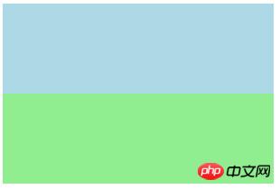
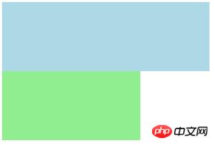
[Note 1] The containing block of the element in IE6-browser will be extended so that its excess content can be wrapped
.box{
    height: 200px;
    width: 200px;
    background-color: lightgreen;
}.in{
    width: 300px;
    height: 100px;
    background-color: lightblue;
}<p class="box">
<p class="in"></p></p>The picture on the left is IE6-browser, the picture on the right is other browsers
 |  |
## [Note 2] There is a bug in the buttons of IE7-browser (including
The picture on the left shows the default situation, and the picture on the right shows the situation after setting overflow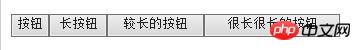 | 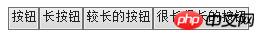 |
If the content is clipped, the browser will display scroll bars In order to view the rest of the content
[Note] For general browsers, and