
 Web Front-end
H5 Tutorial
Detailed explanation of content alignment method when using CSS3 for flexible layout
Web Front-end
H5 Tutorial
Detailed explanation of content alignment method when using CSS3 for flexible layout
Detailed explanation of content alignment method when using CSS3 for flexible layout
This article mainly introduces the detailed use of CSS3 elastic layout content alignment (justify-content) attribute, which has certain reference value. If you are interested, you can learn about the
content alignment (justify-content) attribute application. On the flex container, align the flex items along the main axis of the flex container.
This operation occurs after the elastic length and automatic margins are determined. It is used to allocate remaining space when it exists, and also affects the alignment of items when content overflows.
Note: There are two basic terms main axis and cross axis in elastic layout. Generally speaking, we can regard them as the row direction and column direction on the screen (but Strictly speaking, this is related to the write mode and the elastic flow direction).
Then main-start and main-end can be regarded as the left and right sides of the elastic container respectively.
justify-content syntax is as follows:
justify-content: flex-start | flex-end | center | space-between | space-around
The parameter description is as follows:
flex-start
Flex items are filled next to each other toward the beginning of the line. This is the default value. The main-start margin edge of the first flex item is placed on the main-start edge of the row, and subsequent flex items are placed flush in sequence.
flex-end
Flex items are filled next to the end of the line. The main-end margin edge of the first flex item is placed on the main-end edge of the row, and subsequent flex items are placed flush in sequence.
center
The flex item is centered next to the padding. (If the remaining free space is negative, the flex items will overflow in both directions).
space-between
Flex items are evenly distributed across the row. If the remaining space is negative or there is only one flex item, this value is equivalent to flex-start. Otherwise, the margins of the first flex item are aligned with the main-start edge of the row, and the margins of the last flex item are aligned with the main-end edge of the row, and then the remaining flex items are distributed on the row, adjacent to each other. Items are equally spaced.
space-around
Flex items are evenly distributed on the row, leaving half the space on either side. If the remaining space is negative or there is only one flex item, this value is equivalent to center. Otherwise, the flex items are distributed along the row with equal intervals between each other (for example, 20px), while leaving half the space between the first and last sides and the flex container (1/2*20px=10px).
Justify-content attribute value effect example
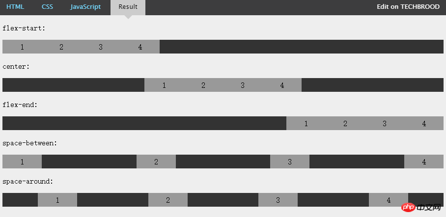
The above figure intuitively demonstrates the effects and differences of the above five values.
The above is the detailed content of Detailed explanation of content alignment method when using CSS3 for flexible layout. For more information, please follow other related articles on the PHP Chinese website!

Hot AI Tools

Undresser.AI Undress
AI-powered app for creating realistic nude photos

AI Clothes Remover
Online AI tool for removing clothes from photos.

Undress AI Tool
Undress images for free

Clothoff.io
AI clothes remover

AI Hentai Generator
Generate AI Hentai for free.

Hot Article
Hot Tools

Notepad++7.3.1
Easy-to-use and free code editor

SublimeText3 Chinese version
Chinese version, very easy to use

Zend Studio 13.0.1
Powerful PHP integrated development environment

Dreamweaver CS6
Visual web development tools

SublimeText3 Mac version
God-level code editing software (SublimeText3)
Hot Topics
 1378
1378
 52
52

 How to write split lines on bootstrap
Apr 07, 2025 pm 03:12 PM
How to write split lines on bootstrap
Apr 07, 2025 pm 03:12 PM
There are two ways to create a Bootstrap split line: using the tag, which creates a horizontal split line. Use the CSS border property to create custom style split lines.
 How to insert pictures on bootstrap
Apr 07, 2025 pm 03:30 PM
How to insert pictures on bootstrap
Apr 07, 2025 pm 03:30 PM
There are several ways to insert images in Bootstrap: insert images directly, using the HTML img tag. With the Bootstrap image component, you can provide responsive images and more styles. Set the image size, use the img-fluid class to make the image adaptable. Set the border, using the img-bordered class. Set the rounded corners and use the img-rounded class. Set the shadow, use the shadow class. Resize and position the image, using CSS style. Using the background image, use the background-image CSS property.
 How to resize bootstrap
Apr 07, 2025 pm 03:18 PM
How to resize bootstrap
Apr 07, 2025 pm 03:18 PM
To adjust the size of elements in Bootstrap, you can use the dimension class, which includes: adjusting width: .col-, .w-, .mw-adjust height: .h-, .min-h-, .max-h-
 The Roles of HTML, CSS, and JavaScript: Core Responsibilities
Apr 08, 2025 pm 07:05 PM
The Roles of HTML, CSS, and JavaScript: Core Responsibilities
Apr 08, 2025 pm 07:05 PM
HTML defines the web structure, CSS is responsible for style and layout, and JavaScript gives dynamic interaction. The three perform their duties in web development and jointly build a colorful website.
 How to set up the framework for bootstrap
Apr 07, 2025 pm 03:27 PM
How to set up the framework for bootstrap
Apr 07, 2025 pm 03:27 PM
To set up the Bootstrap framework, you need to follow these steps: 1. Reference the Bootstrap file via CDN; 2. Download and host the file on your own server; 3. Include the Bootstrap file in HTML; 4. Compile Sass/Less as needed; 5. Import a custom file (optional). Once setup is complete, you can use Bootstrap's grid systems, components, and styles to create responsive websites and applications.
 How to use bootstrap in vue
Apr 07, 2025 pm 11:33 PM
How to use bootstrap in vue
Apr 07, 2025 pm 11:33 PM
Using Bootstrap in Vue.js is divided into five steps: Install Bootstrap. Import Bootstrap in main.js. Use the Bootstrap component directly in the template. Optional: Custom style. Optional: Use plug-ins.
 How to use bootstrap button
Apr 07, 2025 pm 03:09 PM
How to use bootstrap button
Apr 07, 2025 pm 03:09 PM
How to use the Bootstrap button? Introduce Bootstrap CSS to create button elements and add Bootstrap button class to add button text
 How to view the date of bootstrap
Apr 07, 2025 pm 03:03 PM
How to view the date of bootstrap
Apr 07, 2025 pm 03:03 PM
Answer: You can use the date picker component of Bootstrap to view dates in the page. Steps: Introduce the Bootstrap framework. Create a date selector input box in HTML. Bootstrap will automatically add styles to the selector. Use JavaScript to get the selected date.
