The form of 2D transformation in CSS is like this:
选择器{
transform:转换函数(参数,参数);
}where transform ( is transform, not transfrom) is defined 2D or 3D conversion of elements;
2D conversion functions are divided into five categories:
translate() defines the displacement function; the following parameters are relative The offset distance of the x-axis and y-axis, in pixels, in the form: translate(30px,30px); indicates an offset of 30 pixels relative to the x-axis and the y-axis. It can be a negative value, indicating a reverse offset;
rotate() Define the function of rotation; define the element to rotate clockwise by a given angle, negative values are allowed, the element will rotate counterclockwise, the unit is angle deg (degree ), in the form rotate (30deg); the element is rotated 30 degrees clockwise, and a negative value indicates counterclockwise selection;
scale() defines the scaling function, according to Given the width (X axis) and height (Y axis) parameters, the element will be scaled, and the unit is a multiple, in the form of scale (2, 2); indicating that the element will be enlarged by 2 times on the x axis and y axis according to the original size. ; Can be a negative number, indicating rotation;
skew() defines the flip function, flipping based on the given (X-axis, Y-axis) parameters, unit is the angle deg, in the form of skew(30px,30px); it means that the element will be deflected by 30 degrees in the x-axis and y-axis direction; it can be a negative number, indicating reverse deflection;
matrix() function method combines all 2D transformation methods to move, rotate, scale, and flip elements. Note: there is no defined perspective (perspective effect) and no expected deflection effect.
Example:
<!DOCTYPE html><html>
    <head>
        <meta charset="UTF-8">
        <title>演示2D转换</title>
        <style type="text/css">
            #fr{
                width: 500px;
                height: 400px;
                border: 1px solid green;
                margin: 20px auto;
                overflow: hidden;
            }
            .ch{
                width: 80px;
                height: 80px;
                border: 1px solid black;
                margin: 10px;

            }
            #fr p:first-child{
                transform: translate(100px,0px);
                -moz-transform: translate(100px,0px);
                -webkit-transform: translate(100px,0px);
                -o-transform: translate(100px,0px);
                -ms-transform: translate(100px,0px);

            }
            #fr p:nth-child(2){
                background-color: gray;
                transform: rotate(30deg);
                -webkit-transform: rotate(30deg);
            }
            #fr p:nth-child(3){
                background-color: greenyellow;
                transform: scale(1.5,1.5) translate(100px)            }
            #fr p:last-child{
                transform:  skew(30deg,20deg);
                background-color: springgreen;
            }
        </style>
    </head>
    <body>
        <p id="fr">
            <p class="ch"></p>
            <p class="ch"></p>
            <p class="ch"></p>
            <p class="ch"></p>

            </p>
        </p>
</body></html>Browser parsing page:

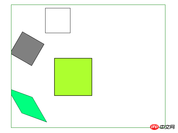
The first rectangle p is moved 100px relative to the original position (X axis);
The second rectangle p is rotated 30 degrees relative to its center;
The third rectangle p, moved 100px relative to its original position, and enlarged 1.5 times along the x-axis and y-axis directions;
The fourth rectangle p, flipped 30 degrees in the x-axis and y-axis directions respectively , 20 degrees;
The displacement, rotation, and flip of the functions here, each function has its own default relative position, which is also in line with our perceptual cognition. To modify the base point position of the rotation element, you can use the transform-origin function to define it;
Form: transform-origin:20% 40% (note that there are no brackets or "," Split); indicates that the relative deflection position moves 20% and 40% along the x-axis and y-axis according to the previous position movement. The w3c page demonstrates it very well
The default position is rotated according to the center of the element, which is the default position transform-origin: 50% 50%;If you want to rotate around the upper left corner of the element, use the parameters transform-origin: 0% 0%, the lower right corner transform-origin: 100% 100%, and so on. You can also use transform-origin:top left; transform-origin: bottom right; to define.
A browser compatibility issue: New versions of browsers seem to support 2D transformation defined by transform. In order to prevent compatibility issues with older versions of browsers (Chrome and Safari require the prefix -webkit-) , you need to do browser compatibility processing, because you never know how old the browser used by website visitors is!
ie browser: -ms-transform:
chrome and Safari browser: -webkit-transform:
Opera browser: -o-transform:
Firefox browser: -moz-transform:
The above is the detailed content of Summary sharing about 2D conversion in css. For more information, please follow other related articles on the PHP Chinese website!


