

Comparison of css float attribute and position:absolute
I believe many people have this question. Which one is better, float or position:absolute, in page layout? Since it is a layout, it is better to use float. I use this more often. This float can be cleared and generally will not affect the overall layout. Position, positioning, is not constrained. It seems that this is not a layout. Generally, you can consider using it when doing special positioning or floating layers. For normal page layout, I personally recommend using the FLOAT
1.float attribute to define the direction in which the element floats. Historically this property has always been applied to images, causing the text to wrap around the image, but in CSS, any element can be floated. A floated element creates a block-level box, regardless of what type of element it is. p is a typical block-level element that occupies a line by itself.
Let’s first look at how the most basic block-level elements are arranged. html code, the following styles are based on this.
Copy code The code is as follows:
Box 1
< ;
css code:
Copy code The code is as follows :
.boxBg{ margin: 0 auto; width:500px;
height:200px; border:2px solid #ccc
}
.box1{
width:100px;
height:50px;
background-color:red
}
.box2{
width:100px;
height:50px;
background-color:blue
}
.box3{
width:100px;
height:50px;
background-color:green
}
Execution results:
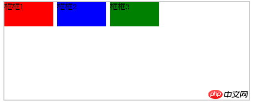
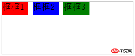
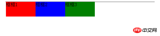
Since p is a block-level element, the boxes will be arranged vertically. In actual operation, it is often necessary to arrange the frames horizontally. There are two ways to do this. The first is display:inlin-block;
 Copy code
.boxBg{ margin: 0 auto; width:500px;
height:200px; border:2px solid #ccc
}
.box1{
width:100px;
height:50px;
background-color :red;
display:inline-block
}
.box2{
width:100px;
height:50px;
background-color:blue;
display:inline -block
}
.box3{
width:100px;
height:50px;
background-color:green;
display:inline-block
}
Execution result:
As for the gap in the middle, the essential reason is traced back to the white space between elements, so set fone- on the parent element size, you can adjust the size of the blank gap.
 Copy code
.boxBg{ margin: 0 auto; width:500px;
height:200px ; border:2px solid #ccc;
font-size:34px;
}
After changing font-size:34px, the gap will become wider.
Execution result:
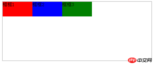
Similarly, to remove the gap, you need to copy font-size:0;
 Code
Code
.boxBg{
margin: 0 auto;
width:500px;
height:200px;
border:2px solid #ccc;
font-size:0
}
Execution result:
The desired layout is achieved, and the text inside the box disappears, as well. Prove that the size of the text affects the gap. Just reset it in the child element. Of course that's not the focus today. The same effect float:left; can also be easily achieved.
Copy code The code is as follows:
Execution result:
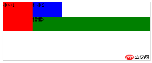
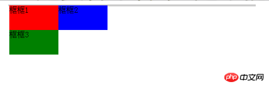
After adding float to the element, the floating element will hit the parent element border or another floating element border, immediately adjacent to it. displayed later. For example, in the following example, when the total width of the floating element is greater than the parent element, the line is wrapped. When the line is wrapped, the previous float is encountered and displayed after it
Copy code The code is as follows:
Execution result:
What will be the result if inline-block is used?
Copy code The code is as follows:
Execution result :
Very common problem, under normal circumstances. The gray background should be as high as the frame, but the reality is always not satisfactory :)
The reason for this situation is known to be caused by floating. Yes, it is floating in many places. It is said that floating elements will break away from the ordinary flow, so ordinary elements can be treated as floating elements that do not exist, so the background will not be opened here. But students who read carefully will remember that it was mentioned above that floating elements will not affect the block frame. But it will affect the line box, that is, text or inline elements. Whether it is a block-level element or an inline element, it belongs to the ordinary flow. If the floating element breaks away from the ordinary flow, why will it affect the line box? In fact, I don’t think there is any need to dwell on these conceptual things. According to my understanding, floating elements are not in the same horizontal space as block-level elements, but in the same space as text inline elements, so the border here is equivalent to being on top of the background, so it will not affect the background elements. What is usually called clearing floats, It does not mean to remove the float attribute of the floating element, but to clear the floating elements around it so that there are no floating elements around it. Therefore, if you want box 3 to move to the second row, you cannot use clear:right; in box 2. You need to use clear:left;
Copy code The code is as follows:
.box3{
float:left;
width:100px;
height:50px;
background-color:green;
clear:left
}
Execution result:
ok! After understanding this, let’s talk about how to make the background and frame the same height. The first method: the most direct The way is to directly set the background height to be equal to the frame and it will be OK. Of course, this is not the point. Let’s talk about clearing the float. First look at the example:
Copy code The code is as follows:
;
;
;
Frame 2
##
Execution result:
#The above result achieves the result. It is obvious that an empty element with the same height is directly added. Because this element is not floating, it is the same as the background, so The background is stretched. In fact, the principle of using clear float is the same as this, and we also try to open up the background; above, remove the width and height of clear, and add the clear attribute
Copy code
The code is as follows: .clear{
clear:left;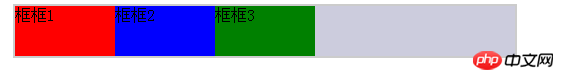 }
}
This You may still not be able to see clearly, try adding a few words to the clear box and see
Execution result:
Because clear uses clear:left. In summary, clear There cannot be a floating element on the left, so it must be displayed on a new line. In this way, you can see that the result in the picture is actually a background held up by one element. Of course, there are other ways to achieve it. The main thing here is to explain floating clearly:)
The above is the detailed content of Comparison of css float attribute and position:absolute. For more information, please follow other related articles on the PHP Chinese website!

Hot AI Tools

Undresser.AI Undress
AI-powered app for creating realistic nude photos

AI Clothes Remover
Online AI tool for removing clothes from photos.

Undress AI Tool
Undress images for free

Clothoff.io
AI clothes remover

Video Face Swap
Swap faces in any video effortlessly with our completely free AI face swap tool!

Hot Article
Hot Tools

Notepad++7.3.1
Easy-to-use and free code editor

SublimeText3 Chinese version
Chinese version, very easy to use

Zend Studio 13.0.1
Powerful PHP integrated development environment

Dreamweaver CS6
Visual web development tools

SublimeText3 Mac version
God-level code editing software (SublimeText3)
Hot Topics
 1386
1386
 52
52

 What is the maximum value of float?
Oct 11, 2023 pm 05:54 PM
What is the maximum value of float?
Oct 11, 2023 pm 05:54 PM
Maximum value of float: 1. In C language, the maximum value of float is 3.40282347e+38. According to the IEEE 754 standard, the maximum exponent of the float type is 127, and the number of digits of the mantissa is 23. In this way, the maximum floating point number is 3.40282347 e+38; 2. In the Java language, the maximum float value is 3.4028235E+38; 3. In the Python language, the maximum float value is 1.7976931348623157e+308.
 Flexible application skills of position attribute in H5
Dec 27, 2023 pm 01:05 PM
Flexible application skills of position attribute in H5
Dec 27, 2023 pm 01:05 PM
How to flexibly use the position attribute in H5. In H5 development, the positioning and layout of elements are often involved. At this time, the CSS position property will come into play. The position attribute can control the positioning of elements on the page, including relative positioning, absolute positioning, fixed positioning and sticky positioning. This article will introduce in detail how to flexibly use the position attribute in H5 development.
 CSS layout property optimization tips: position sticky and flexbox
Oct 20, 2023 pm 03:15 PM
CSS layout property optimization tips: position sticky and flexbox
Oct 20, 2023 pm 03:15 PM
CSS layout attribute optimization tips: positionsticky and flexbox In web development, layout is a very important aspect. A good layout structure can improve the user experience and make the page more beautiful and easy to navigate. CSS layout properties are the key to achieving this goal. In this article, I will introduce two commonly used CSS layout property optimization techniques: positionsticky and flexbox, and provide specific code examples. 1. positions
 How to put div at the bottom in html
Mar 02, 2021 pm 05:44 PM
How to put div at the bottom in html
Mar 02, 2021 pm 05:44 PM
How to place a div at the bottom of HTML: 1. Use the position attribute to position the div tag relative to the browser window, with the syntax "div{position:fixed;}"; 2. Set the distance to the bottom to 0 to permanently place the div at At the bottom of the page, the syntax is "div{bottom:0;}".
 What is the accuracy of float?
Oct 17, 2023 pm 03:13 PM
What is the accuracy of float?
Oct 17, 2023 pm 03:13 PM
The precision of float can reach 6 to 9 decimal places. According to the IEEE754 standard, the number of significant digits that the float type can represent is approximately 6 to 9 digits. It should be noted that this is only the theoretical maximum precision. In actual use, due to the rounding error of floating point numbers, the precision of the float type is often lower. When performing floating-point number operations in a computer, precision loss may occur due to the precision limitations of floating-point numbers. In order to improve the precision of floating point numbers, you can use higher precision data types, such as double or long double.
 What are the database float lengths?
Oct 10, 2023 pm 03:57 PM
What are the database float lengths?
Oct 10, 2023 pm 03:57 PM
Common database float lengths are: 1. The float type length in MySQL can be 4 bytes or 8 bytes; 2. The float type length in Oracle can be 4 bytes or 8 bytes; 3. , The length of the float type in SQL Server is fixed at 8 bytes; 4. The length of the float type in PostgreSQL can be 4 bytes or 8 bytes, etc.
 How to use position in h5
Dec 26, 2023 pm 01:39 PM
How to use position in h5
Dec 26, 2023 pm 01:39 PM
In H5, you can use the position attribute to control the positioning of elements through CSS: 1. Relative positioning, the syntax is "style="position: relative;"; 2. Absolute positioning, the syntax is "style="position: absolute;" "; 3. Fixed positioning, the syntax is "style="position: fixed;" and so on.
 What attributes does position have?
Oct 10, 2023 am 11:18 AM
What attributes does position have?
Oct 10, 2023 am 11:18 AM
The position attribute values include static, relative, absolute, fixed, sticky, etc. Detailed introduction: 1. static is the default value of the position attribute, which means that the elements are laid out according to the normal document flow without special positioning. The position of the elements is determined by their order in the HTML document and cannot be passed through top, right, and bottom. Adjust with the left attribute; 2. relative is relative positioning and so on.
