

Detailed explanation of css3 background-image property examples
This article mainly introduces the css3 implementation of setting multiple background images and background-image attributes in one p. It also provides a detailed explanation of css3 background gradients, horizontal gradients, upper left corner gradients, etc. Friends who need it can Refer to the following
Introduction
In the past when doing web page layout, one p can only set one background image. If you set multiple backgrounds, This can only be achieved by nesting multiple ps, so the compatibility is better. If your website requires compatibility with lower browser versions, it is recommended to use this method. The emergence of CSS3 solves the problem that one p can only set one background, allowing one p to set multiple background images. background-image can also set linear gradients and other effects.
Digression
Regarding the background of css3, it is very powerful and has many attributes, such as background-size, etc., these attributes can be Write a blog about it. Regarding other properties of css3background, I will blog about them separately later!
CSS3/CSS1 background-image property
##Syntax:
background-image:<bg-image> [ , <bg-image> ]*
<bg-image> = none | <url> | <linear-gradient> | <radial-gradient> | <repeating-linear-gradient> | <repeating-radial-gradient>
默认值:none
Value:
##
none:无背景图。
< url >:使用绝对或相对地址指定背景图像。
< linear-gradient>:使用线性渐变创建背景图像。(CSS3)
< radial-gradient>:使用径向(放射性)渐变创建背景图像。(CSS3)
< repeating-linear-gradient>:使用重复的线性渐变创建背景图像。(CSS3)
< repeating-radial-gradient>:使用重复的径向(放射性)渐变创建背景图像。(CSS3)
Description: Set or retrieve the background image of the object.
Ifbackground-image
is set, it is also recommended that the author sets background-color to maintain a certain contrast with the text when the background image is invisible. The corresponding script feature is backgroundImage
.
Compatibility:
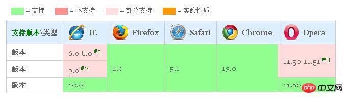 ##IE8 and Earlier browsers do not support CSS3 background-image, that is, they do not support multiple backgrounds and the use of gradients as background images. IE9 does not support the new parameter value of CSS3: < linear-gradient > | < radial-gradient > | < repeating-linear-gradient > | < repeating-radial-gradient > as a background image .
css3 setting multiple background images
To set multiple background images in css3, you can write as follows:
background:url("haoroomsCSS1_s.jpg") 0 0 no-repeat,url("haorooms.jpg") 400px 201px no-repeat;
You can also write like this:
background-image:url("1.jpg"),url("2.jpg "),url("3.jpg");
background-repeat: no-repeat, no-repeat, no-repeat;
Standard writing method
background-image: linear-gradient( [ <angle> | <side-or-corner> ,]? <color-stop> [, <color-stop>]+ );
We often see the above CSS syntax. Some people may not understand the specific meaning. In fact, the meanings of the above symbols have many similarities with regular expressions:
[] It represents a character class in regular expressions. Here, you can understand it as a small unit.
background:linear-gradient(red, yellow);
is the effect of red and yellow stripes from top to bottom.
+ is also a quantifier, indicating 1 or more. Therefore, the termination color is indispensable. For example: linear-gradient(red) is soy sauce, a blank slate.
{background-image:linear-gradient(left, red 100px, yellow 200px);}
The effect is as follows:
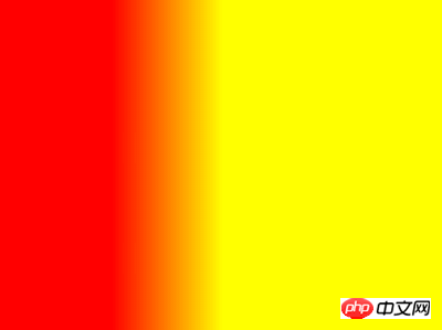
Gradient in the upper left corner
Then from (100px, 100px) to (200px, 200px) should be from the upper left corner To start, write as follows:
{background-image:linear-gradient(left top, red 100px, yellow 200px);} 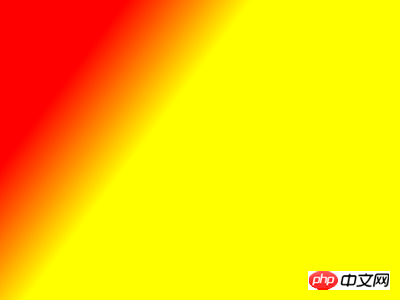
注意:有不少效果加了-webkit前缀以及-moz前缀会展现的不一样! 例如: 原因很简单,CSS3目前还是草案阶段! 从浏览器去掉前缀前后的变化可以推测,之前,W3C的渐变坐标是与photoshop中一致的,但是,后来,由于某些原因,修改了。 至于什么原因,根据我草草的查找,可能与下面几个关键字之一有联系:animation/transition动画、write-mode书写方向、flex box模型、以及radial-gradient渐变等。在这里就不深入研究了! 前缀兼容 基本的写法如下: left, right, top, bottom, left top, left bottom, right top, right, bottom
分别表示,从左往右,从右往左,从上往下,从下往上,从左上往右下,从……(都懂的,不全写了)
当然,也可以用angle角度来写!{background-image:linear-gradient(-45deg, red 100px, yellow 200px);}
具体的样式大家可以尝试着写一下,看一下!很多情况下,用了才知道!background-image:-webkit-linear-gradient(-45deg, red, yellow)
与background-image:linear-gradient(-45deg, red, yellow)<br/>在Chrome浏览器下的渐变方向居然是相反的!但是45deg是正常的。Firefox浏览器下也是如此,有前缀和没有前缀方向相反!咋回事? background-image: linear-gradient(top, #fff, #dededc);
但是为了兼容,有时候要写多个前缀,变成如下:background-image: -ms-linear-gradient(top, #fff, #dededc);
background-image: -moz-linear-gradient(top, #fff, #dededc);
background-image: -webkit-gradient(linear, left top, left bottom, from(#fff), to(#dededc));
background-image: -webkit-linear-gradient(top, #fff, #dededc);
background-image: -o-linear-gradient(top, #fff, #dededc);
background-image: linear-gradient(top, #fff, #dededc);
关于”css3实现一个p设置多张背景图片及background-image属性“今天就写到这里,有问题可以相互交流,加油!
The above is the detailed content of Detailed explanation of css3 background-image property examples. For more information, please follow other related articles on the PHP Chinese website!

Hot AI Tools

Undresser.AI Undress
AI-powered app for creating realistic nude photos

AI Clothes Remover
Online AI tool for removing clothes from photos.

Undress AI Tool
Undress images for free

Clothoff.io
AI clothes remover

AI Hentai Generator
Generate AI Hentai for free.

Hot Article
Hot Tools

Notepad++7.3.1
Easy-to-use and free code editor

SublimeText3 Chinese version
Chinese version, very easy to use

Zend Studio 13.0.1
Powerful PHP integrated development environment

Dreamweaver CS6
Visual web development tools

SublimeText3 Mac version
God-level code editing software (SublimeText3)
Hot Topics


 How to achieve wave effect with pure CSS3? (code example)
Jun 28, 2022 pm 01:39 PM
How to achieve wave effect with pure CSS3? (code example)
Jun 28, 2022 pm 01:39 PM
How to achieve wave effect with pure CSS3? This article will introduce to you how to use SVG and CSS animation to create wave effects. I hope it will be helpful to you!
 Use CSS skillfully to realize various strange-shaped buttons (with code)
Jul 19, 2022 am 11:28 AM
Use CSS skillfully to realize various strange-shaped buttons (with code)
Jul 19, 2022 am 11:28 AM
This article will show you how to use CSS to easily realize various weird-shaped buttons that appear frequently. I hope it will be helpful to you!
 How to hide elements in css without taking up space
Jun 01, 2022 pm 07:15 PM
How to hide elements in css without taking up space
Jun 01, 2022 pm 07:15 PM
Two methods: 1. Using the display attribute, just add the "display:none;" style to the element. 2. Use the position and top attributes to set the absolute positioning of the element to hide the element. Just add the "position:absolute;top:-9999px;" style to the element.
 How to implement lace borders in css3
Sep 16, 2022 pm 07:11 PM
How to implement lace borders in css3
Sep 16, 2022 pm 07:11 PM
In CSS, you can use the border-image attribute to achieve a lace border. The border-image attribute can use images to create borders, that is, add a background image to the border. You only need to specify the background image as a lace style; the syntax "border-image: url (image path) offsets the image border width inward. Whether outset is repeated;".
 It turns out that text carousel and image carousel can also be realized using pure CSS!
Jun 10, 2022 pm 01:00 PM
It turns out that text carousel and image carousel can also be realized using pure CSS!
Jun 10, 2022 pm 01:00 PM
How to create text carousel and image carousel? The first thing everyone thinks of is whether to use js. In fact, text carousel and image carousel can also be realized using pure CSS. Let’s take a look at the implementation method. I hope it will be helpful to everyone!
 css3 what is adaptive layout
Jun 02, 2022 pm 12:05 PM
css3 what is adaptive layout
Jun 02, 2022 pm 12:05 PM
Adaptive layout, also known as "responsive layout", refers to a web page layout that can automatically recognize the screen width and make corresponding adjustments; such a web page can be compatible with multiple different terminals instead of making a specific version for each terminal. . Adaptive layout was born to solve the problem of mobile web browsing, and can provide a good user experience for users using different terminals.
 How to enlarge the image by clicking the mouse in css3
Apr 25, 2022 pm 04:52 PM
How to enlarge the image by clicking the mouse in css3
Apr 25, 2022 pm 04:52 PM
Implementation method: 1. Use the ":active" selector to select the state of the mouse click on the picture; 2. Use the transform attribute and scale() function to achieve the picture magnification effect, the syntax "img:active {transform: scale(x-axis magnification, y Axis magnification);}".
 Does css3 animation effect have deformation?
Apr 28, 2022 pm 02:20 PM
Does css3 animation effect have deformation?
Apr 28, 2022 pm 02:20 PM
The animation effect in css3 has deformation; you can use "animation: animation attribute @keyframes ..{..{transform: transformation attribute}}" to achieve deformation animation effect. The animation attribute is used to set the animation style, and the transform attribute is used to set the deformation style. .
