

How to adapt ionic2 to mobile phones, tablets and other devices
This article mainly introduces the sample code for ionic2 screen adaptation to adapt to mobile phones, tablets and other devices. It has certain reference value and interested friends can refer to it.
This article introduces the sample code for ionic2 screen adaptation to adapt to mobile phones, tablets and other devices, and shares it with everyone. The details are as follows:
The recommended editor is: VS code (Visual Studio Code) => Only responsible for editing documents, not compiling.
And WebStorm has checking and compilation, etc. When ionic1 was developed, it was very convenient to use the browser to click the button to browse the effect at any time. However, after developing ionic2, ionic2 will automatically check and compile, and it will be displayed as a webstorm card. Pause, cannot be edited.
1. First add a side as a test
The project I use is sidemenu
in the project directory Execute the following command: ionic g page page4
2. Run the command to open the browser for debugging
Ionic serve
3. Modify the content of the page4.html file as follows:
##
<ion-header >
 <ion-navbar >
  <button ion-button menuToggle>
   <ion-icon name="menu"></ion-icon>
  </button>
  <ion-title>title</ion-title>
 </ion-navbar>
</ion-header>


<ion-content style="background-color: #abaaaa;">
  <ion-grid style="height: 100%; display: flex; padding: 0px;">
    <ion-row style="background-color: #abaaaa; flex: 2;">
     <ion-col style="flex: 1; padding: 10px 10px 5px 10px; " >
      <ion-card style="height: 100%; width: 100%; margin: 0px; background-color: #cdcecf">
        <ion-card-content style="height: calc(100% - 30px);">
         card content
        </ion-card-content>
      </ion-card>
     </ion-col>
    </ion-row>
    <ion-row style="background-color: #abaaaa; flex: 4;">
     <ion-col style="flex: 1; padding: 5px 10px 10px 10px; " >
      <ion-card style="height: 100%; width: 100%; margin: 0px; background-color: #434343">

        <ion-card-content style="height: calc(100% - 30px);">
         content
        </ion-card-content>
       </ion-card>
      </ion-col>
    </ion-row>
  </ion-grid>
</ion-content> 4. Test results:
The above is the detailed content of How to adapt ionic2 to mobile phones, tablets and other devices. For more information, please follow other related articles on the PHP Chinese website!

Hot AI Tools

Undresser.AI Undress
AI-powered app for creating realistic nude photos

AI Clothes Remover
Online AI tool for removing clothes from photos.

Undress AI Tool
Undress images for free

Clothoff.io
AI clothes remover

Video Face Swap
Swap faces in any video effortlessly with our completely free AI face swap tool!

Hot Article
Hot Tools

Notepad++7.3.1
Easy-to-use and free code editor

SublimeText3 Chinese version
Chinese version, very easy to use

Zend Studio 13.0.1
Powerful PHP integrated development environment

Dreamweaver CS6
Visual web development tools

SublimeText3 Mac version
God-level code editing software (SublimeText3)
Hot Topics
 1387
1387
 52
52

 The all-round center for learning and entertainment - new Lenovo Xiaoxin Pad Pro 12.7 Comfort Edition hands-on experience
Aug 05, 2024 pm 04:28 PM
The all-round center for learning and entertainment - new Lenovo Xiaoxin Pad Pro 12.7 Comfort Edition hands-on experience
Aug 05, 2024 pm 04:28 PM
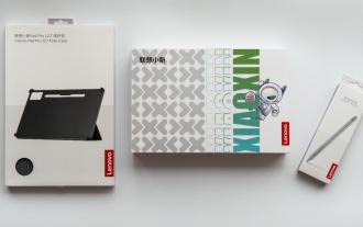
Thanks to netizen Nobilta for submitting the clue! Today, with the rapid development of smart hardware, when we think about prioritizing productivity, notebooks must be a topic that cannot be avoided. However, as the performance of the Arm architecture becomes more and more powerful, tablets between mobile phones and notebooks have gradually become one of the productivity choices for more people. As an old giant, Lenovo undoubtedly firmly occupies a dominant position in the PC field. Can the just-launched Lenovo tablet Xiaoxin PadPro 2025 shoulder the "glory of the big brother" and become an important part of Lenovo's ecology and serve as the "student party"? ”, a productivity tool for “beating workers”? Let’s experience it together. Unboxing & Appearance: This time I received Lenovo Xiaoxin PadPro 12.7 (second generation) Comfort Edition +
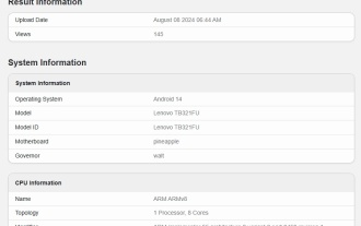 Lenovo TB321FU new phone appears on GeekBench, expected to be the Savior Y700 2024 small screen tablet
Aug 12, 2024 pm 04:31 PM
Lenovo TB321FU new phone appears on GeekBench, expected to be the Savior Y700 2024 small screen tablet
Aug 12, 2024 pm 04:31 PM
According to news from this site on August 12, a new Lenovo machine with model number TB321FU appeared on GeekBench. The machine scored 2209 in single-core and 6509 in multi-core. The CPU information is similar to the Qualcomm Snapdragon 8Gen3 processor. This site noticed that the new Lenovo TB321FU machine is pre-installed with Android 14 system and equipped with 12GB of storage and storage. According to blogger @digitalchatstation, the machine is expected to be the Lenovo Savior Y700 small-screen tablet, equipped with Qualcomm Snapdragon 8Gen3 processor and pre-installed ZUI16.1 system. Lenovo's 2023 Savior Y700 Android tablet will be released in July 2023. It is equipped with a Snapdragon 8+ processor, equipped with an 8.8-inch 2.5K144Hz screen, weighs 348g, is 7.6mm thick, and is equipped with two Typ
 Lenovo Savior Y700 2023 tablet launched ZUI 16.0.336 update: upgrade to Android 14, support Xiaoxin Wireless Keyboard Air
Aug 11, 2024 pm 04:41 PM
Lenovo Savior Y700 2023 tablet launched ZUI 16.0.336 update: upgrade to Android 14, support Xiaoxin Wireless Keyboard Air
Aug 11, 2024 pm 04:41 PM
According to news from this website on August 11, the 2023 model of Lenovo’s Savior Y700 tablet has been updated to version ZUI16.0.336, which upgrades the bottom layer of the Android 14 system and adds support for Xiaoxin Wireless Keyboard Air. The details of this update attached to this site are as follows: Android 14 major version upgrade highlights new color design: adopts a new color system to enhance the visual experience; optimizes the Gaussian blur effect to help you focus more easily Newly added video call assistant: online conference Or during video calls, the video call assistant can help you quickly access portrait and sound enhancement settings. Supports Lenovo Xiaoxin Wireless Keyboard Air: supports quick pairing of keyboards and multiple shortcut keys. System optimization optimizes game freezes and screen recording freezes in some game scenarios. Dayton’s user experience optimization AI scan
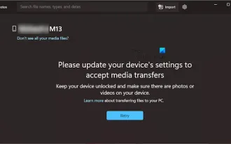 Please update your device settings to accept media transfers
Feb 19, 2024 pm 12:24 PM
Please update your device settings to accept media transfers
Feb 19, 2024 pm 12:24 PM
We will show you how to fix media transfer error when connecting your phone to PC via USB cable. When you try to import photos and videos from your phone to your computer, you may encounter a "Please update your device's settings to accept media transfers" error message displayed by the Photos app. Please update your device settings to accept media transfers Update your device settings to allow media transfers to resolve the error message. Restart your two devices Use different USB cables Check your Android phone settings Install the MTP USB device driver Use other methods to transfer your photos and videos Let’s get started. 1] Restart both devices It is recommended that you first try to restart your devices, including computers and phones, when you encounter a temporary failure. Heavy
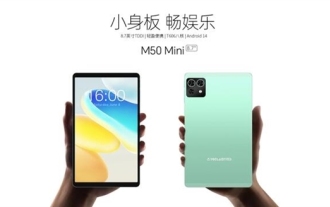 Teclast M50 Mini tablet is here: 8.7-inch IPS screen, 5000mAh battery
Apr 04, 2024 am 08:31 AM
Teclast M50 Mini tablet is here: 8.7-inch IPS screen, 5000mAh battery
Apr 04, 2024 am 08:31 AM
According to news on April 3, Taipower’s upcoming M50 Mini tablet computer is a device with rich functions and powerful performance. This new 8-inch small tablet is equipped with an 8.7-inch IPS screen, providing users with an excellent visual experience. Its metal body design is not only beautiful but also enhances the durability of the device. In terms of performance, the M50Mini is equipped with the Unisoc T606 eight-core processor, which has two A75 cores and six A55 cores, ensuring a smooth and efficient running experience. At the same time, the tablet is also equipped with a 6GB+128GB storage solution and supports 8GB memory expansion, which meets users’ needs for storage and multi-tasking. In terms of battery life, M50Mini is equipped with a 5000mAh battery and supports Ty
 OPPO Pad 3 tablet parameters exposed: Snapdragon 8 Gen 3 processor paired with 12.1-inch LCD screen
Jun 05, 2024 pm 01:44 PM
OPPO Pad 3 tablet parameters exposed: Snapdragon 8 Gen 3 processor paired with 12.1-inch LCD screen
Jun 05, 2024 pm 01:44 PM
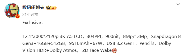
According to news from this site on May 16, blogger @digitalchat.com recently shared a set of main parameters of a new tablet product. Based on previous revelations, it is expected to be OPPOPad3. The summary of this site is as follows: Screen: 12.1-inch 3K7:5 LCD, resolution 3000*2120p, 304PPI, 900nit brightness; Image: 8Mp/13Mp Performance: Snapdragon 8Gen3+16GB+512GB; Battery life: 9510mAh battery + 67W wired fast charge; others : USB3.2Gen1 interface, Pencil2 smart pen, Dolby Vision, Dolby Atmos, 2D facial recognition ▲ Picture appreciation on this site: OPPOPad2 As a reference, OPPOPad2 was released in March 2023. This tablet
 What should I do if there is no sound in the system after win11 update? How to solve the problem of no sound in win11 device
Jun 25, 2024 pm 05:19 PM
What should I do if there is no sound in the system after win11 update? How to solve the problem of no sound in win11 device
Jun 25, 2024 pm 05:19 PM
After some users have updated and upgraded the win11 system, the computer has no sound. The problem of loving you is usually caused by no device, missing sound card driver, or unknown error. So how should we solve these problems? , this issue of win11 tutorial is here to answer everyone’s questions. Next, let’s take a look at the detailed steps. Solution to no sound after win11 upgrade: 1. No device 1. If we are using a desktop computer, it is probably because there is no device. 2. Because ordinary desktop computers do not come with built-in speakers, we need to plug in speakers or headphones to have sound. 2. The sound card driver is missing 1. After we update the Win11 system, the original sound card or audio device driver may not be available.
 Cube mini 2 tablet officially announced to be equipped with Qualcomm Snapdragon 6 Gen1 processor
Aug 09, 2024 am 02:04 AM
Cube mini 2 tablet officially announced to be equipped with Qualcomm Snapdragon 6 Gen1 processor
Aug 09, 2024 am 02:04 AM
According to news from this website on August 8, Kubi Cube issued a post today to warm up its new mini2 series of handheld tablets, confirming that they will be equipped with Qualcomm Snapdragon 6Gen1 processor. The Cube mini2 tablet is a small tablet for positioning games. It supports 4K video decoding and can output images to the monitor. The official also released a function demonstration video today: This site previously reported that the Cube mini2 tablet will use UFS storage, with a size of 8.4 inches, a front-facing 5-megapixel camera, a rear-facing 13-megapixel camera, and a screen resolution of 1200×1920 , pre-installed with Android 14 system; also equipped with dual speakers and battery capacity of 6050mAh.
